Stripping a certain space of its unnecessary things makes a room minimalist.
In most cases, this type of design is achieved when a house is new, when people just came in the house. And as time passes by, we tend to add more and more stuff in one room, especially when there is a kid around.
How are we even able to say this? Well, that explanation is practically based on random experiences we have seen our friends in. Maybe when someone is living in a pad, or maybe single, these are also the few times minimalism is quite achieved.
But today, like a few of the articles we have posted lately, we will be showing you photos of rooms – this time, of kitchen spaces wherein minimalism is achieved. The next 15 photos may be a quite an inspiration for people who would love their kitchen spaces be more organized and really spacious.
Come on, and let us take a quick look at them.
Bohdan Townhouse
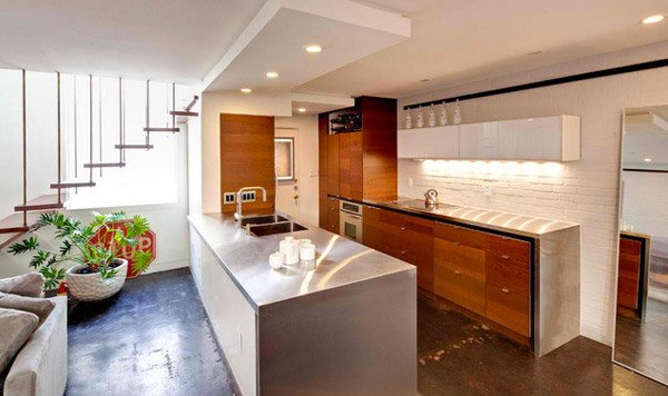
Look how simple yet pretty this room is. The granite flooring contrasts the shiny countertop that the kitchen has.
Crystal
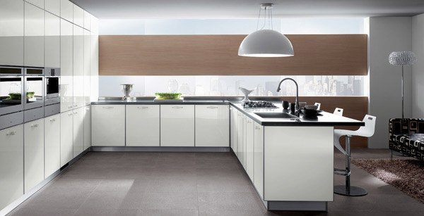
Isn’t a kitchen more spacious once there are fewer things in it? This space for example is wider and far more appealing than a crowded kitchen with a lot of things in it.
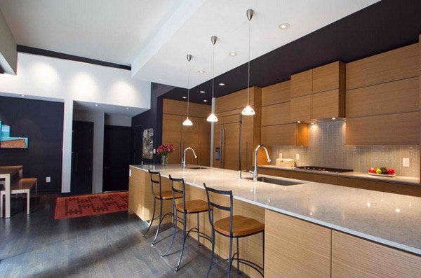
Frair Tuck Home
darkhorsewoodworks.com
Fascinating countertop with the classic laminated kitchen cabinets and drawers. The room is beautified by the treatment with the lighting.
Gioconda
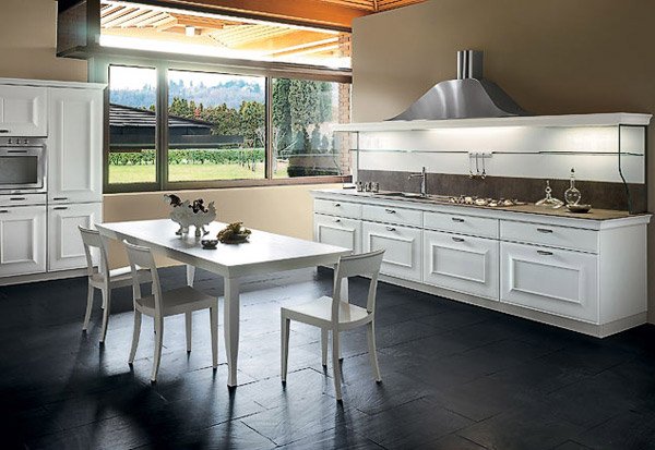
Pretty kitchen cabinets and drawers in white. Lovely how a small space like this can be charming and gracious.
Kube
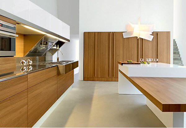
We don’t know about you guys, but modern wooden kitchen can really be a charmer in any home.
Modernist House Modern Kitchen
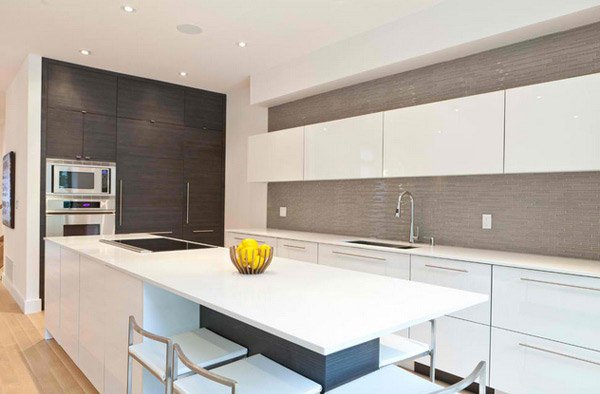
A brand new kitchen with great color palette and modern materials used. This kitchen sure is spacious and pretty.
Ola20 Bianco Micalizzato
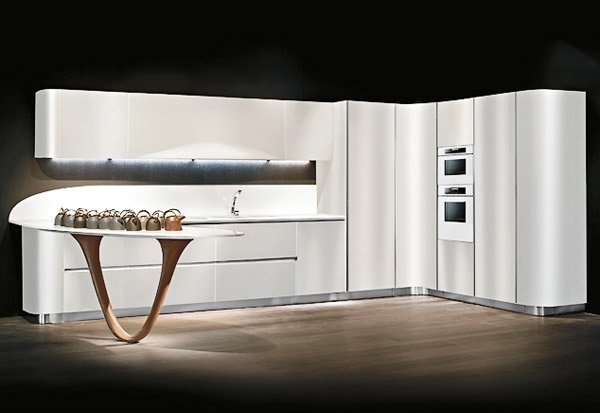
Ultra-modern design of a modular kitchen. Who in the world would not want a kitchen as fascinating as this?
Code
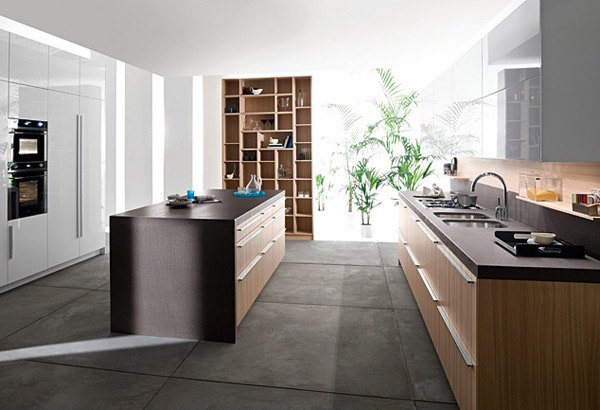
Snaidero Design
This modular kitchen design may be one of the best Snaidero has. We personally love the dark colored-countertops matched with wooden cabinets and drawers.
Sistema Zeta
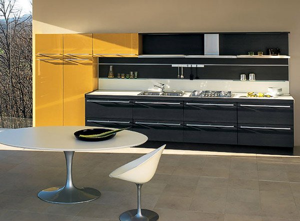
Good combo for the color chosen for the cabinets and drawers for the kitchen. The entire room is widen because the modular kitchen is placed only on one side.
Terra
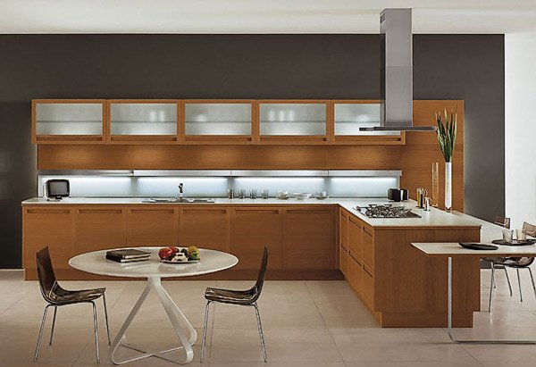
Clean lines make this modular kitchen design a classic beauty. Using brown for the color is quite simple but really eye-catchig!
LG House Interior Modern Kitchen
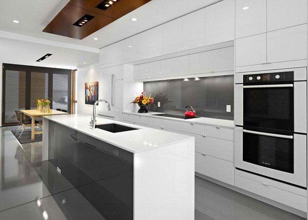
Third Stone Modern House + Landscape Design
Pretty countertops and modern materials used for this yet another example of a modern kitchen. Using the best materials always make something simple look really special.
Kubika
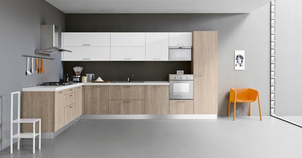
ZG Group
The color of this modular kitchen is pretty and looks amazing for the wall color. The palette that the designer used is quite cool to the eyes.
Country
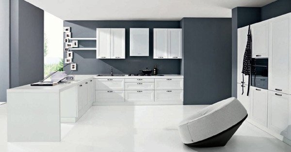
The ever classic black and white kitchen is the most popular color scheme for a modern kitchen. Because of fewer things in the kitchen, the space is cleaner and wider.
Vega
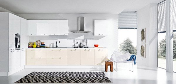
Thanks to the glass windows, this kitchen is admitting as much light in the morning which is a good practice of green architecture. The use of neutral colors make this room look really clean.
Venus
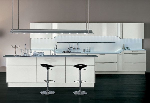
A white and gray combination is always a killer in terms of beauty and cleanliness for a certain room, especially for kitchens.
Wow! That was sure an incredible list of 15 Simple and Minimalist Kitchen Space Designs! Some of the designs are common for homes that preferred modular kitchens, but some were made specially for the families who wanted unique designs for their homes. Whatever the cause may be, it is still important to take note that a kitchen is a space where families can prepare their food for their loved ones and that design should never be a reason to compromise use and functionality. We also have 20 Sleek and Natural Modern Wooden Kitchen Designs for more inspiration. More to come in Home Design Lover!