We are used to the fact that a dwelling is permanent and would stay in a certain area all the time. That is why columns and foundations are made for each home. Of course, it has to be sturdy too. But if you think one cannot make a mobile home, you are wrong. Actually, we have seen many mobile homes already and are really very advantageous especially if one doesn’t intend to stay on one place for a long time. For many, a mobile home would be perfect for those who love to visit places. Well, they can bring their home with them as long as it can actually be brought somewhere because other areas would limit the size of mobile structures. Well, obviously, what we are going to feature today is a mobile dwelling called the Forest Lodge.
The Forest Lodge is located within a clearing of New Forest Woodland. PAD Studio were commissioned to design said bespoke contemporary mobile dwelling. The design conforms to the 1968 Caravan Act and it will be capable of being lifted once installed. The air tight, highly insulated dwelling is constructed to PassivHaus standards and CSH Level 4. It utilized Solar PV and it also features rainwater harvesting making it small but sustainable. In the interior, the design aims to maximize spaciousness. And it is nice that it was able to achieve that. The small home features an open plan rooms with minimal corridors and lots of natural light. With this, the dwelling appears much bigger than the restricted dimensions which are just 6.8m wide x 20m long. Let us take a look at the house below.
Location: United Kingdom
Designer: Pad Studio
Style: Contemporary
Type of Space: Mobile Home
Unique feature: One look at it will make you think that it is a permanent home but it is actually a mobile dwelling.
Similar House: A Compact Mobile Home and Office Called #dojowheels
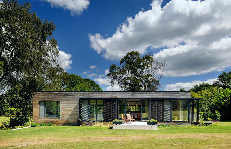
For sure, you didn’t expect the mobile home to look like this. You might think that it is just like trailer parks wherein all the homes look the same. But the mobile home that you are seeing now is definitely a step above what we normally see. At first glance, you will not even think that it is actually a mobile a home.
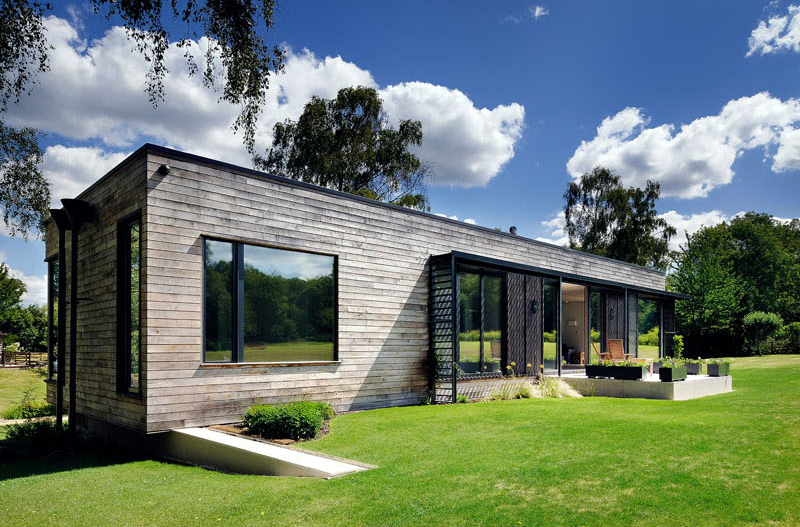
The owners of this house wanted to have a new, very low energy dwelling that is flooded with light and has a strong connection to the surrounding landscape. They also want it to look beautiful but it shouldn’t resemble or feel like a mobile home. Well, it appears that it is exactly what the owners got.
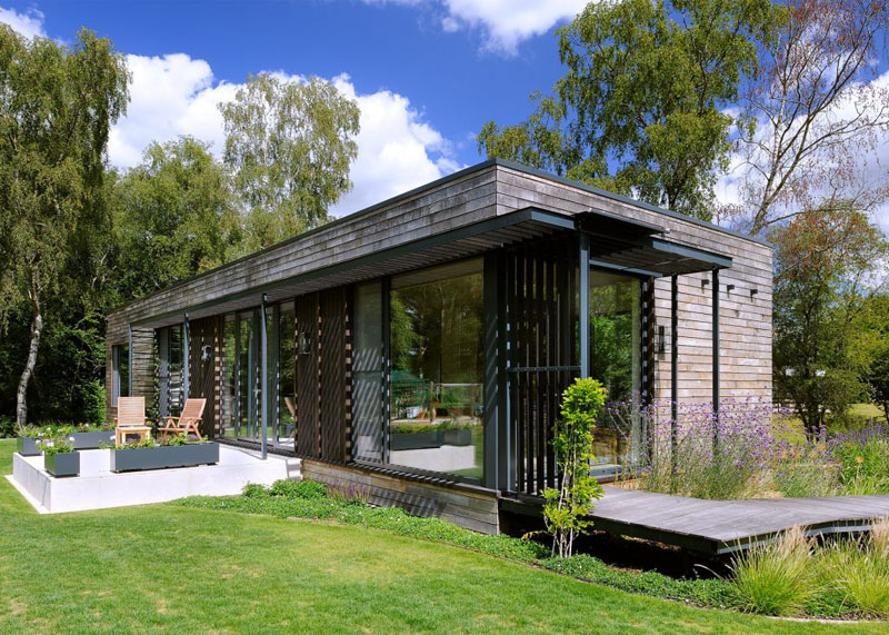
The home is covered in panels of dark stained sweet chestnut which added appeal to the house. The black steel elements on it also bring more contemporary touch to it. As you can see, it also features windows around it that bring natural light inside the home.
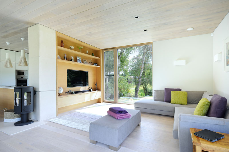
Inside the house, it used natural oak, limestone, and white paneled walls resulting into a warm and cozy aura. I also like it that there are pops of purple and lime green in it turning the space into a stunning residence. It is also a great idea that gray furniture is used here.
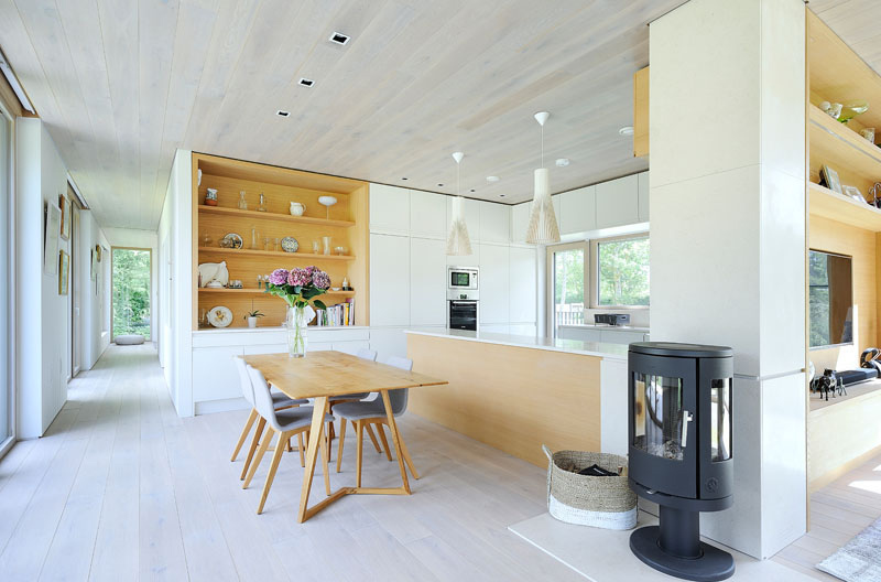
Aside from the living room with built-in cabinetry that is featured above, around the corner one can see the dining room and kitchen. In this area, a free standing wood fireplace heats the space. I also like the combination of white and wood in it.
Read Also: The Tiny Tack House- A Couple’s Perfect Mobile Home
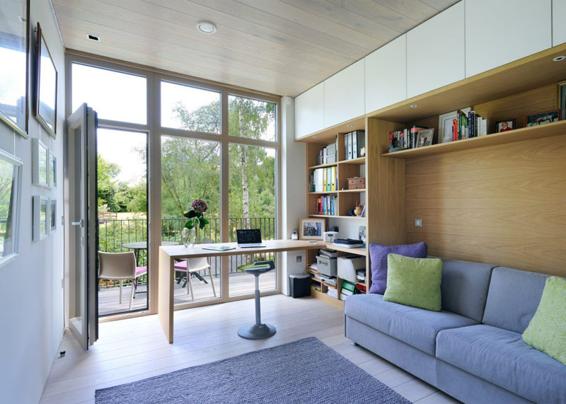
This is the space for the home’s workspace. It is also nice that there is a wooden bookshelf and storage space. Like the living area, purple and green is also used in here. It also opens out onto a little deck with enough room for a couple of chairs.
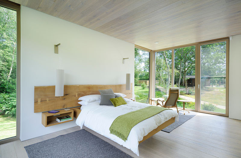
In the bedroom, it features a floating bed, and a space for a table and chair. Like other parts of the house, it is also positioned to enjoy the scenery. Isn’t it nice to have a bedroom as neat as this? Instead of adding so much items in it, it s just simple but it has everything one needs.
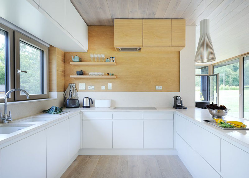
The kitchen is also simple in style featuring a U-shape. It allows plenty of counter space as well as open shelving which is perfect for displaying various kitchen items. You’d definitely love the wood and white combination here.
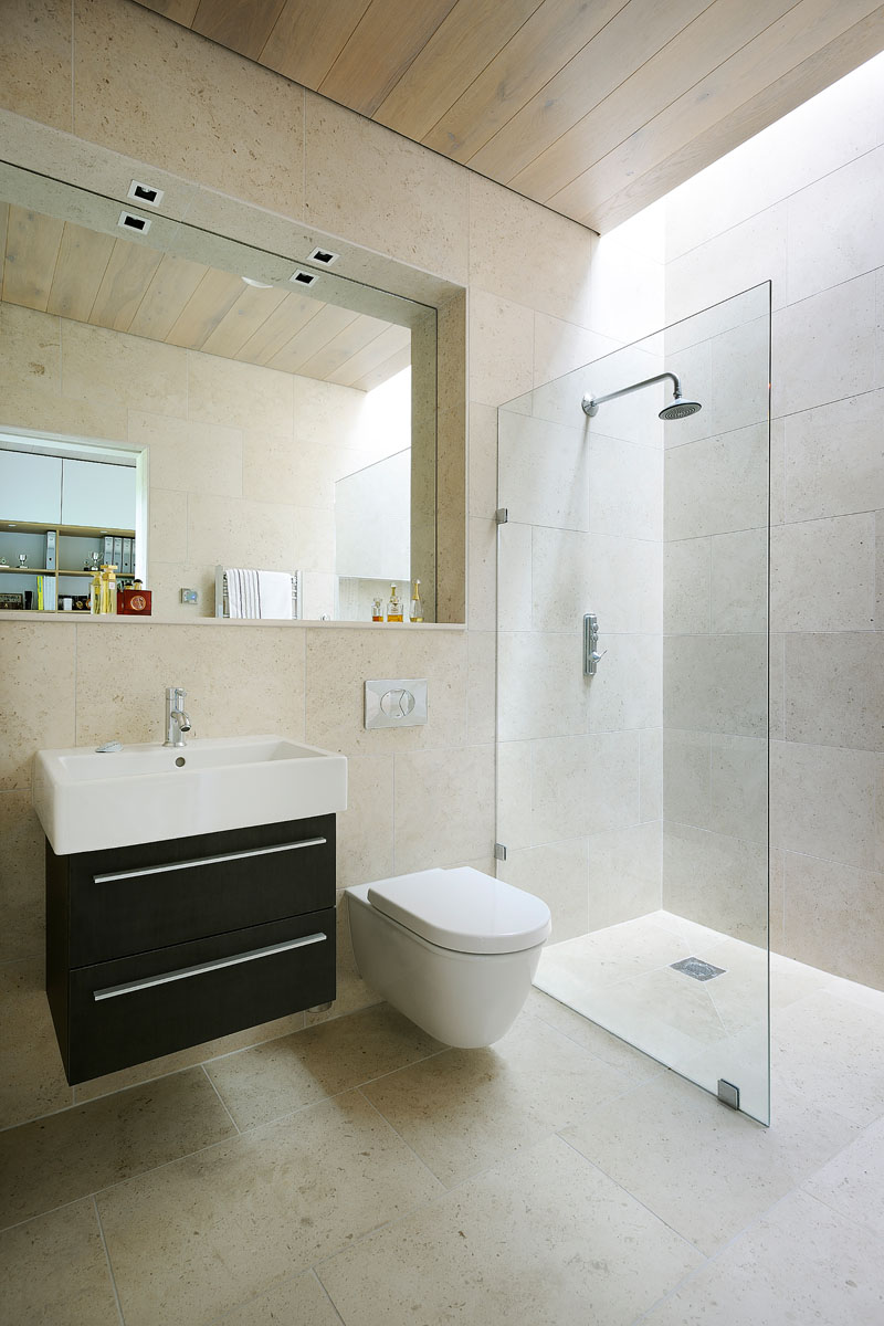
This is the bathroom wherein the mirror is set back, providing space for a ledge that is perfect for displaying personal items. There is also a skylight above the shower to ensure that the space has as much light as possible.
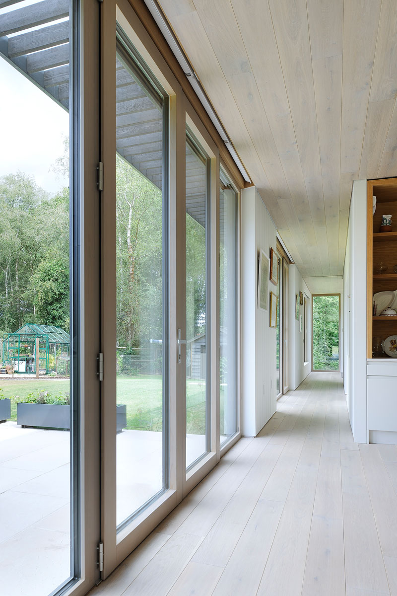
With floor-to-ceiling windows, it can provide an abundance of light in the hallway that leads to the bedroom. It is nice to have a hallway like this that isn’t dark and doesn’t give the feeling of being boxed and cramped inside.
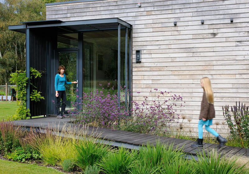
Who would expect that this is actually a mobile home? With the looks of it, it appears permanent but it can actually be lifted and transferred anytime. Seen here is an outdoor walkway that leads to a glass door. What made this even more stunning are the plants around it.
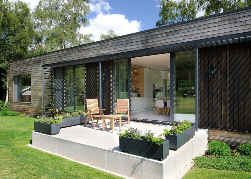
Just off the dining room, there’s a small patio where the family can relax and enjoy the views. Also seen here are planters and chairs on an elevated patio to level the interior of the house. For sure, you didn’t expect to see an elevated patio like this for a mobile home!
Amazing, right? I like that it doesn’t have any traces of being a mobile home. It actually just looks like the usual home that stays in the same area for a lifetime (unless it is broken or demolished.) I could say that this home appears really tricky as it tried to trick people about its ability to be transferred to other places. I also like the simple design but no matter how simple, it looks really beautiful. This home is designed by Pad Studio who managed to come up with a home that isn’t just nice aesthetically but also very functional. Another impressive feature is its being sustainable. What can you say about this house?