Posts and columns have been used since the early time of construction. If you actually search for these terms, you’d be able to see how awesome designs are available a few centuries ago up until now. In today’s contemporary designs – even when it’s actually traditionally designed homes, columns and posts are totally something you can add to your spaces as functional elements in them or just for decorative stuff.
Today, we would be sharing to you a couple of spaces that have freestanding posts or columns in them; some of them I believe you would like, while others you might find uninteresting. But check out how they helped the spaces turn out incredible and tell me, you wish you have one at home! Look at the living room spaces below and tell us what you think!
1. Trump Hollywood Apartment
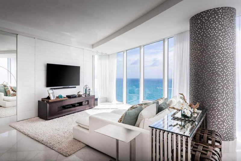
Now, the beginning of this living room is quite a treat! We see how luxurious this space is and how fascinating everything in here is. From the stunning view of the sea, the awesome furniture and the large column, I think this living room is something you could use as inspiration for your next design project.
2. Green Soho Loft
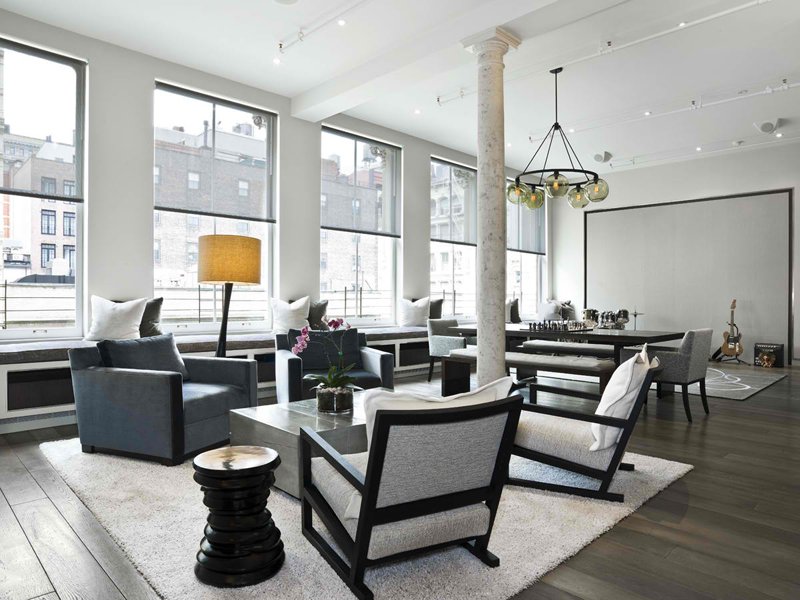
Grade New York
This large soho loft might be one of the finest examples of living rooms that we have on this list. The colors are simple but a classic, and the pieces of furniture is something I would really suggest people get once they pick out pieces for their homes.
3. King West Condo
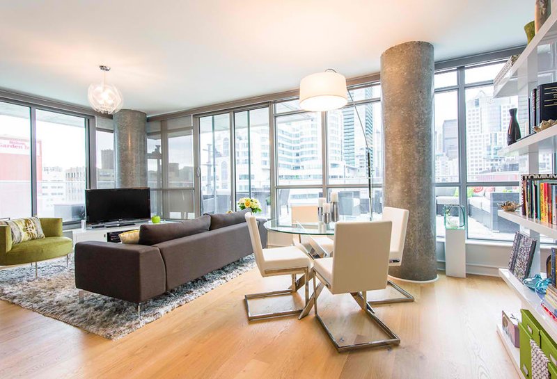
Here is another living space that has those large columns. Structurally, columns like these are quite large because this is a high-rise building. What’s nice is that these columns have a stunning finish to serve as Architectural feats this condo would have.
4. 56 Leonard Residence
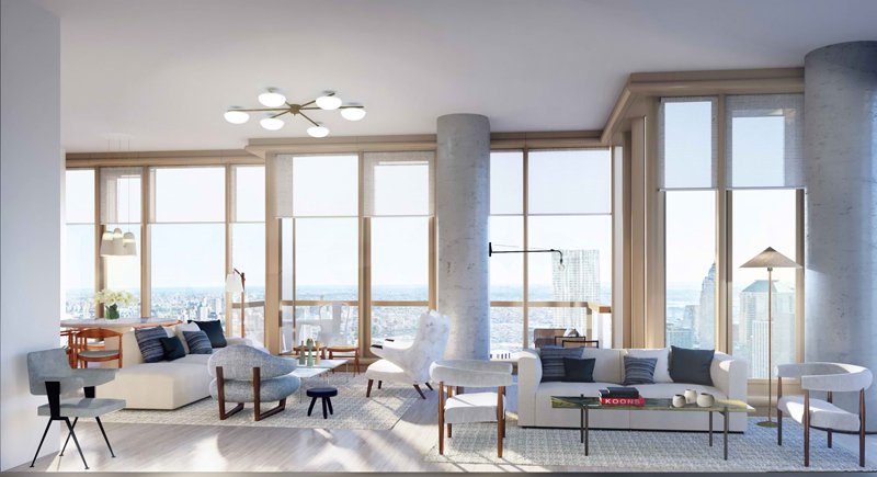
The classic color seen and used in this living room is quite charming. Honestly, everything in here is so expensive and fascinating that being inside this place might be something of a great opportunity to witness and even explore. I wish of course that they get a prettier chandelier.
5. Hillside Residence
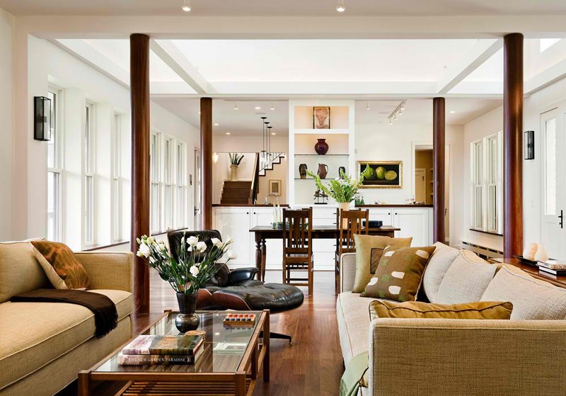
A beautiful hillside home is presented to us by the Smith and Vansant Architectural group. The color combination in here is really homey and traditional but you know that everything in here were chosen with care and comfort was really one of the priorities of the designers.
6. Hudson Loft
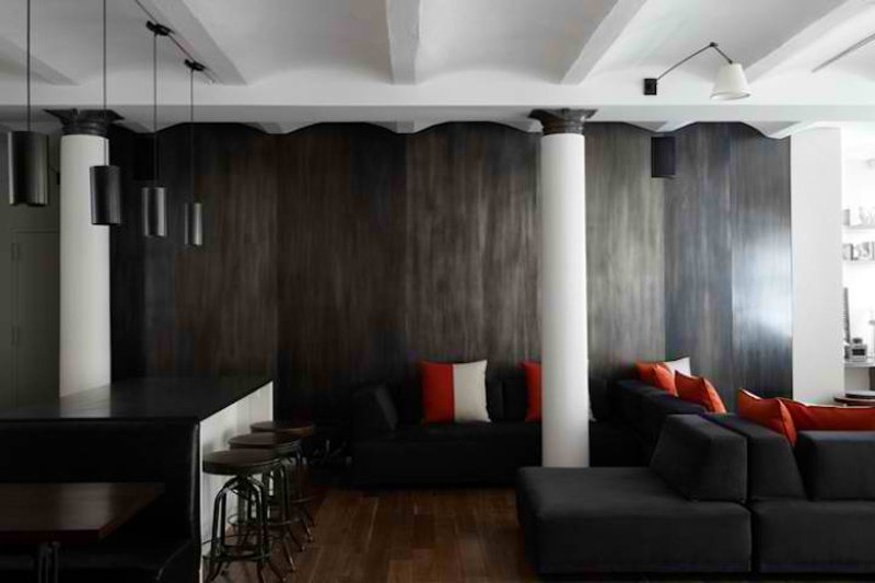
SchappacherWhite Architecture D.P.C.
What do you think about the color combination of this beautiful living room that you see in this picture? If you agree that a house’s beauty depends on the details that it has, you’ll know that this house has that and it’s just really interesting and neat!
7. Indigo Lane House
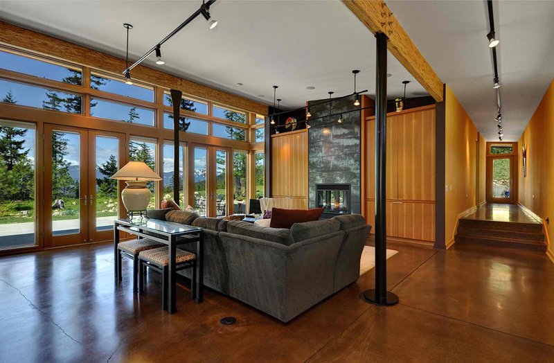
Mohler + Ghillino Architects
What do you think about this wonderful house? When I saw the facade of this home I got totally amused and of course fairly interested. The details of the exteriors as well as the interiors are real nice and fancy.
8. LaVista Park Renovation
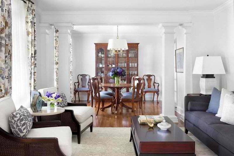
This all-white space is quite fun and luxurious looking! Adding different colored furniture and decoration and even drapes made this white space prettier and a whole lot classier! The wooden furniture used in here is my favorite!
9. Oakley Ranch
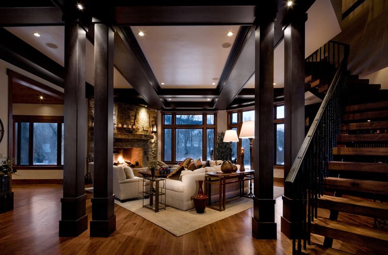
Wood, being the primary material used for this house, adding black balustrades and columns made this place really beautiful and alluring. The old world look and charm that this place have is just something you can get used to – something you should look forward to every night after school.
10. Spice Warehouse
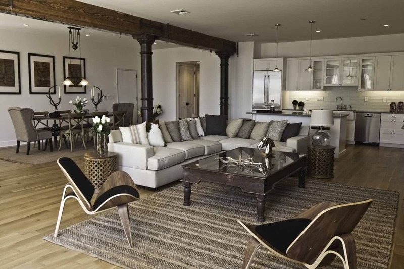
This specific home may be one of my favorite spaces since I have started collecting photos for lists like this one. The color combination looks real nice and furniture and decorations that they have are pretty relevant at this day and age. If you notice, the columns in here could possibly pass for the original ones that this warehouse could have had since it was built.
11. TriBeCa Loft
Office of Architecture
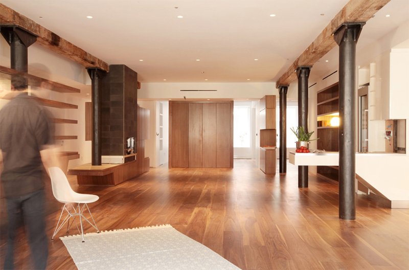
This Tribeca loft has a couple of columns in them – pretty great stuff – the fact that they combined wood and steel made a whole lot of difference. I like the color choice they did with the columns too, do you too?
12. Vacation Lane
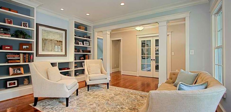
This is one of those living rooms that have the same effect and design as some of the spaces on this list where doors or openings are the areas where they actually placed the columns or posts on – sometimes the spaces look cool with them in it, but sometimes it seems like they are misplaced or something.
13. Warren Residence
Union Studio, Architecture & Community Design
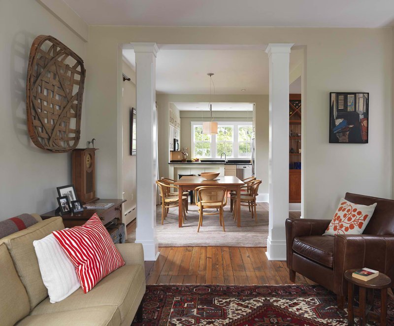
Okay, I think it this opening would still have been pretty without the columns, but they placed them anyway, I would like to think that these columns are in there because they have to and not because they just wanted them to be there. Using white for the color is quite a nice choice too.
14. Westport Island House
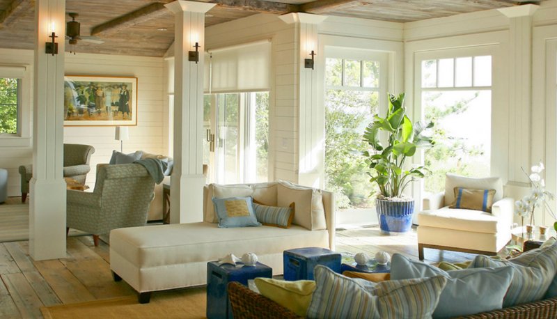
The beautiful detail on the columns of this space is really interesting. The white color definitely makes up for the fact that this house is basically a beach home guised as an island house. The furniture in this living room is also something we should commend the designers for because they look comfy and quite fancy too!
15. Beach Cottage
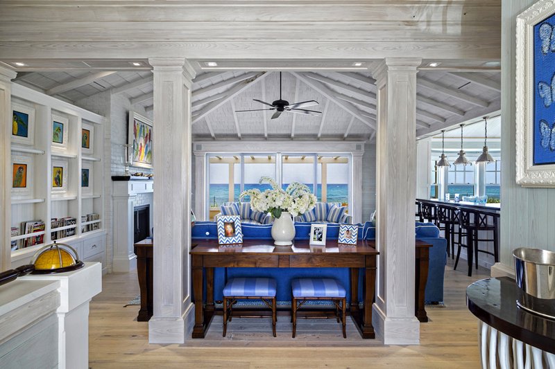
The color of the columns in this space is quite interesting. They grey effect of this space in general is actually appealing; mixing it with blue made it more interesting for me though. Beach homes like this one is real fancy!
16. Classic Coastal Colonial Renovation
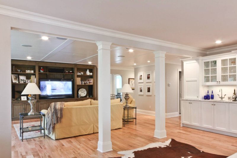
The posts in the middle of the room look like this could possibly be structural features that this space actually needs. They made it look really pretty even when it is simple; even when it looks simple, you know that they create a certain look and feel to this space that would not be complete without it.
17. Davis Residence
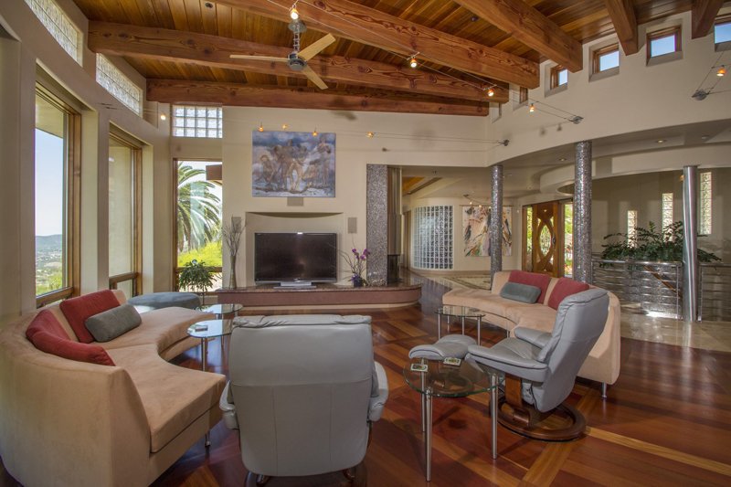
Wylie Architecture Planning Interior Design
I can’t totally pinpoint the design that this home has – it’s like a hint of a beach home with a bit of contemporary feels to it. From what you can see with the furniture – they are pretty contemporary, and the wooden floors, ceiling and the little skylights that they have above the windows and the ones above the posts make it really feel like you are close to the beach.
18. 87 Leonard Model
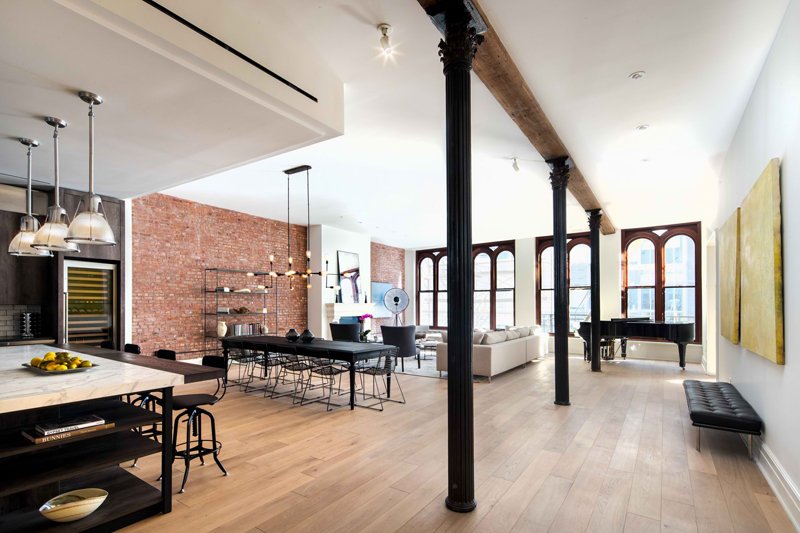
Grade New York
The black posts in this loft look really cool and vintage. The fact that this is in black possibly made from steel, the whole industrial look and feel of this space is quite fascinating. Look at the material, furniture and decorations that this space has and I think you’d be amused too.
19. Sky @ MidCity Lofts
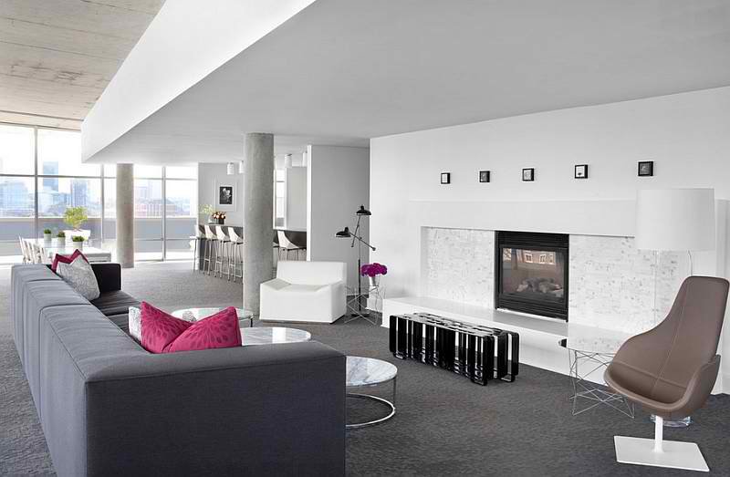
Niki Papadopoulos | Yummy Scrumptious
When I saw this living room, I thought that we could really do so much with it – the area is really large and really fancy-looking. If you ask me, I think this is one of those houses that is pretty large and has very few people living in them; totally not a bad thing, but I think this space could definitely make a large family really happy.
20. Brooklyn Apartment
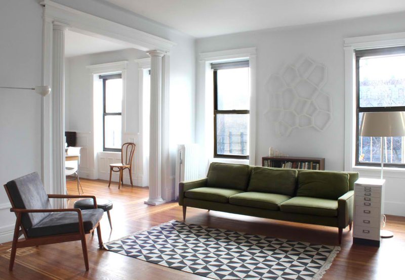
Maletz Design
The last picture in this list is a simple mid-century living room that shows us a large space but with minimal seating but incredibly sexy vibe. The colors used in here are simple and even plain, but it really looks neat and classy. The vibe that this space has is something we can always aim for in our own homes; notice the posts though? Pretty intense, right?
If you have seen the article that my colleague created about the Skyhouse: A Unique Home with Rock Climbing Columns and Metallic Slides, I think you’d know that the living spaces in this list is really nothing in compare, but I think that it is like a great start to the achievement of something really beautiful. This list may not be something you can do right now, but believe me when I tell you that you can have decorative ones if you’d really want too.