Half Walls Divide Spaces in Apartment Huber
Look at how the spaces are defined in this small apartment.
No matter how small the area is, there is always a solution to that. There are different ways to maximize space like having lofted areas and adding creative storage in order to have enough space for some home items and belongings. For sure, it isn’t new to you because we have featured many apartments with limited spaces as well as tiny homes too. Also, when decorating and designing with small spaces, you don’t have to limit your creativity because there is actually a lot that you can do to it, just like what we are going to feature today.
MAEMA Architects designed the renovation of a small 538 sqft (50m2) apartment called Apartment Huber. The designers decided to make the living, dining, and kitchen areas all open but in order to provide some separation, they designed two angled half walls that wrap around the kitchen and living area, essentially creating three separate areas. On the ground floor of this Parisian duplex, three spaces coexisted: the kitchen, the dining room and the living room, there was also a bathroom and wasted space. The kitchen too was generating little closed-off traffic, and the other two areas were unable to find their place. The idea was to open to the maximum, to enlarge the space and move the bathroom on the floor to create additional office open to the living space. Let us take a look at the space below.
Location: Paris
Designer: MAEMA Architects
Style: Modern
Type of Space: Apartment
Unique feature: A small apartment used unique half walls to define the spaces in the interior.
Similar House: Creative Ideas Maximized the Living Spaces in this Small Apartment
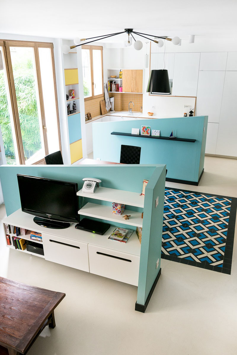
From either side of the windows a slender library embellishes the divider which permits a play of shading and design. The windows were changed for new wood and incorporate the wood material in kitchen.
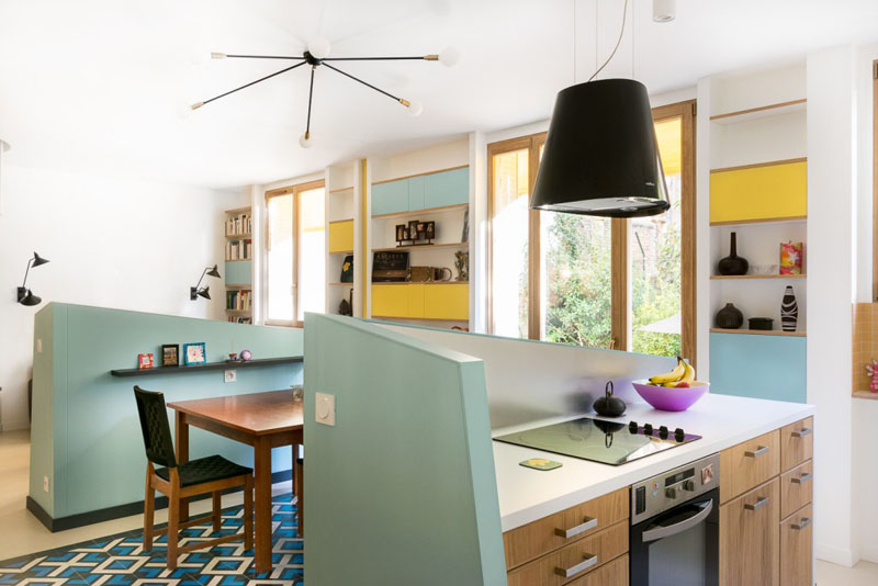
By binding together the ceiling in one huge room, the light could slip to the base of that space. However, the dividers were expected to structure space and incline there. The kitchen area has an open cooking space but it is hidden from view from the dining and the lounge area.
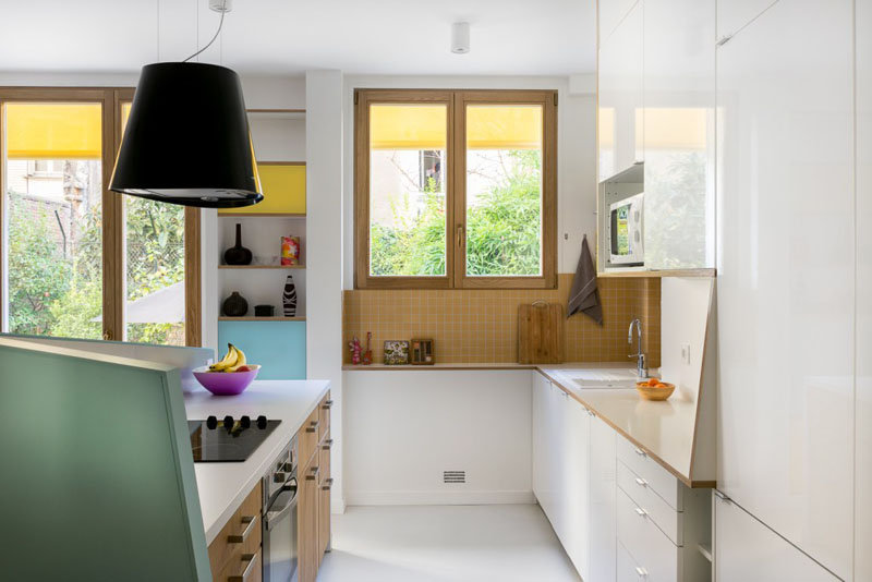
The right half of this exceptionally useful kitchen is enhanced with brilliant white to??bring more light into the apartment. The suspended hood permits to have no obstruction to the eye.
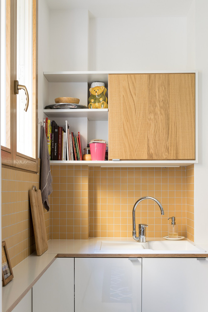
The kitchen has a simple design and built without being cold. It features a set of wooden facade, wooden plan with singing and cognac colored tiles which bring warmth to the whole area.
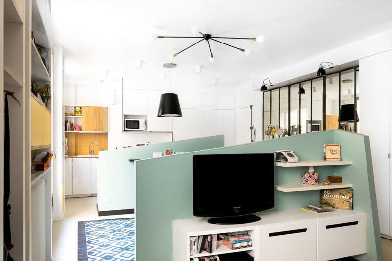
From the lounge side of the apartment, the half-wall leans on one side. On it is a television which is not visible elsewhere. Behind it is a large row where we can see mirrors positioned for enlarging the room with the feeling of extra windows.
Read Also: A Small Apartment With Black Spiral Staircase in Brazil
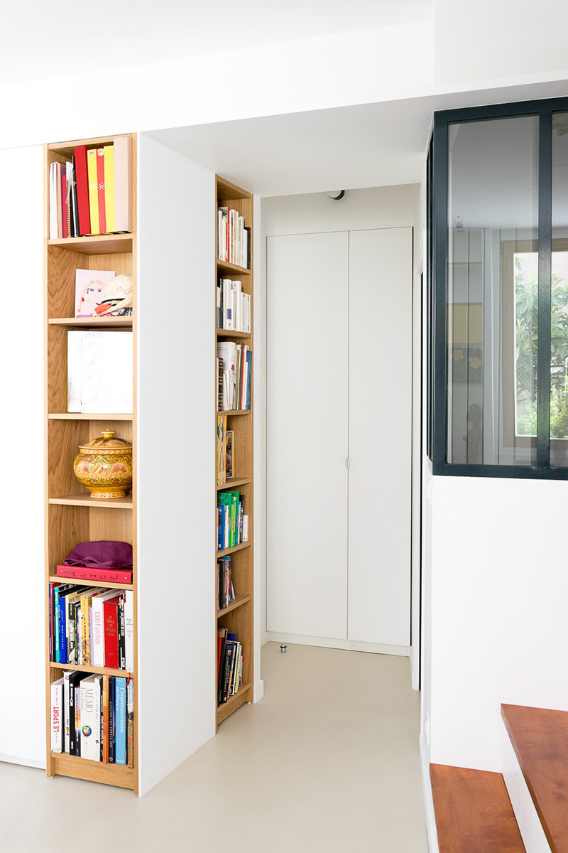
The library of the apartment is deep enough to accommodate most of the books. The doors are painted medium and tablets in film faced plywood. On the other side, one can have access to the office. Independent small rooms are used as guest room. Wooden libraries are standard elements arranged in the apartment.
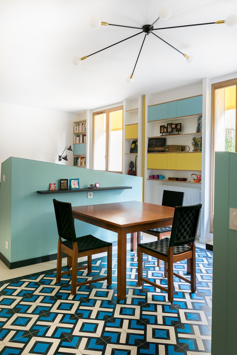
Between the kitchen and the living room is the dining room illuminated by a lighting. The floor is covered with a carpet tile inlaid pattern cement in white polished concrete floor. By using this tile carpet, the corridor effect is being avoided by expanding the dining area room wall to the window..
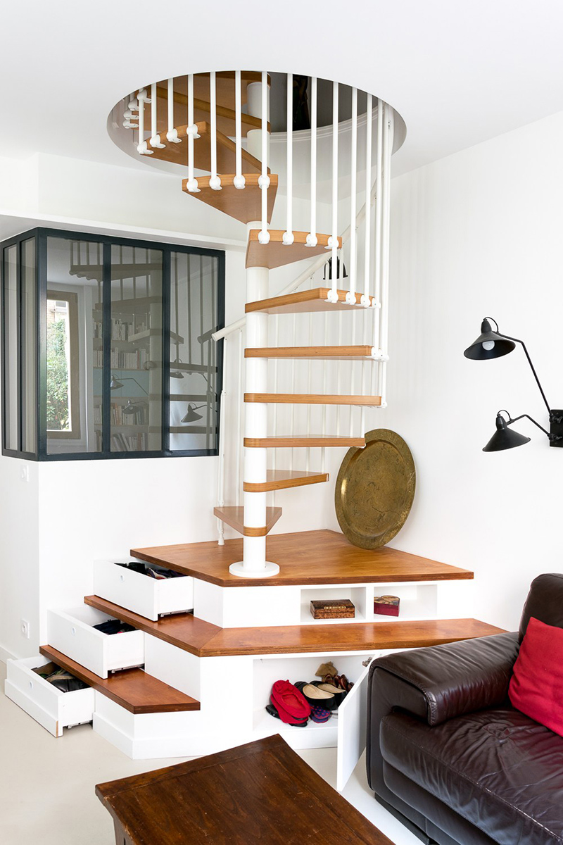
A spiral staircase lead upstairs with a dais of three steps that offsets the entrance to the staircase. This platform has been used to its full potential by creating shoe drawers and decorative niches on it.
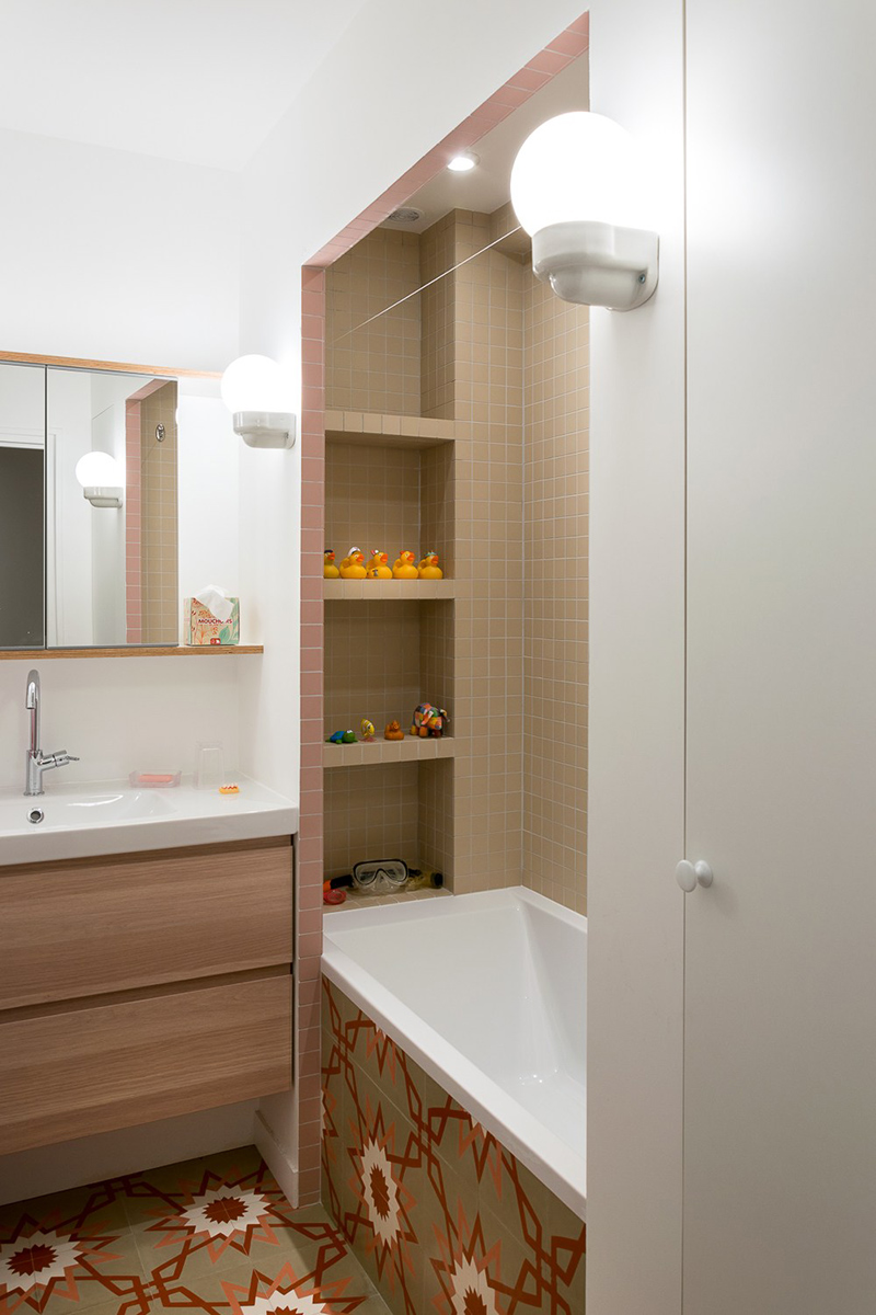
The first bathroom in the apartment has been redone in a pink and beige combination. It used small tiles with lovely patterns to give it a new look.
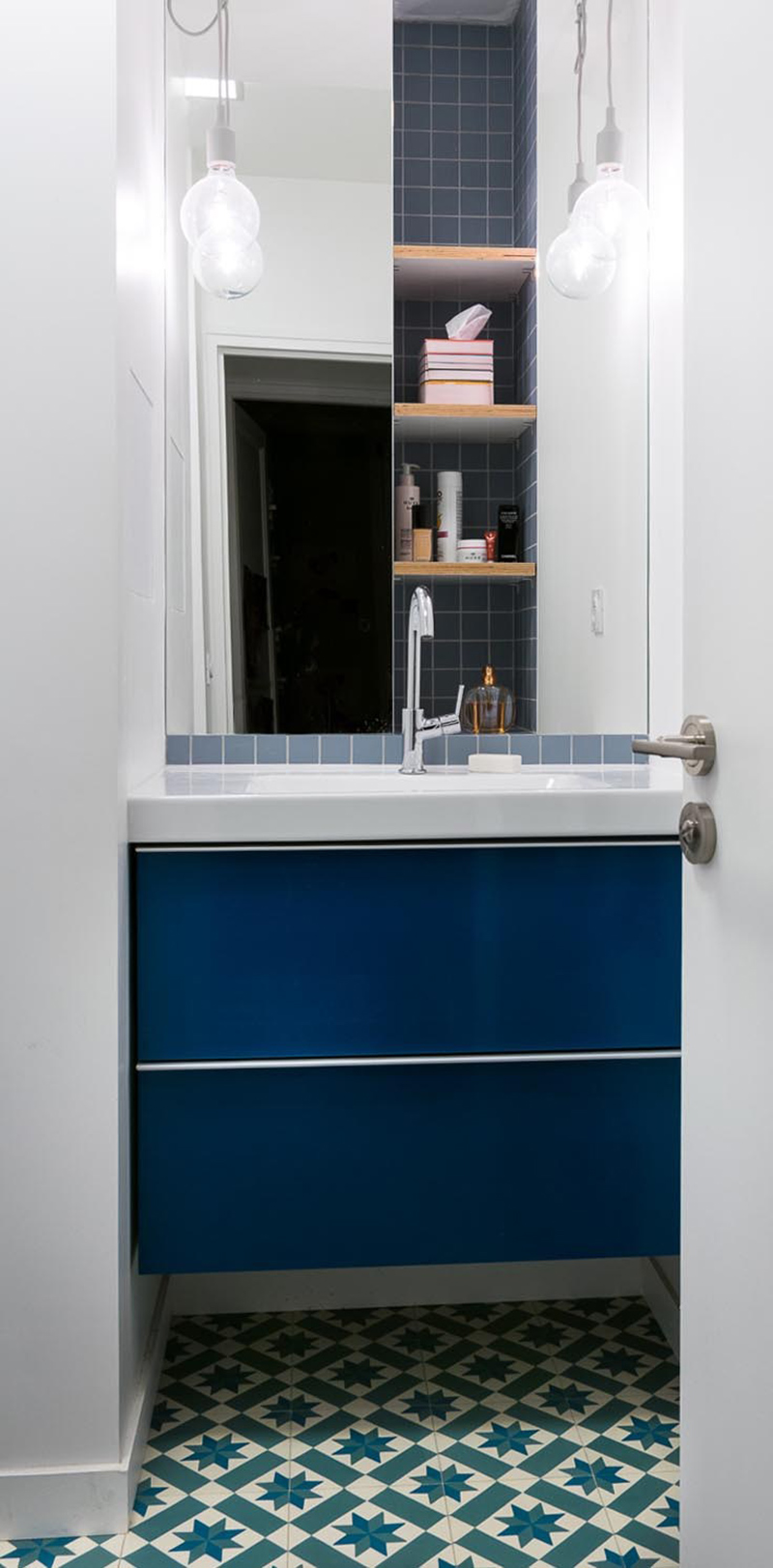
The second bathroom has a game of blue shades with patterend flooring ceramic tiles and a blue colored vanity. It may look small but it does look really nice.
If you are working on your apartment or is planning to get a small apartment, then this will surely inspire you and give you ideas on how you can maximize the area of you apartment. It is actually well designed even if it used divisions for every area. It has a unique modern design which can be a lovely source of inspiration. This space is a project from MAEMA Architects who managed to maximize the use of the small space. I also like the colors used in here becaue it didn’t make the area appear smaller even if there are already half walls. Well, the windows and the white walls also helped to make it look visually spacious. How about you, what do you like most in this apartment?


