Le Nook: A Stunning Modern Home That Used Light and Dark Materials
You'll love the contrast in this house in Quebec.
Contrast is one element in design that gives a home a pleasant and impressive look. We have seen contrasting spaces for the interior and we always end up happy about how the interiors look like. But have you seen a house that has a light and dark combination not just in the interior but also in the exterior? But the contrast won’t be apparent unless you get inside the house because the exterior is just white while the interior combines black and white colors end it. It appears experimental but it turned out totally beautiful! Today, we will show you a house that made use of contrast in a very nice manner.
This home called Le Nook bravely combines light and dark materials in it. With its white exterior, it appears like its blends with its snowy surroundings during winter. The home, which is located in the quiet area of Mansonville, Québec is designed by MU Architecture, covered in white painted wood siding and is broken up by the light wood on the roof soffits. In the interior, you will see some black features in it as well as its use of wood and white colors. Aside from the contrast of colors, you will also see a contrast of materials as well. You will understand what I am talking about once you see the images of the house below.
Location: Mansonville, Québec
Designer: MU Architecture
Style: Modern
Number of Levels: Two-storey
Unique feature: This beautiful modern home has a white exterior and a contrasting materials and colors for its interior.
Similar House: Spacious and Beautiful Modern Black and White Apartment in Ukraine
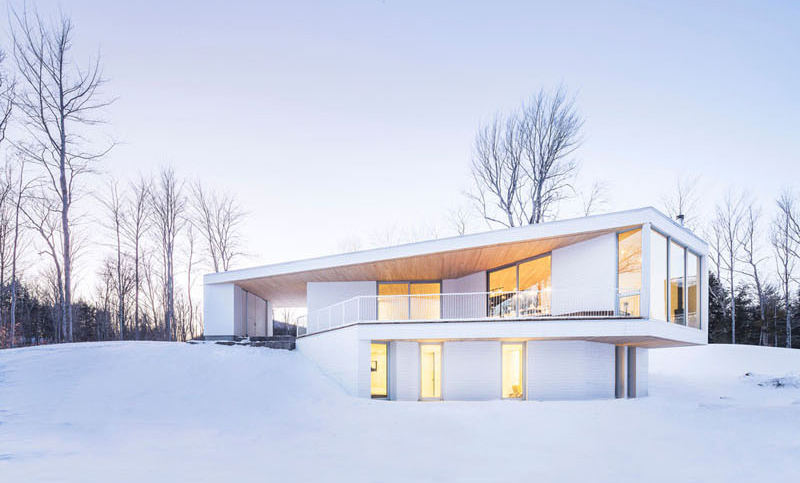
First glance at the house will make you love it. It sure is something that you will like especially if you are inclined to simple structures and modern homes. This one apparently made use of lines and shapes together, which is creatively done. And it does look really nice in its surrounding.
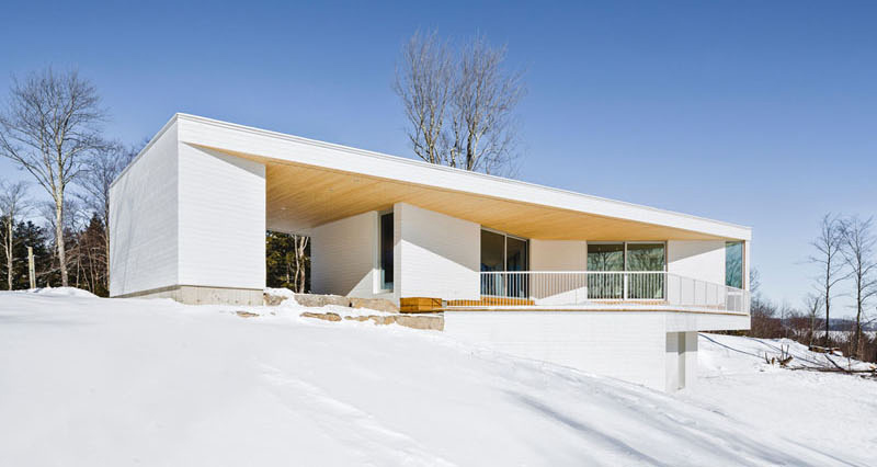
This is one side of the house which has a big white rectangular portion that holds a cantilevered roof to cover the patio. The design might be simple but it sure is very interesting indeed.
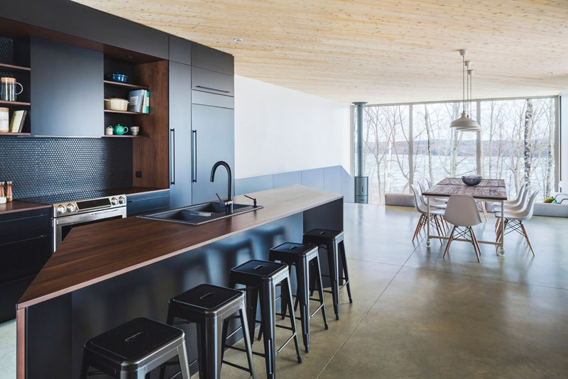
Inside the house, you will see many contrasting elements in it from its usage of materials and colors. Seen here is the kitchen with a uniquely shaped kitchen island. You can also get a glimpse of the dining area as well as the outdoor space that can be seen through the tall glass windows.
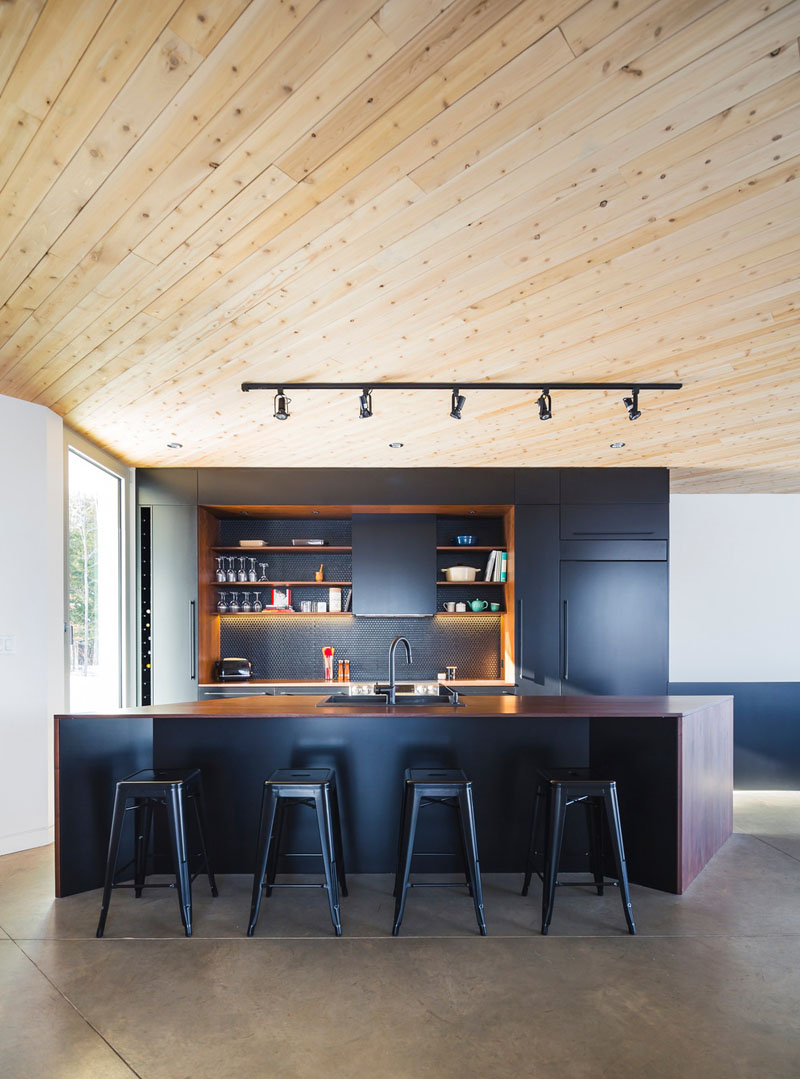
The light wood continues through to the interior ceiling of the house and it is a strong contrast to the dramatic black and dark wood kitchen. You can see that the kitchen has a textured backsplash that is lighted and it has tall plastic black chairs on it.
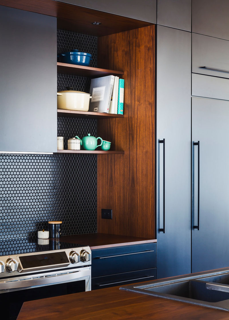
Small black hexagon tiles are used in the backsplash for the kitchen which is good contrast the deep rich wood countertop and shelves. And it sure added appeal to the look of the kitchen as well.
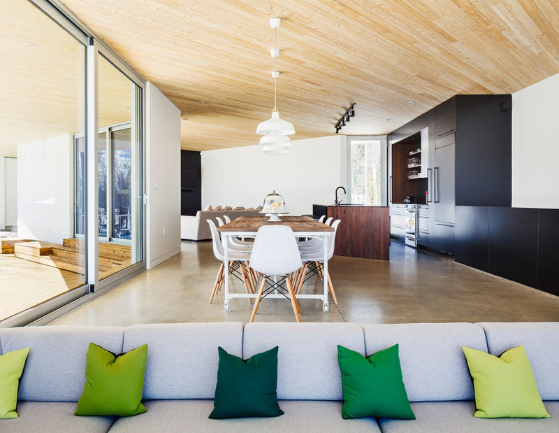
Just off the kitchen, one can see the dining area and a sunken living room. Aside from seeing the dining space, you can also see here the colorful throw pillows that give an ombre look because of its use of light yellow green color to dark green color for the throw pillows.
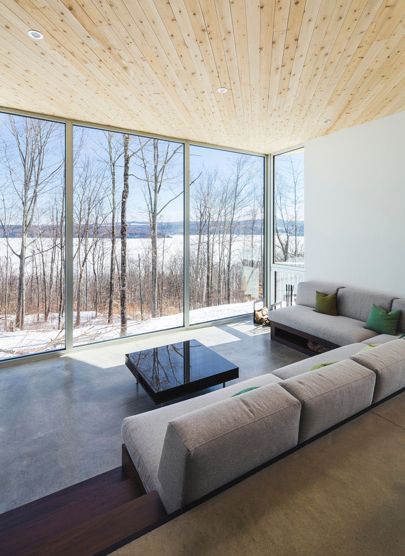
A very comfortable gray couch sits in the living area that faces a tall glass window which gives a good view of the woods and the outdoor area. It would be nice to stay here and just relax. Aside from the couch, I also noticed the black glass coffee table in the center.
Read Also: Classy and Black and White Theme of the Chorus Apartment in Taipei, Taiwan
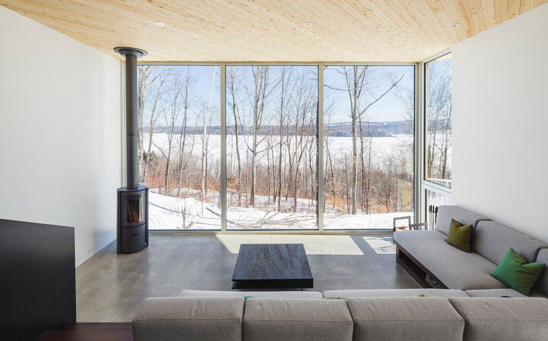
Located down just a few steps from the dining area is a sunken living room which you can see here with a wooden stove as a fireplace. It has floor-to-ceiling windows that perfectly frame the view and it has simple concrete flooring as well.
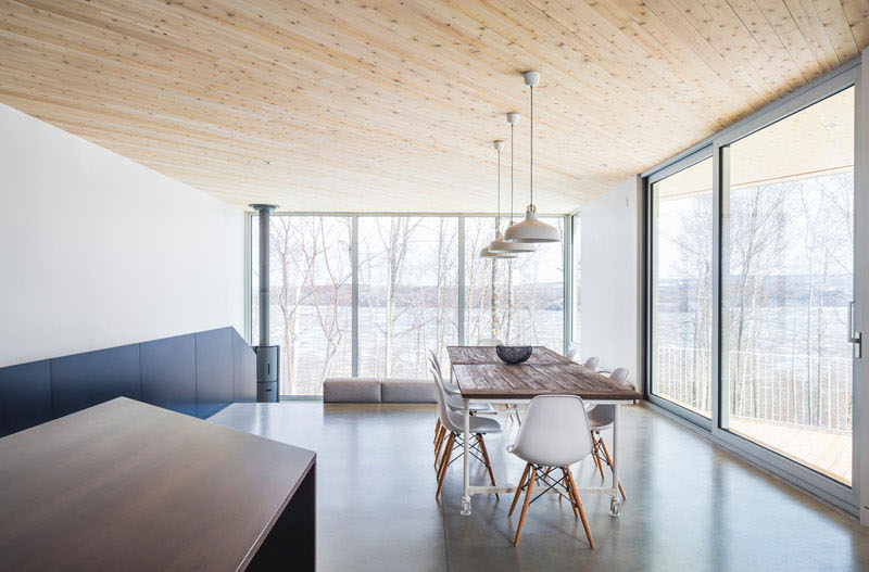
The dining area provides a separation between the sunken living room and the kitchen and it located just off to the side. It also has a sliding door that provides access to the outside area.
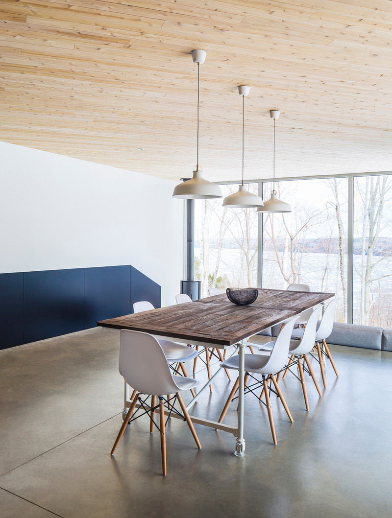
A closer look at the dining area which has a wall with a combination of black and white colors. It also use beautiful contemporary chairs and a wooden dining table that can pass as an industrial element in the area.
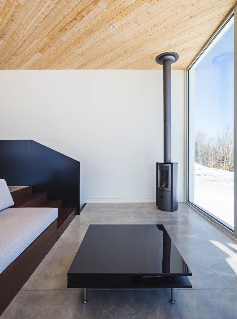
In the corner of the house is a small cylindrical fireplace that has been added, and a low profile coffee table makes sure the view remains unobstructed. Isn’t it nice to have a sunken living area like this one? It sure is especially if it has wooden steps like this.
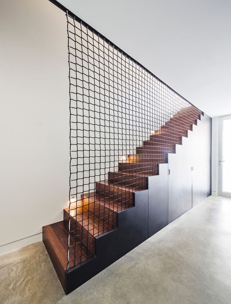
One interesting feature of the house is the stairs that lead to the bedrooms and bathroom on the lower level of the home. Who would think that a mesh for the stairs will look nice? And the staircase also used black and wood together.
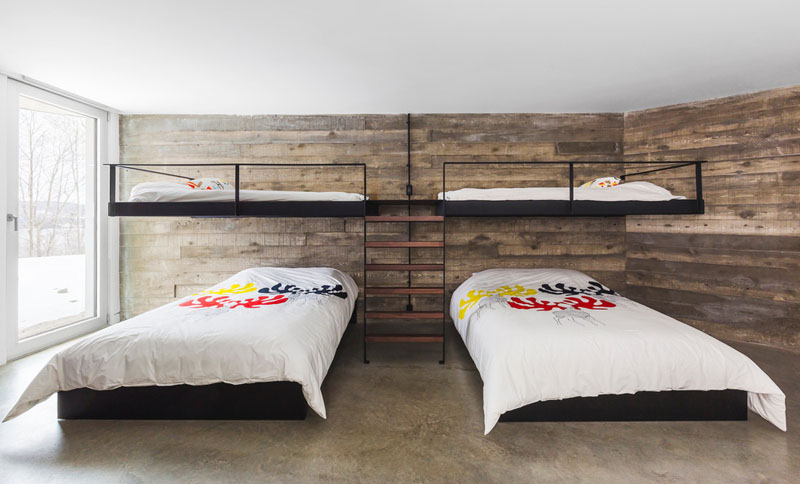
This is one of the bedrooms with bunk beds to increase the number of people that can visit and can sleep in here. I like the simplicity of the design as well as the print of the duvet set. It also looks nice with the wooden backdrop.
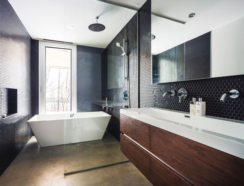
In the bathroom, it used black tiles to create a dramatic touch, and the bath is positioned to take advantage of the views just like the living and dining areas. The tiles used here is like the ones in the backsplash in the kitchen. Notice also that the bath tub is separated from the vanity with a glass division.
So, what can you say about this house designed by MU Architecture? I am sure you love how it looks because despite its simplicity, it is very beautiful, functional and sophisticated. For people who are minimalists, this will surely be a good option. I like it that they used contrasting colors and materials in it which added appeal to the entire house. Aside from that, the surroundings are a huge plus too!


