There are times when the architecture of a house is untouched and only the interior is being changed and updated. This happens for homes wherein the structure is still good and sturdy and only the inside of the house looks outdated or maybe just not appropriate for those who currently live in it. With that, interior renovation is being undertaken which may included changing the paint colors, adding new furniture and decors or even changing the flooring. We have seen these in other homes that we have already featured before. Today, we have another before and after showcase of an interior.
A small house located in The Netherlands was updated with a lovely design by architects and interior designers of ZW6. They added various wooden features in it from the walls, changed the flooring and also brought in new furniture that had a great impact to the house. If you look at the images of the house before the renovation, you will see that the furniture certainly added a stunning appeal to the new home. You will also notice that the walls are retained in white and there were some changes on the flooring. It also used black colors for the kitchen cabinets and even in the bathroom. You can take a look at the before and after photos of the house below.
Location: The Netherlands
Designer: ZW6
Style: Contemporary
Number of Levels: One-storey
Unique feature: The interior of an unorganized home is updated into a beautiful contemporary interior with many black colors and wooden features.
Similar House: Before and After: 1980’s Split-Level House Transformation in Canada
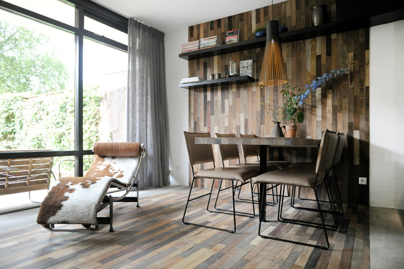
The walls in the living room were painted white. It has a floor-to-ceiling window that provides a good view of the outdoor area but it also has a sheer curtain as well to control the amount of light that enters the space. It has a feature wall of wood flowing from the dining area, to the sofa on the other side of the room. One thing I like about the living room is the lounge chair.
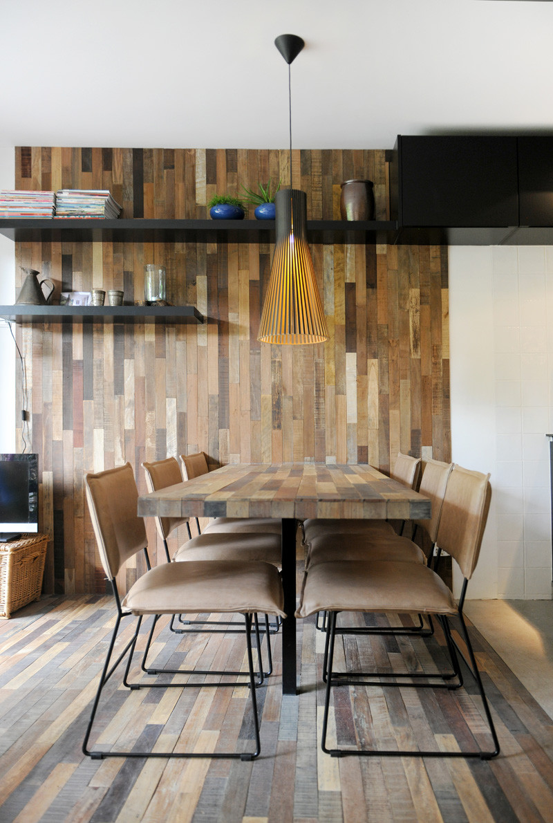
A single pendant light hangs directly above the center of the dining table. The wood used on the feature wall perfectly lines up with the wood used on the dining table as if they are one item. Notice also that there are black floating shelves on the wall that holds various display items.

Before, the furniture wasn’t placed in an organized manner. For the new interior, a small wall in the kitchen has been removed to open up the space. And a kitchen island is being added into it.
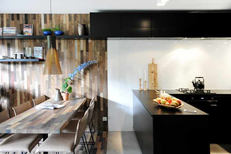
The upper black kitchen cabinets extend to line up with the floating shelves in the dining area. Don’t you love it that the dining area has some lovely wooden features in it from the wall to the table and to the flooring in order to define the space?

The kitchen is one area of the house that has been completely replaced and reorganized as you can see in this picture. Simply compare how the old interior looks like and you will surely be able to appreciate the look of the new home.
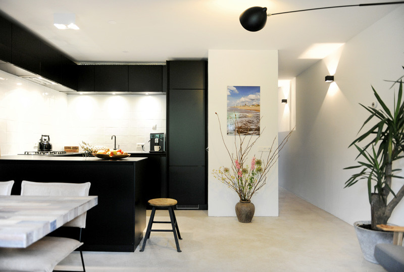
From an L-shaped kitchen, it was changed into a U-shaped kitchen with black cabinets and an island. The door and window that leads to the hallway have also been removed.
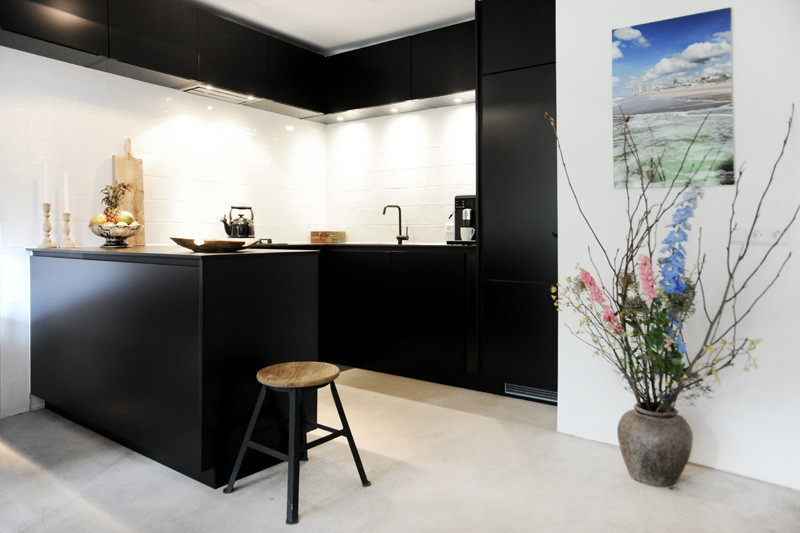
Aside from those black cabinets, I also like the white tiles in the backsplash and the lightings that added some drama to it. Notice also that the house has many plant decors in it.
Read Also: Before and After: Updated Interior of Pied-à-terre with Pre-War Character
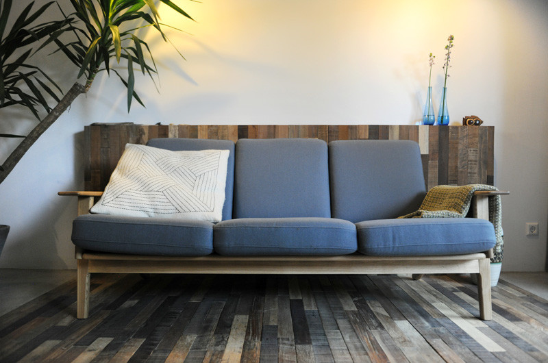
Since the living room and dining room are in one area, they share the same flooring. The same wooden material was used at the back of the sofa that you can see here. The wood is built to provide a shelf for decorative items. It is also nice that they added a simple sofa in this space.
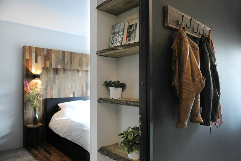
A bedroom is found down the hallway. Like the dining and living areas, it also has the same wooden material used for its flooring and accent wall. You can see here a wall shelf that used natural wood. Isn’t it nice?
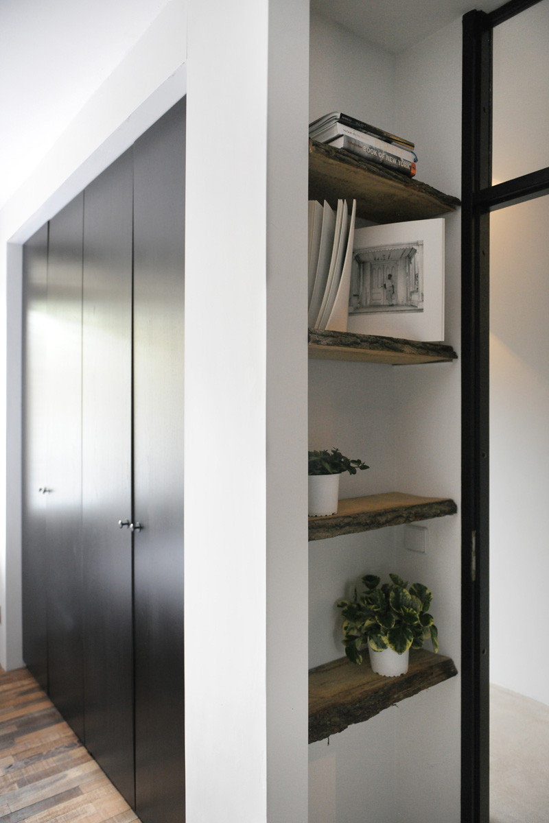
When one enters the bedroom, they are welcomed by the live-edge wooden shelves that has plant decors on it as well as a built-in wardrobe with black doors.

Before, the bedroom just looked plain but its layout was changed, moving the bed to the opposite wall, where a desk once was. Because of that, the bed is now near the window and there is more free space. Instead of curtains, it used blinds for the new design of the bedroom and a new bed was added in here.
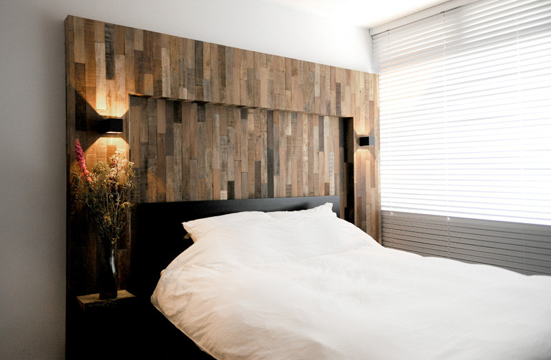
The same wood that was used as a feature wall in the living/dining area is used to create a headboard surrounds for the bed and it looks really stunning! The combination of black and white for the bed works well with the wooden feature.
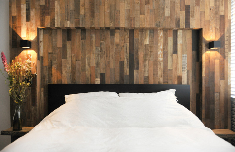
Aside from the texture of the wood and the contrasting colors of the bed and the covers, the lights already bring a lot of drama to the area as well as the plants that can be seen around the bedroom for a natural touch.
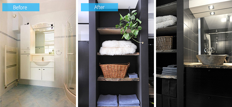
From a cream color, the bathroom was changed to black which looks a lot better than its previous color and design. More wooden shelving and storage was also added in the area.
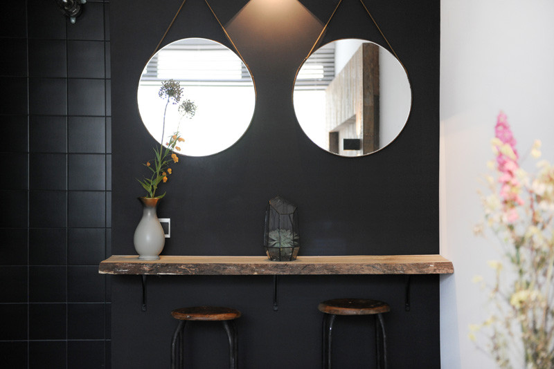
A small vanity area with natural wood leads to the bathroom. This looks really nice with a subtle rustic touch. It was also a good idea to use circular mirrors in here instead of one big rectangular one.
By looking at the images above, we are able to see the great difference of the original interior and the new interior. The look of the home’s interior is a lot better than before as it is updated by the architects and interior designers of ZW6. It is also made more functional as well especially that the furniture are arranged in a better way. And I am certain that you also loved the wooden and black features of the new interior. Do you think the same way too? Share that in the comment section below.