I know that you have seen so many inspiring homes here on Home Design Lover. There are even features wherein you can see a before and after photo of the homes for renovations and remodels. But sometimes, we just show you the end result which is still very inspiring. This is what we are going to feature today. A home which is a result of an impressive remodel with an extension to the house. If we look into it, it doesn’t appear like a remodel or a redesign because of how gorgeous it looks like. Maybe if we see the before photo, we would be pretty impressed with how it appears right now.
Cloy Residence is a house located on a small street in Venice, California designed by Mayes Office. The house is a complete remodel project with an addition to expand and update the look of the entire a stucture. The second floor was extended with two additional bedrooms and a roof deck. The floor plan and layout of the first floor where the public spaces are located was also redesigned to ease movement and visual depth throughout the home. New architectural elements are added to the home in order to transform its look and character which also increased the value of the property. Well, with the looks of it, it really has a high value indeed. In the interior, it has white walls and ceilings as well wooden flooring which creates a warm, cozy and relaxing space to live in. It used modern furniture and you can also spot many different artworks on the wall too.
Location: Venice, California
Designer: Mayes Office
Style: Modern
Number of Levels: Two-storey
Unique feature: A house remodel with addition featuring geometric lines on the exterior and a cozy interior combining wood, glass and other materials.
Similar House: Stunning Renovation of the Ark House in Australia
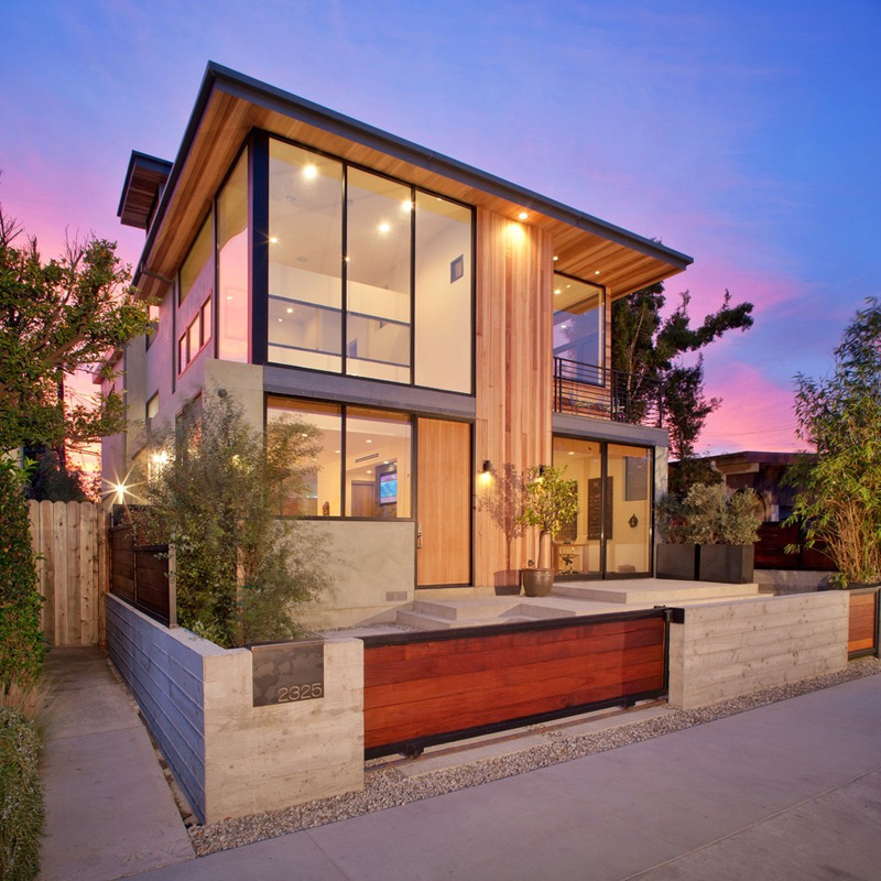
The exterior of the house has wooden sidings on it even on the eaves. It also used glass for the windows as well. You can notice that it has a low fence which is a good idea to boast the beautiful exterior while providing security and privacy to the home.
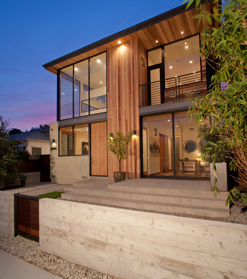
The house is apparently elevated from the ground level and has steps that lead to the floor line of the home. From outside, you can clearly see the interior because of its glass windows. This is a transparent home with a rich flow of natural light into the area.
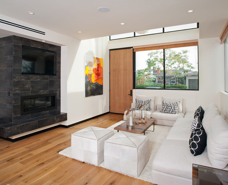
White living room sofa with black and white throw pillows is easy for the eyes especially that it is combine with wooden table. The black fireplace is a good contrast to the living area too.
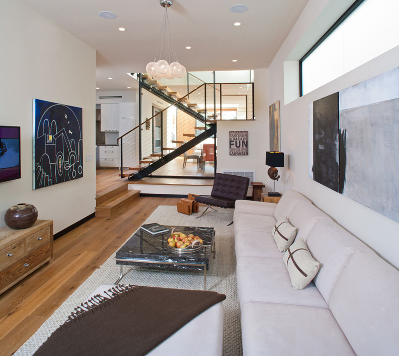
Seen here is the family room that is long and narrow. Notice that its features many different wall decors that add an artistic appeal to the entire space. You can also notice that some parts of the interior is a few steps higher than the other areas.
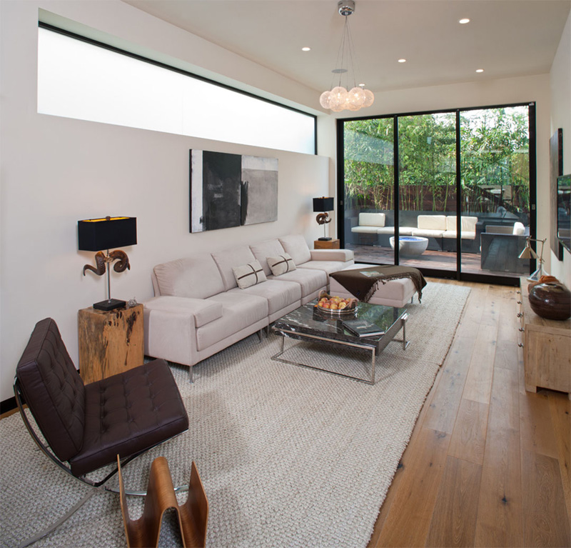
From this area, an outdoor courtyard can be accessed. The clerestory window brings more light into the space which has beautiful modern furniture in it combined with an eclectic design. But the area isn’t crowded with too many items.
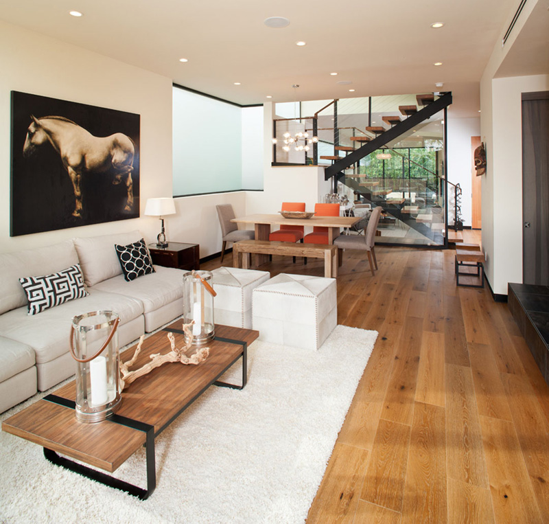
Next to the living area is the dining space with a pop of orange from its chairs. It also uses a bench for one side too. Wooden elements are well distributed all throughout the house.
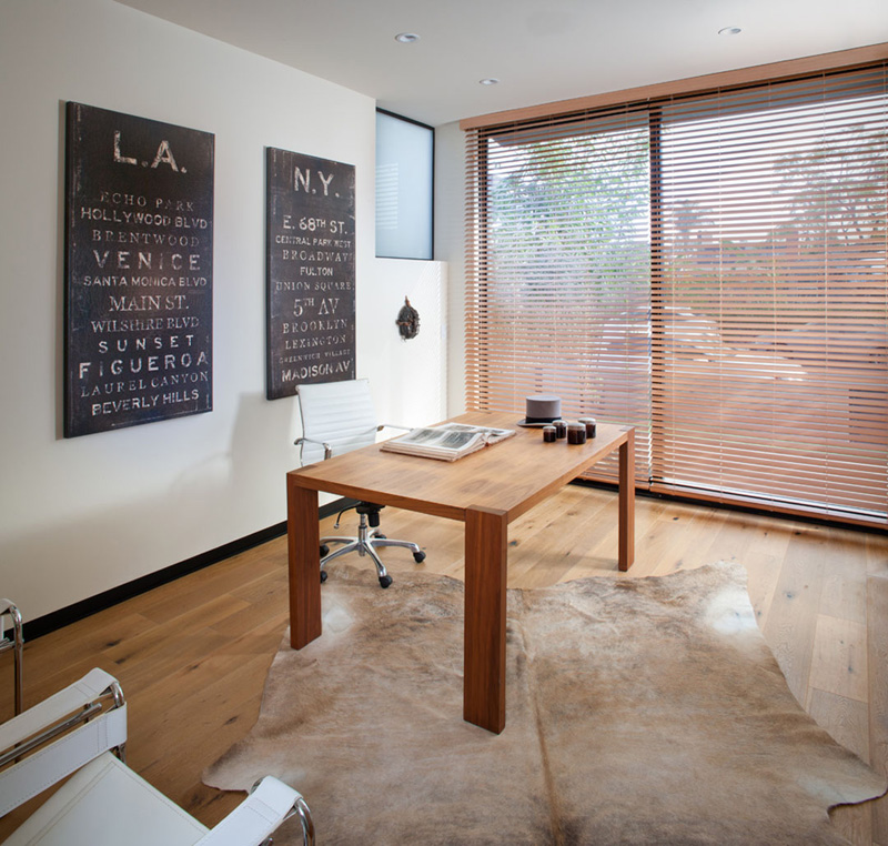
This is a working space for the owner with a cowhide area rug and wooden table. That white office chair looks comfy and gives this space a formal office touch. Notice that it used blinds for the window so that they can just close it for privacy.
Read Also: Utterly Stunning Australian Holden Street Residence Interior Renovation
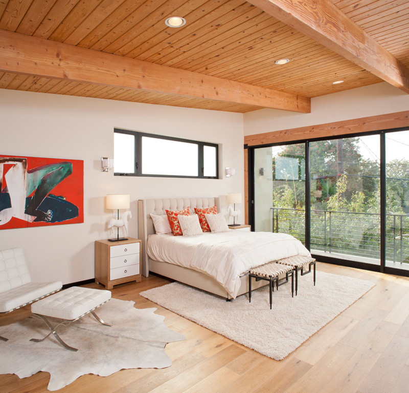
A spacious bedroom with white colors as well as a combination of wooden textures from the ceiling to the furniture. You can see that there are also red and orange colors in here from the throw pillows and wall art. A balcony is connected from the bedroom that can be accessed through sliding doors.
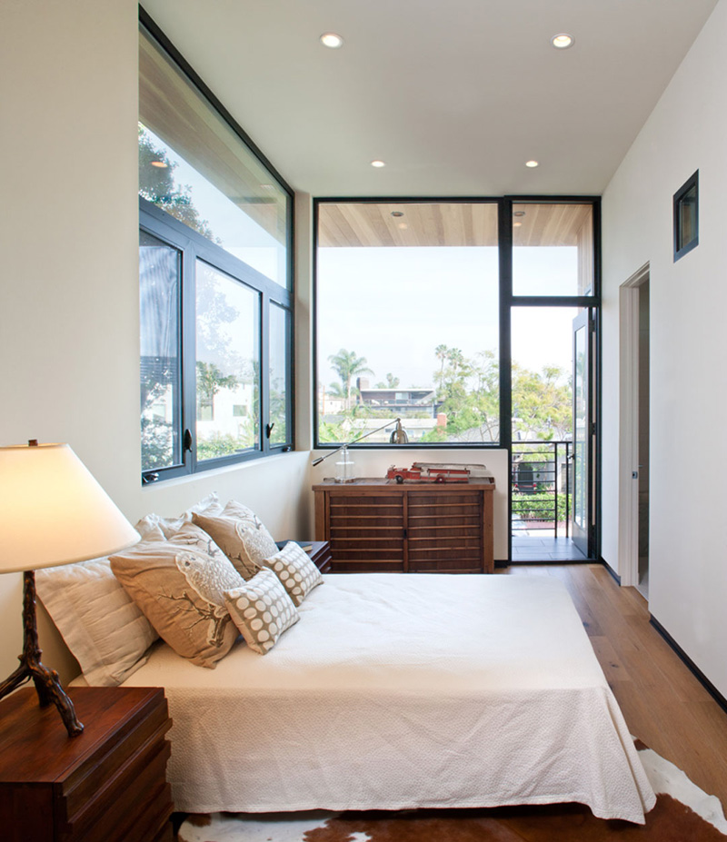
A smaller bedroom in the house which looks like owned by a teen, is also connected to a balcony too. The bedroom is surrounded with windows and I don’t see any curtains and blinds here.
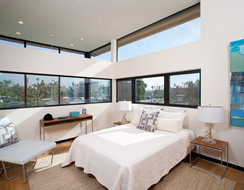
A third bedroom in the house which also has different windows around it. You can see how this area is filled with natural light and how it also used wooden furniture in it that complements with the white fabrics and colors utilized here.
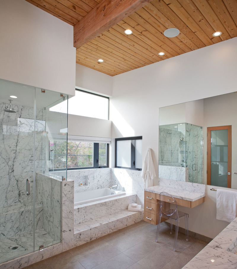
This is the bathroom of the house with marble texture on the shower and bath tub area, as well as on the vanity. I am not a fan of marble but this one looks nice especially that they used plenty of glass here.
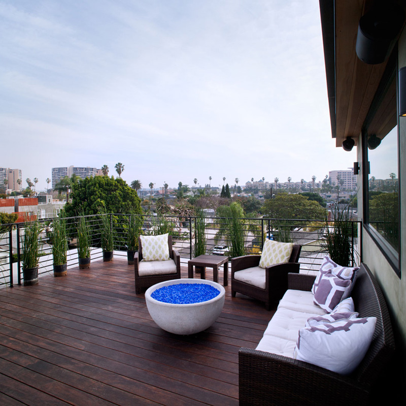
And this one s the balcony with comfy wicker furniture. It has a bowl for the fire pit which tells us that one could have a pretty relaxing and exciting time in here. One can also take a look at the lovely surrounding around it.
Beautiful home, right? I like its use of glass and wood together as well as how they did the lighting for the exterior. Another thing I like is the way its fence and outdoor space is designed. Of course, we wouldn’t skip “liking” the interior of the house because obviously, it is something most of us would be digging. This is a home designed by Mayes Office, who did a great job on the renovation and the addition.