Father and Son Apartment in Paris: Full of Creative Surprises
A masculine themed apartment has impressive and surprising elements you'll get to love!
Most of the time, apartments would be occupied by a couple or a family of three or by one person. The design would depend on the type of dwellers-their gender, their age, their work and their lifestyle. Everything would depend on what they need, what they want and what they are comfortable of. Of course, it is very important to consider the needs of those who dwell in the home because if not, the purpose of the dwelling will fail. We have seen various homes which are owned by photographers, designers and other professions. We have also seen spaces owned by bachelors and those with kids. But have you seen a space where a father and son lives?
Well, this is what we are going to feature today. Designer Glenn Medioni did the renovation of an apartment in Paris that is occupied by a single father who lives with his young son. How would the space look like? Some of you might think that it will be all cluttered or unorganized but you are very much incorrect because once you see the images of the apartment below, you might feel ashamed of your own space because it isn’t just aesthetically appealing but it is also functional and very clean! If the Dad does all the cleaning, I’ll be pretty impressed. Aside from that, the design of the apartment is indeed beautiful with all the sleek lines and masculine look. Curious? Scroll down and take a look.
Location: Paris
Designer: Glenn Medioni
Style: Modern
Type of Space: Apartment
Unique feature: Surprisingly, a modern apartment owned by a father and son, has yellow accents together with white and wooden materials. It features an impressive way of concealing the kitchen, bedrooms and the bathroom.
Similar House: A Space-Saving 13 Square Meter Apartment in Poland
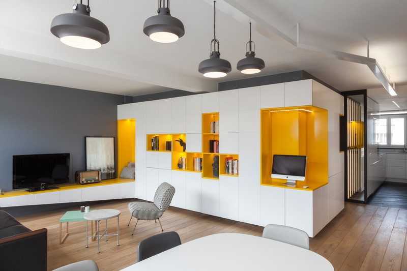 The house is owned by two men but despite its masculine features, you can see pops of yellow in the interior like in the cabinet which has an amazing design. It has open shelves in it as well as a low table that extends from the beautiful wood work painted in yellow and white.
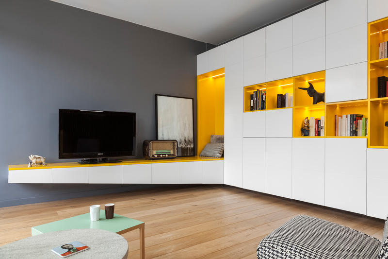 The design of the extended area from the wall cabinet system has a unique futuristic look. I like it that yellow was added to it to break the strong masculine appeal. It also looks great with wood too.
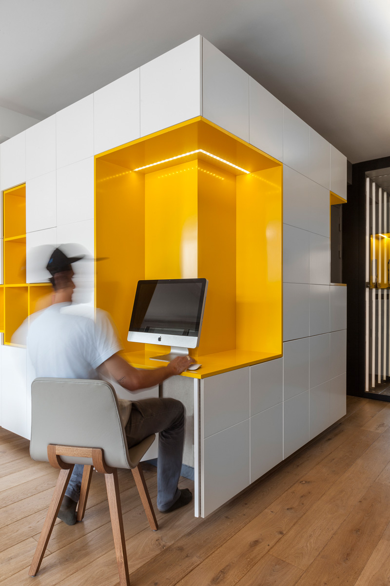 The corner area of the wall system can be used as a working area. Isn’t this a good way to use space? It sure is! I am also digging that string of lights too.
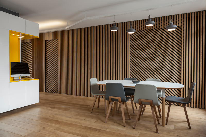 The dining area has simple minimal looking furniture in gray tones. You can see how they used wood in here with a vertical style for the walls and diagonal for the doors. Nice, right?
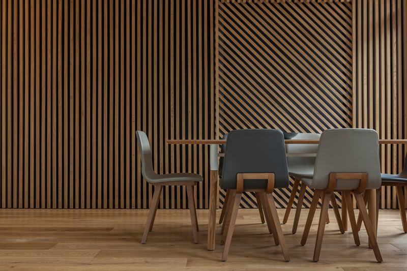 The wooden slats is makes a beautiful backdrop to the dining space. It looks very sleek with a warm modern appeal because of its use of wood.
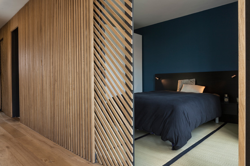 The bedroom has manly colors of blue on the walls and the bed covers. The headboard is black in color as well. Take a look at the area rug here which also has blue lining and textured white.
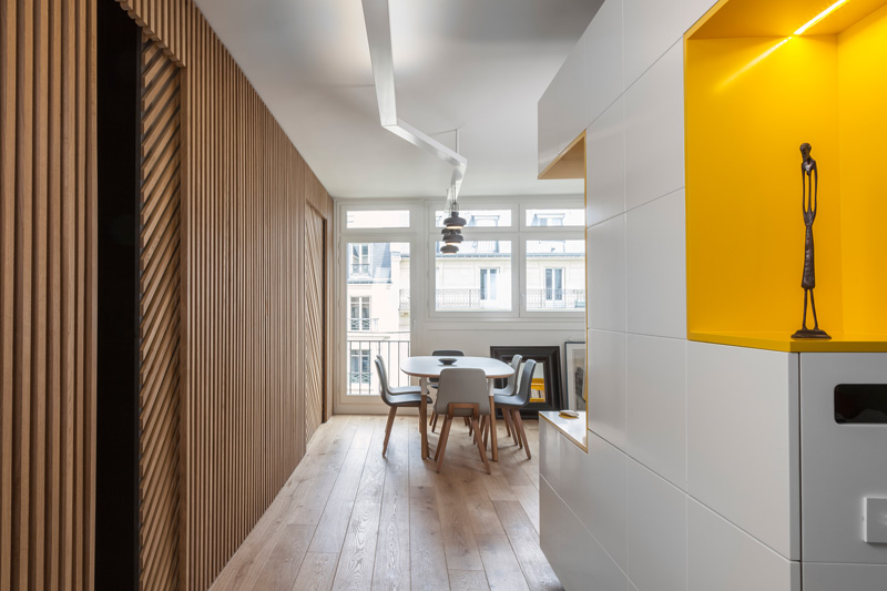 You can see here the hallway that leads to the dining and living spaces as one pass by the private spaces with sliding doors. Notice what they did to the ceiling here.
Read Also: A Splash of Colors Fills the Tuhachevsky Street Apartment in Russia
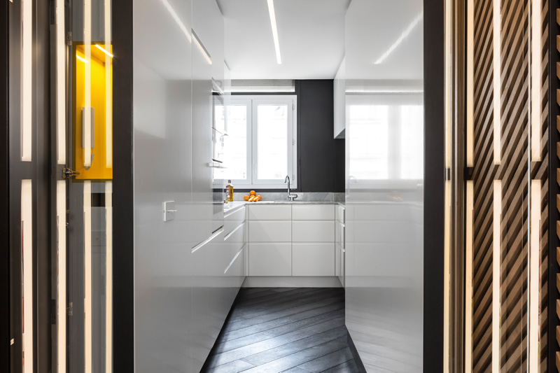 Behind one of the sliding doors is the kitchen. Yes, this is a small closed kitchen but it is complete with everything the owners need to prepare and cook food. Unlike women, men are already happy with a small kitchen like this one. The colors here are contrasting white and dark gray.
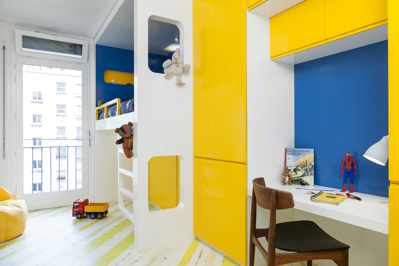 The boy’s bedroom also has yellow colors in it but it was paired with blue and white which is a good idea. The combination turned the space into a lively and playful private space for a kid.
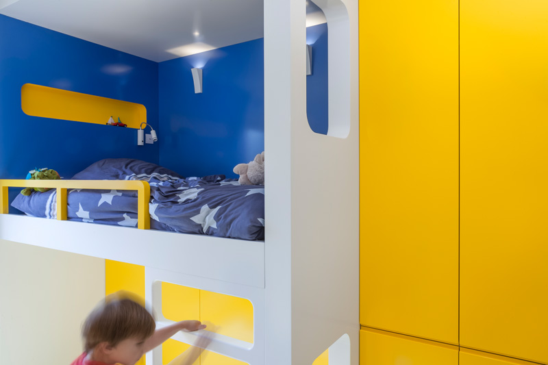 The boy’s bed is elevated to provide more space for playing under it. Don’t you love the star-printed covers of the bedding used here? It adds a more childish feel to the space.
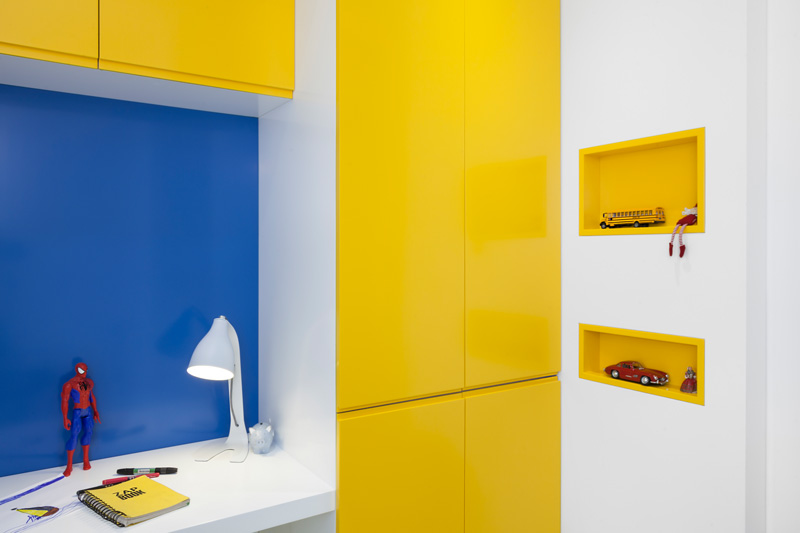 There are also many storage spaces in the boy’s bedroom as well as a study area and some built-in wall shelves. I like it that the cabinet doors doesn’t have handles for a sleek look.
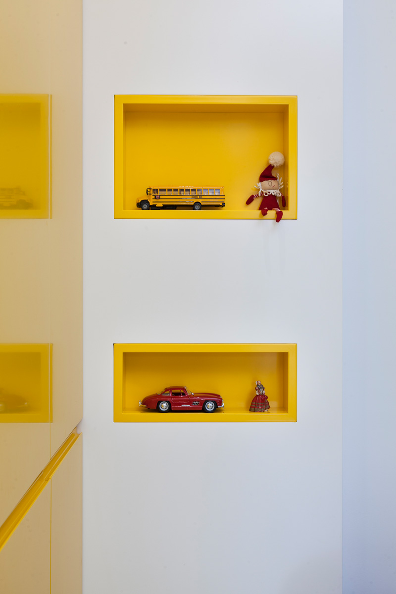 Seen here are the built-in wall shelves in yellow. This adds a more interesting appeal to the space while providing a space to display some items owned by the little boy.
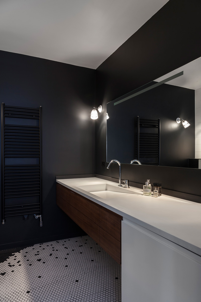 Mosaic floors creatively arranged are used in the bathroom with black and white colors. The vanity has a unique modern appeal featuring a sleek white sink.
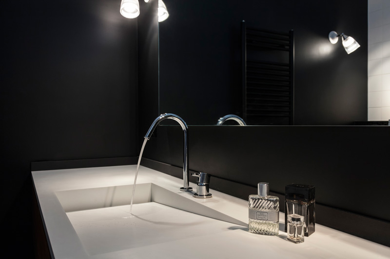 The sink has a modern design as well is its faucet too. The bathroom has silver fixtures that complement with the colors of the masculine space. The lighting here add some drama in the area.
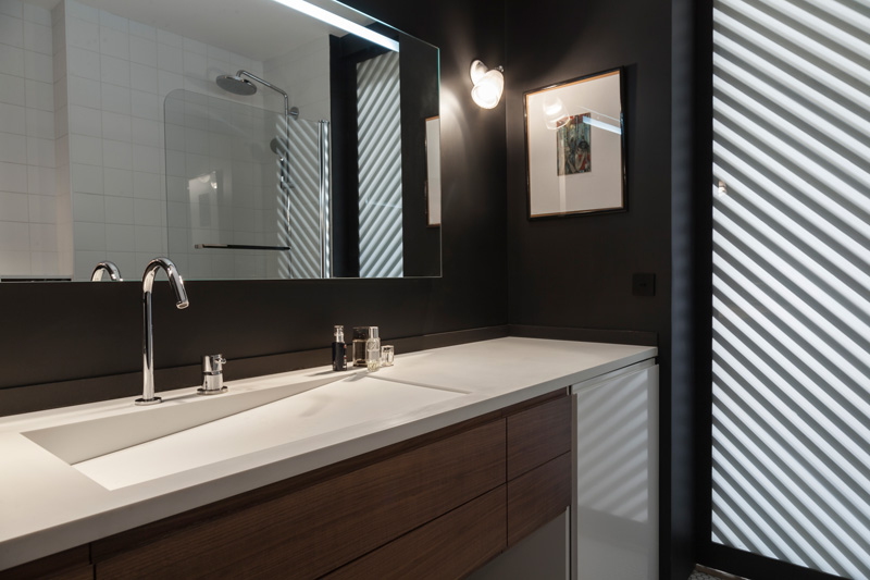 As you can see, the bathroom is also behind one of the sliding doors. You can also see here that a simple wall art was added to the bathroom. The shower area is enclosed in glass which is a good idea to give the area a more spacious look.
I like the design of this apartment especially that it added some pops of yellow despite the masculine look. I never imagined that a space for boys can actually look like this. Aside from the color palette, the neat and sleek design is also something I really love about the space. This apartment owned by a father and his son is designed by Glenn Medioni. I wonder how the exterior looks like but with the looks of it, guests are up for a surprise when they enter this gorgeous masculine apartment with bright pops of color and the creative use of wood. I like the idea of what they did to the kitchen, bathroom and bedrooms which were behind wooden sliding doors. How about you, what can you say about this apartment?


