For sure you have seen so many dilapidated buildings or those that are still structurally good but aesthetically failed. This could be because of the longs years of existence of such edifice or because it is no longer being used for a long time. But whatever the reason is, there is still a way to recover and transform and old structure and make it appear new and look like a totally different space. We have actually seen that in other before and after features but what we will feature today has an impressive and interesting facade design.
A run-down commercial building in the city of Bangkok, Thailand was renovated by IDIN Architects, transforming it into a family home with retail space. This renovation project is both for a house and the office of the family’s jewelry business. The building isn’t just occupied by the big family with 4 brothers-sisters, but it is also for the future extension of family members. Because of that, large utility space is necessary for the redesign. Two identical buildings sit on the original site. The new design of the structure utilized the space in a manner that every unit for each family member would be a compact private house that comprised of the rest area, pantry, bedrooms and the living room. Each unit of this home is double-leveled with separated access. It has an elevator at the back which is separately accessible to each unit. On the top level of the house, it contained the main living room and dining room for the family. Meanwhile, the central core and the back of the house are opened to allow daylight to enter to all levels. At the facade, there is a big tree that provides the feeling of nature. Through the central core, the family members can see movement of each other all day. This time, let us take a brief tour of the house below.
Location: Bangkok, Thailand
Designer: IDIN Architects
Style: Modern
Number of Levels: Five-storey
Unique feature: An impressive renovation of a commercial-residential area with a beautiful geometric facade of windows.
Similar House: An Apartment Above a Restaurant in Montreal, Canada
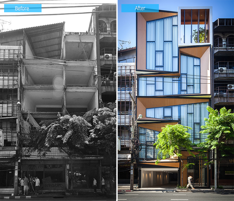
If you look at the old building, it looked damaged on the front part and needed a lot of work. Looking at the current design of the structure, you can see that there is indeed a significant change!
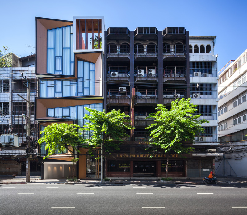
The modern design of the house stands out from the rest of the buildings beside it.
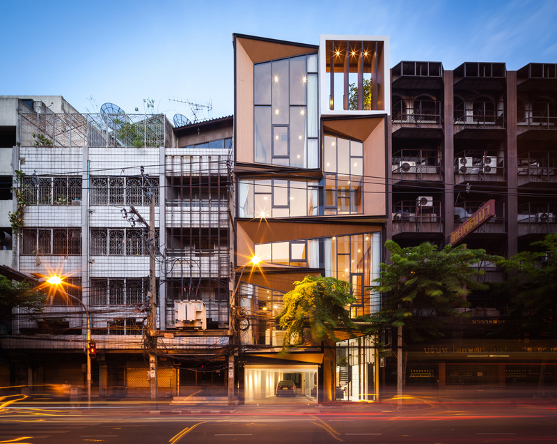
Most of the tall buildings near it aren’t updated in design. That is why, the once ugly structure now became a head turner. Look closely at the garage area- nice, right?
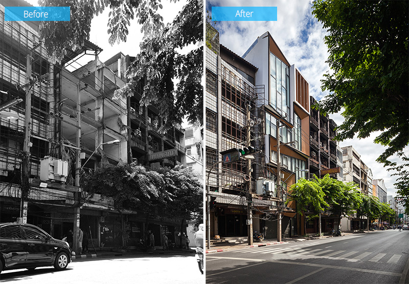
One good thing about the redesign is that they retained the tree outside which brings a natural feel into the facade of the house.
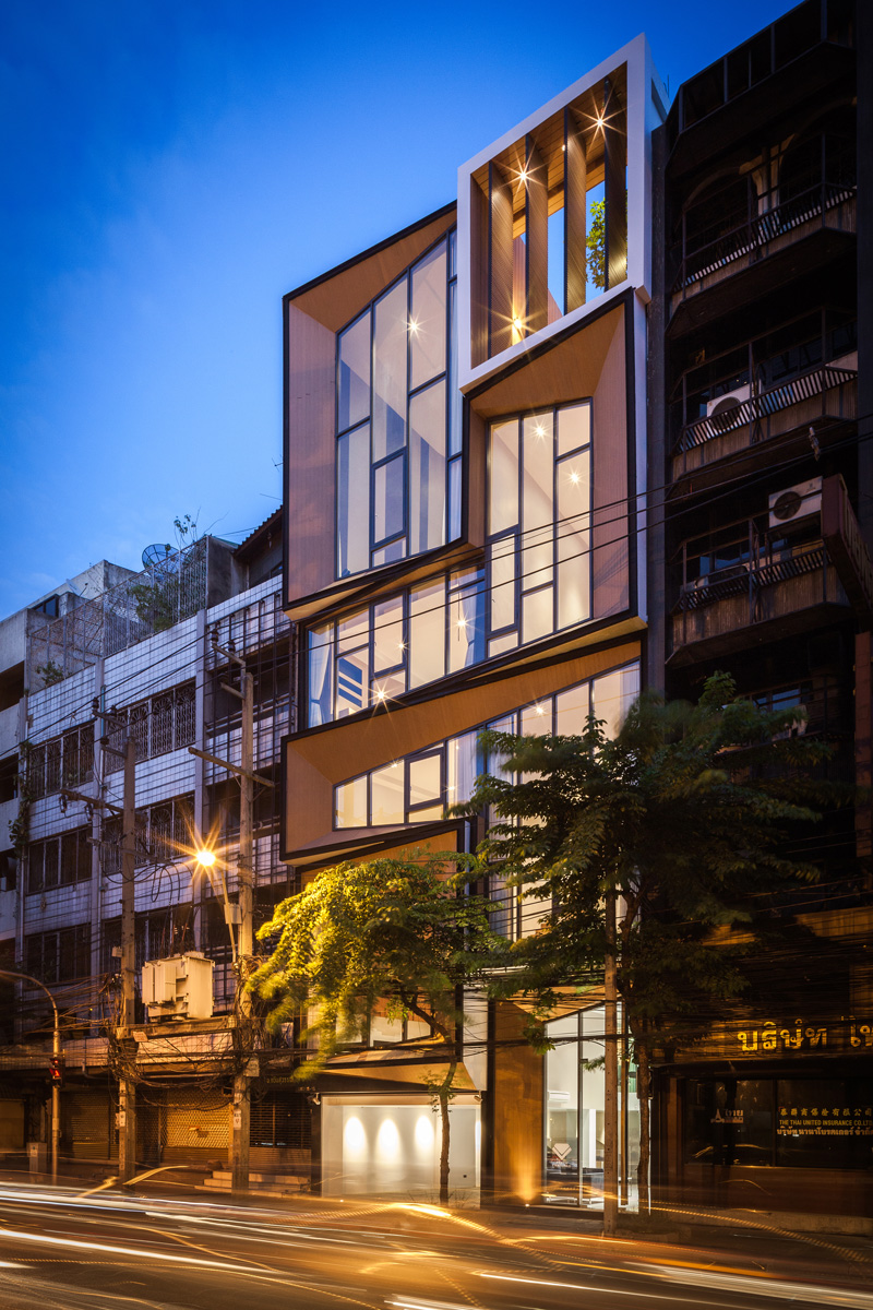
During the night, when the lights are on, the building comes to life and looks even more sophisticated!
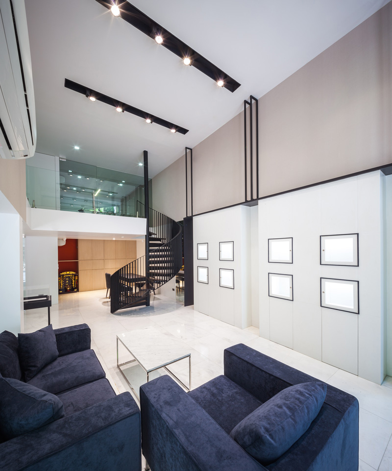
In the interior, it used white mostly with a contrast of black and dark gray. Seen here is a spiral staircase that leads to a mezzanine.
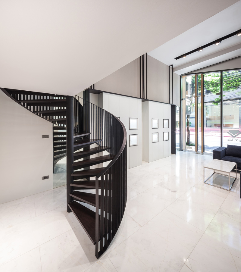
This is a photo of the business area of the family where they sell jewelries. Notice that it has a minimal design on it with a large sofa at the center. I can tell that the white boxes on the wall are display areas and that more items can be seen on the mezzanine of the retail store.
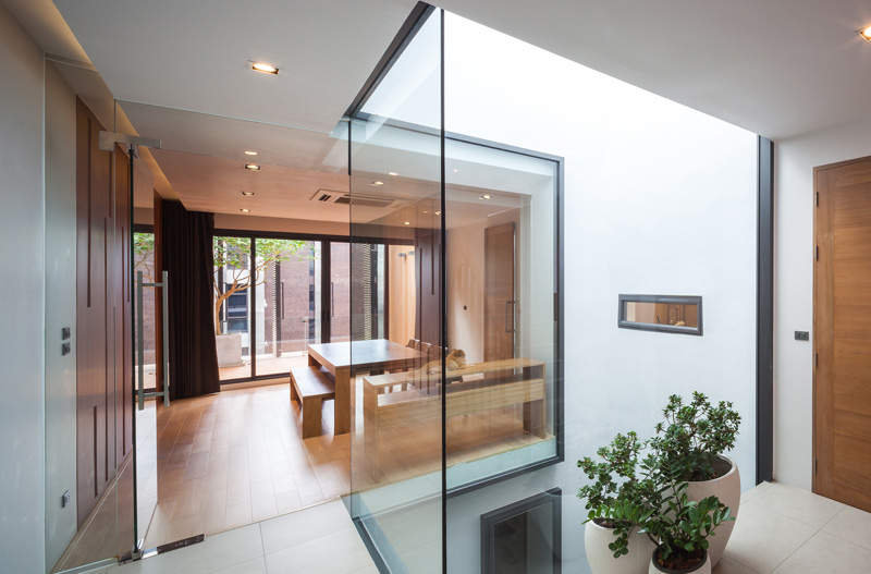
Apparently, this is on the upper level with wooden dining set, as well as glass walls and doors. Notice that it has curtains that can be drawn for more privacy.
Read Also: L250: Simple Yet Extraordinary Private House With Office
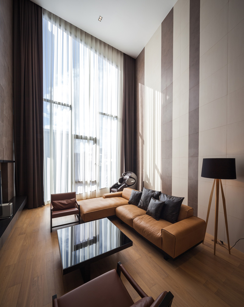
With a tall ceiling, this living area with leather furniture looks more spacious and inviting. You can also see here the design of the windows that we saw on the facade.
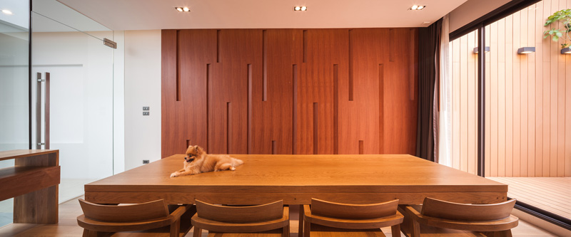
I admire the woodwork on the wall of this dining space. It also has wooden dining set as well.
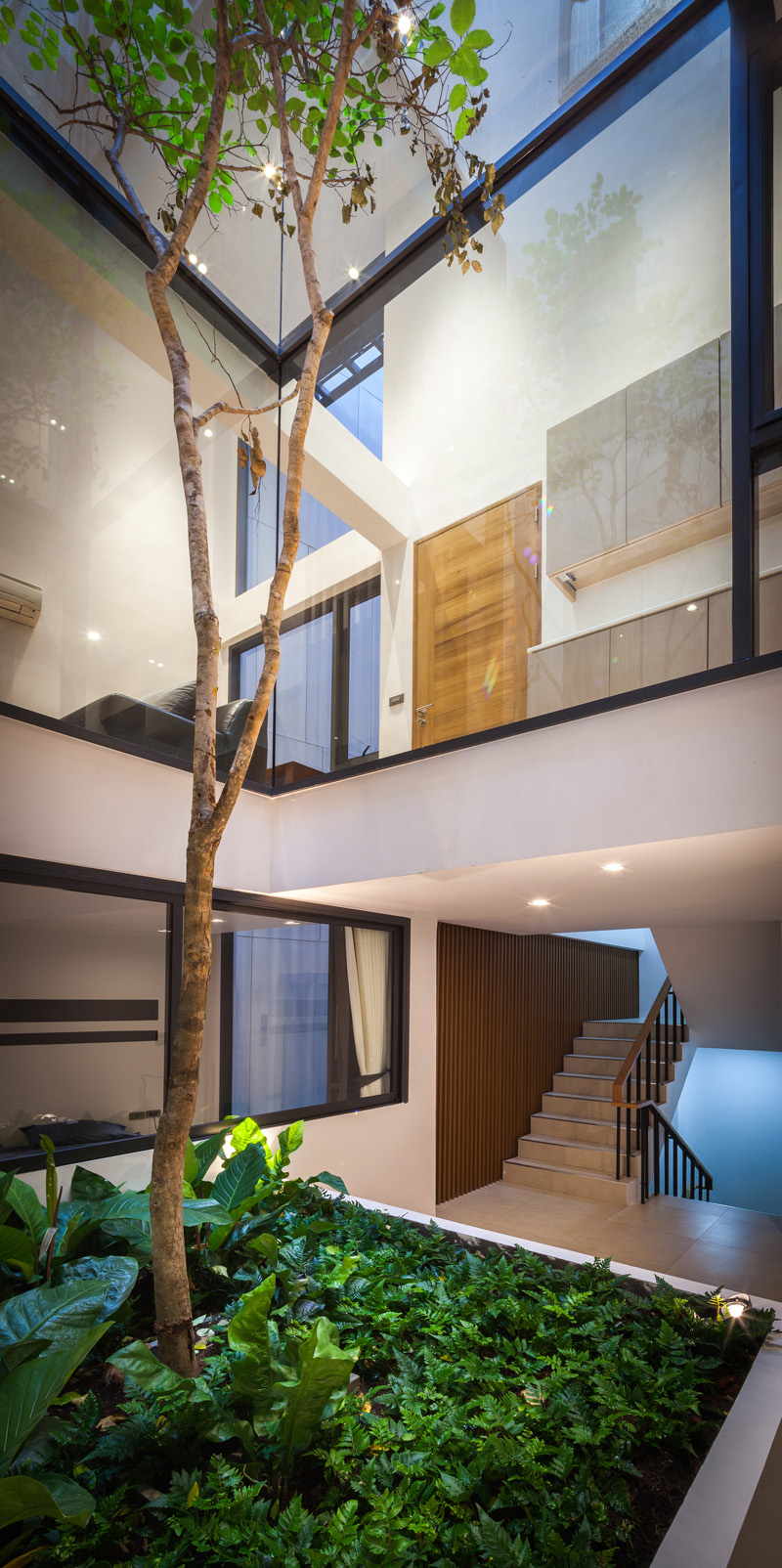
This is one feature that I like in the house- an indoor garden with a tall tree that towers to the next level of the structure.
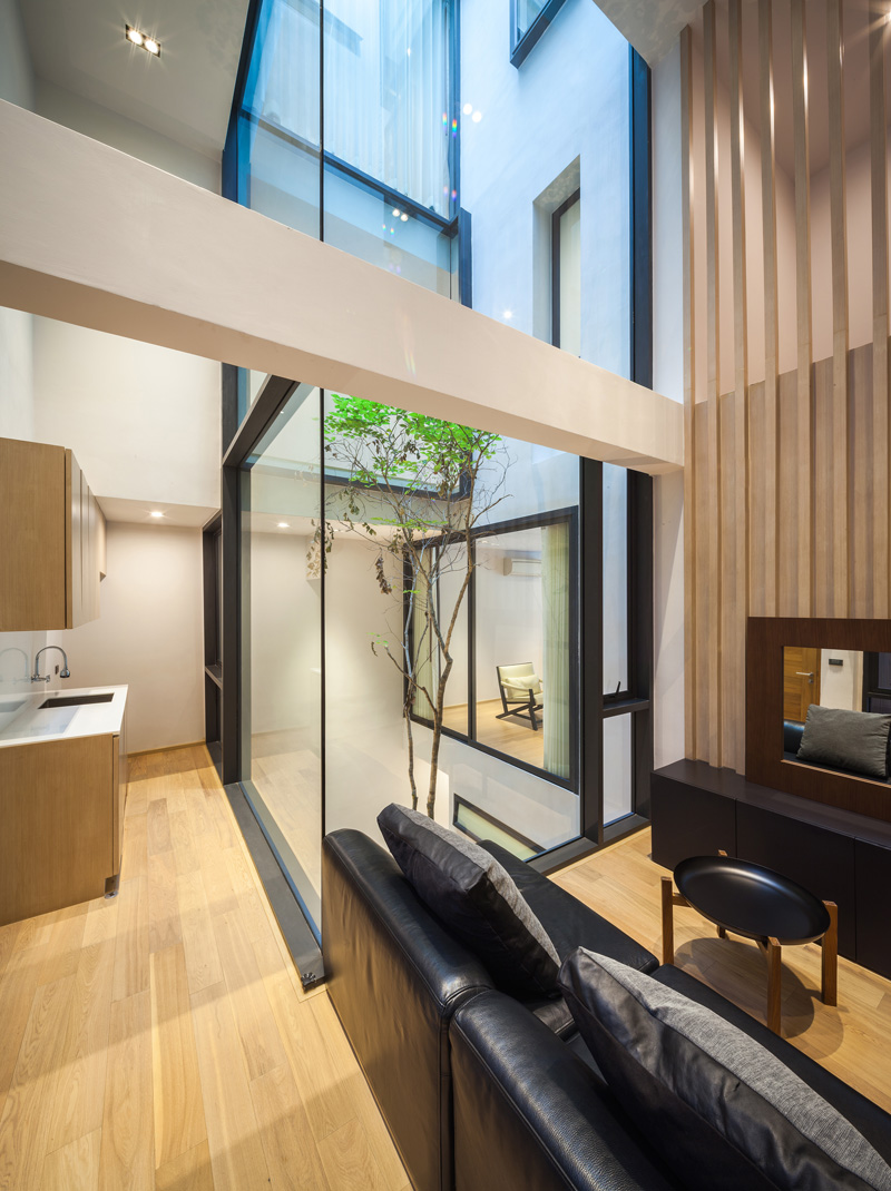
On the next level, you can see that the tree reaches up to here. Wouldn’t it be nice to see something green growing inside your house?
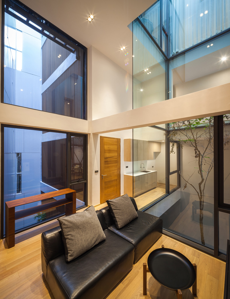
In this space, you can see black upholstered seats in the living space with a small white kitchen. The part where the tree grows is enclosed with glass.
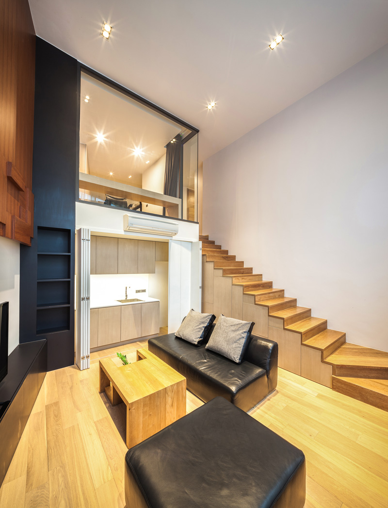
From this area, a wooden staircase can be used to access the upper level. This design of the staircase will be better with storage areas on it. And look at that hidden kitchen! Amazing, right?
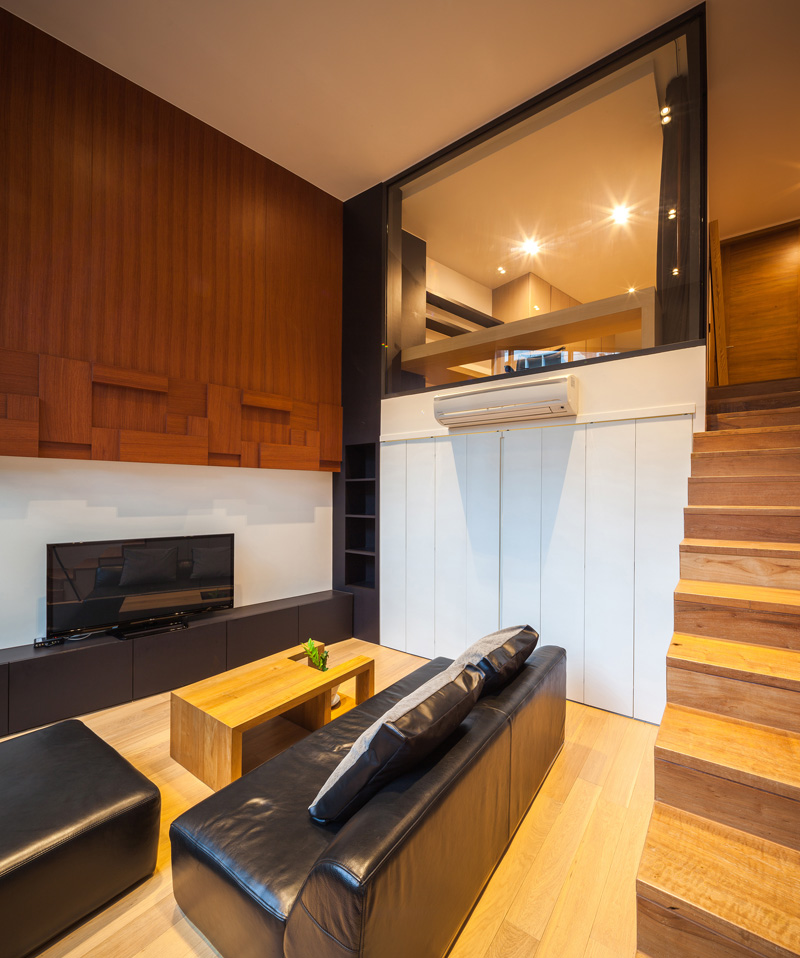
When the folding doors are closed, you cannot tell that it has a kitchen inside it. Nice idea indeed!
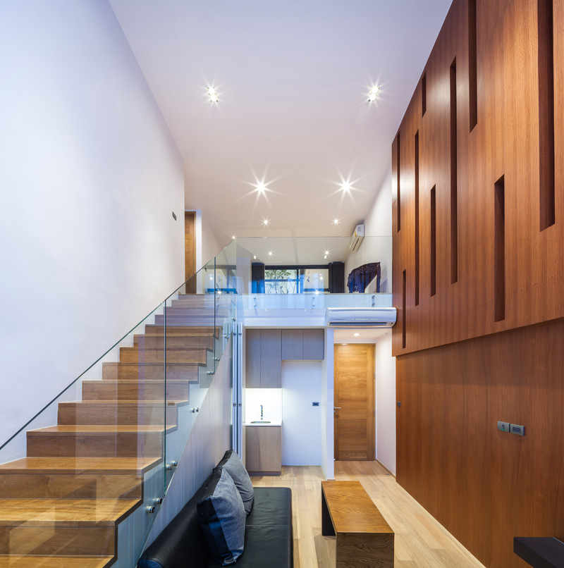
Don’t be confused, this is another space only that the seats and throw pillows are the same. It has a small powder room that can be hidden too with folding doors.
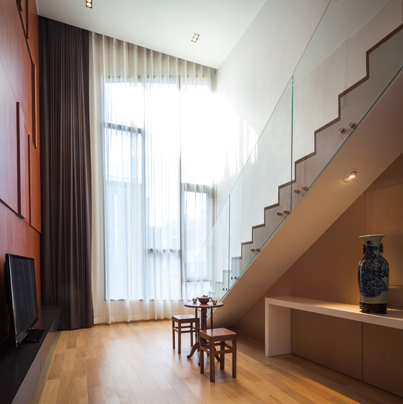
Glass is used as the railing of this staircase. Take a look at the tall drapes on the windows, very very tall indeed!
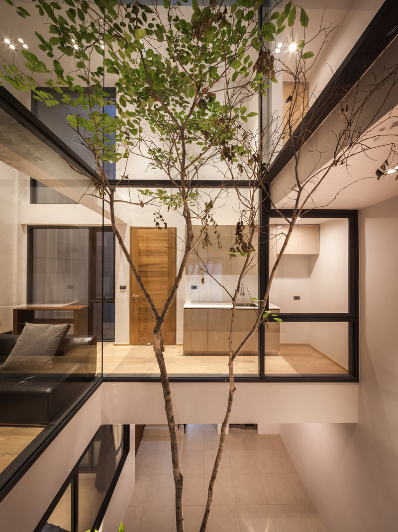
Take a look at this tree with all its glory as it towers through a glass enclosure inside the house.
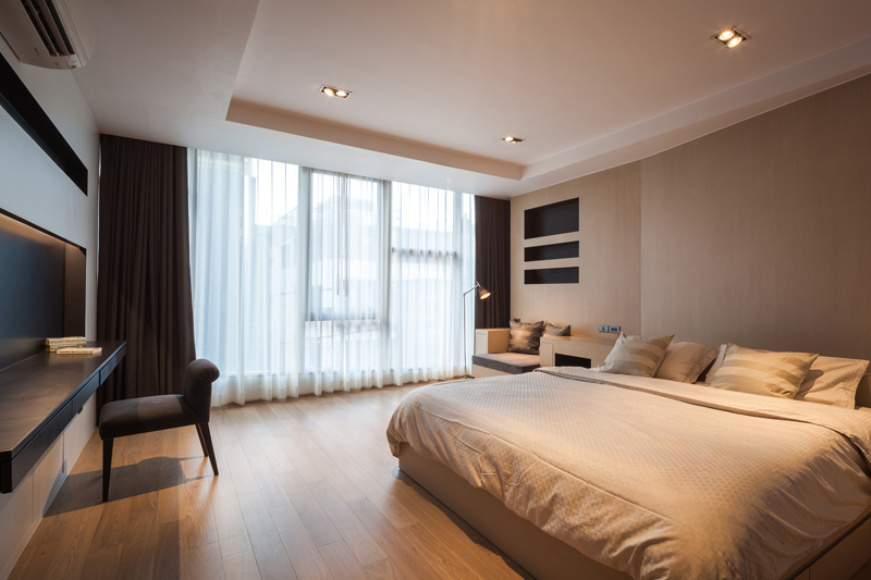
A simple yet sophisticated bedroom in the house where the owners can take a look at the beauty of the city through its large windows.
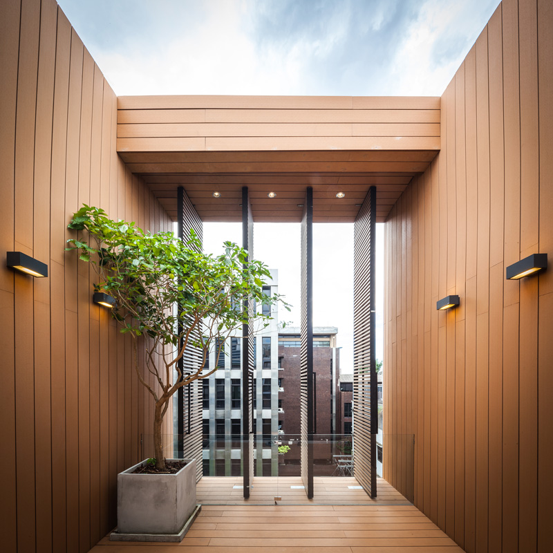
Notice that those tall panels of vertical wood design can actually be closed. I can tell that this is an interior courtyard for the house.
From the exterior to the interior- this house is indeed beautiful! I so love its modern appeal especially on the facade. It is also a good idea to integrate natural materials into the home giving it a homier feel. We can see that there is indeed a huge difference between the previous structures to the new one. This is the result of the amazing job done by IDIN Architects! Indeed, the building turned into a stunning home to live in and an inviting commercial space to do business. Any thoughts? Share it on the comment section below.