We have always witnessed that there are many designers who were successfully collaborated with brilliant architects to convert an apartment into a residential house design. With that a superb and elegant house is achieved. Today, we will share to you a house design in South Yarra, Melbourne. This house project is named as the Davis Avenue. They utilized simple colors of paints, furniture, trendy fixture to highlight the sense of comfort and class.
Davis Avenue has a three storey house with a sculptured building that is connected with the quiet and nurturing streetscape. The entrance is enveloped in a woven metal veil which illustrates the incredible lights into the street-front residences which allows the interior areas to connect with the tree canopies outdoors. Behind its simple palette and design is a functional and elegant surprising features. Scroll down the page and see the different areas of the house through the images below.
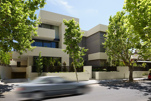
Geometrical forms and volumes of the building obviously presented a modern architectural design together with the tall trees here.
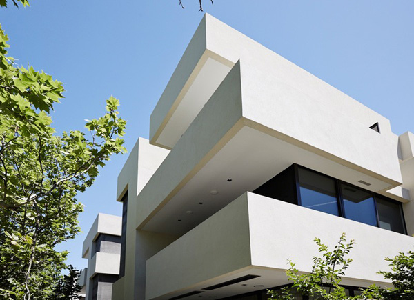
Lines and textures are also stressed in this three-floor building.
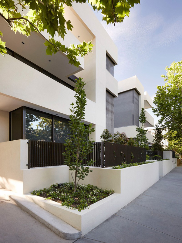
Sustainability and eco-friendly features is illustrated in the entrance spaces.
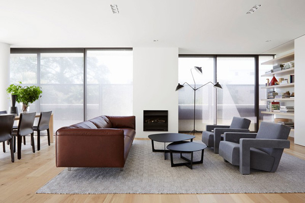
Brown and grey colored sofa creates a very comfortable and elegant living space here.
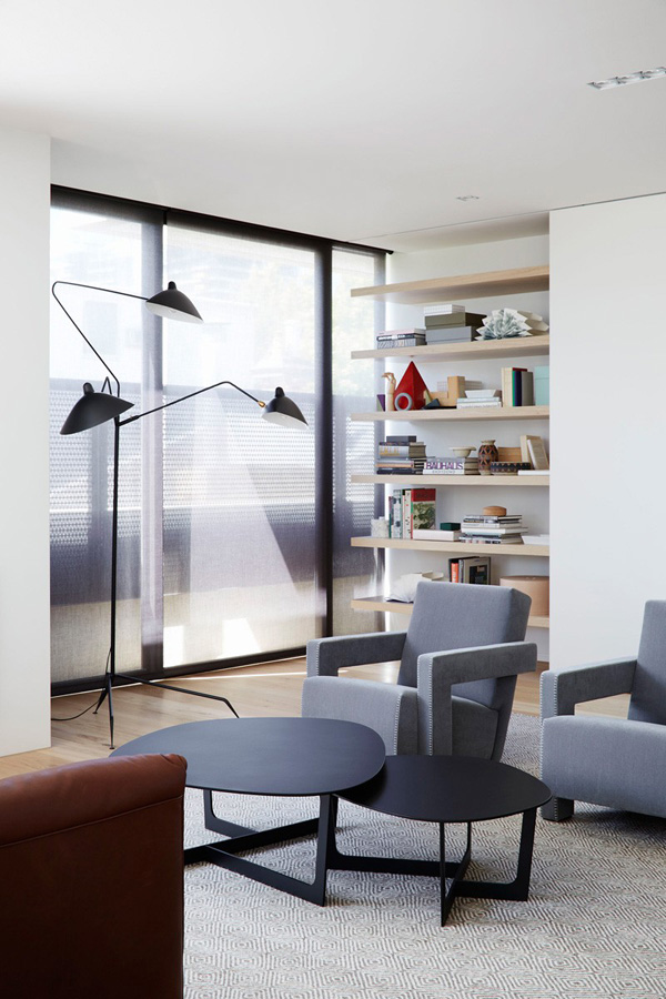
See how this trendy and exceptional designed lamp that perfectly jives with the design of the furniture.
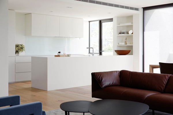
White palette applied in the kitchen is effective in making this neat and hygienic.
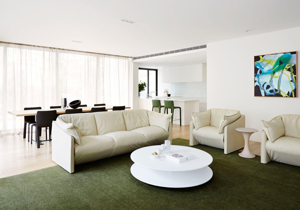
Soft and white sofa is perfect for this round and white table in the center of this living space.
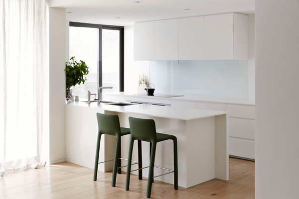
Black chairs set in this kitchen space breaks the plainness and simplicity of this modern kitchen.
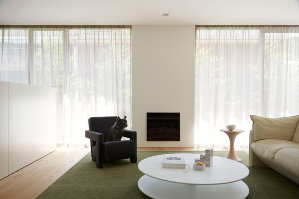
Combination of black, white and beige color of furniture in this space speaks nothing but elegance.
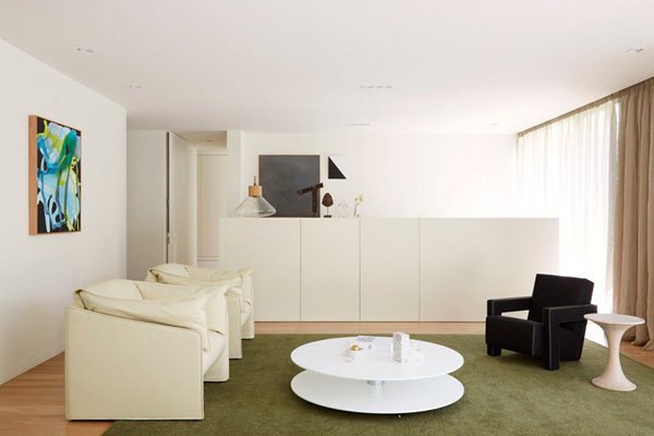
From this area, you may see the importance of this wall art that creates balance and enhance the interior.
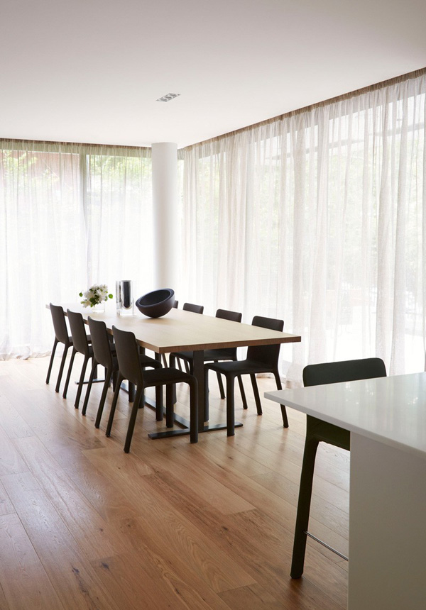
Wooden table with this black chairs is perfect for the white themed dining space.
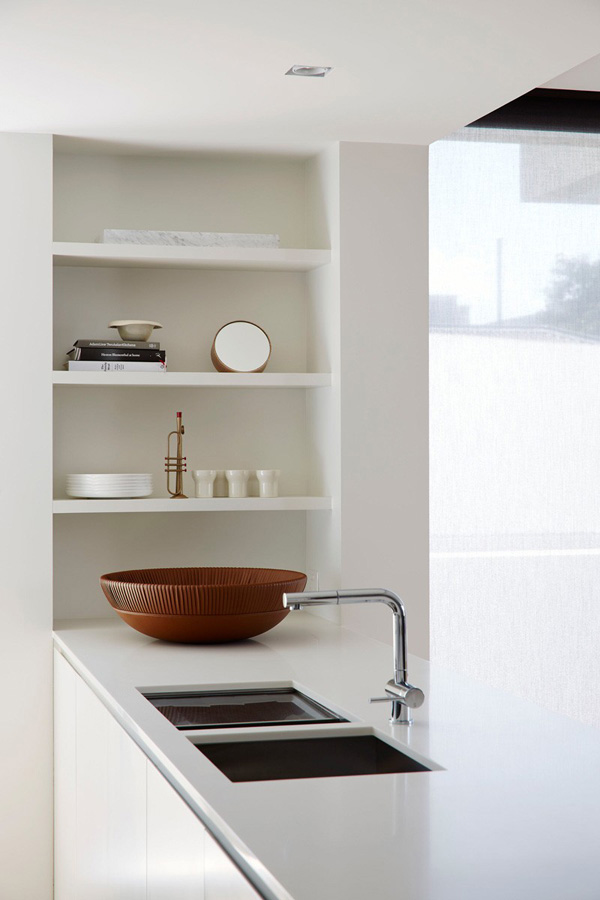
Looking closely at this kitchen sink, you can see how this trendy fixtures explains the modern concept.
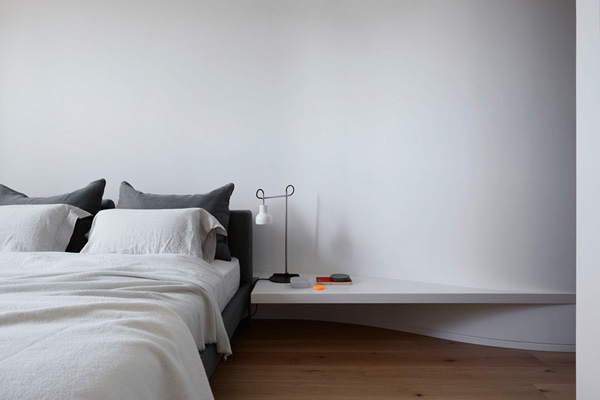
Here’s the simple yet relaxing zone in the house where the client can fully take his rest in this white and grey bed.
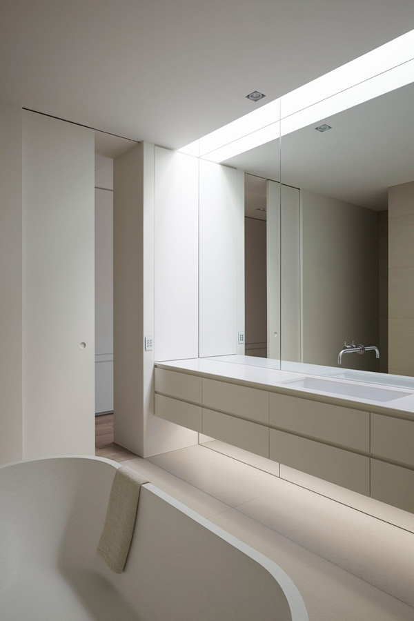
The large mirror in this bathroom improves its plainness and white themed color.
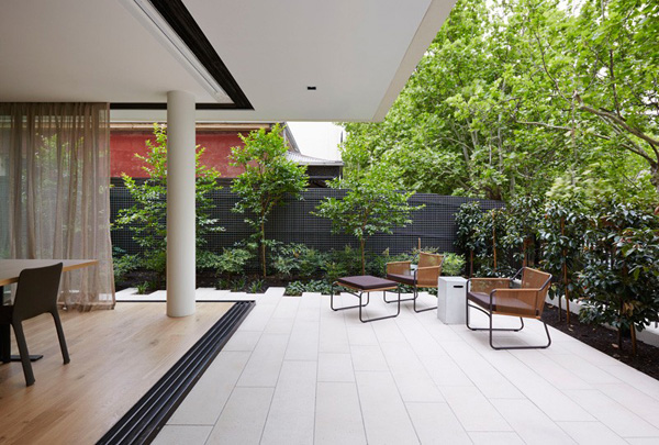
Contemporary brown designed chairs set in the patio creates a strong connection between the interior and the exteriors.
Photographed images presented by Lucas Allen above is efficient enough to underline the details and functions of each zones in the house. The Orchard Piper collaborated with architect and interior designer Jolson and Eckersley Garden Architecture was built this Davis Avenue and we can clearly see that in the interior, we can see the adaptable spaces which allows the flawless flow or movement. I like the ground-floor residences with the private gardens which dissolve the distinction between the indoors and outdoors spaces. We hope that once again you have learned new ideas that may inspire you to adapt in the future.