We know for a fact that every home is unique. There are certain elements in the house that will set it apart from the rest like how the architecture as well as the interior layout and decorations are done. Some would also choose a certain theme to use for their home and bring in some elements to showcase that particular feel. This is what we can see in many homes just like what we are going to show you today.
Casa PN is a private residence located in Mexico City, Mexico. It has a modern and contemporary design for the architecture. But when you get inside, you will get an eclectic feel with the mix of decors and materials used in it. You can notice its extensive use of wood as well as how it is combined with glass and other types of materials as well. Even the layout is nicely done too. Let us take a look at the house below.
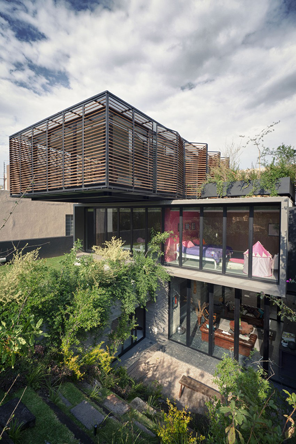
The upper area of the home showcases a place that is glassed with louvers. It looks really contemporary.
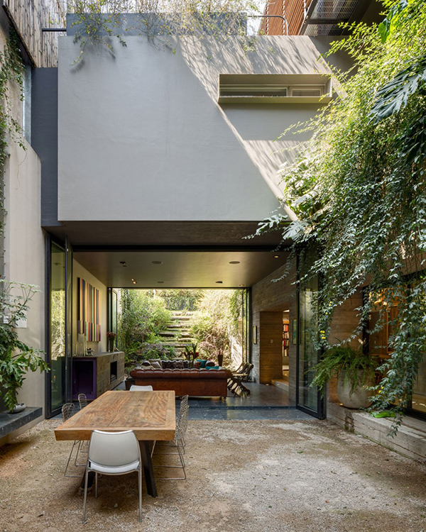
An internal courtyard sits in the middle of the house where you can find a dining space with eclectic mix of chairs.
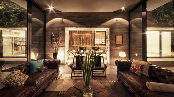
In the interior, you can find a touch of nature from its wooden materials and even in its choice of colors.
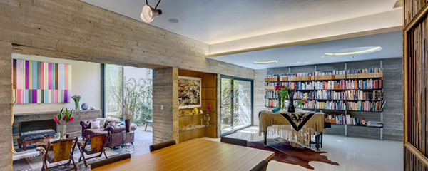
Seen here is the dining space and a mini-library showcased in a lovely open shelf.
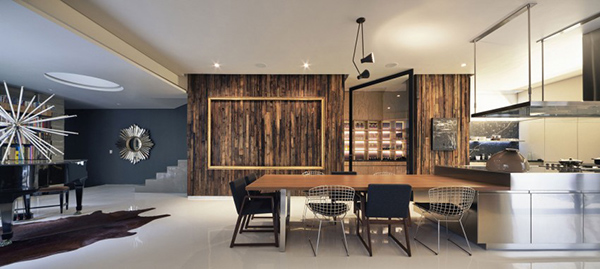
The walls with wooden texture add some natural appeal to the interior. Different decors and furniture are also used here.
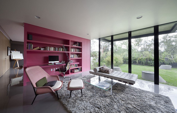
For this area, a bookshelf with a built-in desk becomes the highlight.
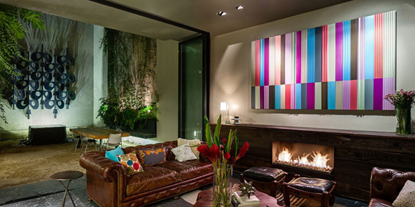
The colorful wall art brings beauty to this family room with a fireplace.
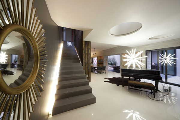
Sunburst is everywhere from the mirror to the decor on top of a grand piano.
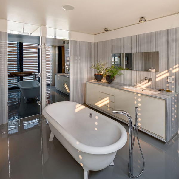
The bathroom looks nice too with a glossy flooring and some vertical patterns on the wall.
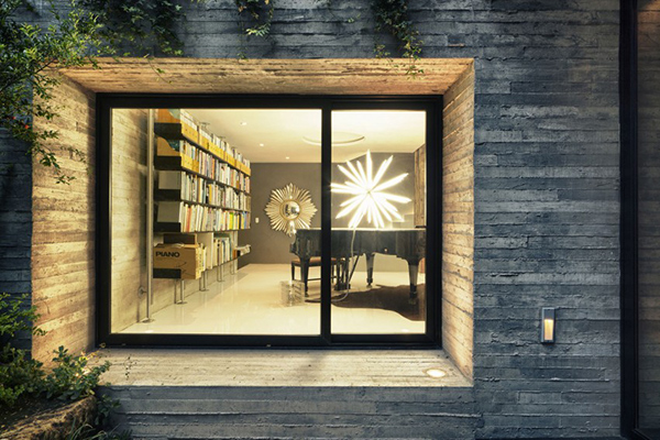
This photo shows how the interior is seemingly framed with the windows.
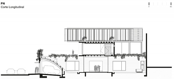
In this cross section, what I found interesting is the way the car park was designed.
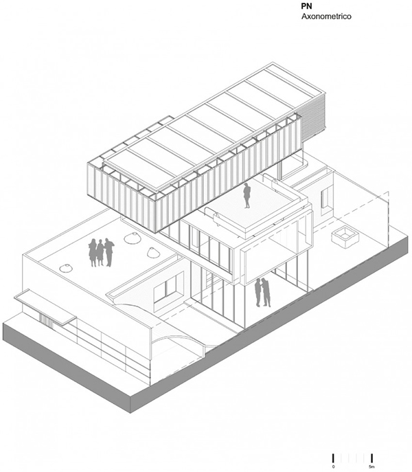
An axonometric view of the house showing the rooftop as well as other areas.
This is indeed a lovely home. You can see how well the areas are distributed and how the indoor and outdoor areas were connected. Don’t you just love it? I like their living area as well as the courtyard too. This home is designed by ZD+A and they really did a good job. Too bad there isn’t any photo of the garage because it looks pretty interesting for me. Do you like this home design too?