There are plenty of transformations here and there. We have seen so much of this for the previous posts we had here in Home Design Lover. Well, what designers did in transforming spaces is indeed impressive. And I can’t help but envy the owners of the homes that were turned into gorgeous dwellings. So, today, we have another amazing renovation to show you but minus the before and after shots. You will see how the house looks like after the repairs and all.
This place was once a Viking Pencil Factory. From that, we could already assume that it has industrial features, brick walls and maybe even exposed beams. But this factory had already undergone a drastic renovation. So, you won’t see all those industrial features because this loft in central Copenhagen, Denmark was stripped to the bone. The owner of the loft is industrial designer Morten Bo Jensen, the chief designer at Vipp and his partner, graphic designer Kristina May Olsen. They live with their 5 years old twins in this home and loved the idea that it is near the river and is accessible to their workplace. Enjoy a virtual tour of the loft below.
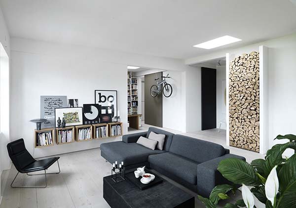
The interior looks really modern and warm with its choice of furniture and colors!
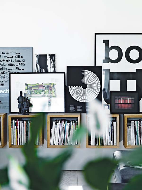
Black and white decors grace the home just like these paintings that were prompted on top of wooden cubes bearing books.
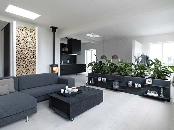
The modern loft also has dark colored furniture that sits in the white space.
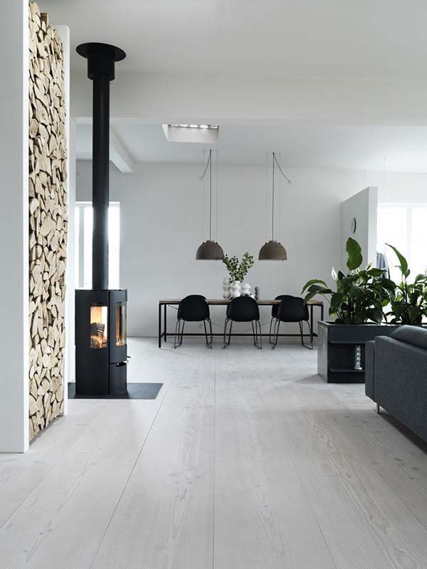
I like this one wall with wood on it as well as the indoor planter in dark gray.
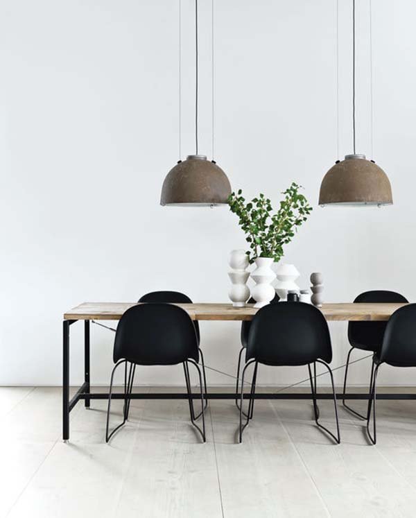
A wooden dining table with steel legs add an industrial feel to the house. I like how the centerpiece was done here!
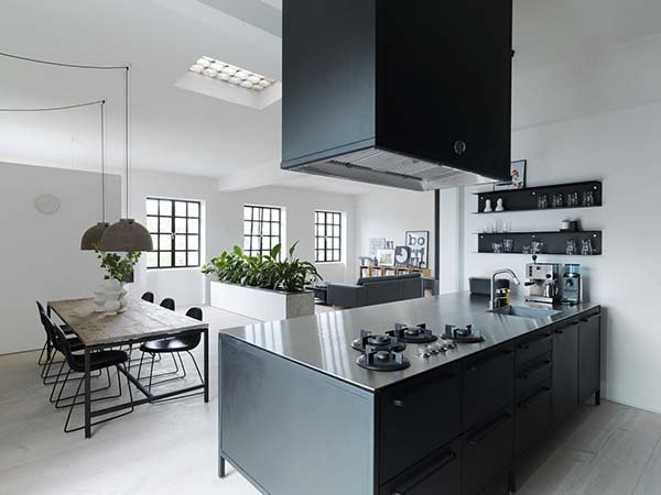
The kitchen is from Vipp which is the company of the owner. He was able to bring in furniture that he personally designed for the home.
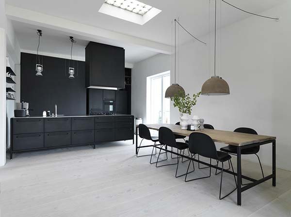
A black kitchen isn’t bad at all. It actually looks very sophisticated despite its matte finish.
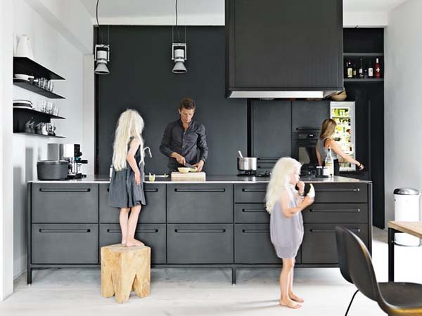
The family can spend time around the house because of its kid-friendly design. Yes, they have bonding time even in the kitchen.
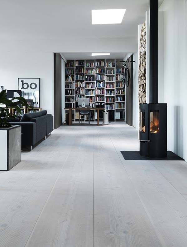
The flooring was installed by Dinesen Douglas made of fir plank and finished with lye and a whole lot of white pigment.
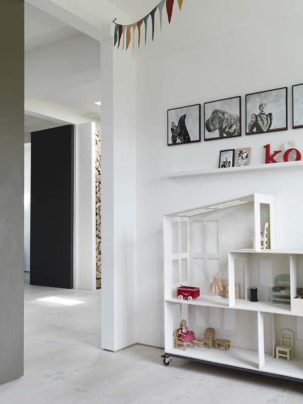
Take a look at this modern design of a doll house. I like the idea of adding wheels into it!
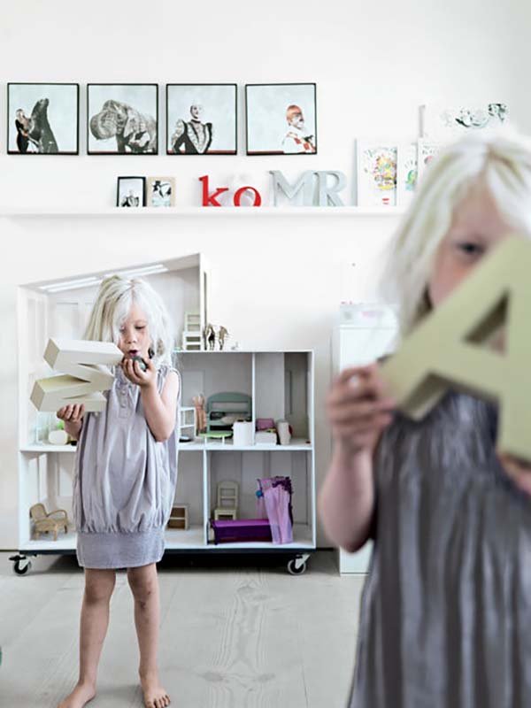
And here are the cute twins enjoying their play area. Well decorated space I can say.
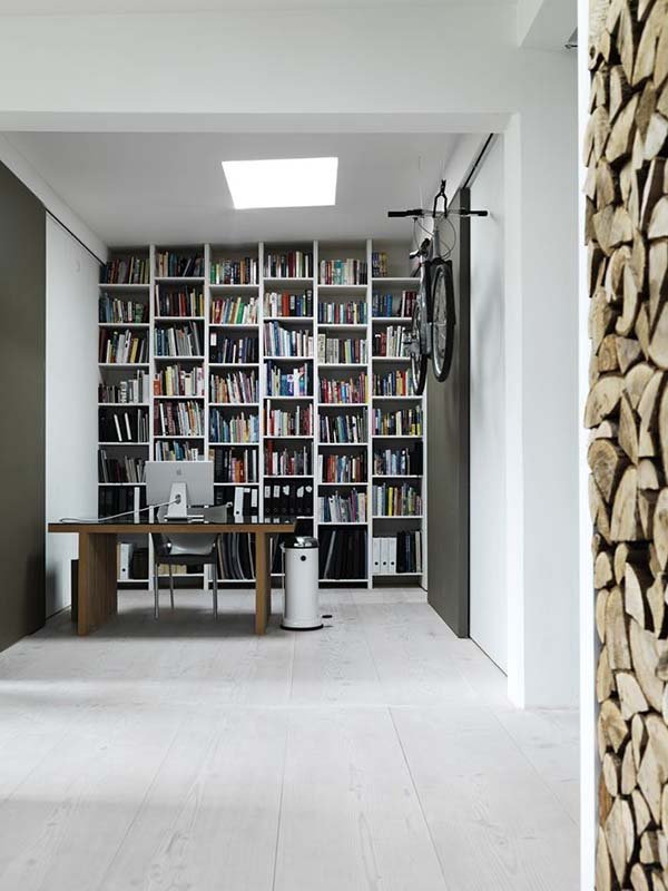
For the working area, a floor to ceiling bookshelf was installed that is the backdrop of this home office.
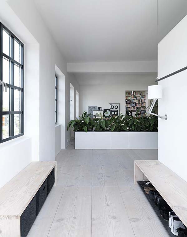
Rectangular benches with voids under it allow space for storage.
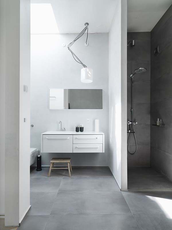
The bathroom has a minimal approach as well with white and gray colors.
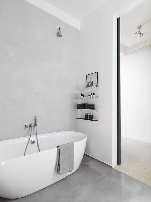
Slim shelving was added to the walls of the bathroom to store some items as well as a framed decor.
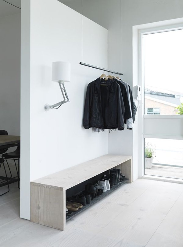
The mudroom at the back of the house shows us a neat space where they keep jackets and shoes.
Beautiful interior, right? I actually think that it looks more masculine and of course modern because of its color and the sleek elements in the house. Even the kitchen or the kid’s play area has that modern minimalist appeal that look very gorgeous. The owner Morten Bo Jensen made sure that his own house will be fitting to their lifestyle and needs. He said that “function and efficiency must be the starting point, both in the architecture, the interior and in the location”. And we saw all that in this loft where he lives with his family.