De Waterkant Project: A Gorgeous Modern Duplex Apartment Redesign in Cape Town
We know that your hearts had been captivated more than once by the beauty of apartments and other modern homes. We felt that way too every time we see a beautifully designed apartment. But of course, nothing beats having our own separate home with a yard and garden. But then again, when you are living in an apartment, it doesn’t mean that you cannot turn it into a gorgeous home. Today, we are going to show you another stunning apartment located in Cape Town, South Africa.
The interior design was done by Antoni Associates (AA) Interiors and OKHA Interiors who collaborated to pull off a home that combines contemporary living with high design. The interior is a representation of modern, urban Africa and a strong emphasis on rhythm, geometric forms and graphic elements. And this is what we will really see in the De Waterkant Project. I invite you to a virtual tour of the apartment below:
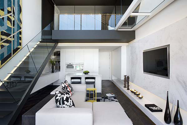 The interior has a contemporary design with modern colors in it.
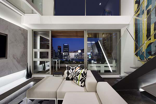 It used black and white as a primary combination but has other hints of bright colors too.
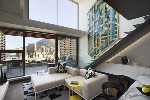 The furniture in the house is perfect for a contemporary space as it bears clean sleek lines.
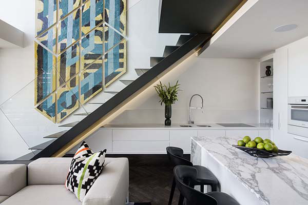 The living room has a double height ceiling and tall windows that made it airy and light.
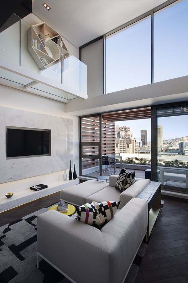 I love the patterns used in the throw pillows as well as the area rug.
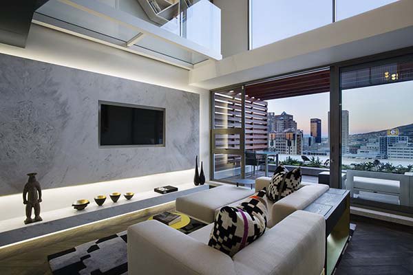 There are African decors in the house too to reflect local culture.
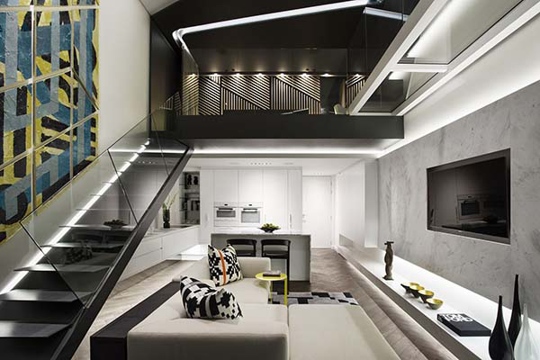 There are actually different patterns around the house that add a graphic appeal into it.
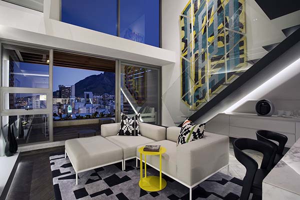 Notice here that a side table in yellow is being added to the space for a surprising burst of color.
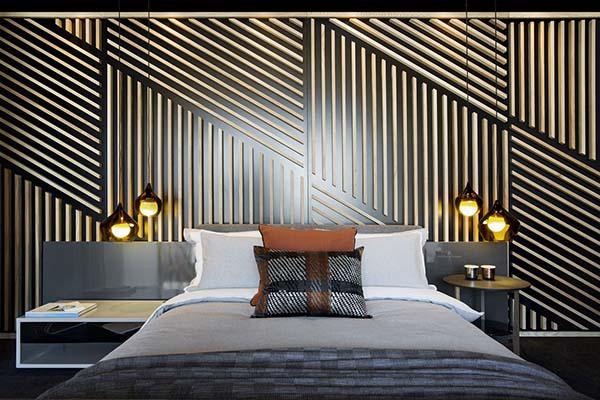 The bedroom in the loft of the apartment has contemporary design with beautiful candles on the bedside and of course a stunning wall design.
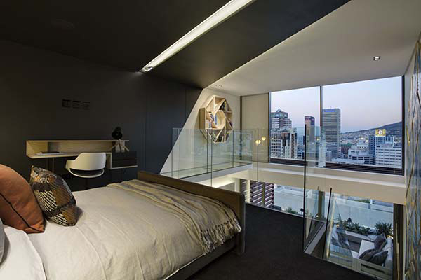 From the bedroom, the view of the city is clearly seen. It has clear glass railings for the stairs and mezzanine.
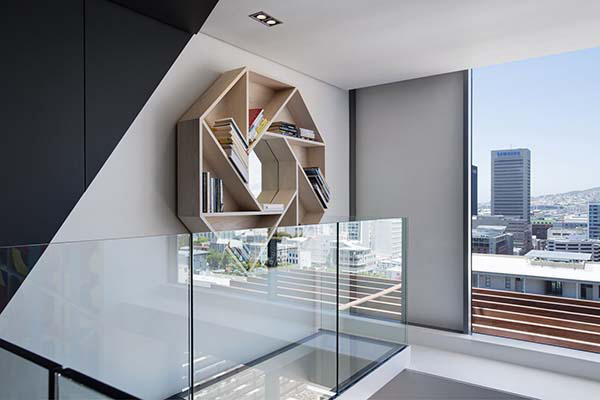 Near the stairs is this unique bookshelf design which doubles as a wall decor.
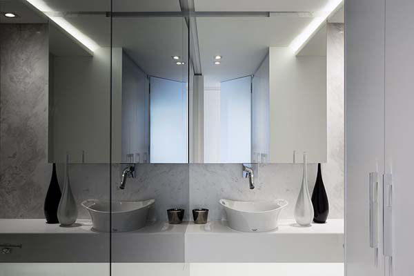 This one is the bathroom in white which also has plenty of mirrors inside.
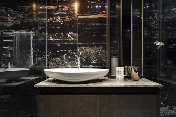 A vanity is well-designed with marble on the walls. A luxurious space indeed!
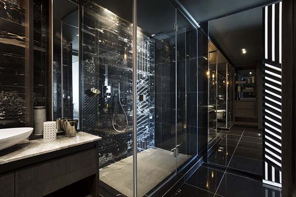 And when you look at the entire bathroom, this is indeed a marvelous design!
Definitely stunning! We really cannot deny that this home is full of beauty and luxury. I so love the graphic appeal in it that made it look captivating and gorgeous at the same time. The redesign of the duplex apartment is done by Saota. And when we say it is done by SAOTA, we are sure that the output is impressive with that SAOTA mark. I can say this because we have also featured other homes from them as well. I’m sure you have noticed how excellent the designs are just like this apartment.


