Although most people would not give their approval to a home that looks dull, others actually consider it as an opportunity to express their creativity. Instead of snubbing an ugly home, creative minded individuals prefer to remodel them or renovate them to achieve a space that is beautiful and comfortable. Most of the time remodels surprise many because of how it looks like compared to the original space. But this is just a clear manifestation that no matter how dull or boring a space is, there is always a huge possibility that it can be transformed into something that anyone would love to call home. Today, we are going to show you a home interior which is a result of a remodeling work from Design Hound.
The project is called Sinclair Remodel which is a repeat client of Design Hound. The homeowner is a chef and owner of The Peached Tortilla. They approached the design company to re-imagine a home that they are considering purchasing located in the Rosedale Neighborhood of Austin. According to the website’s project description, the home has a pleasant living area which is located just off the entry. Apart from this problem, it has an overall lack of flow within the home which chopped up the living experience, cut off natural light, and it even made the home feel smaller. Because of that, the design team focused on opening up the house while making sure that the existing footprint will be maintained. The living, dining, and kitchen areas were then connected resulting in an increase of the home’s livable area. But that’s not all, with the new layout, a skylight was added in the kitchen and a large glass door was installed which leads to the backyard. These new items brought natural light into the home.
Location: Rosedale Neighborhood of Austin
Designer: Design Hound
Style: Contemporary
Type of Space: Apartment
Unique feature: A dark kitchen was remodeled into a beautiful blue and white space.
Similar House: The Invisible Kitchen Seems to Disappear But is Totally Functional
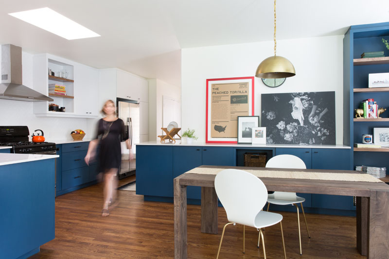
The homeowners wanted to get rid of the dark and secluded kitchen. With that, the designers managed to come up with a beautiful kitchen design that is more open and brighter. Blue cabinetry was added with black hardware and brass accents. But despite that color scheme, the designers decided to add some pops of color like the red frame. Overall, the space looked fun and exciting!
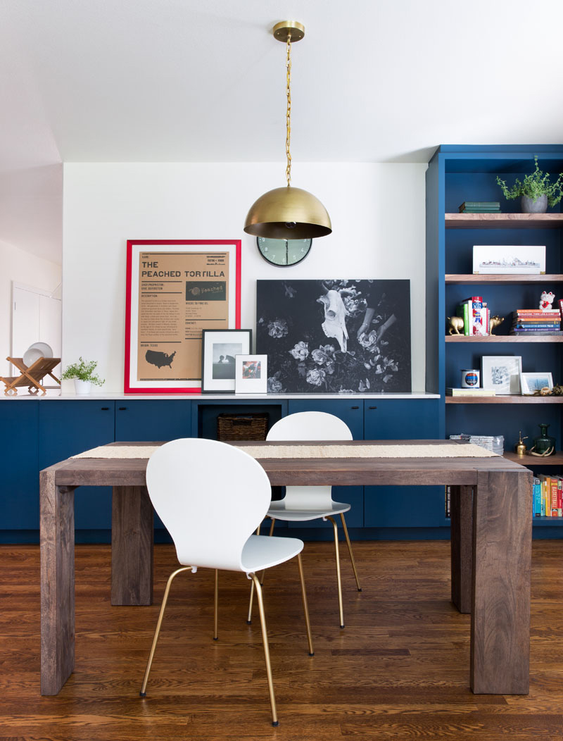
A clean palette of white paint and tile is used in the space. The white colors look amazing along with wood floors that are placed throughout the home. These are balanced with navy painted millwork paired with accents of black and brass. It is also nice that the kitchen and dining area has many decorations in it which make it appear even more lively. And that orb golden pendant light is also a nice feature in the area.
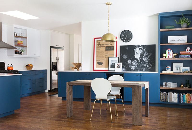
You can see that the project turned out really beautiful! Say goodbye to the dark kitchen and welcome to the new exciting kitchen space and dining space. Even that wooden table and a pair of white chairs look really nice in the area.
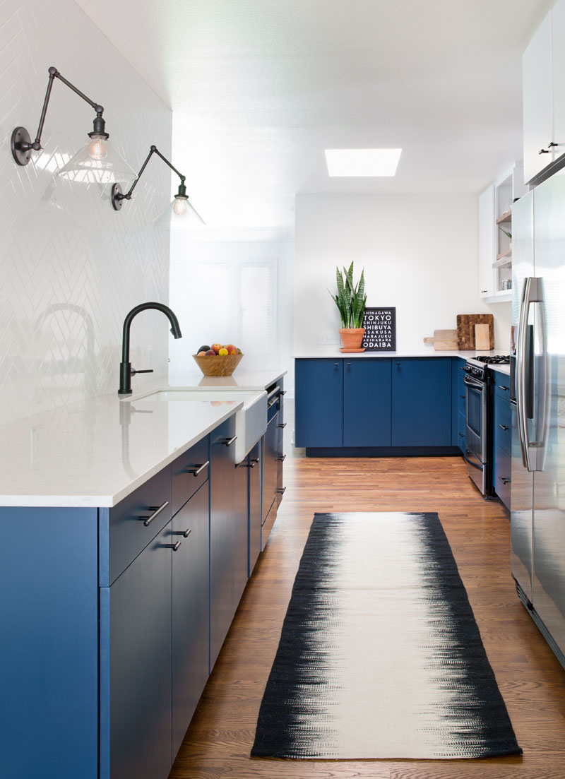
This is a long and narrow space but it looks really amazing with the blue and white colors in it as well as the black and white area rug that defines the area. You will also love the lighting used here as well as how everything is arranged.
Read Also: Apartment M Features Creative Ways to Define a Space
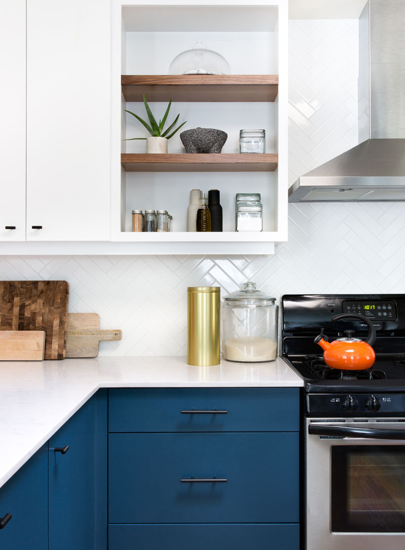
In this picture, you can see that white tiles are arranged in a herringbone pattern which covers the wall behind the sink and it also makes up the backsplash around the rest of the kitchen. With this, it creates a contrast against the dark hardware and also against the navy cabinets that will make the space look clean and contemporary.
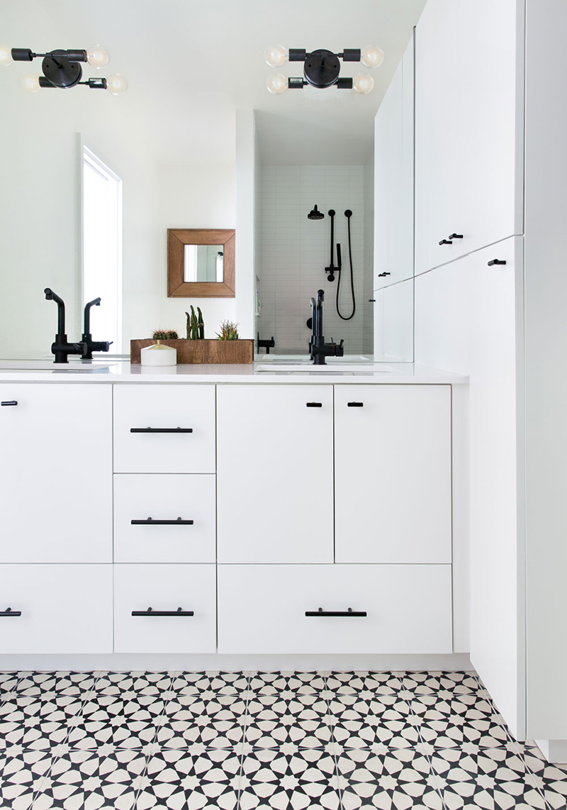
The master suite was extended in order to accommodate a larger bathroom and closet. Aside from the kitchen, the bathroom was also remodeled as you can see in this picture. The patterned black/white cement tile and black fixtures in the master bathroom adds a touch of sophistication to the space.
For sure, the owners did not regret working with Design Hound because they were able to come up with such a stunning home. Although we were not able to get a glimpse of the original space, we are sure that there is a great difference based on the definition. Who would expect that a dark and secluded kitchen can actually look this beautiful? Indeed, everything is just a matter of design. Once you achieve the design that suits the space, it will really work well in it especially if you consider what the homeowners really want.