A house built in before the Revolution in Moscow, Russia turned into an apartment needed an update for its interior. The Interior MA have a French neo-classical elements seen in its white walls, high ceilings, floor-to-ceiling walls, parquet flooring, plaster cornices, and wood shutters. The white walls are perfect to give the interior a more spacious look.
Interior MA’s white walls also highlight the proportions of the room, showcasing clean lines. Since the space has a small are, a minimalist black box is added to house the toilets, boiler room, kitchen and storage including the laundry, and closet for clothing and shoes. It has an open plan kitchen and dining area with a four meters long island, a bar and lounge space charmed with leather furnishings, bio fireplace and projector as well as a bedroom with work space. Modern elements of the interior contrasts with the classic architectural features of the home. But they also compliment with each other really well.
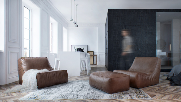
The interior of the house has a beautiful design that looks almost masculine.
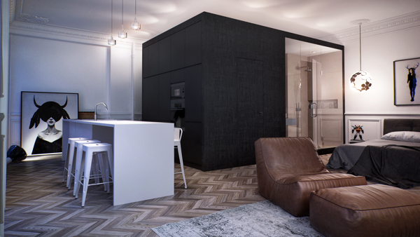
Aside from the white island, leather furniture for living area is also see as well as the bed and a black box.
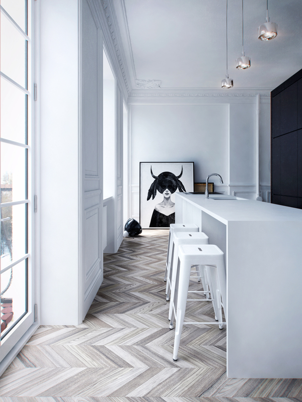
The herringbone pattern on the wood flooring gives the space a luxurious and warm feel.
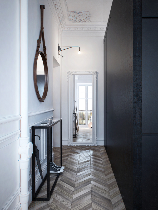
The hallway of the house has a slim foyer table that doubles as storage for shoes.
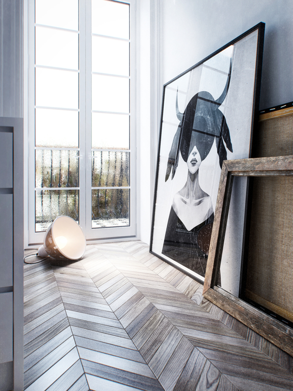
This painting of a woman with horns is a highlight in the interior.
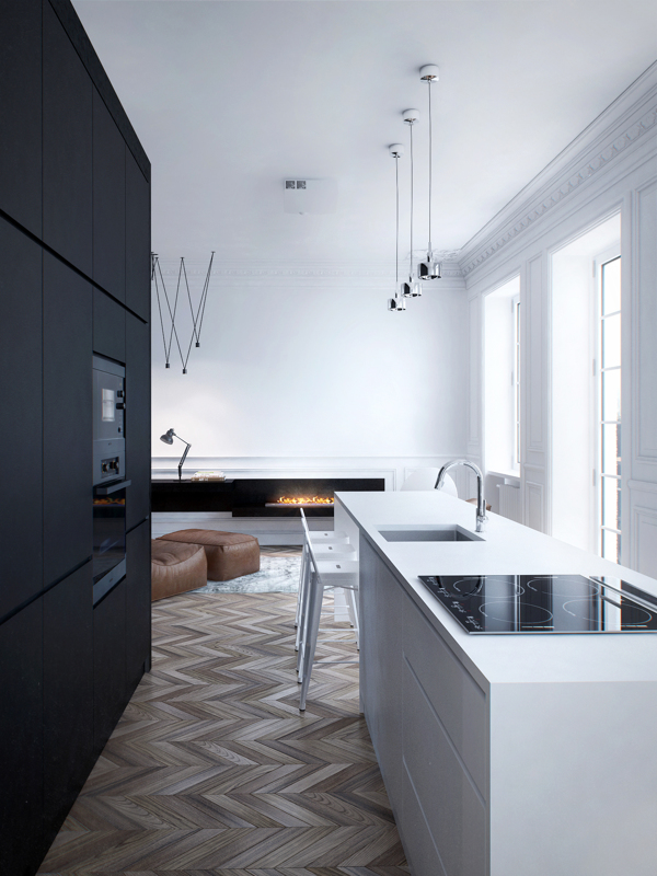
Despite being small, the interior is functional and complete with modern equipment from the kitchen to a modern fireplace.
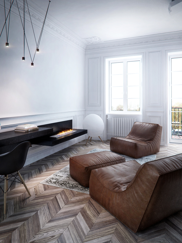
The modern fireplace extends the look of the office desk with glossy black finish.
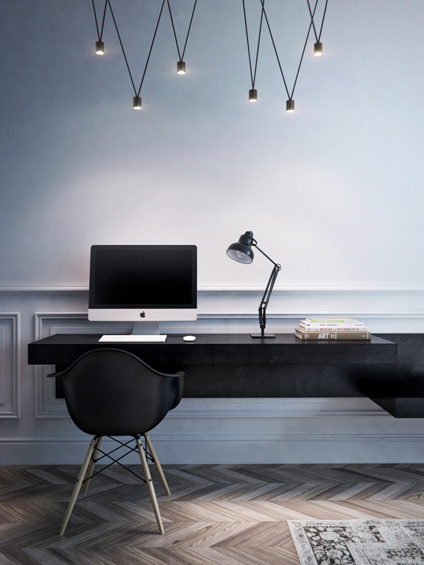
It has a built-in desk to the wall that serves as a working area just near the living space.
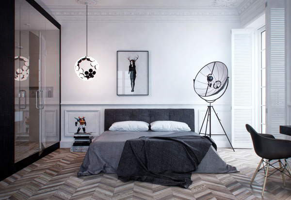
On the same open layout is the sleeping area with a very masculine design.
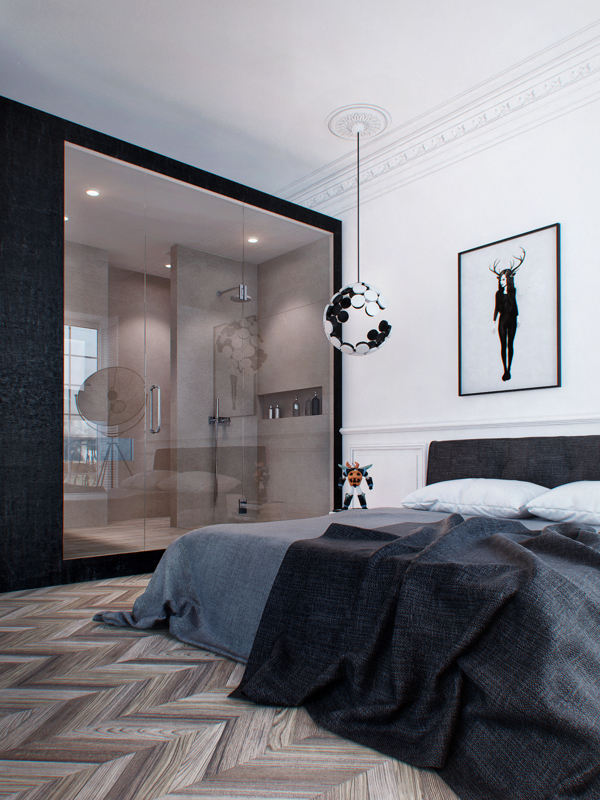
A black box is found in the interior that keeps the private areas like the bathroom.
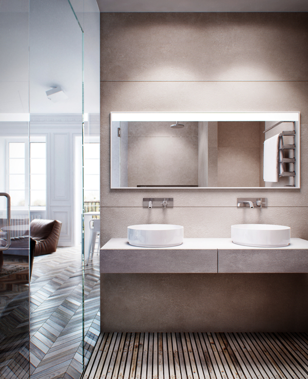
This is the bathroom found inside the black box with glass doors.
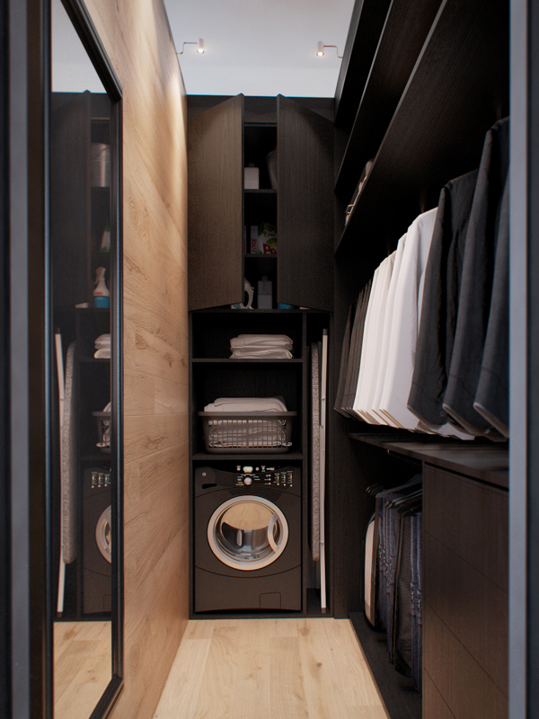
Aside from a bathroom, it also has a laundry and wardrobe.
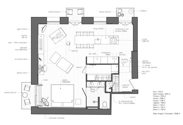
Seen here is the floor plan of the apartment.
This isn’t’ the first space that we featured from INT2 Architecture. The other interior designs that they did are equally stunning and impressive. For this one, you can see that it is just a small space but it looked very functional and the design is indeed beautiful. As we can see the floor plan, everything is truly well-planned! Can you tell me what you love most about this space?