Unlike old times, the trend these days is to open up the layout of the interior instead of adding walls to divide the spaces. This way, it is easier to access the spaces and it also makes the interior more spacious. The home will also feel lighter and brighter as well. For sure you have observed this in many modern and contemporary homes that we have featured already but today, what we are going to show you is a modern apartment that had a unique way of defining spaces in the house.
The GH Mild apartment designed by Archetonic is located in Mexico City intended for a couple who wanted to have three distinct smaller spaces from their large open space home. But they did not put up solid walls to do that. Instead, they used wooden dividers which had other functions too. The interior of the house features a great room with a tall ceiling, sliding wooden doors that separate the rooms and it has overall minimalist black and white colors in it. The apartment used light-tone wooden elements in it paired with the elegant furniture in the house. The resulting look is very much welcoming atmosphere. Also, one can get a good view of the garden in the house.
Location: Mexico City
Designer: Archetonic
Style: Contemporary
Type of Space: Apartment
Unique feature: An apartment that has an open space but the areas are defined using light wood dividers. It also has a black and white color palette.
Similar House: The Extraordinary Glass House in Lakefield Ontario
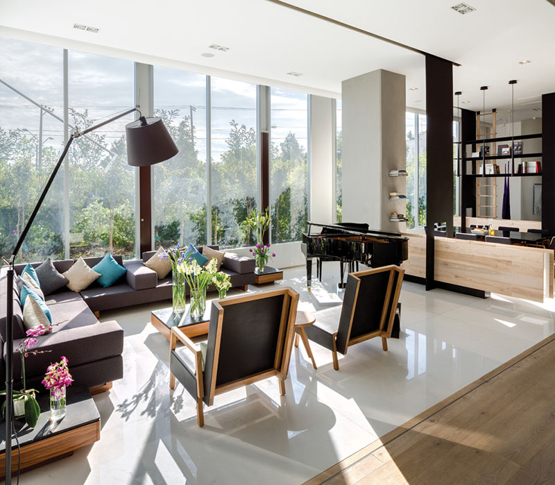
Starting at one end of the room in this apartment, we can see the living room/lounge area that features a large sofa, a couple of arm chairs and also a piano.
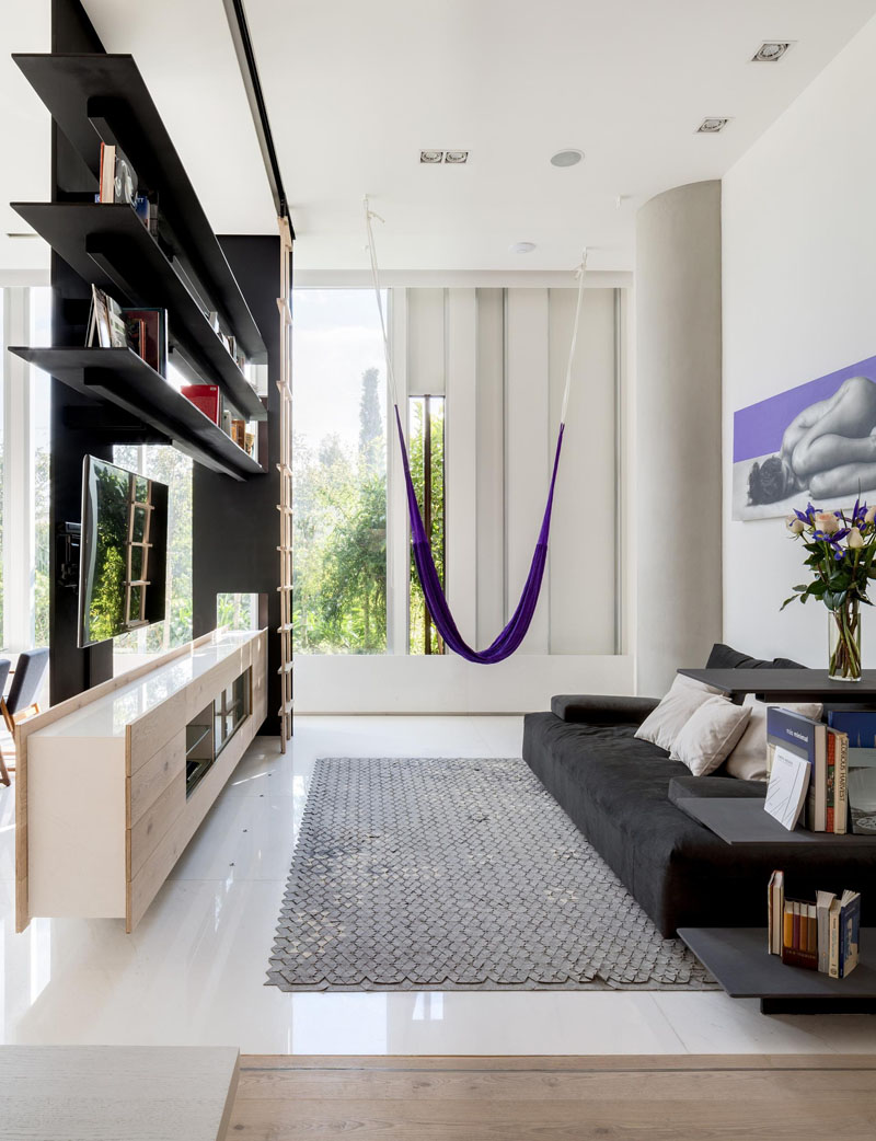
On one side of the interior is this lounge space that doubles as an entertaining area since the TV is added in here facing the sofa. I like the purple accents found in this space.
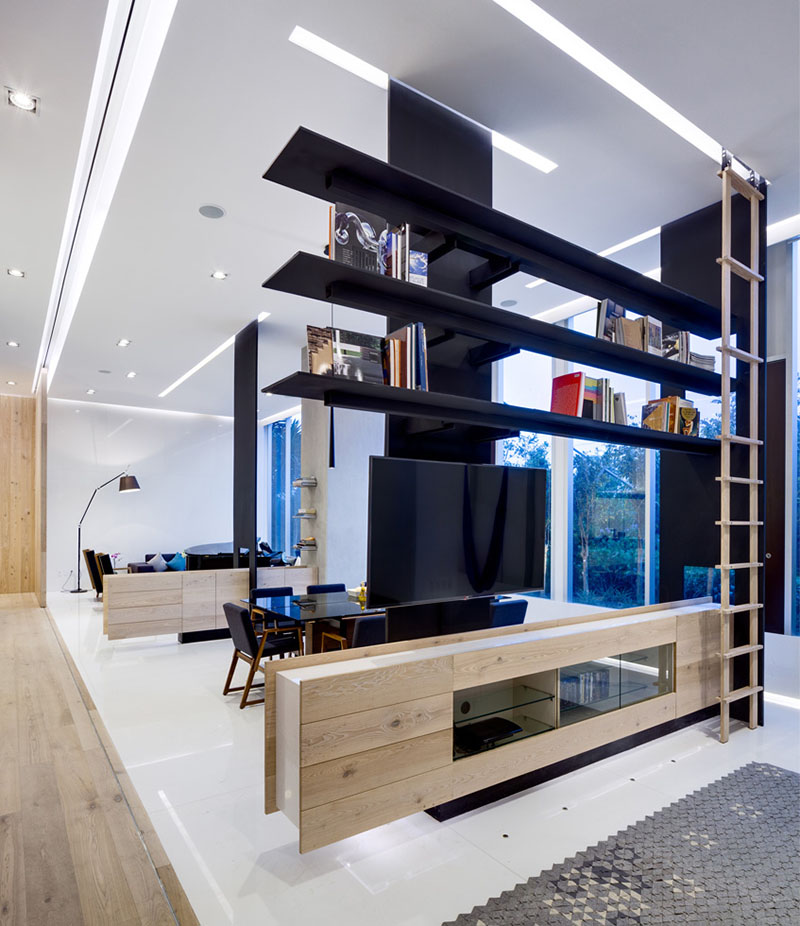
You can see in this image how the dividers were able to define three spaces in the apartment. On the other side of the dining area, the next divider is home to a TV and open shelving. With dividers like this, light and views pass through, and an open airy feeling is being maintained.
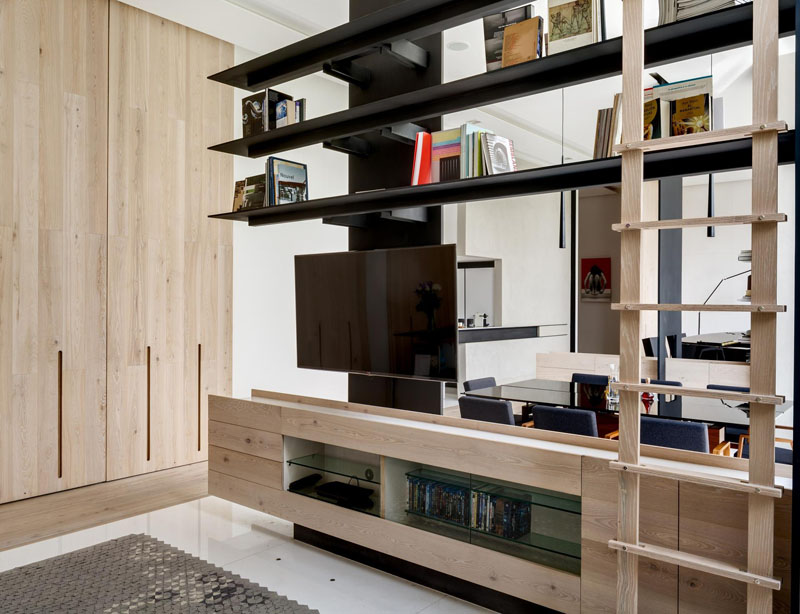
This divider has a movable ladder that gives people access to the upper shelves, and there’s also some storage below the television as well with glass shelves.
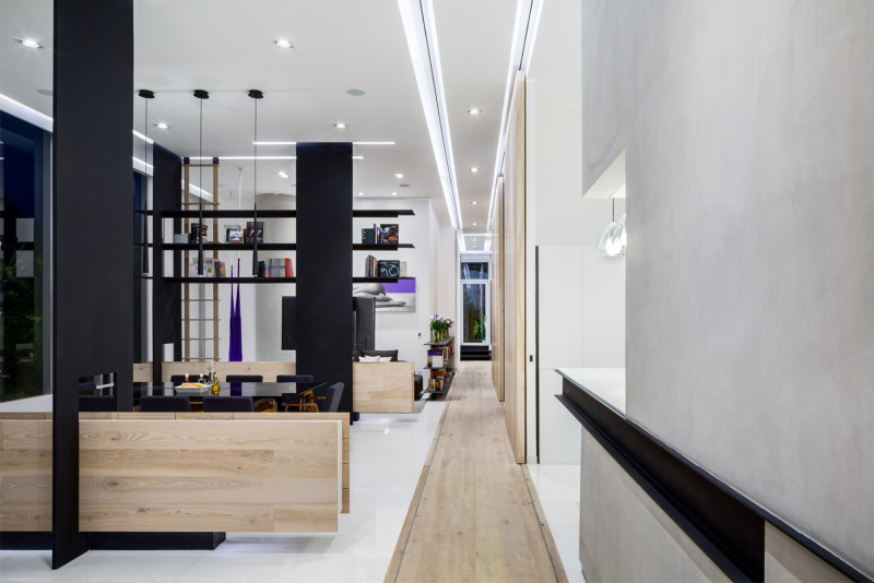
In between the lounge and the dining area is a custom-designed, built-in low wooden cabinet. You can also see here the hallway as well as some sliding wooden doors to some rooms in the house. What added to the brightness of the space are the lights on it.
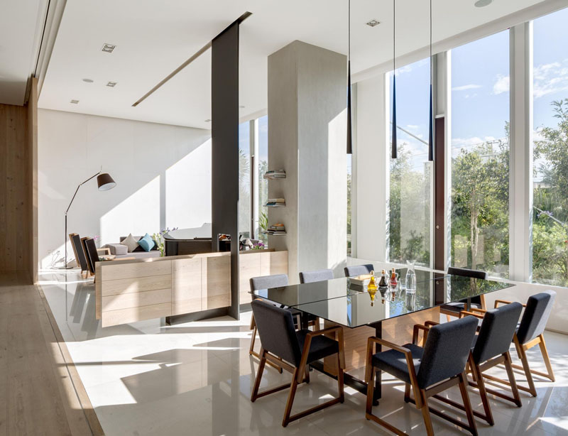
The cabinet in this home is also able to serve as a sideboard that is useful storage for the dining area. And no doubt, it adds appeal to the entire interior.
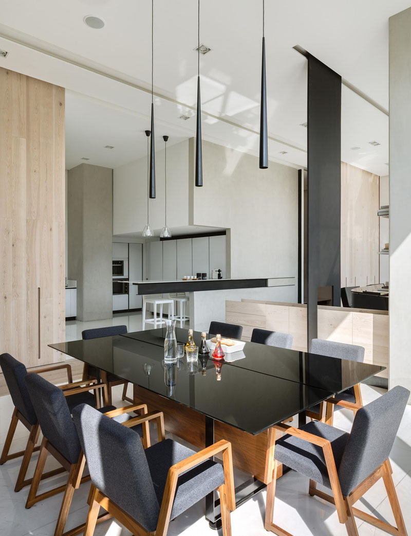
The dining area is good for 8 persons with three minimalist pendant lamps hanging along the length of the table. I like it that they opted for a black glass table with wooden base.
Read Also: Cliff House in New Zealand: Beautiful Glass House Overlooking a Gulf
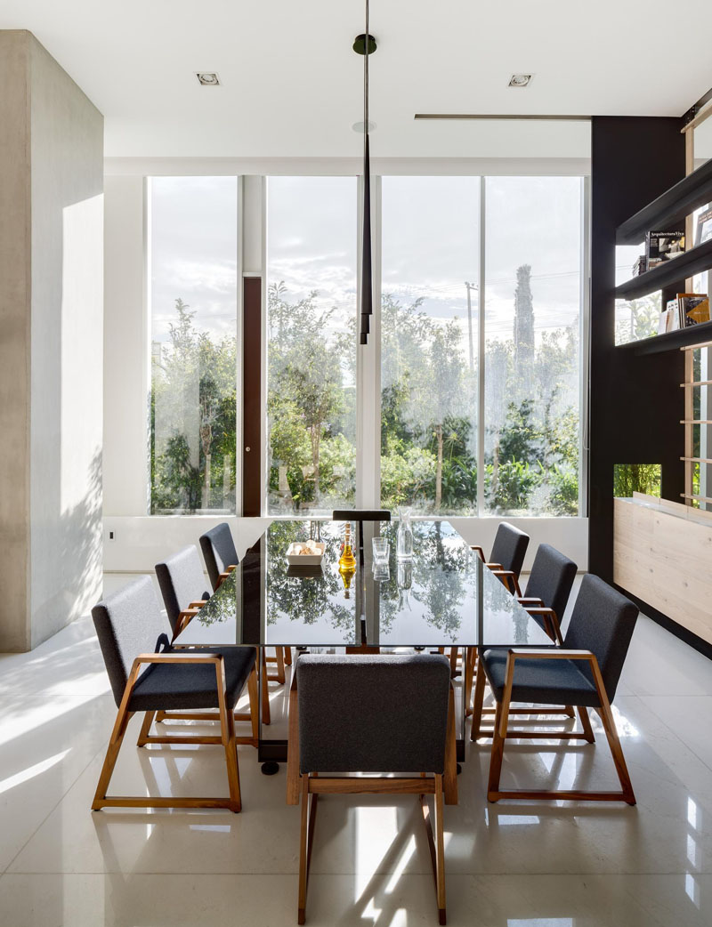
Large windows that are seen along the length of the wall, flood all the spaces with sunlight, which also brings more brightness to the apartment.
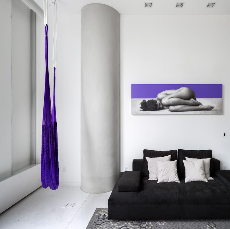
This one is actually part of the living area wherein there is a purple hammock hanging from the ceiling and an interesting wall decor that also has a purple color on it.
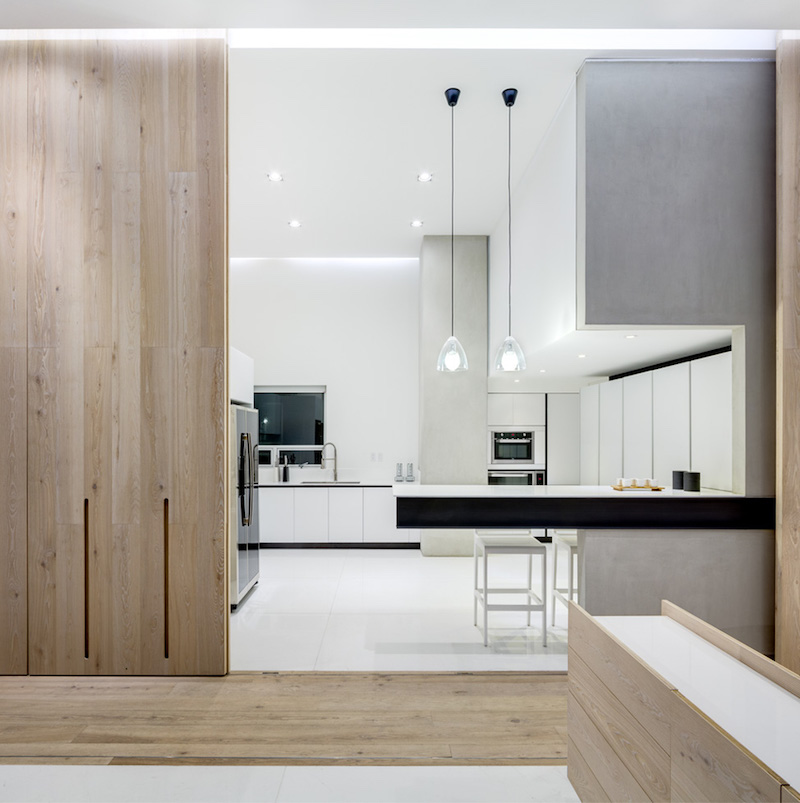
Large sliding wooden doors are used in the house to separate some rooms just like this kitchen. It could be closed when needed and it could also be left open as well. I could say that this is such a neat kitchen!
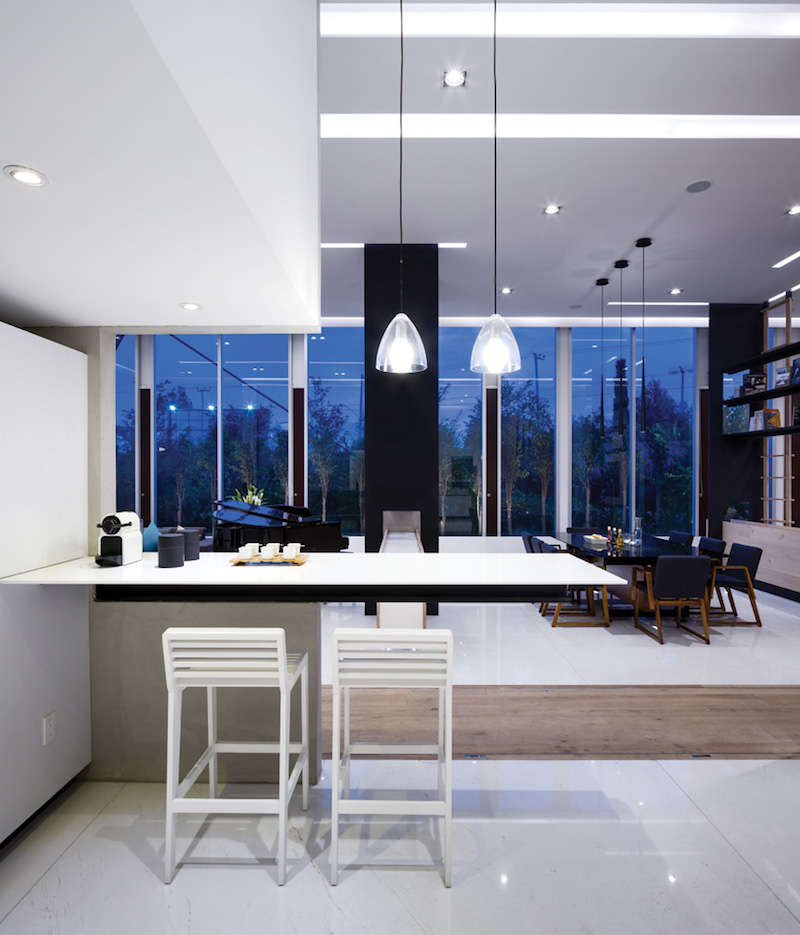
Across the space that was divided is the kitchen in black and white. It has a tall white counter height chairs for the counters. The color of the kitchen added to the light and neat appeal of the apartment. It also faces floor-to-ceiling windows that allow the entry of natural light into the home.
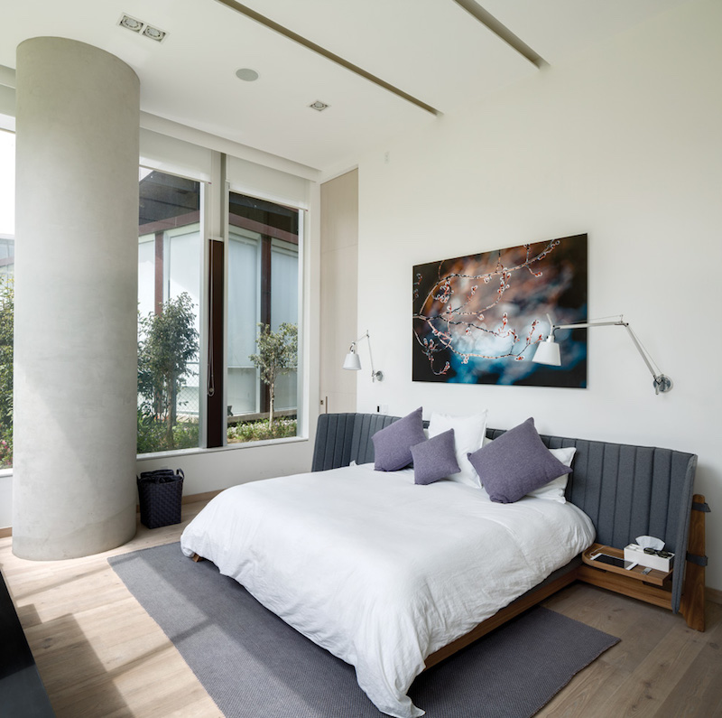
A beautiful neat bedroom is graced by a lovely wall decor featuring a fabulous print. It has a white and gray color scheme on it with an interesting headboard design.
Isn’t this a beautiful apartment? I am sure you will give this question a nod as an answer because apparently, it has an impressive design. I like the way they used dividers instead of solid walls. This apartment is designed by Archetonic who was able to come up with a design that the owners wanted. Apart from the living area, the other areas of the house also look neat and bright were well. Indeed, this is an apartment that we would all love to call ours!