We have seen so many gorgeous apartment interiors and we cannot get enough of them because of how beautiful and inspiring they all are. Merely looking at the interiors would make us desire to have a home similar to it or something that would fit our lifestyle and budget using the interiors we see as a source of idea. Now, we will give you another stunning apartment design.
A duplex in Coronado District of Downtown Phoenix, Arizona was renovated and redesigned by a creative team who came up with a very gorgeous interior while retaining the existing architecture. The home has that modern contemporary appeal with some air of industrial touches. Aside from the brick walls which added more drama to the area, the contrasting black and white colors of the space made it even more beautiful and cozy despite the double height space. You will know what I am talking about once you see the space below.
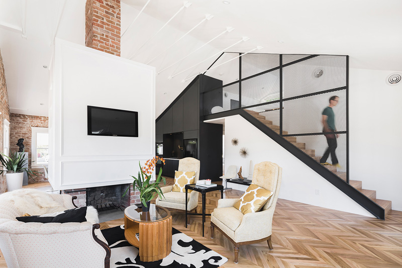
The interesting contrast of colors and materials would impress you. Even the choice of furniture and decors is worth an applause.
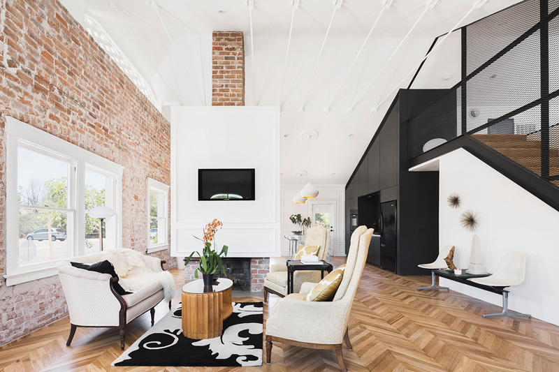
The brick walls serve as an artistic backdrop in the home with white frames for the windows and a white cube where the fireplace and television are contained.
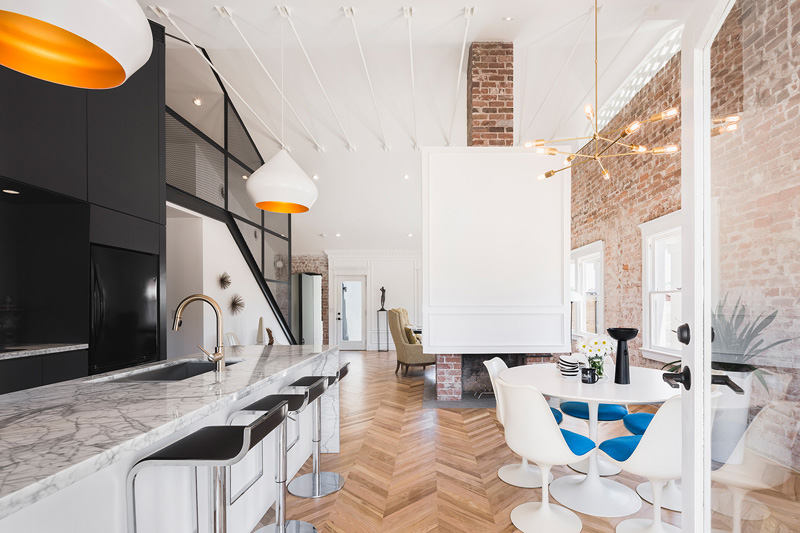
The kitchen and dining areas are in one space where we can see the black and white colors and some pop of orange and blue.
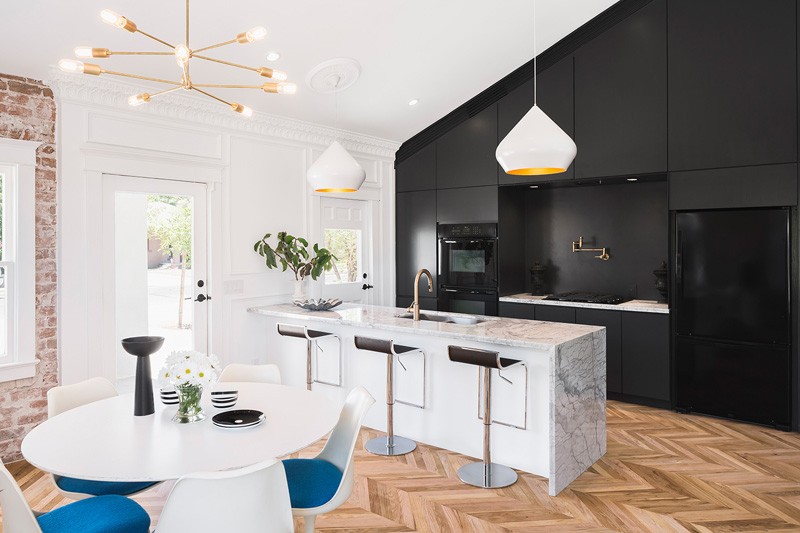
Because of the balance of color and lighting, the kitchen didn’t look so dark even if it used black in its cabinets and walls.
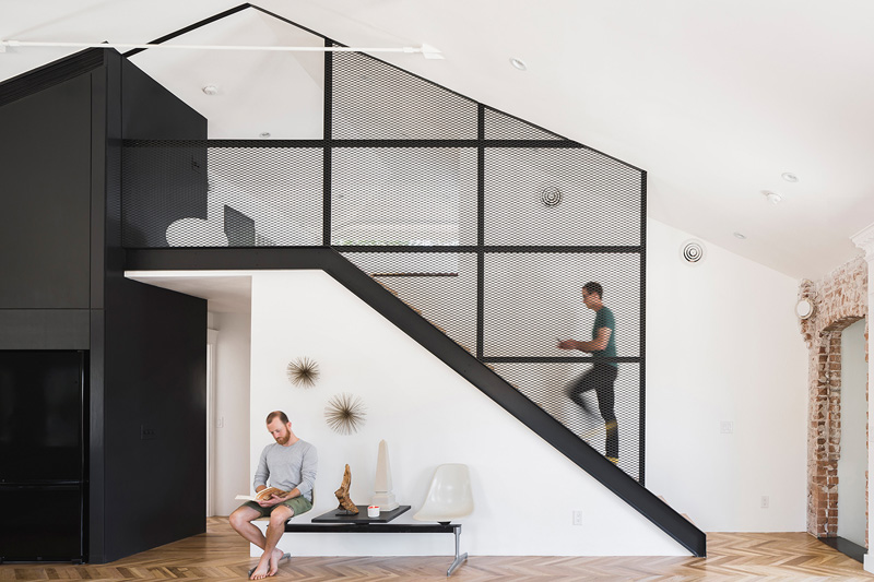
This staircase is one interesting feature of the house with black railings that is covered with a screen.
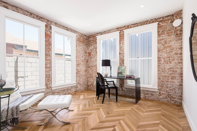
Love the pattern on the floor as it complements with the walls.
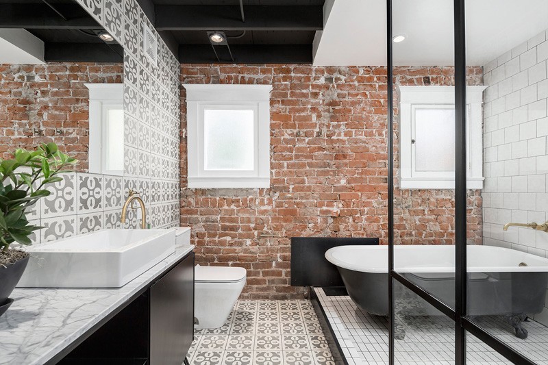
The bathroom used different patterns for the walls and flooring too while the brick walls is still visible here. But that didn’t hinder in making a sophisticated bathroom space.
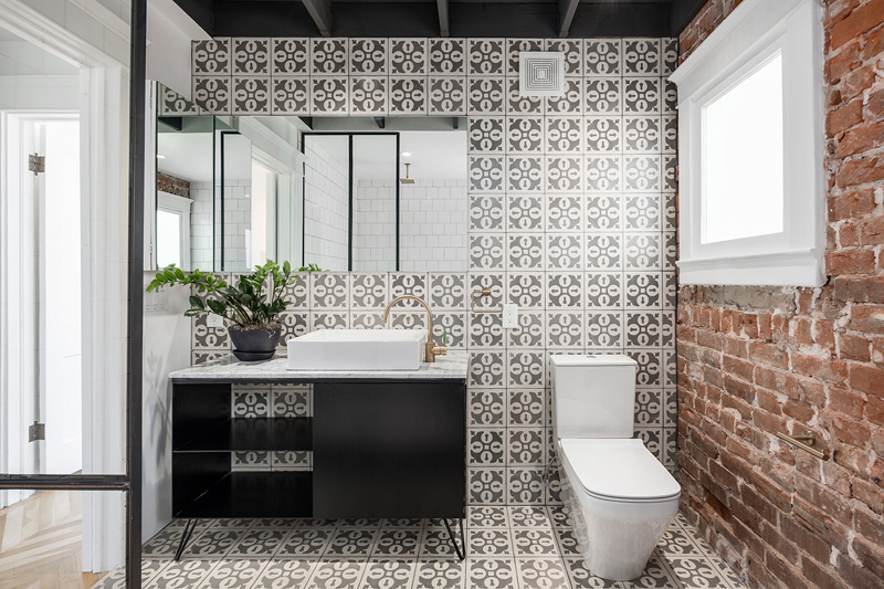
The bathroom has these floral tiles on the wall in black and white which is the color palette of the interior.
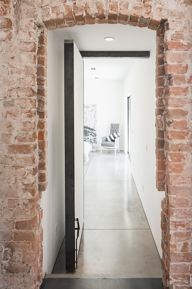
Upon entry of the house, it would pass through this brick wall that surrounds the door.
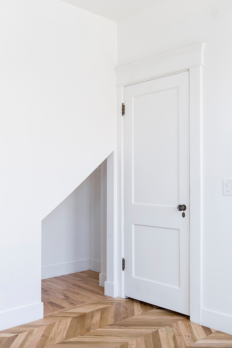
This space looks intriguing to me as a small opening is seen near the door. It actually looks like a play area but I am not sure though.
Isn’t this a beautiful apartment? It sure is! I love the mix of brick wood and other materials in the interior. Even the choice of furniture and decorations are just so stunning that we would wish this space is ours! The project is a collaboration between Amy Beaumont of Knob Modern Design and Contramark.com – Joel Contreras of ContraMark Design. No doubt, their collaboration resulted into a breathtaking space that is both comfortable and functional. Aside from the aesthetics, the space is practical too. What can you say about this modern dwelling?