There are homes that are still structurally stable and only needs an update in the interior. That is why we have seen so many interior remodels and renovations already. We have featured interiors of various homes and I am certain that you were all impressed of how the homes look like. But aside from that, you also realized that no matter how a space looks, it can be enhanced and updated as long as you do it with the right design. When we say right design, we are not just talking about the look or aesthetics but also its function and usage.
Today, we are going to show you a home with an updated interior. Interior designer Victoria Benatar did the design the home with a pre-war character Pied-à-terre on the Upper West Side in New York City. If you want to know, “pied-à-terre” is a French term that means “foot on the ground” and refers to a small home space located in the city. Well, with that definition, we can tell that this interior that we will feature today is either an apartment, flat, or condominium. Whatever it is, we can surely appreciate how much change the space undergoes through the images that we will share below. We have the before and after photos of the interior so that you can see the changes and for sure, you will notice how beautiful it turned out! Scroll down and take a look!
Location: Upper West Side in New York City
Designer: Victoria Benatar
Style: Modern
Type of Space: Small Living Unit
Unique feature: A before and after showcase of the interior of a small living unit in New York City which was built during the pre-war period.
Similar House: Impressive Design of the Concrete House in Melbourne

As you can see, you will no longer recognize the space because of what the designer did to it. With the looks of it, I can tell that the window was frame was painted white too. It is a good idea to cover the areas around the window with shelves and storage spaces.
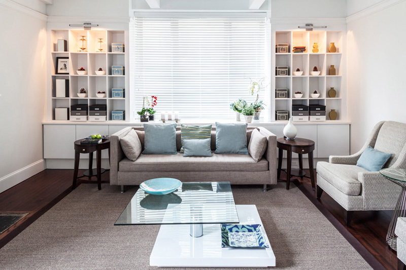
The living room has a beautiful design with built-in shelving on either side of the window. It has plenty of storage cabinets below the shelves. I love the way the arrange the boxes and jars and other decors in it.
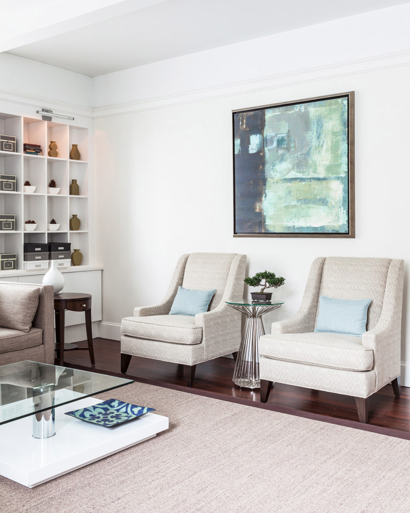
One side of the living room with twin chairs is seen in this photo. Take a look at the tall table in between them, isn’t it nice? You can also take a glimpse of the glass center table here.
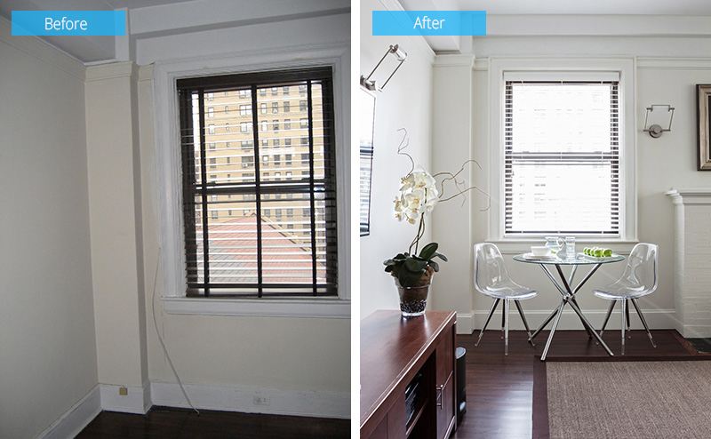
White wooden blinds are used for the windows in the interior. All of the original molding was kept to retain some historical appeal in the space. The blinds keep the overall look of the room bright especially that the walls are white too.
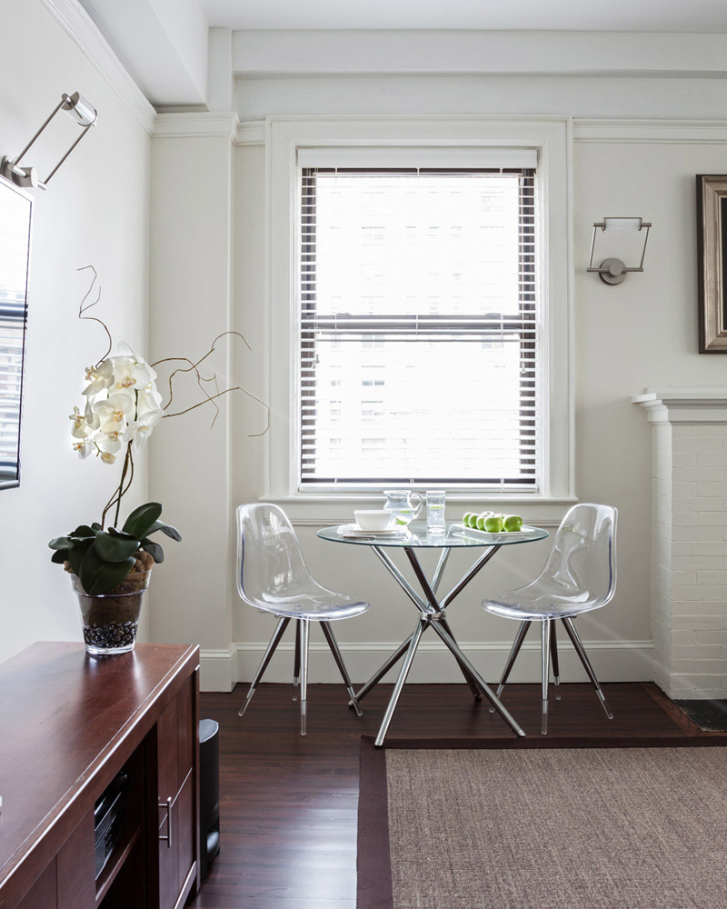
Just near the window is a small dining area that has a round glass tabletop. It has transparent chairs that match with the glass table. This also adds brightness to the interior too.
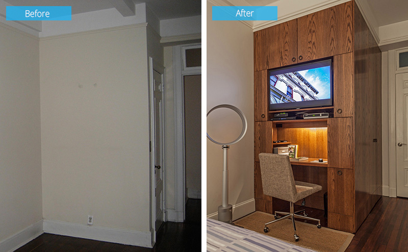
In the bedroom, it has an inefficient closet that was once dull and useless. It was transformed to a small work area that provides extra storage above. Good idea, right?
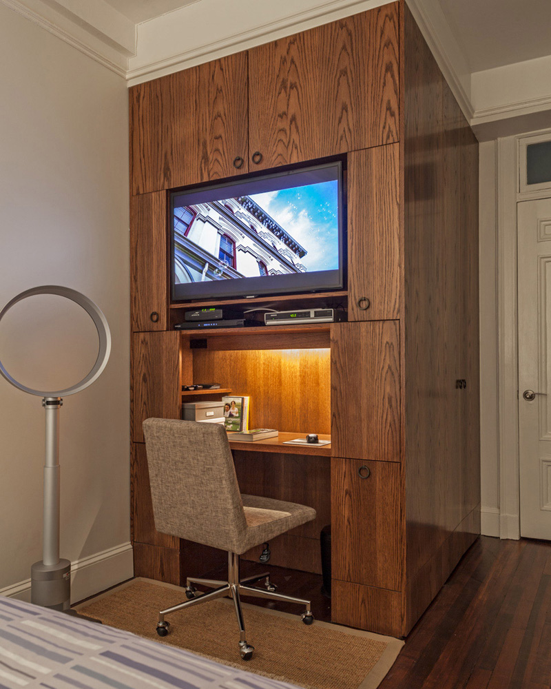
A closer look at the small working area that includes a TV. It also has a space to store a router/printer and filing drawers. This is indeed a good idea to make use of a space not just in the bedroom but even on other areas of the house as well.
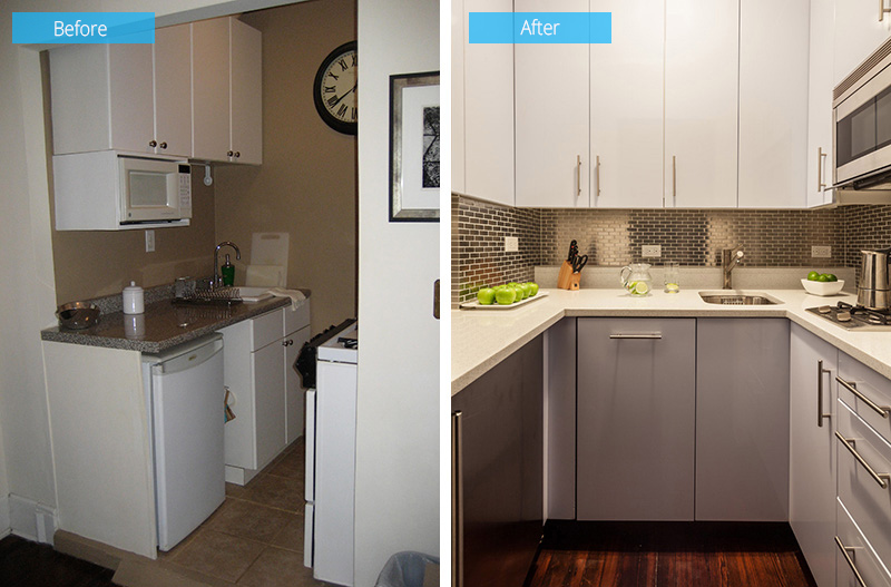
This is the small kitchen which is big enough for one person. The designer re-arranged the layout to make it possible to fit everything one needs in the kitchen. What I like here is the shimmering backsplash as well as the paneled cabinets that add more neatness to the area.
Read Also: Easy-Cut Volumetric and Naturalistic New Concrete House
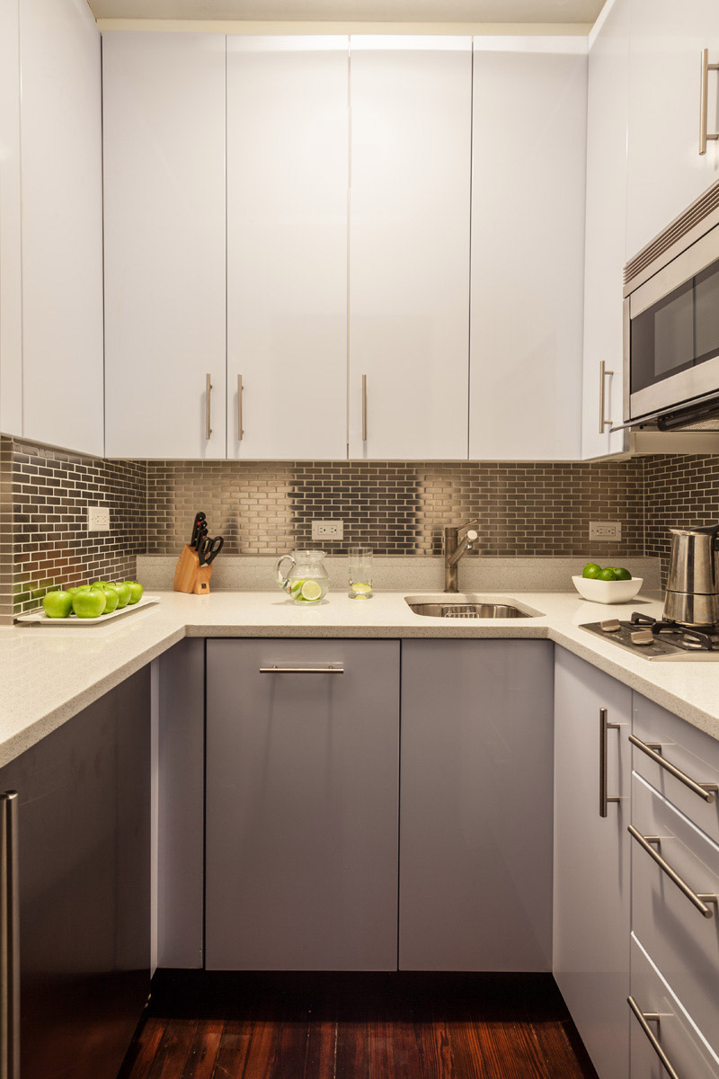
The tiny kitchen includes an under-the-counter 24″ refrigerator, a small sink, dishwasher, a two burner cook top, a 30″ microwave/convection oven, and storage for all the kitchen essentials. I really like that backsplash!
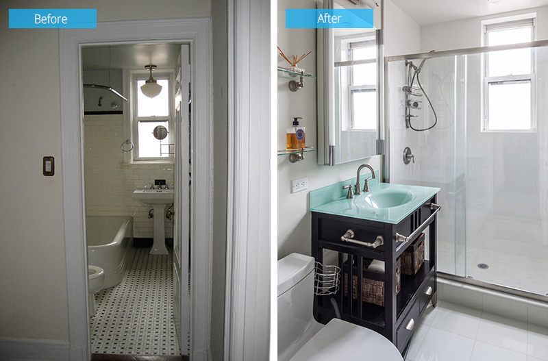
This before and after photo shows the bathroom that was completely re-designed and re-configured. The floor is replaced and a full height shower was installed instead of the tub. The vanity and toilet was moved and they had a better vanity now. Very pretty vanity they have here!
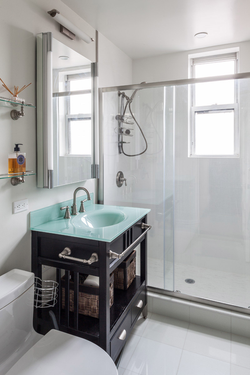
The shower screen is clear and the walls and floor are white. All this as well as the mirror could add brightness to the entire bathroom. That vanity is indeed cute with storage baskets in it! Gorgeous!
There is indeed an obvious change in the interior that we just showcased. You can even appreciate such change even more because you have seen the before and after photos. This shows us that no matter how dull or ugly an existing space is, we can always update that or remodel that into something even better with the right idea and the right design, just like this home that Victoria Benatar did. Were you impressed? Let us know through the comment section below.