Today, we will be able to take a short tour to a modern apartment that has a pale color palette in the interior. We have seen apartments that played with color combinations or those that stick with a certain color scheme or those that settled for neutral hues or even black and white. But this apartment interior that you will see today has pale colors in it giving it a soothing aura.
We are referring to Apartment D which is a residential project completed by Ippolito Fleitz Group located in Stuttgart, Germany. The way we look at it, its highlights are its beams and columns as well as its pale color palette that adds to its sense of space. The floor plan of this space shapes a drawn-out rectangle. It is comprised of a living room area including an open space kitchen unit wherein secondary rooms array in a U around it. Beams and columns has some curves in it which are accentuated by lit gaps.
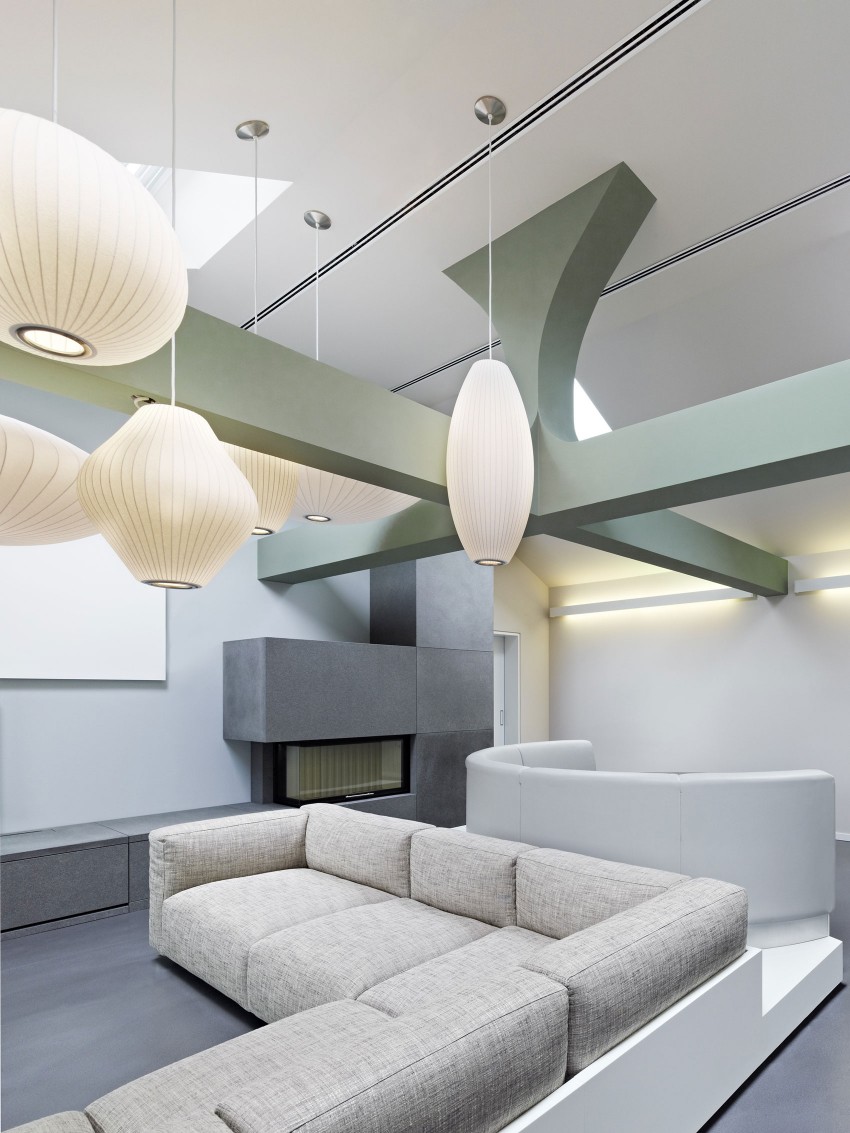
A generous living room deserves comfy furniture in it. It would look good even with different shapes.
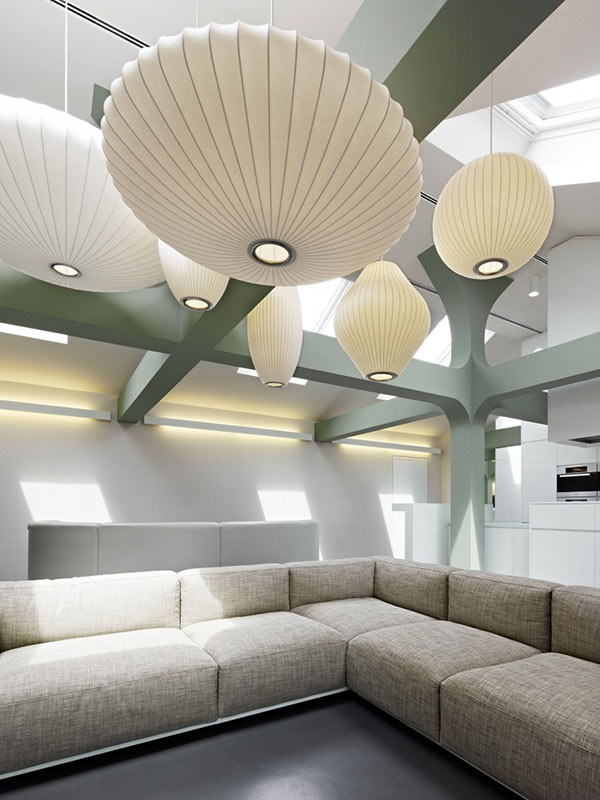
Of course, it has to be well-lighted too but instead of the usual lights we use at home, this one used Japanese lanterns or maybe it just looked like one.
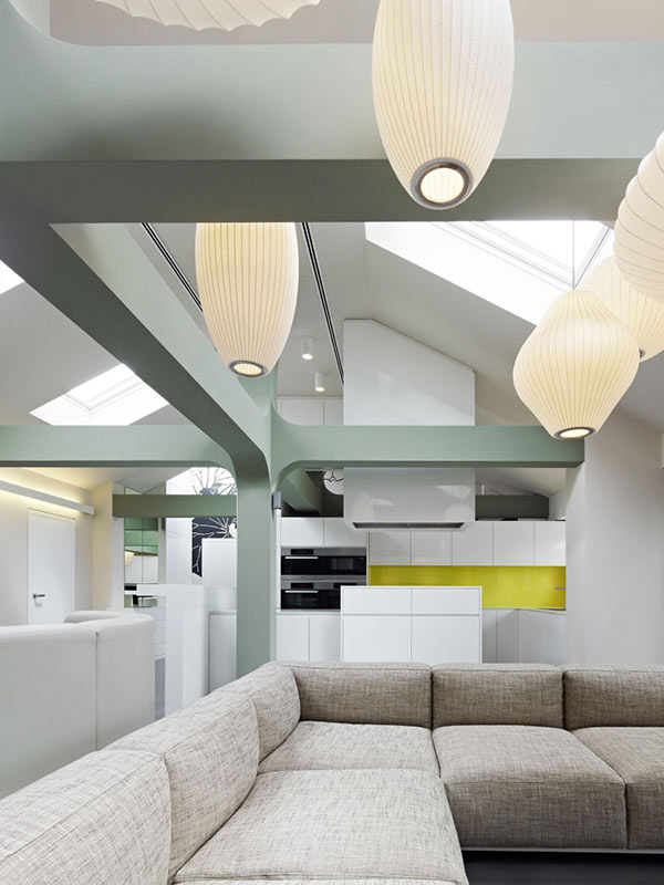
All throughout the house, you can see its pale color palette except for that yellow area for the kitchen and that graphic wall.
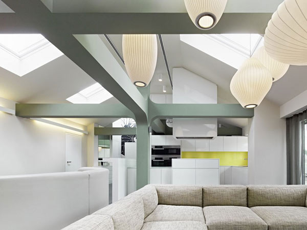
What we can clearly see here are the beams and columns which are relevant features of the house.
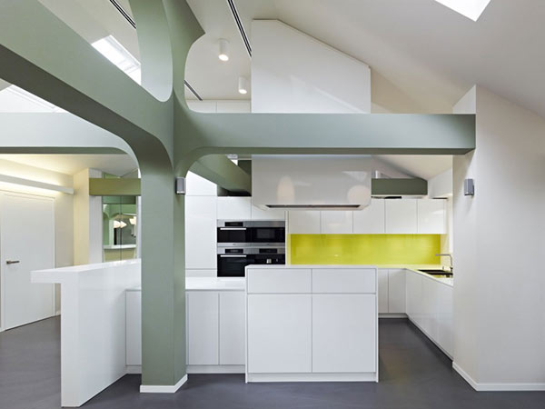
The kitchen area courageously used yellow for the backsplash despite the pale color scheme of the interior.
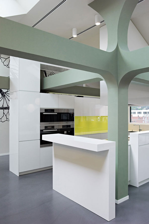
Too bad we can only see a small part of the wall art but we are sure it looks nice.
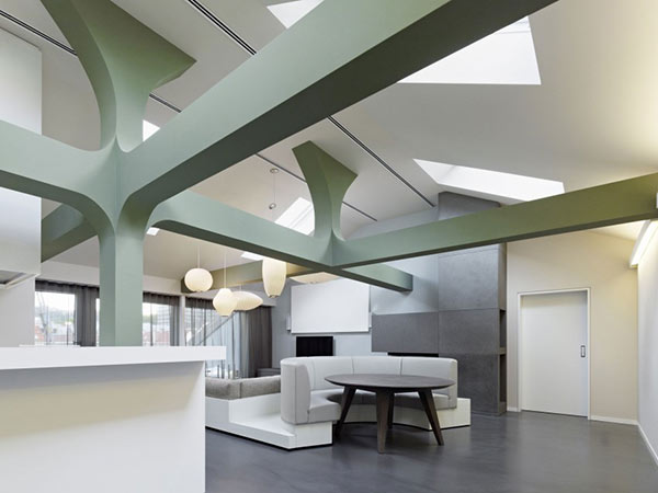
This is part of the living area where we found a round sofa. We actually think it is a dining space too.
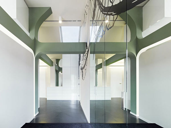
Curves of the beams and the graphic wall are seen here. Lighting floods in the area too
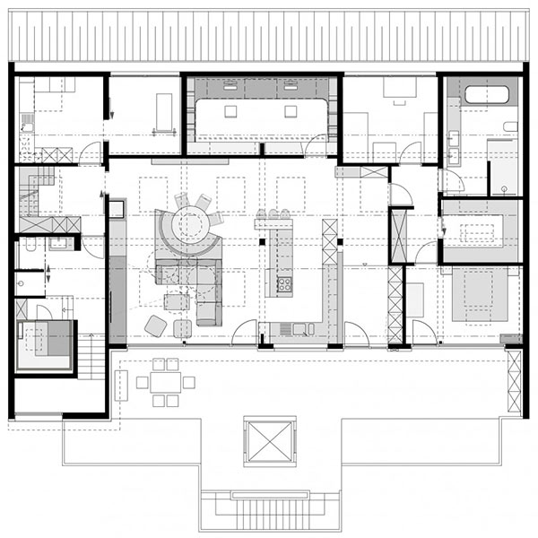
The floor plan showing us how the spaces were divided in the interior.
The Ippolito Fleitz Group did a good job in this interior where it used cladding forms that play as counterpart to the cubic nature of the furniture and equipment. We are sure you have noticed an abstract wall graphic from the above pictures which “creates an additional contrast to the reduced geometry of the installations.” The pale color palette create a calming ambience in the house.