We have showcased many dining room renovations and makeovers before. We have also featured so many dining room interior designs in different colors and styles. There were red dining rooms, modern dining rooms and a lot more. But we haven’t shown you a list of before and after photos of these makeovers. Today, you will see just that.
Seeing before and after photos of interior designs will allow us to spot the differences of the spaces. This will let us appreciate the new design even more. It is like seeing a lovely metamorphosis from a boring or empty space to a lively and gorgeous area that the homeowners are surely proud of. Aside from that, we could also get ideas on what we can do with our own dining rooms especially if it has a similar set up. Now, let us take a look at how the dining areas evolved into stunning spaces!
A Dining Room Refresh
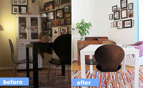
Cortney said: “Our family spends a lot of time at the dinner table. We (mainly me) were looking for a change. I really wanted to brighten the area and free up the wall space that our hutch was on. We found the new dry bar on Washington, DC Craigslist for $20! In my eyes it was a miracle, it’s in great shape and it’s the perfect size for our small space. We then painted the walls with Behr paint in cloud white. I painted the dining table with Annie Sloan Chalk Paint. The whole process took about 2 – 3 days.”
Dining Room
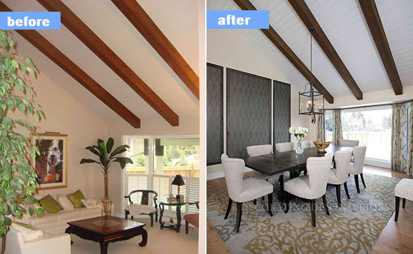
Katie ODwyer
A formal living room was re-purposed into a dining room allowing the home-owners to have a new space for entertainment.
Minnesota Residence
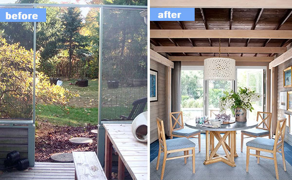
With the help of architect Larry Bowne, Drew Hodges linked the main house and garage via an enclosure that provided a dining room. The new dining room has glass doors that open into the garden. He left the clapboard intact exposing the Mondrian-like framework beneath it. The designer further defined that, “installing walls of glass doors in the dining room and den was the most expensive thing they did. The indoor-outdoor space is right in the heart of the house which almost feels like a courtyard.”
From Cookie-Cutter to Personality-Packed
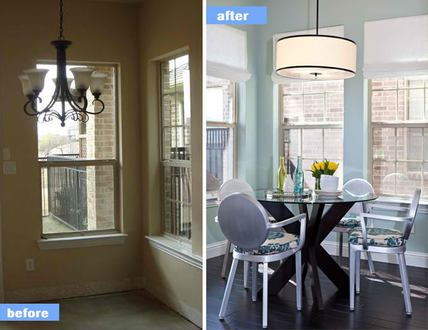
“We started by replacing the carpet with dark espresso hardwoods, swapping out the dated lighting, and bringing in a fresh color palette of black and white with pops of turquoise and yellow to liven up the space. The modern drum light fixture and simplistic white silk shades round out the space without taking over visually,” defined House Beautiful. Glass top table with metal dining chairs that were given a fresh look with seat cushions in a turquoise Ikat fabric were added to the area.
Dining Room Full of Life
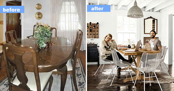
Dramatic roof beams and beadboard where revealed when the homeowners removed the structure’s dropped ceilings and drywall. Flooring is sanded pine stained with rich ebony. Aside from the midcentury Woodard chairs, a dining table crafted out of wood salvaged from a bowling lane, an oversize light that formerly illuminated a factory, we can also see the valuable contribution of the walls painted in High-Gloss White by Behr.
Before After Sherrys Dining Room
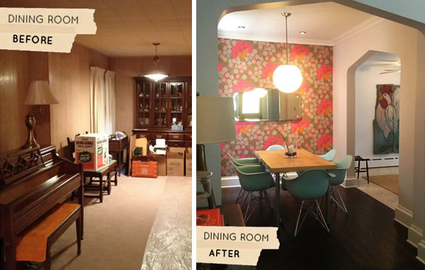
Sherry Quam Taylor| Design Sponge
Sherry Quam Taylor’s home was built in 1903. After demolishing and gutting the entire first floor, the dining room was remodeled. A new Tudor archways and crown molding, were made over their dining room from top to bottom, including new wallpaper from Osbourne & Little, dark chocolate floors and important family mementos like a vintage mirror that belonged to Sherry’s grandparents.
Outdated Dining Area Get Fresh Make Over
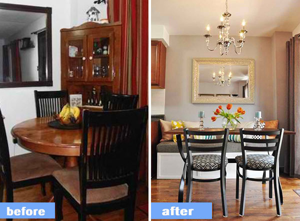
Amy | Love on Sunday
After selling the existing furniture on Craigslist, a custom banquette was added which was the perfect idea to bring more comfortable seating and extra storage space in the dining room. The rest of the pieces here were all found at local thrift stores. The solid wood table was sanded and refinished with a darker stain, the chairs were re-upholstered with a geometric fabric and a large mirror and chandelier were added to soften the space. The overall look of the house is much more functional and comfortable.
New Deco Dining Room
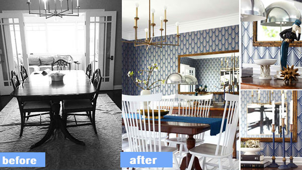
The home has a lot of architectural detail including wainscoting, crown molding, and beautiful wood floors. To add more color to the wall, the Graham & Brown’s Soprano pattern wallpaper was added. The owners wanted to keep their heirloom dining table, so traditional chairs were used to match it while bringing in a pop of white to juxtapose against the navy walls. The couple who live here (with their two children) has bold taste and big personalities, so an elegant dining room fits them while also being dramatic and graphic.
Before and After Nashville Dining Room
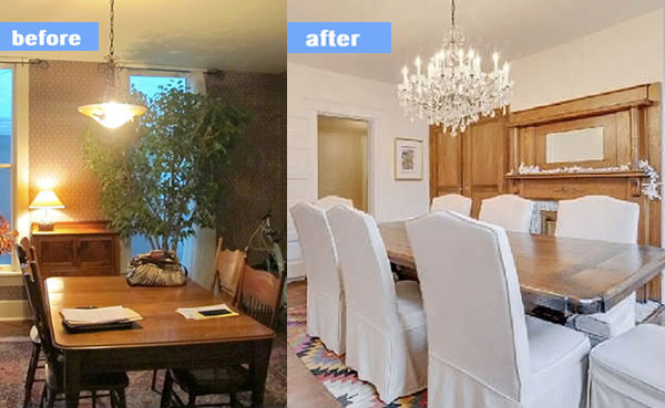
Before the makeover, the dining room was sad, gloomy and boring. The wallpaper was scrapped, added several coats of paint, and brought in some new furniture. The result is indeed lovely!
Dining Room Refined Rustic
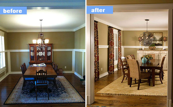
Tracy Pulsipher and Keely Woodford
These homeowners requested dining room furniture with a comfortable refined-rustic look that is relaxed enough for the children to sit and do homework, but beautiful enough to entertain. And that is how the dining room turned out to be.
A Distinctive Dining Room Transformation
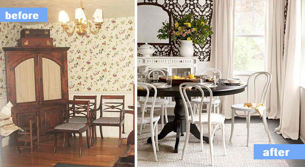
The dark wood in the dining room couldn’t enhance the space so a new color scheme was added. Now, it looks more open and bright. It was balanced with lots of white colors for a brighter look. The old wallpaper and dated light fixture are the worst offenders in the previous space which was improved in the new dining room design.
Dining Room Makeover
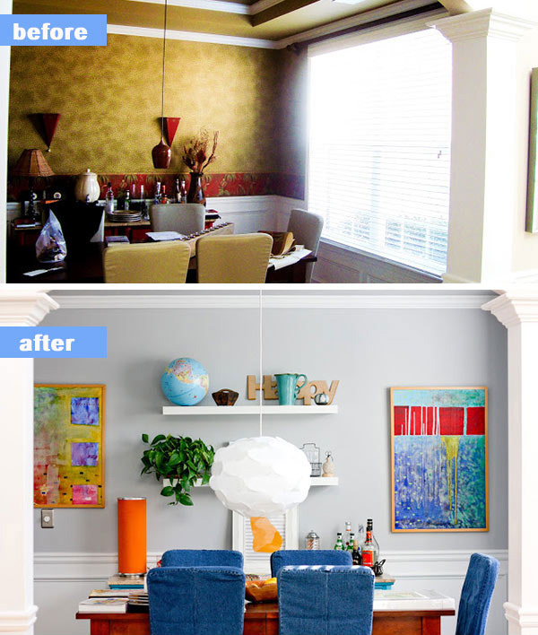
Looking at the new dining room, we will really not expect that the previous space looks like that. It has more life now with more colors in it especially from the abstract paintings on the wall. The chair covering was changed to denim and a lovely Ikea pendant light made a huge difference to the look of the area.
Emma’s Dining Room
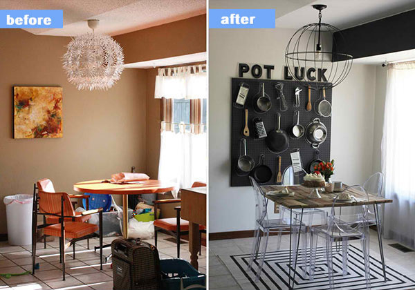
This small dining area looked a lot better when it was designed in black and white. The clutter was removed too which were total distractions to the space. Adding a natural square table and transparent dining chairs look totally nice on top of the square area rug. We love the new look!
Before and After: The Dining Room
Old House New Tricks
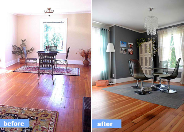
From a boring dining room, it was turned into a stunning modern dining area. The glass round table and transparent chair add a charming appeal to the entire space. Who would think that a small dining area like this can actually turn into a gorgeous space?
Bonnie’s Casual Lakeside Dining Room
Bonnie | Teal and Lime
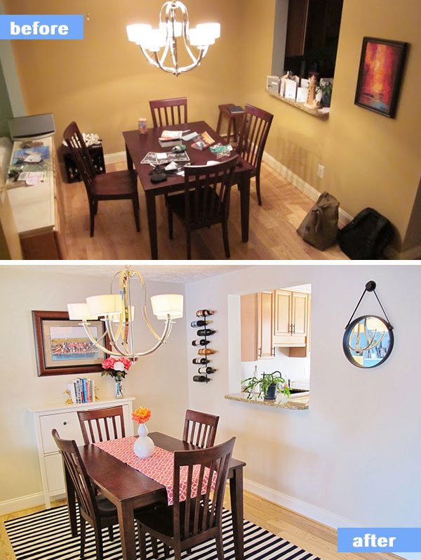
Bonnie’s dining room looked dull and needed a makeover. She created a mood board first then shopped for her needed items. The result is very beautiful! You cannot see in this picture the twin lamps that topped the built-in to mimic a sofa table. The table runner is reversible which is one feature of the dining room Bonnie is happy about. But of course, she is proud of how her dining room turned out to be!
Amazing, right? The spaces really improved a lot! This shows us that with creativity, any boring spot can be a lively place to dine in and bond with the family. But remember that there is no such thing as the “right” stuffs to place in your dining area because it always depends on your taste, motif, style and budget too. If you are planning for a makeover, go out and check the market for available decors and furniture so you can plan your design well.