A house sits within a long and narrow plot located in a wooded urban area. The design of the house is long and narrow too and it is almost like a tube. The Rogers’ House which is named this way since it is owned by Richard Roger provides maximum privacy with two separate elements that faces to a courtyard garden. These are comprised of a flat and a pottery studio in two separate houses.
The house is defined by Rogers as “a transparent tube with solid boundary walls”. We can see its tube-like feature even in the interior. Steel structure is used in the house with eight welded clear-span rigid portals fabricated in standard steel section. Its walls are composite panels of plastic-coated aluminum inner skins with foam plastic core and neoprene jointing system. The interior is rich in colors and looks really cozy despite the long and narrow design. Enjoy a virtual tour of this house in London, England.
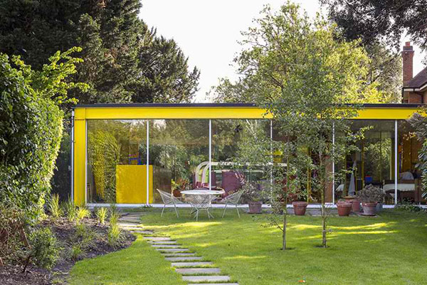
Painting the structure with yellow seems to frame the facade and draw the eyes to what we can see through the glass.
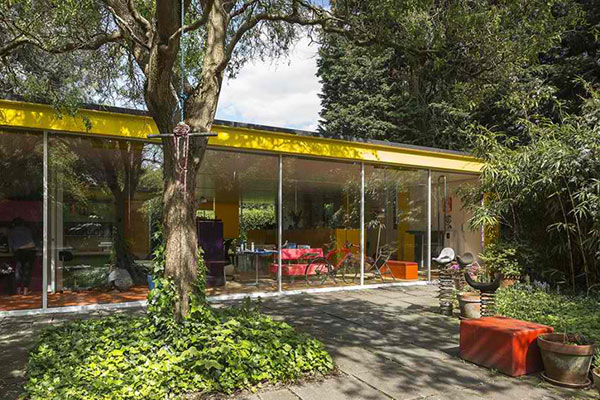
With tall glass windows, the courtyard is clearly seen from inside which sure is a good view.
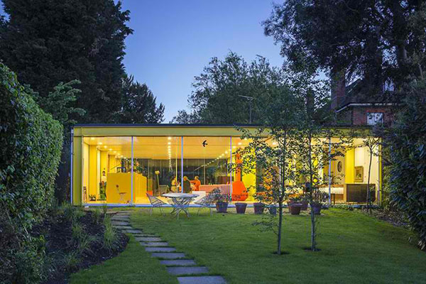
The house even looks more transparent when the lights are on especially that the walls are also yellow inside.
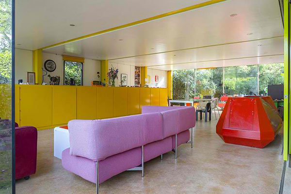
What a colorful interior! You can see pops of various colors in this living area.
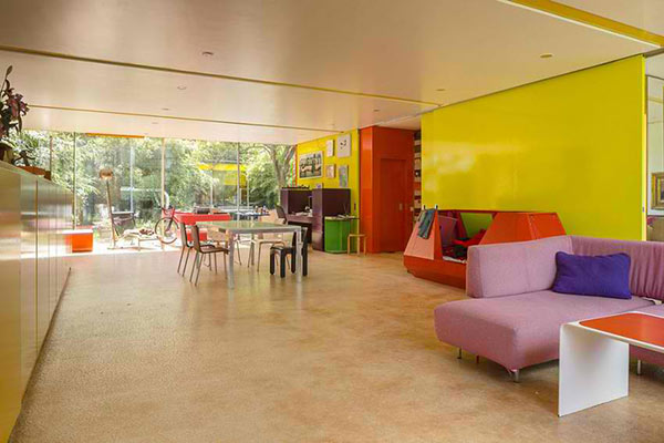
If we didn’t know that it is a house, we might think this is a place for children because of the play of colors.
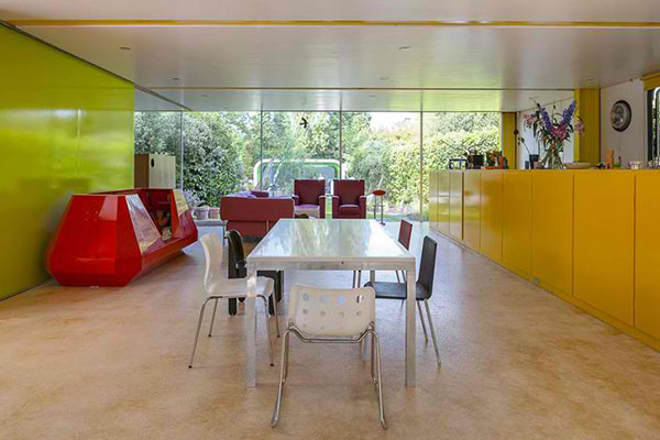
But the colors in it actually creates a lively yet cozy environment inside the house.
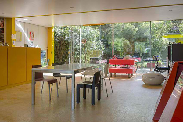
Chairs of different types and styles are used for the dining area.
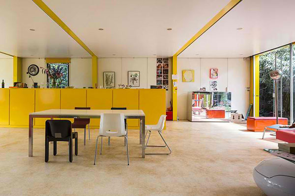
The kitchen has that yellow island which serves as a pretty backdrop for the dining area.
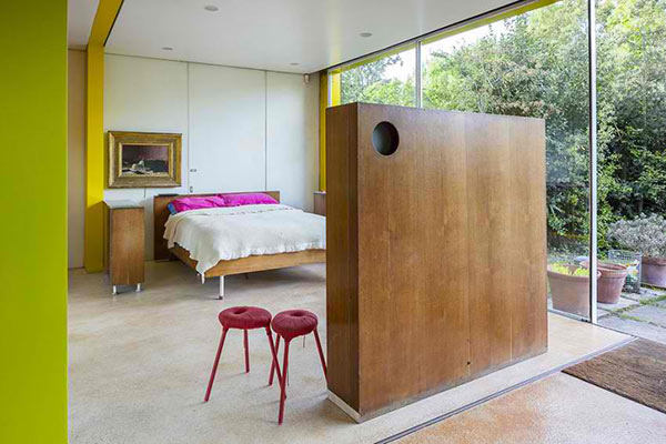
The bedroom has the same sense of transparency and has varying pops of colors too.
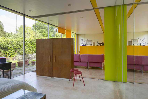
Different furniture were combined inside the house but maintained a modern feel.
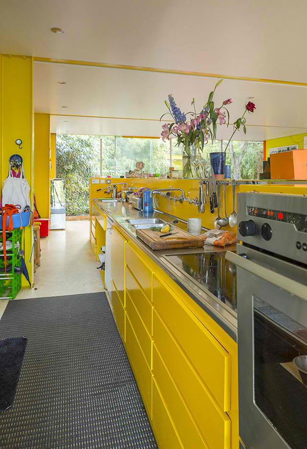
A closer look at the kitchen which seems to have just everything one needs to prepare food. You can see that this too is yellow.
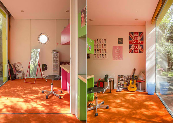
We’d guess that this is either a study area or a play area for boys and girls. Just look at those wall decors.
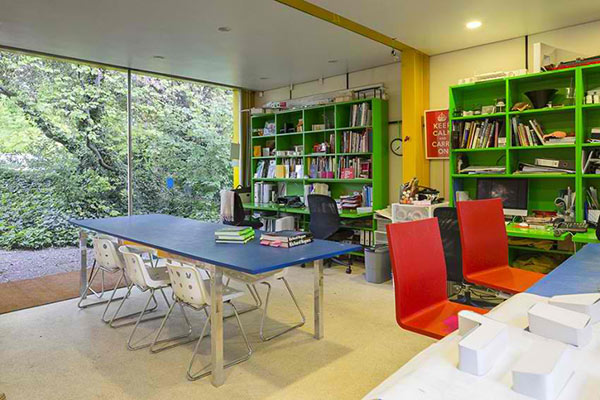
And this one is a work area and home library complete with computers and of course, books.
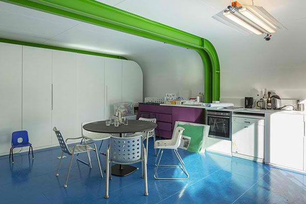
You can see this kitchen and dining area on the other house which has green and blue colors.
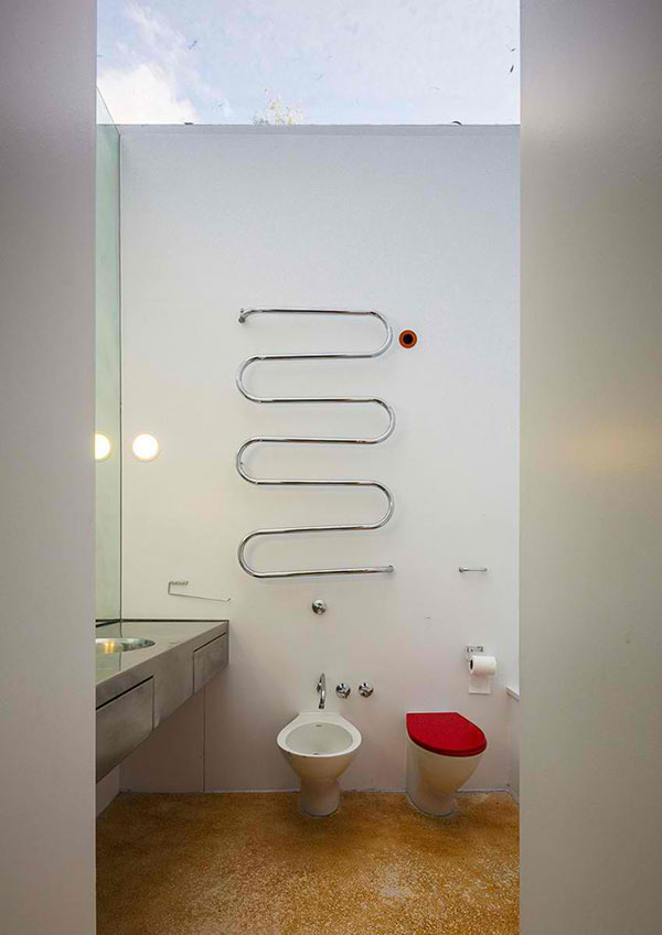
The bathroom has a minimal yet stylish design with a little red on the toilet cover.
Aside from what is mentioned above, the Rogers Stirk Harbour + Partners defined that the house has these features: “maximum sized, double-glazed, sealed units in painted steel frames have been used and glazed roofs, neoprene zipped and solar reflecting, enclose the bathrooms.” The home has that coherence from its exterior to the interior. It really looks as one even the separate house in it. It is also a good idea to have a center courtyard creating a void where the family can enjoy the outdoors.