Home renovations and updates isn’t new to us. As a matter of fact, we have seen home transformations many times already and most of them are indeed impressive. There are just homes that have boring and dull designs which needs an upgrade while there are also existing homes that are too outdated or maybe even too old that it needs some areas to be replaced. The condition of homes vary but all of them can look better and can look new with a simple upgrade. Today, we are going to show you before and after photos of a home which was built many years ago and was updated into a lovely dwelling.
A house in New Milford, Connecticut was originally built back in 1968 but it has a bland design and with its look, it appears like a warehouse or something. But everything changed when it was bought by architect Donald Billinkoff. After buying the home, the architect renovated it for himself and his wife. You will see it in the images below that one of the major changes done to the home was the replacement of the original slotted windows at the front of the house with floor-to-ceiling glass windows, making it look more modern and yes, bright in the interior. Also, the interior of the house looked very lovely as well than the previous look of the original interior. Scroll down and see how the home transformed!
Location: New Milford, Connecticut
Designer: Donald Billinkoff
Style: Modern
Number of Levels: One-storey
Unique feature: A bland and boring home was transformed into a beautiful modern home from the exterior to the interior, giving it a look that anyone would love to have in their own homes.
Similar House: Before and After Images of a Redwood Clad 1980s Home in Phoenix
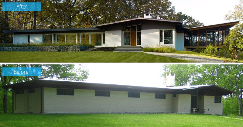
You can see the difference of the home’s architecture in this image. Before, it looks plain and boring but with the added windows, it appears nicer now especially with the extension added into it.
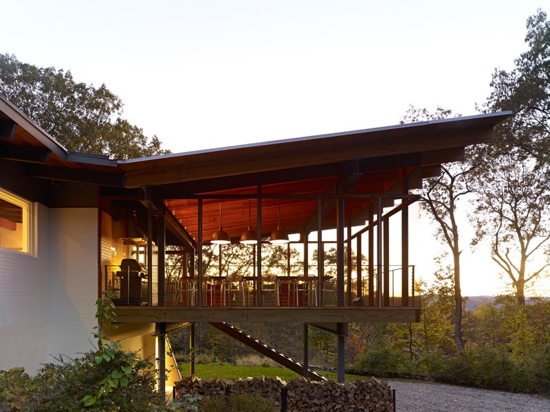
Another change to the home, is the added 600 square foot screened-in deck which is located off the dining room of the home. It looks very nice, right? I also like it that the roof is done this way making it appear like it’s about to fly!
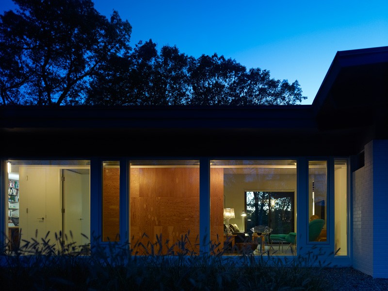
Instead of the walls that cover the house, it has floor-to-ceiling glass windows in place of the opaque walls. It sure looks better this way and brightens the interior too.
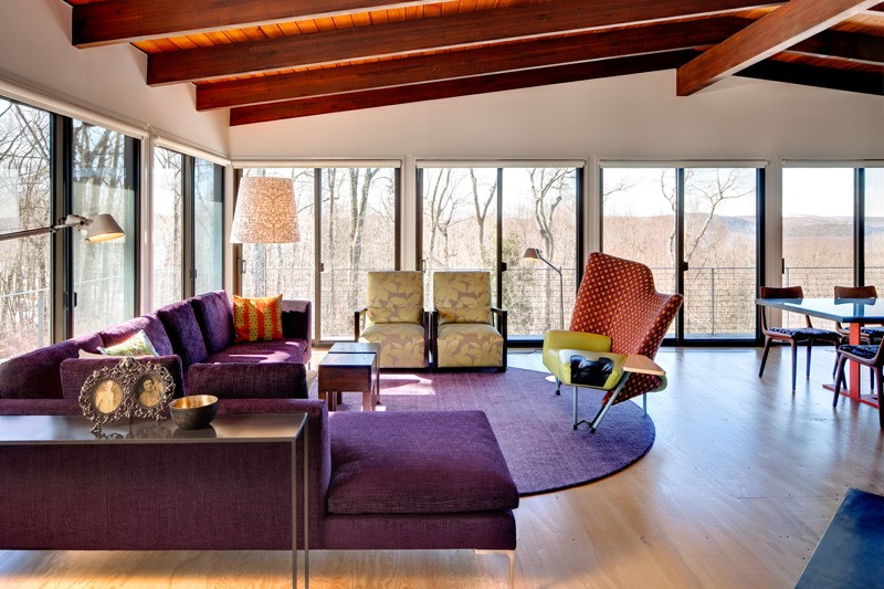
The living room has sweeping views of the area and is flooded with natural light. Don’t you like the furniture in here? I love it that they have various colors and patterns on it. I especially like that sofa with winged back.
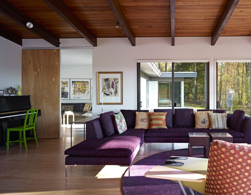
The purple sofa adds a fun and lively touch to the interior. It also has throw pillows with different prints on it but it does look good when combined together. We can say that aside from being a lover of art because of the decors on the walls, colors and patterns used in the home, the owners are also music lovers as they have their own piano.
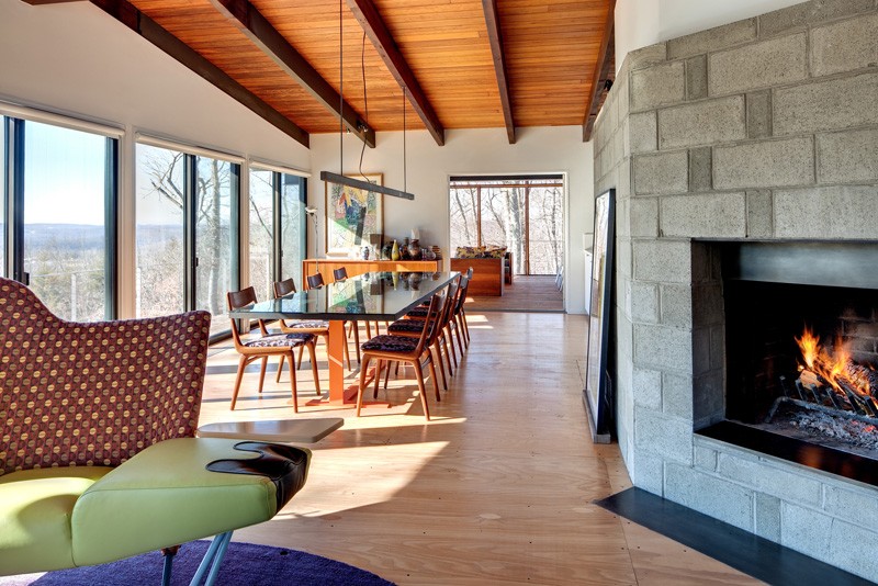
A concrete block wraps around the wall of the interior which brings a subtle industrial touch. It goes well with the wooden flooring and ceiling and as well as its wooden beams that are left exposed.

The original fireplace of the house was built to last. Its original mason embedded the tile into the concrete to form the mansard. But since it was easy to remove, the designer decided to hide the mansard behind a screen of concrete block, blackened steel and sheet rock.
Read Also: Before and After: Brightened Modern Celio Apartment in Italy
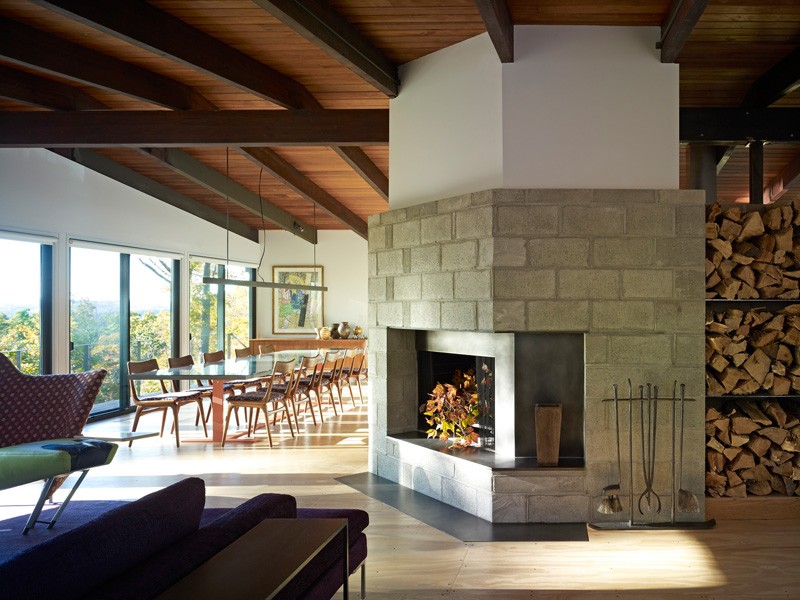
No it looks a lot better than the previous fireplace, right? On the other side of the fireplace are steel shelves that were added to allow for firewood storage. And it also seems to be an added decor to the area as well.
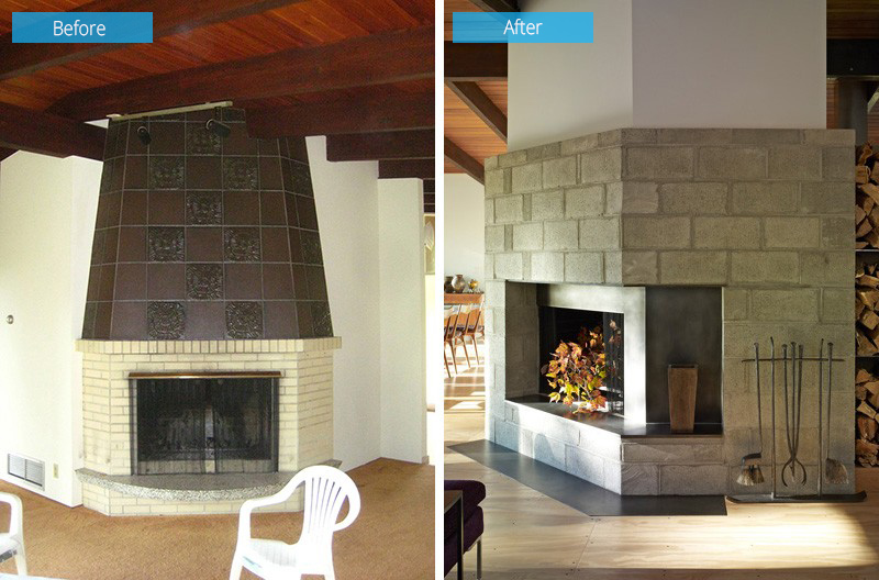
Now here is a better look at the before and after images of the fireplace. The original fireplace looks really classic but the design isn’t appealing at all. Good thing that the new owner was able to think of a way to make it look a lot better!
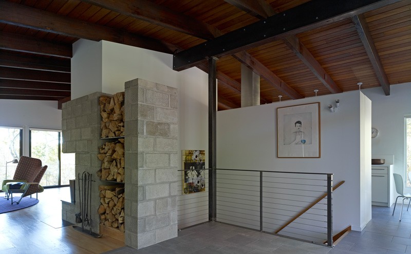
Seen here is the fire wood storage just next to the fireplace with the same concrete blocks. You can also see a stairs that lead to a lower level.
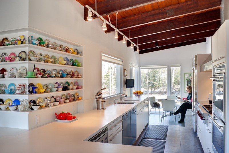
This is the kitchen of the house with custom kitchen cabinets made of pre-finished maple with plastic laminate fronts. Its countertops are made from Corian and it also has built-in shelving unit that houses a colorful tea cup and saucer collection.
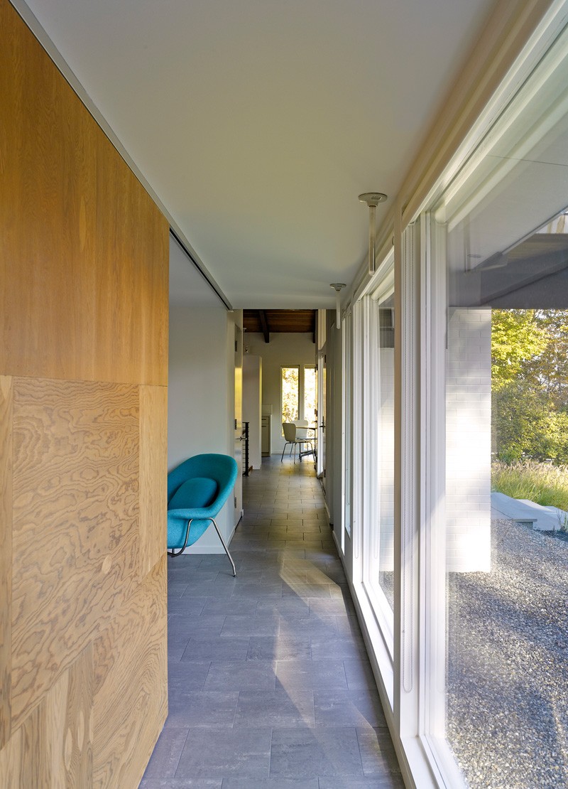
The media room can also be accessed from a hallway that leads to the bedrooms. Notice that in this area it used gray flooring and it also has floor-to-ceiling windows.
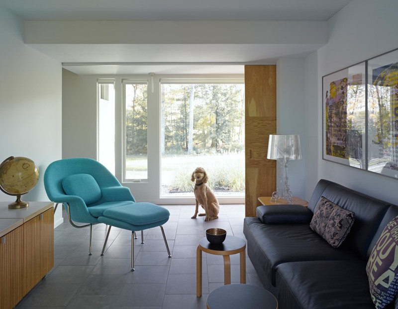
This could be the media room with a comfy sofa, a unique side table lamp and a pretty turquoise lounge chair. Say hi to that cute doggie looking at the camera! Lol!
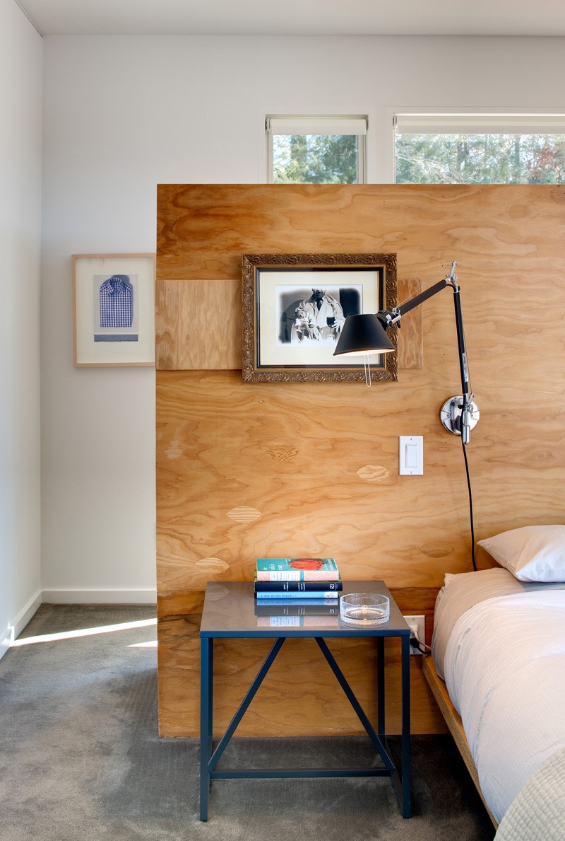
When one reaches the end of the hallway it would lead to the master bedroom, with a large centrally located wooden headboard. Look at the details of the headboard as revealed in this image. It has a wall reading lamp attached to it as well as some framed photos.
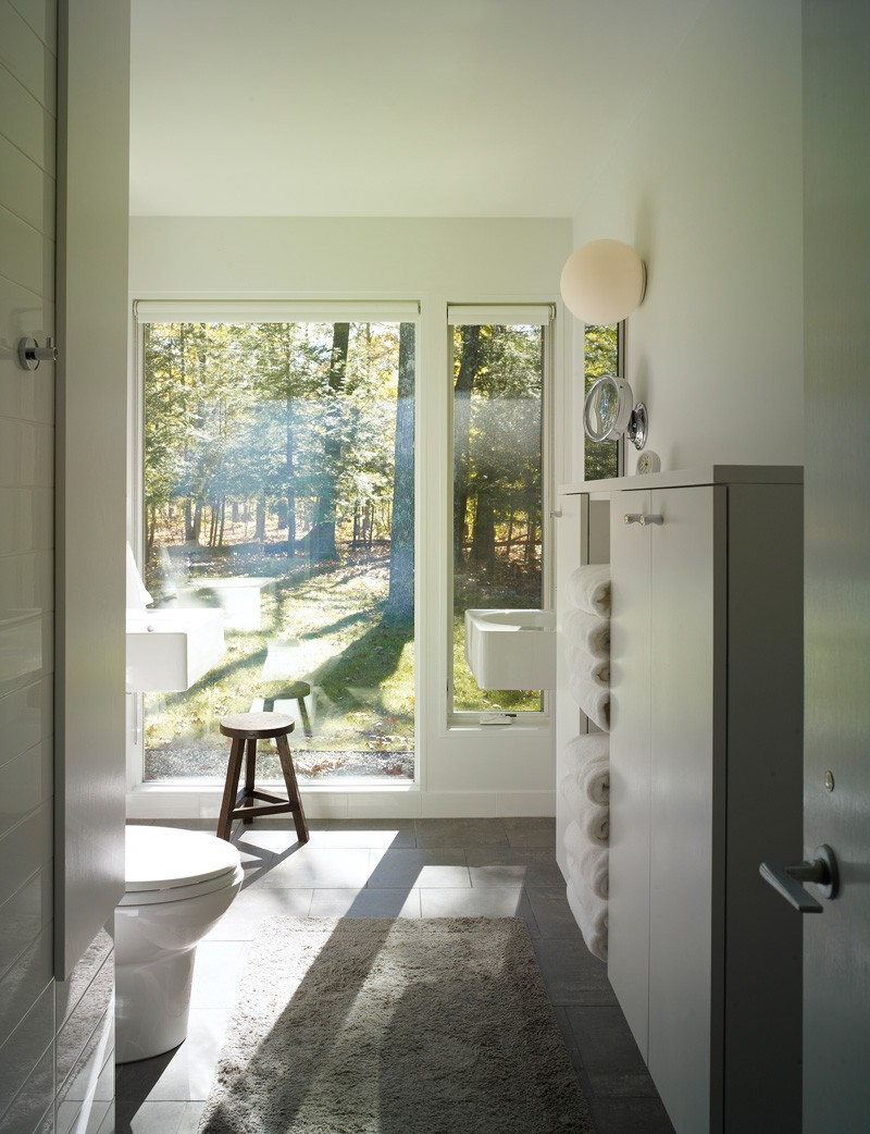
Because of the floor to ceiling windows, the master bathroom has nice views of the surrounding trees. You can also see here that it has a tall storage area for towels and other items.
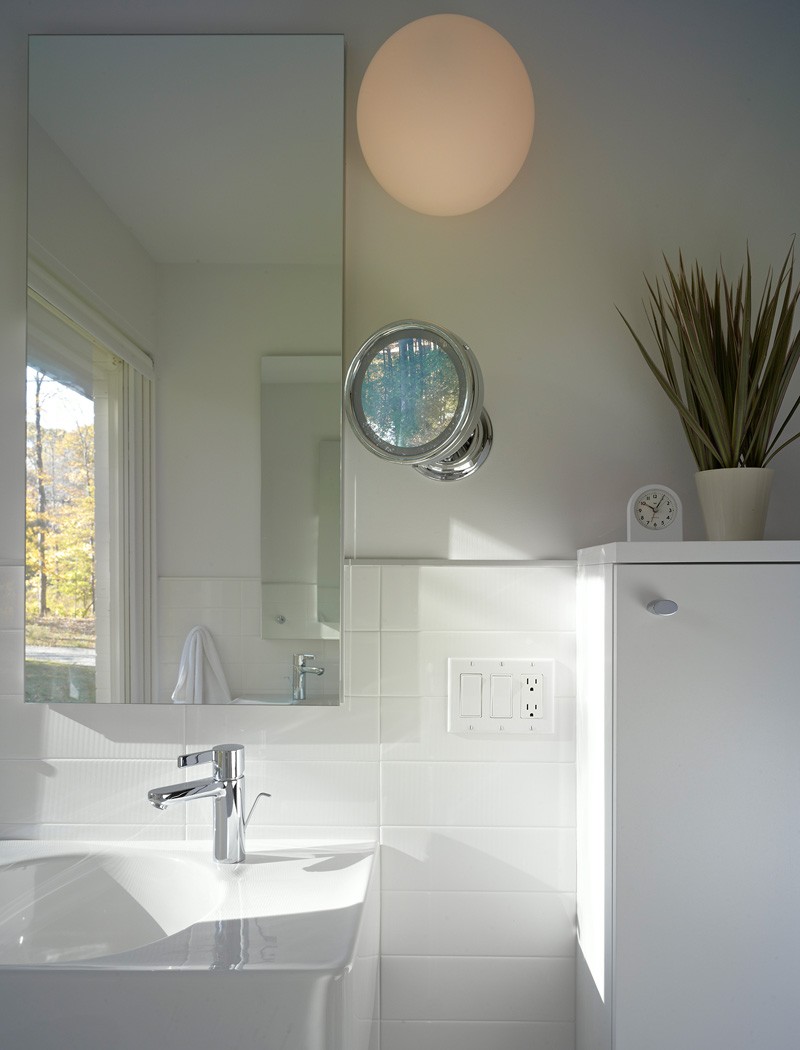
In this photo, you can see the design of the bathroom sink as well as its modern faucet. The bathroom is white in all areas and has a rectangular mirror for the vanity.
Beautiful indeed! We have seen how the exterior changed a lot. Who would expect that such boring design can actually look gorgeous? Well, owner and architect Donald Billinkoff really knew what to do and he was able to transform the house in the best possible way. Aside from the exterior, the interior also looked brighter and cozier. I also like it that he added colors in the interior as well. And my favorite part? The cantilevered wooden extension he added for the dining area! It is such a lovely place indeed. If this is my house (in my dreams), I would spend more time in that airy area to work on my laptop or read a book. How about you, can you tell me which part of the house is your favorite?