Our featured house today has a unique style which is the result of the extension, conversion and renovation of the house several times since its construction in 1951. The Haus von Arx in Binningen, Switzerland was once again renovated reducing the building to its original size and primary qualities. But you can see traces of the heterogeneous style of the home’s interior despite this renovation. Old additional elements were dismantled and needed a controlled addition to new expansions for the house.
Designer Haberstroh Schneider said that “the new volumes were clustered at the western side of the plot, touching the old building only in one place. While the old building had been freed from any disturbing elements and thus restored to its classic elegance, the new cubes present a composition of simple and plastically reduced volumes. The cubes, according to their different position, spacing and size, create fascinating passageway- and patio-situations with the old building. To the south-western side of the plot we removed the former winter garden. In its place we constructed a generous, open garden pavilion which works well as mediating element between old building, pool area and the garden.” With this definition by the architects, we could create a beautiful picture of the house in our mind. Now, let us not just imagine the house but let us take a look at the images of it below:
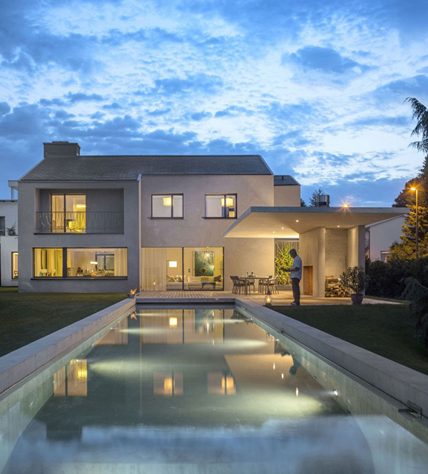
Aside from the lovely house, you can also see the pool that seems to extend its inviting appeal to anyone who gets into the house.
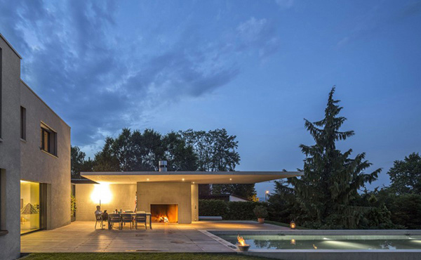
The home’s surrounding is blessed with the beauty of nature as seen from the trees and greens around it.
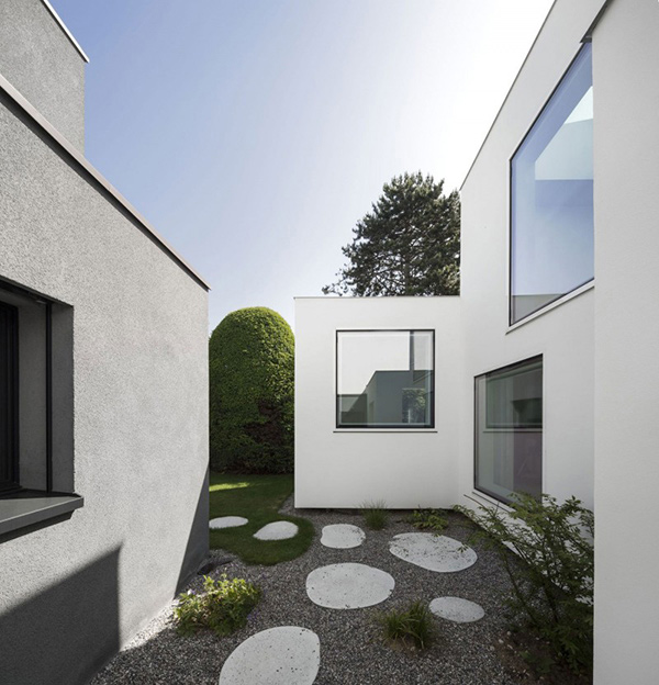
How do you find those oval concrete on the walkway? Isn’t it cute?
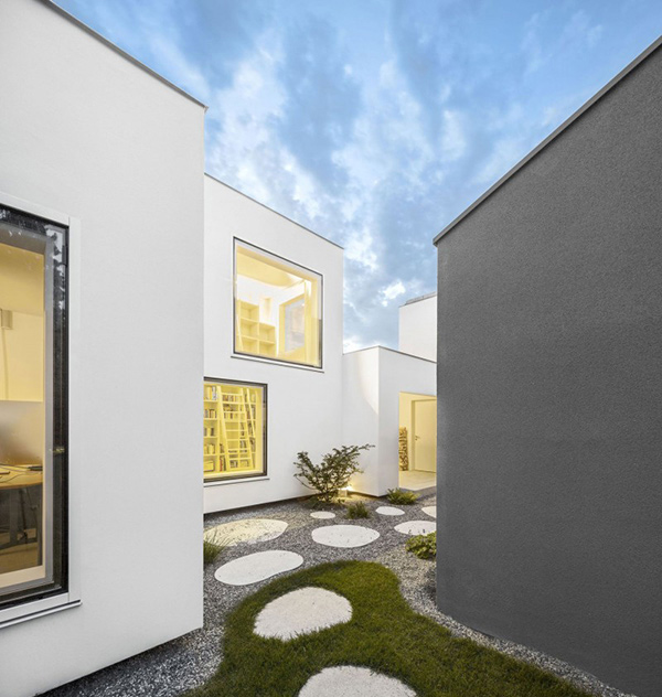
The house is surrounded by large glass windows allowing ample entry of light into it.
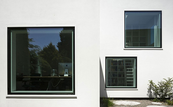
Seen here are just some of the windows that surround the house. Through it, the interior is seen from outdoors giving us a clue of the home’s hidden beauty.
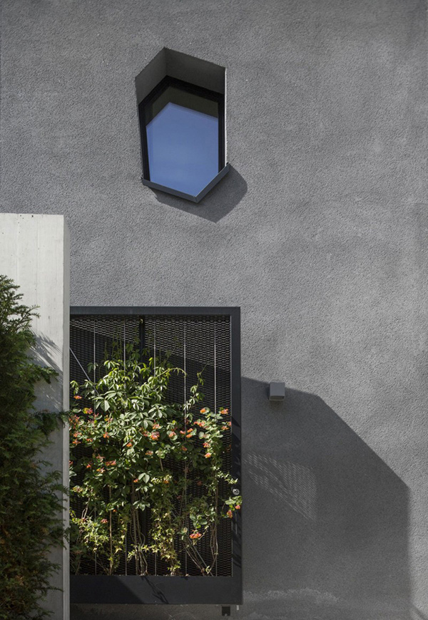
This side of the house has gray finish instead of white which we can see from other exterior walls.
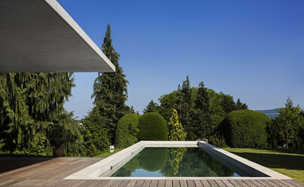
Another look at the pool area that is surrounded by wooden decking and green bushes.
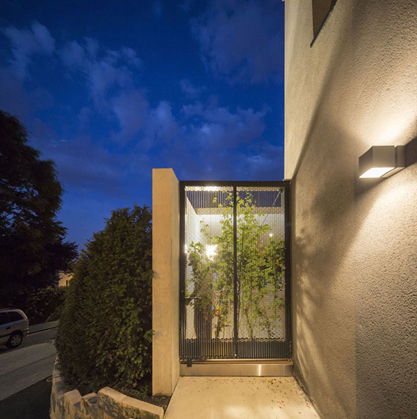
The pedestrian gate is the portal to get into the house. One will feel welcomed with its simple grill design and lighting.
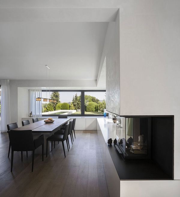
A dining room in black and white looking lovely with the glass windows on the side and black dining set.
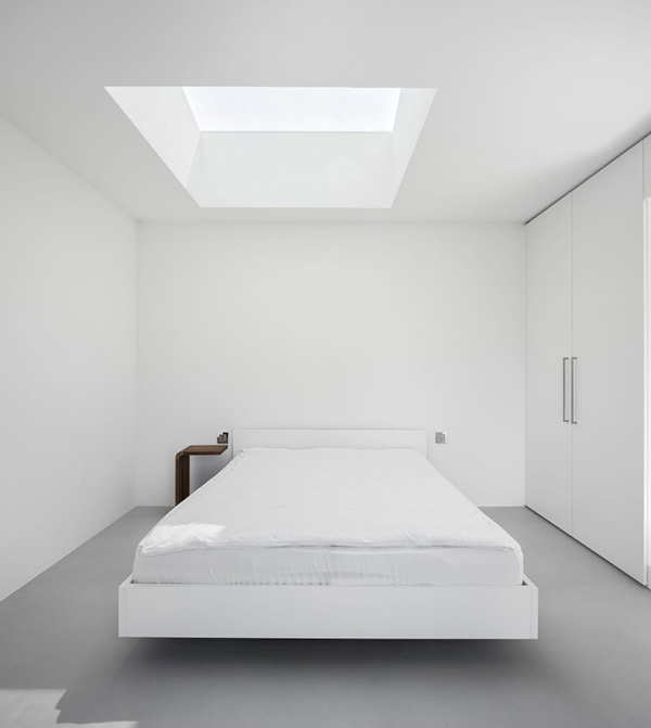
The bed seems to float in this bedroom that has gray flooring and white walls. This space has a minimalist approach.
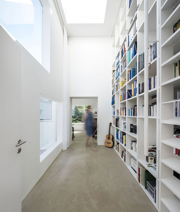
We’d guess that the homeowners are book lovers because of all these books placed in a floor to ceiling shelves.
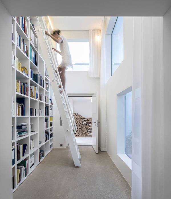
To access the books from the upper area of the library, one has to use ladders. Notice that even the ladders are white too.
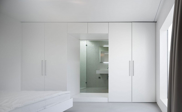
The wardrobe of this bedroom is in all white with a central mirror.
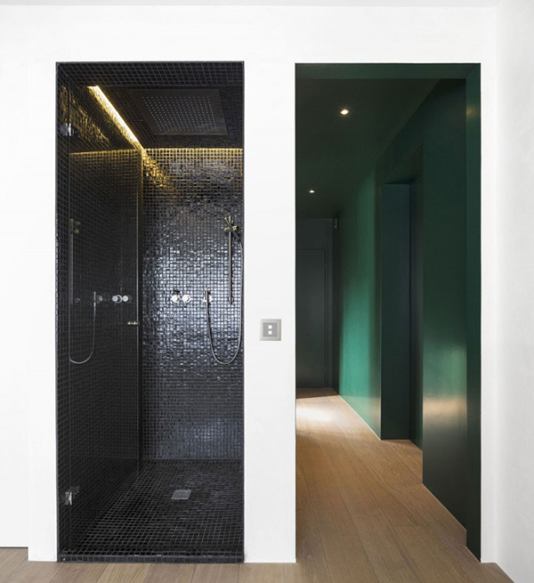
For this hallway, green was used instead of white. Seen here is a black shower area with glass door.
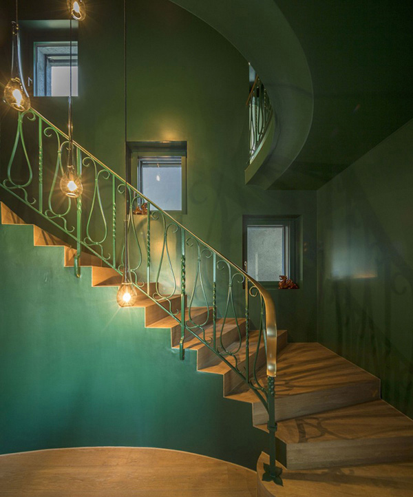
When you look at this space, you will not believe that this is one area of the house but it really sis! It adapted a classic or traditional design seen from the stair railings.
We can see that there are different styles in the interior as well as the exterior of the house. But overall, the Haberstroh Schneider – haberstrohschneider.ch, was successful in creating a house that is cozier and a better place to live in. Aside from its heterogeneous style, you can also notice that it was able to link each space successfully despite that. We have more house design inspirations to show you so be back here on Home Design Lover for some more!