Some homes still have that retro feel in them. Well, retro is cool and definitely lovely! So, why not? Some modern homes even add retro decors in their homes while not making it look old or classic. It really just depends on how you do the decoration just like a home in Vancouver that was updated while retaining its 1970s appeal. You will see that it turned out even more beautiful!
The owner of the house wanted to keep the funky vibe of the home. So, interior designer Sarah Gallop did just that. She merely added functions to the home by opening compartmentalized rooms. The original fireplace and wood paneling was preserved in the living room. The house which is located in the Delta area of Vancouver measures 2,120 square feet (197 square meters) with 4 bedrooms and 2 bathrooms. A father with his three kids aged 10-13 lives in this beautiful retro home. Come take a look at the images of the house below:
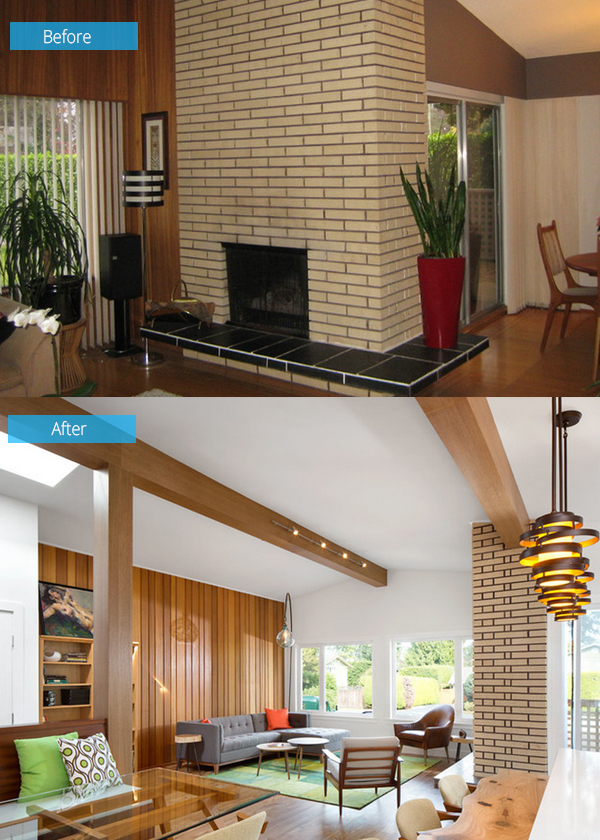
The wood paneling and a brick fireplace were see in the house. These were retained and were merely refinished for a fresher look.
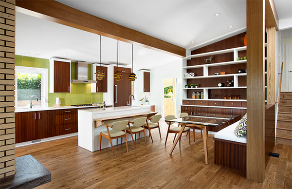
Plenty of wood mixes can be seen in the house just like this area with a floor to ceiling shelves. Pops of lime green can be seen everywhere.
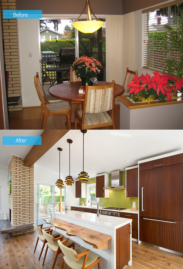
Before, there was only a small dining area that lacked connection to the other spaces. Now, new custom dark wood cabinets and lime green backsplash were added to the area.
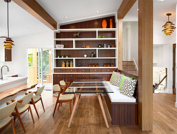
Who wouldn’t love the lime green patterned throw pillows here and yes, the furniture and lighting too!
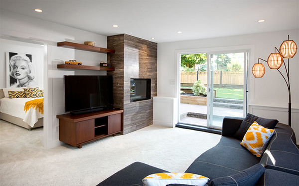
A better connection to the backyard and master bedroom was established in this lounge area. It does look very relaxing indeed!
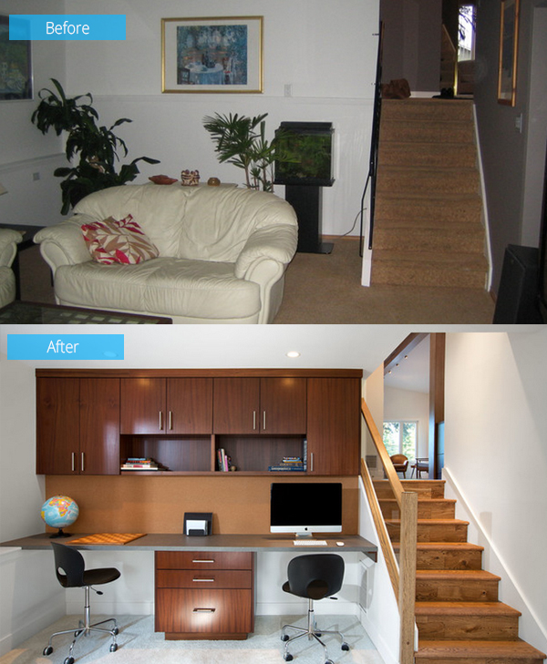
This is a dark den area which is a redundant space for the homeowner. Hence, it was turned into a home office and homework area for the kids.
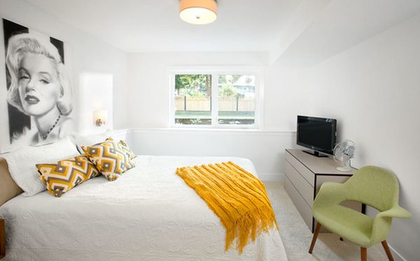
A bright and airy master suite that has some pops of retro colors. Who wouldn’t like this with a large window for natural light entry?
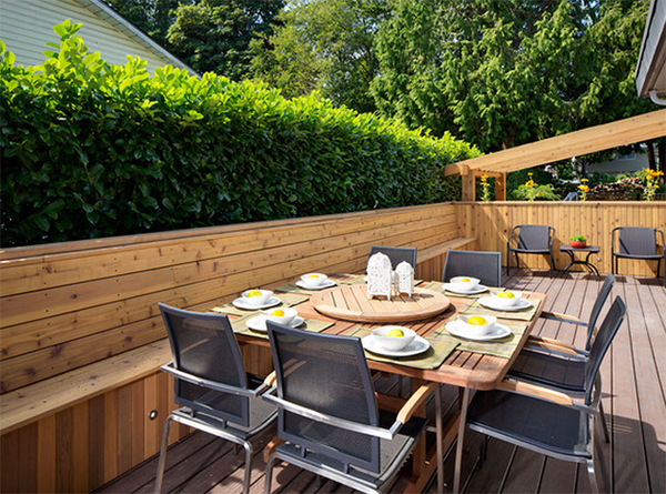
Before, this area has multi-level decks. The designer created “an expansive, multipurpose wraparound deck that goes from the front of the house” that has a dining area and outdoor sitting area.
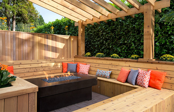
While this is a lovely sunken fire pit where they can spend some time for a relaxing experience.
Sarah Gallop Design Inc. did a great job for this interior! I like it that despite the retro feel of the home, it didn’t look too old. As a matter of fact, it looked even more beautiful with that funky vibe in it. I also like the color combination especially the splash of yellow here and there. How about you, what do you love about this home update?