When a house is designed with an organic feel, giving it the relaxing aura from nature, it becomes more than just a home. It turns into a haven of comfort where you would like to spend most of your time in. A contemporary residence named Appleton has an eco-friendly design using natural materials that softens its look. It also uses earth tones that bring in freshness to the entire home. It is also designed to maximize passive solar design and natural ventilation.
You might have seen other homes similar to this one but of course this differs in plan layout and design too. You will see that the use of wood have a great impact to the entire feel and appeal of this home in Venice, California. Even the pool area is full of vitality. Take a look at the Appleton Residence below:
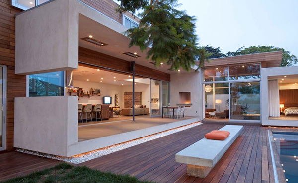
The terrace and outdoor area of the house is seen in this image. Isn’t this a view that every homeowner would like to have? You can see that it also used wood decking for the pool just like what it used in the interior.
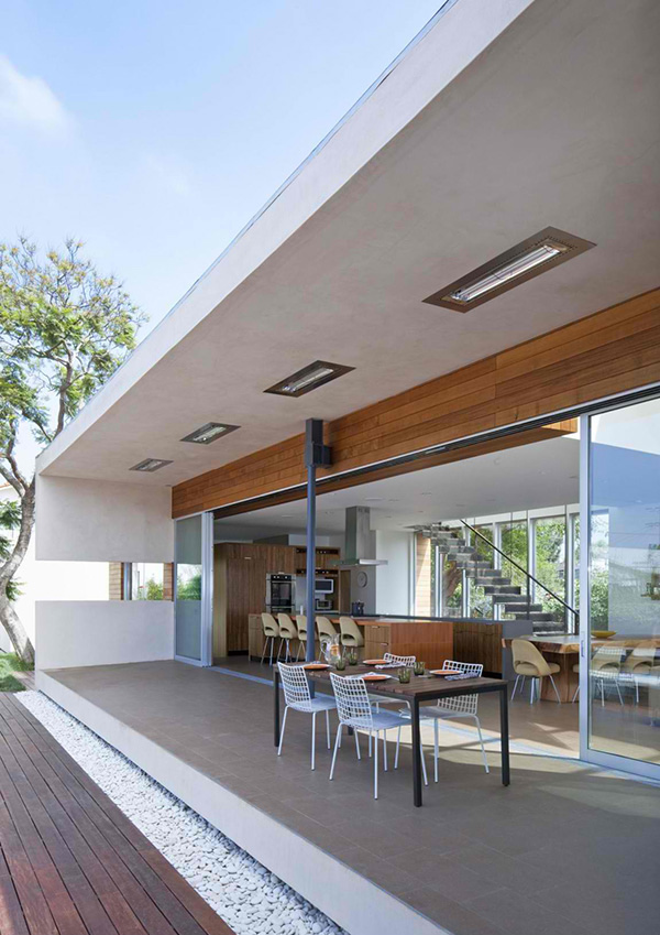
An outdoor dining area perched on tiled flooring where one can access the indoor area through a sliding glass wall.
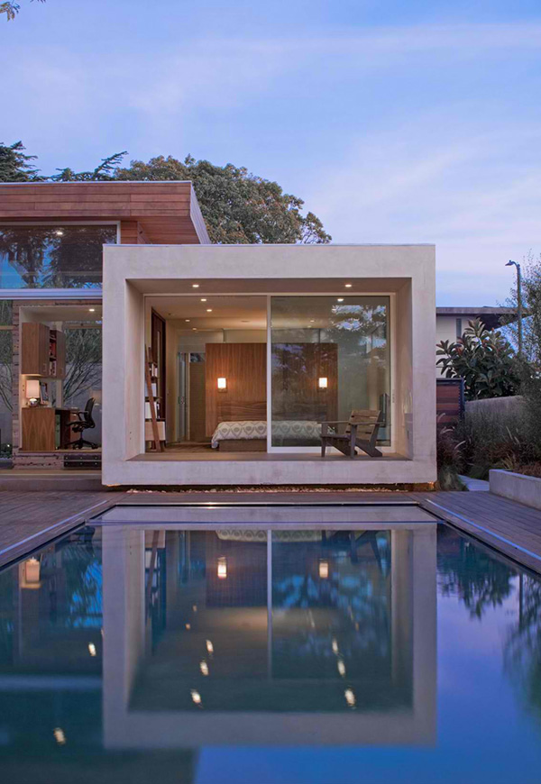
From the pool, one can see this bedroom that also have a sliding glass door but we are sure it has some black out curtains too so that they can close it when privacy is needed.
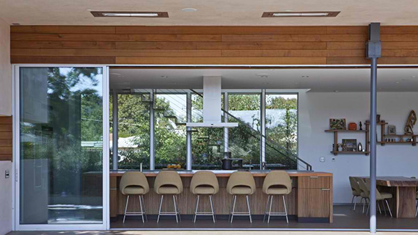
Catch the home’s beauty through its openness! Seen here is a kitchen island with counter-height chairs.
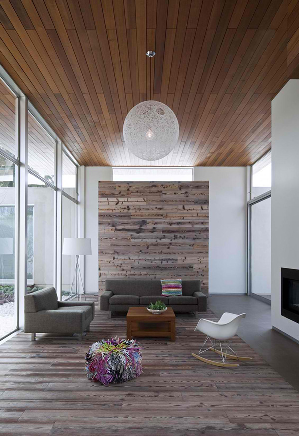
Wood for the ceiling is a good choice for material but adding wood for a wall accent is even a more creative touch for this living area.
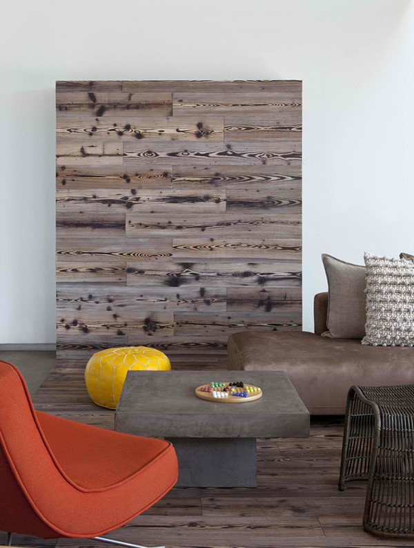
The textured wood we saw above is also used in this area which has pop of colors in it.
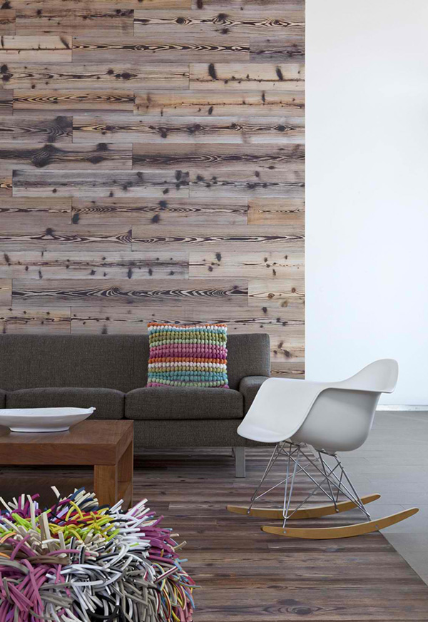
The throw pillow and ottoman has colors that add more zest to this space.
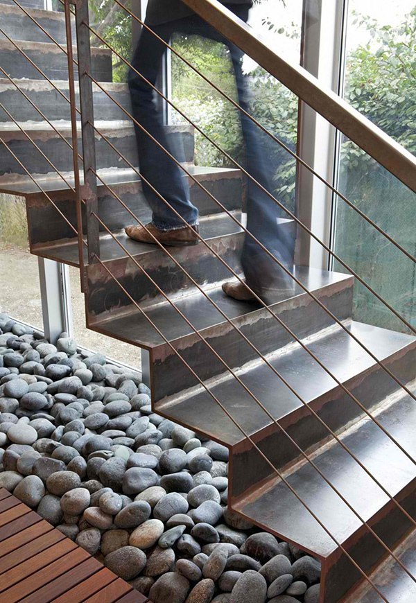
Look at the stones under the stairs, isn’t it a good way to bring nature into the home?
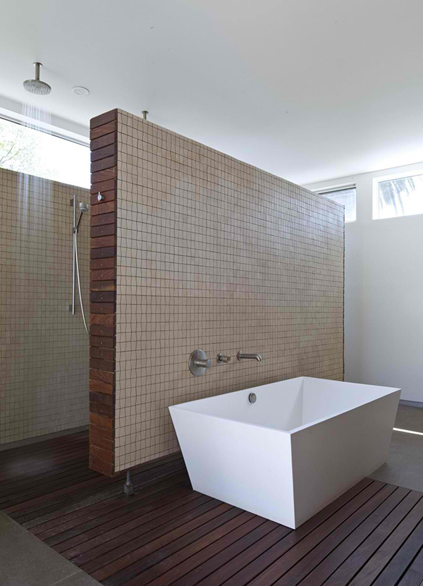
This contemporary bathroom also has a natural look with its earth tones for the wall tiles.
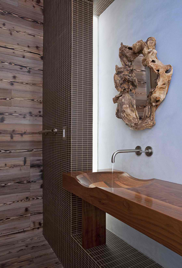
Natural decor is added in the house just like this mirror in the vanity area.
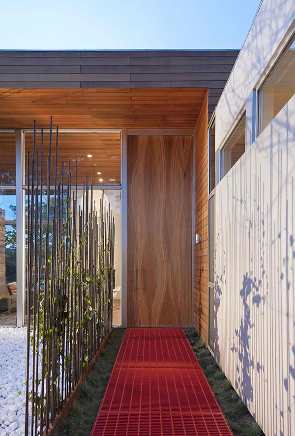
This is the entrance leading to the residence. It sure drops a hint of the organic feel that one can get inside.
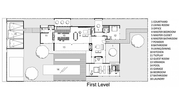
This is the first level floor plan showing how spacious the area really is.
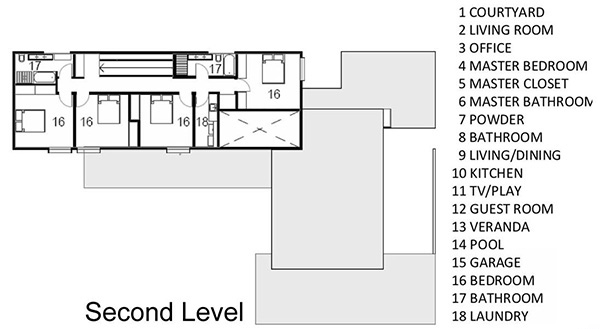
On the second level are the private areas like the bedroom.
Minarc the designer of the house defined the house further: “Floor and ceiling materials connected in an unobtrusive and whimsical manner to increase floor plan flow and space. Magnetic chalkboard sliders in the play area and paperboard sliders in the kids’ rooms transform the house itself into a medium for children’s artistic expression. Material contrasts (stone, steel, wood etc.) make this modern home warm and family friendly.”