Before and After: Renovation of Mark and Rick’s San Francisco Home
Who says you have to be in a rush in renovating your home? For the owner of this house in Noe Valley neighborhood of San Francisco, the length of time of their house remodel wasn’t a big deal. This is because both of them are busy with their full time jobs and divided the renovation into different phases. It took six years before the house was completely finished. But no matter how long the time, they were still able to get their dream house.
The 100 year old home was built in 1914 and was renovated in 1970’s. But the remodel didn’t take advantage of the views from the hilltop where the house was built. This is one thing that Mark Topetcher and Rick Bacon wanted to change. They want to get a good view of nature and to add more light inside the house. The new look of the house was inspired from the topography of the place and the vibe of the city. A third floor was added to the house with a central staircase. To save money, it was furnished with items that were reused and revamped creating an eclectic mix of repurposed decors, furniture and others.
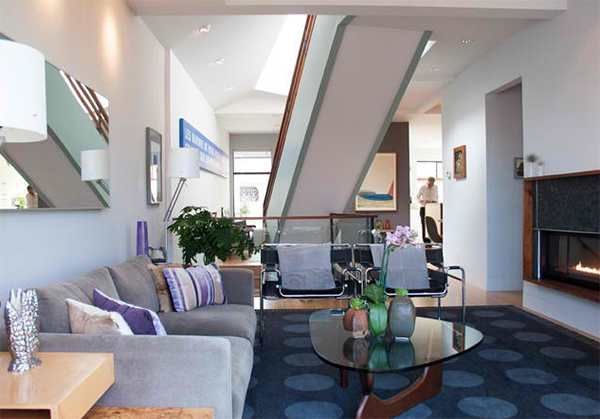 One key goal of the house is to add more light into it which is really how the house turned out.
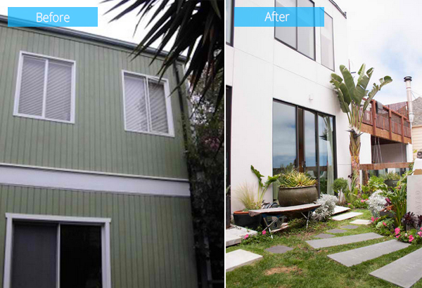 Before, the exterior of the house had a bright spearming green paint and faux white window shutters. After the renovation, the exterior had white cement-board cladding. The glass panels used here let the building breathe and shed water from the rain.
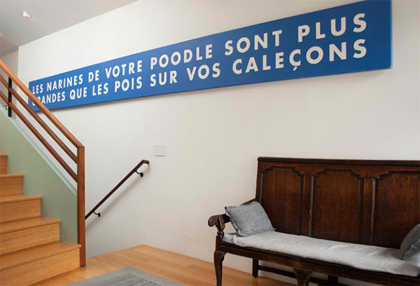 What is highlighted in the entryway is an antique bench and a 17 foot long painting with some type.
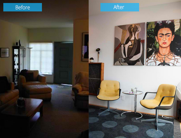 This area was dark but with the renovation, more light were added into it. You can see a sense of playfulness here with the colors of the chairs and artworks.
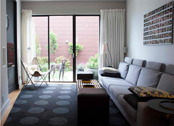 The black area rug with gray polka dots is from a leftover carpeting of a restaurant. The colors connect the space to other areas of the house.
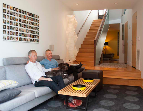 One of the favorite spots of the homeowners is the media room with a 14 foot long sofa.
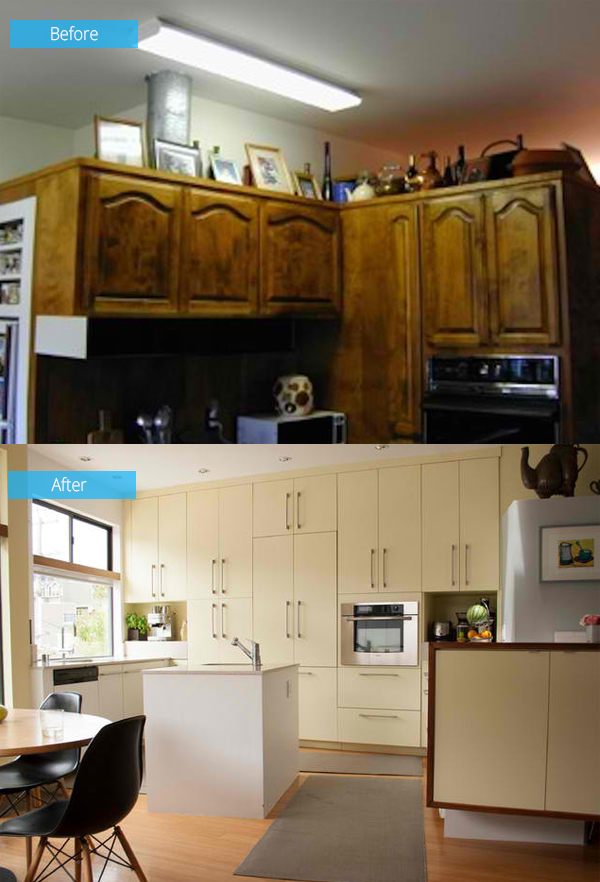 The kitchen was once cluttered with an ugly cabinetry. The new kitchen had beautiful and neat cabinetry where a refrigerator was also seamlessly integrated.
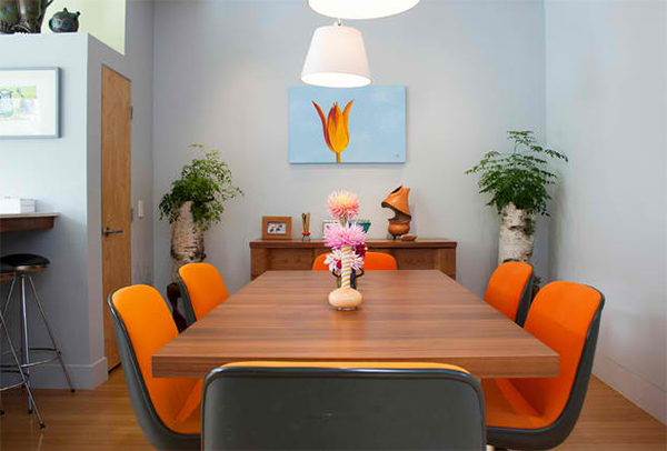 I like the colors in the dining area which also featured the couple’s pottery collection.
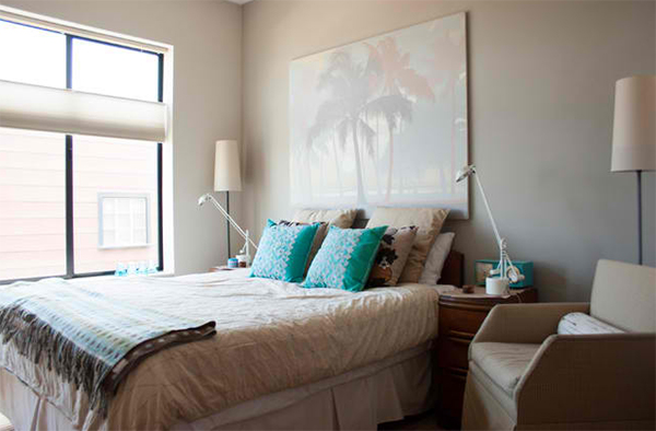 The guest bedroom has a hotel like feel which is the result of Bacon’s hospitality experience.
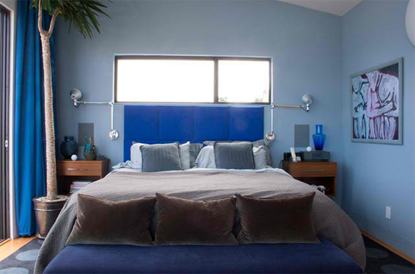 On the third floor, you will find the master suite with an almost 360 degrees view of the hills, bay and city.
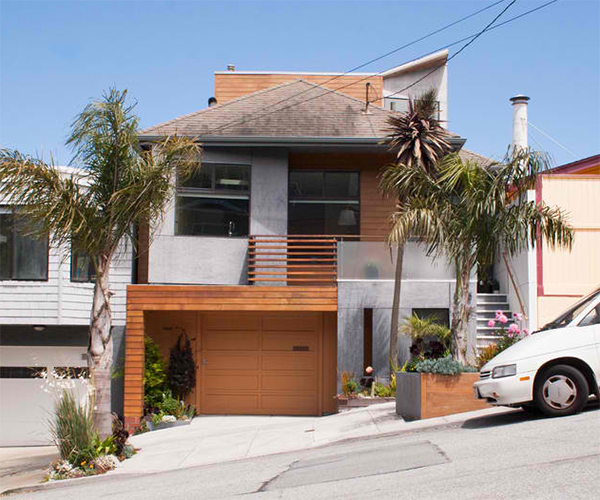 Believe it or not, even the exterior materials are recycled. It used some Carrara marble from a dismantled church altar.
What I like most about this house is how they repurposed and recycled so many stuffs to create it. Now that sure is a green home! The design was done by Mark Topetcher himself who is also a San Francisco architect. It is a result of his collaboration with his partner, Rick Bacon, director of catering at Hotel Kabuki. This house has an area of 2,450 square feet (228 square meters) with 3 bedrooms and 3½ bathrooms. Let me know what you think about this house renovation as we can see in the before and after photos.


0
Tusuubira K Aaron
Awesome style stunning designs big thanks to home design lover.
0
Ronald Bien
No problem Tusuubira. We hope that this post inspires you :)