Aroeira III House is a private residence located in Aroeira, Portugal. At first look, you will be intrigued with how the house was designed because instead of the usual pitch roof or the volumes of a modern house, this one is just a horizontal rectangular home. But there is more than what our eyes can see. Designed by ColectivArquitectura, the house took advantage of the characteristics of the plot, sun exposure, the natural slope of the terrain and the nearby surroundings. They defined a volume in which the horizontality prevails. The house is split into two levels with a partially buried area of the lower floor level.
The partially buried ground level is comprised of the storage compartment in the basement area, a two-car garage and the entrance hall, both with North facing access. It also features a support room with private toilet and a compartment the laundry and poolside toilet. You can also see the swimming pool located to the east. On the upper level, it consists of the master bedroom, with toilet support, faces South and West, the remaining two bedrooms, also facing South, turn to the patio, the kitchen faces South and East, and the living room faces South and North. The locations of the house allow them to get a good view of the pool and golf courses and other lovely scenes around the house. Now, let us take a look at the images of Aroeira III House below.
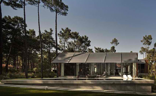
Simple. This is what first came to our minds when we saw this house but we were wrong.
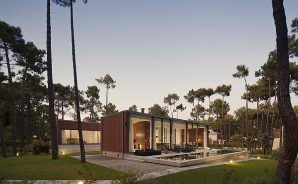
It was actually wrapped with subtle sophistication and stateliness that can be seen as we take a closer look at the house.
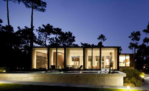
When lighted, it looks even more stunning, revealing its indoor spaces through the glass walls.
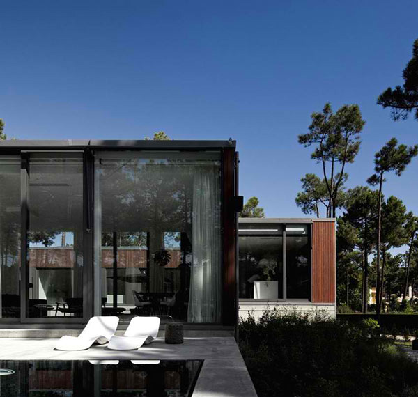
The surroundings of the house was preserved which greatly adds to its aura.
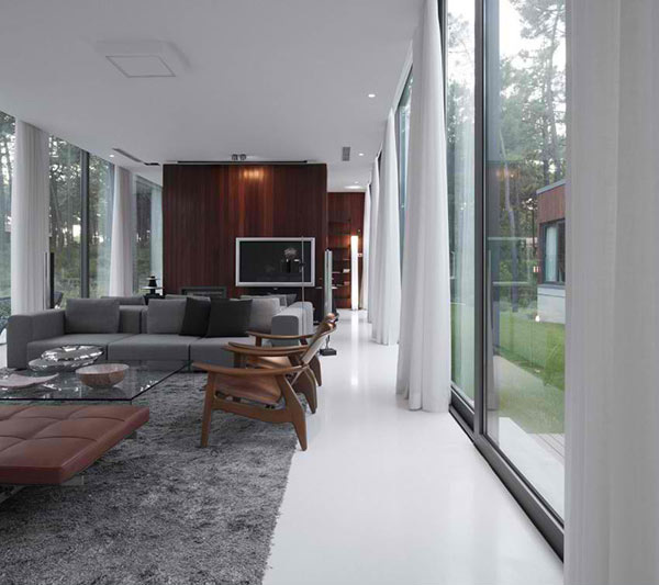
A modern interior is featured using earth colors from gray to brown. You can also spot the usage of wood in the area.
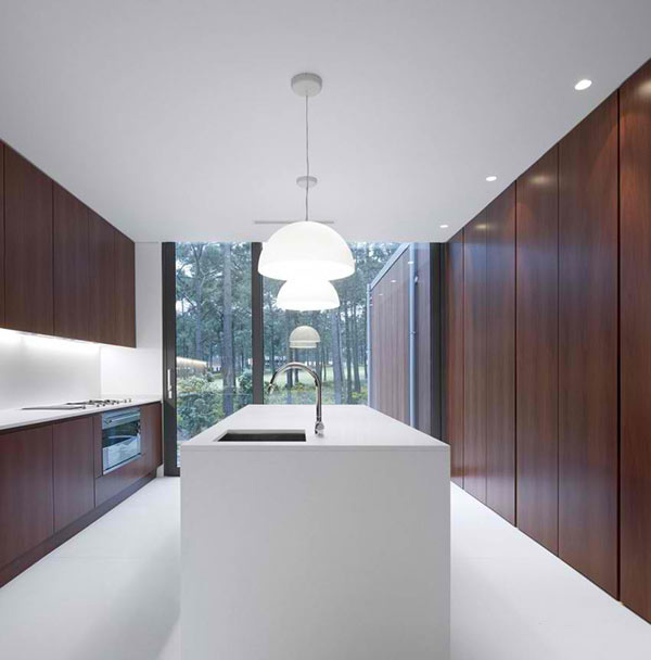
What a kitchen! It seems like there isn’t anything in it because of how well kept things are in the storage wall system. Very neat!
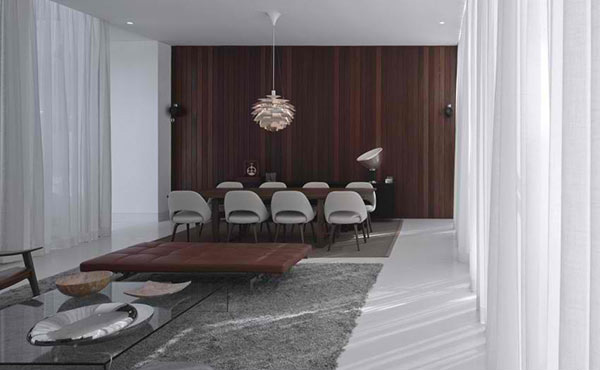
The house has an open layout that easily links the different areas just like the living room and dining room. Note that familiar pendant light in the dining room.
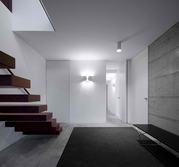
Well, this house is married to simplicity, neatness and minimalism. Just look at the wall sconces as well as the stair design.
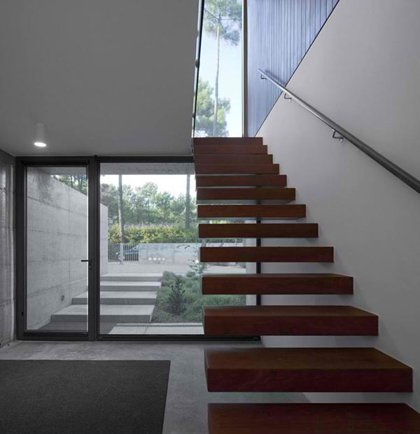
Wooden treads lead to the upper level of the house. Look outside and you will see a concrete staircase leading to the door which connotes that this area is lower.
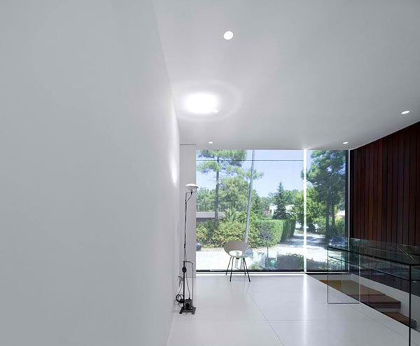
This is the landing of the upper level which is graced with a slim lined floor lamp and a chair. Yes, one can spend time alone here while looking at the view outside.
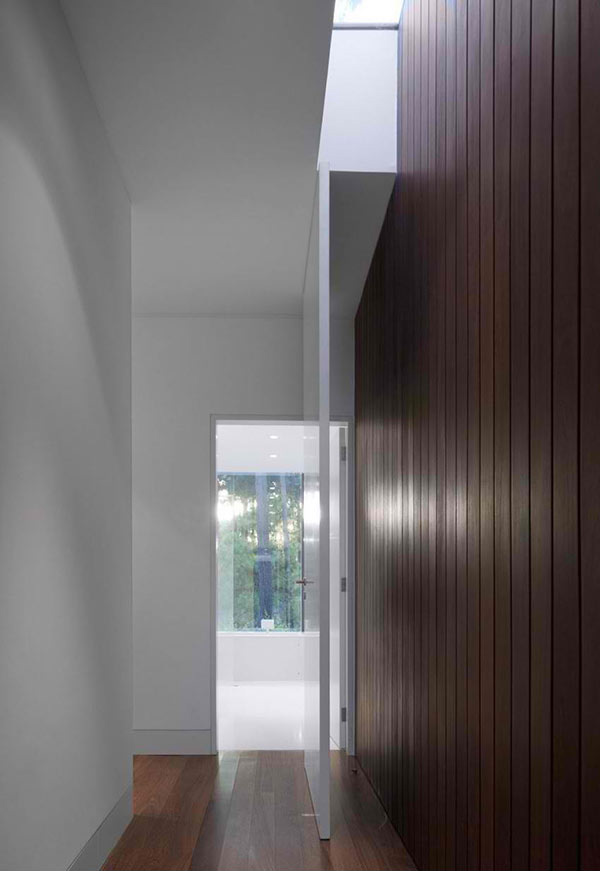
The hallways have wooden flooring and white walls. But there are also some walls that are wooden too.
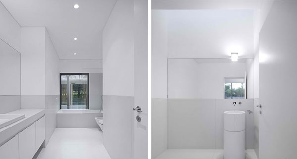
If the kitchen was neat, expect the bathroom to neater! It has white all over the place!
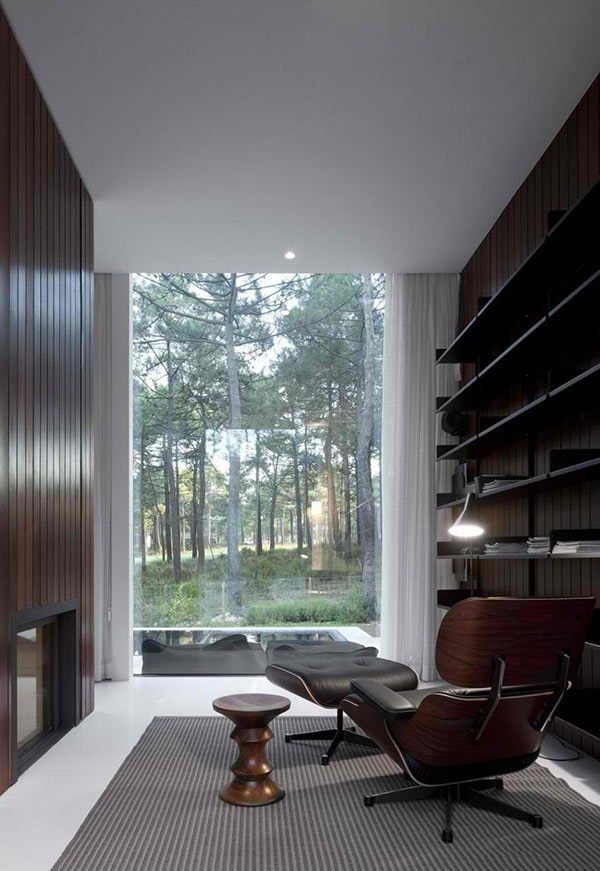
We’d guess this is the home library with a comfy reclining chair made of wood for a perfect contemporary style.
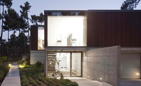
This is the North area of the plot showing a car access towards the garage.
ColectivArquitectura further defines that “the construction with reinforced structure, and visible concrete on the lower floor, assuming the function of the material and with a structure and coating of Cumarú wood upstairs – with significant advantages in thermal and acoustic comfort -, develops in a U-shape form, defined by three intersecting volumes, forming an open courtyard to the West, limited, to the South, by the swimming pool.” Meanwhile, the landscaping with a car access was designed considering the preservation and reinforcement of the existing plant species.