No matter how small a space is, it is important that everything it in is not just well-designed but also organized. The layout has a huge impact to the design of a home. There are so many ways to do the layout of the interior and if one makes a mistake, it might turn out crowded. That is why, it is important for the home to be well-organized. Aside from that, the colors and the kind of furniture and decors used in the home also have a huge impact to the interior. Like how you should avoid chunky furniture in the house and what certain colors will make the home look really bright despite the small space. Today, we are going to show you a small apartment with a lovely interior.
This apartment dubbed as Tones Harmonize which has a combination of industrial and Nordic styles. It also mixed vertical lines with curved ones and the colors of contrary meet with complementary ones. Because of this kind of approach CHI-TORCH managed to attain a lovely home design. They believe that tones of different living kinds could blend with thinking and imaginative sense of beauty. This apartment that they worked on was short at public living space. With that, in order to settle existing dimension defects like bedrooms bigger than living room, they made adjustments of partitions. These are added not only to amplify living region but also to spare an entry-porch and study/guest room. The house owners have lively personalities and they love to read and relax inside their home. With that, they wanted to have a dream mood-easing, personal space that they can use when they are off duty. Hence, based on the owner’s individual characteristics and desires, the designers built up this “space with tones of New York frosty Industrial and Nordic torrid Skandia blending in each other.” Let us take a look at the home below.
Location: New Taipei City, Taiwan
Designer: CHI-TORCH Interior Design
Style: Modern
Type of Space: Apartment
Unique feature: A small modern apartment which has a design that harmonizes a contrast of colors, texture and others.
Similar House: Lovely Contemporary Home on Di Lido Island in Miami
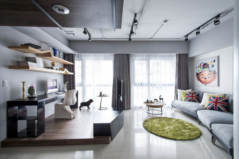
Seen here is the interior of the house which has a very nice design despite its simplicity. You can see sleek lines in it from the elevated area to the other parts. You can see both straight and curvy lines in it. Because of its glass windows, the living area looked really bright.
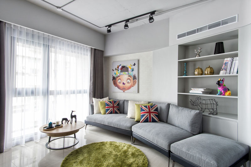
There are also fun elements in the house like the wall decor and the throw pillows. Also seen here are a round green area rug and an oval coffee table which is a nice contrast to the straight lines used in it. Notice also an open shelf where various lovely displays are added.
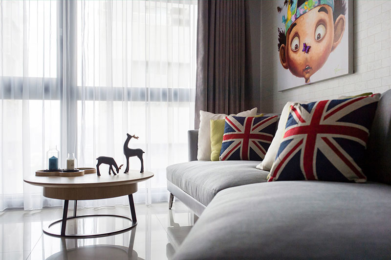
A closer look at the wall decor and the throw pillows which bring colors to the interior. In order to filter the amount of light that enters the home, the owners opted to use sheer white curtains but when privacy is needed, there is also a gray block curtain that can be drawn open.
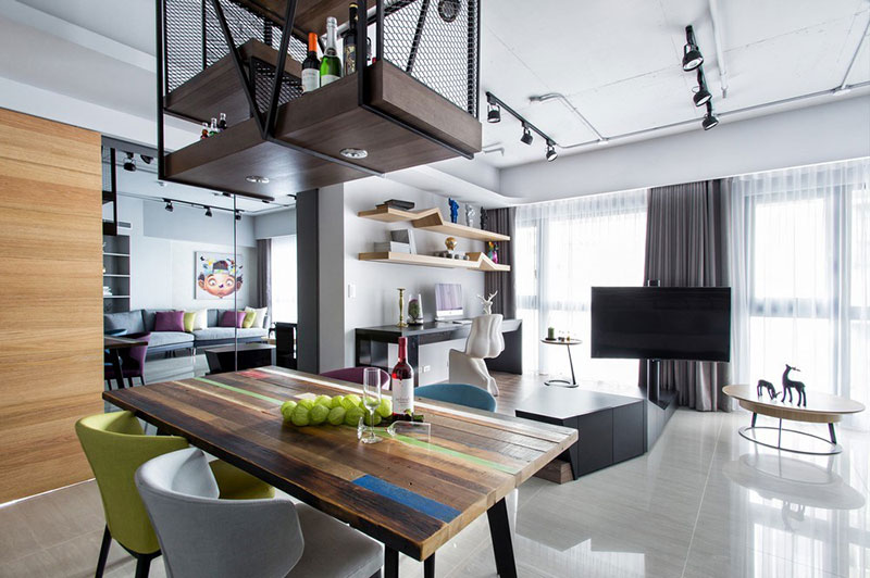
The home also has a dining area just off the living room. It used a wooden table that looks neat even if it s refurbished. Above it is a cold steeled rack for rare vintages collection of wine and books. In this image, you can see the fascinating light and classic furniture in the interior of the home.
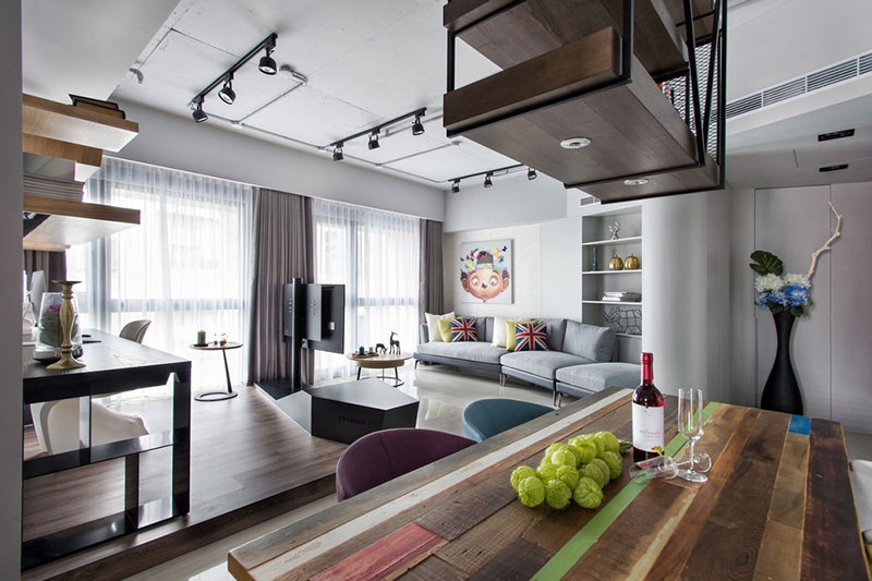
I am sure that you will agree with me that this space looks really nice. In all angles, I can see nothing but beauty despite its simplicity. It is also nice that it used muted colors in the home as well. Aside from natural light, some parts of the home are being illuminated with track lights.
Read Also: The Pond House at Ten Oaks Farm: Angled Sustainable and Energy-Efficient House in Louisiana
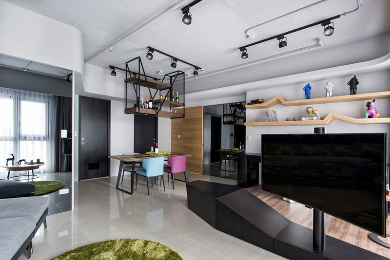
Let us draw our attention to the elevated part in the living area which is the reading and working area of the owners. But aside from that, one eye-catching feature it has is the black storage area wherein the television is also installed. Isn’t this a nice idea?
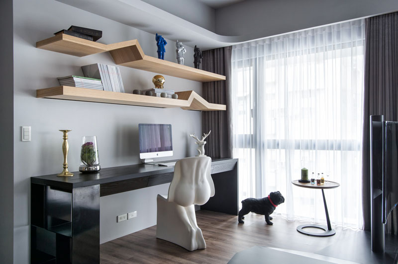
Now this is the working area and reading area of the owners. For sure you noticed that unique chair that is formed like the body of a human. Neat, right?
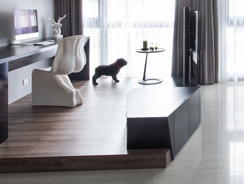
Another look at the work area which gives us a better view of the decors on it. That dog got me at first. I actually thought it was real but apparently, it is just a decor. The space was split by creating a platform, with a television and entertainment unit built-into it. This way, the area is also being divided. With this, one can focus on the television while sitting in the living area.
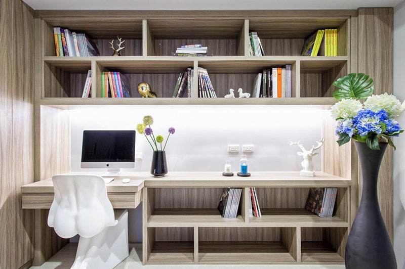
Aside from the working area above, there is another one just near the dining space. It also used the same unique chair but it has more spaces for books. What I love here is the texture of the wood.
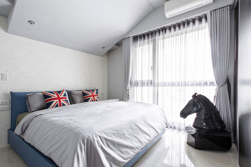
And finally, this is the bedroom. It has the same throw pillows like what we saw in the living area. But it is very creative that it added a huge chess board piece in it. Very nice, right? Like the public spaces, this one also used a white sheer curtain in it as well as block curtains too.
I like how this apartment turned out. The overall design is so nice. You can see some unique items in the home but it isn’t done in an exaggerated manner that it will look crowded. Because of that, it turned out that the space is creative and attractive at the same time. Everything is well arranged and well decorated. This apartment in Taiwan which is dubbed Tones Harmonize because of how everything in it is in harmony is a brilliant project from CHI-TORCH Interior Design. I just love how relaxing it is to see the beautiful colors, furniture and design of this apartment. How about you, what can you say about this apartment?