There are so many different ways to design a house and there are also various considerations that one has to look into before a certain design is being decided. Primarily, the goal of the owners has to be considered and should be included in the design brief. It is important that a designer knows what the owners need for their home. Aside from the aesthetics, other features also need to be looked into like the materials as well as layout of the house. Others are even very particular about setting boundaries with the indoor and outdoor areas. Still others want to make sure that they have privacy in their on home. Today, we are going to feature a house wherein the owners needed more space. We will see what the designers did to it to meet the needs of the homeowners.
For the Wall House, form, material, scale and color were the primarily concern of the designers to create a modern home at the traditional Queen Anne neighborhood. Although the livability of the area is tight, the urban lot is enhanced through creative and efficient spaces that are the same time flexible. The house features a shed roof that rests above an open ground floor living space. Apart from the main house, there is also a detached structure that serves as an office, garage, play space and guest quarters. According to the designers, the length of the site was designed as an alternating series of indoor and outdoor rooms that has a continuous cedar clad wall which visually connects the spaces. The indoor and outdoor spaces’ relationship was blurred with the use of slide/fold doors which opens the full width of the living area to the exterior at both ends. When the doors are open, the living room turns out to be a porch allowing the owners to interact with their neighbors as well as passersby.
Location: Seattle
Designer: Rick Mohler and Rick Ghillino
Style: Modern
Number of Levels: Two-storey
Unique feature: A modern home that used space wisely while having a beautiful design both for the interior and exterior.
Similar House: A Home with Glass Walls and a Central Courtyard in Brazil
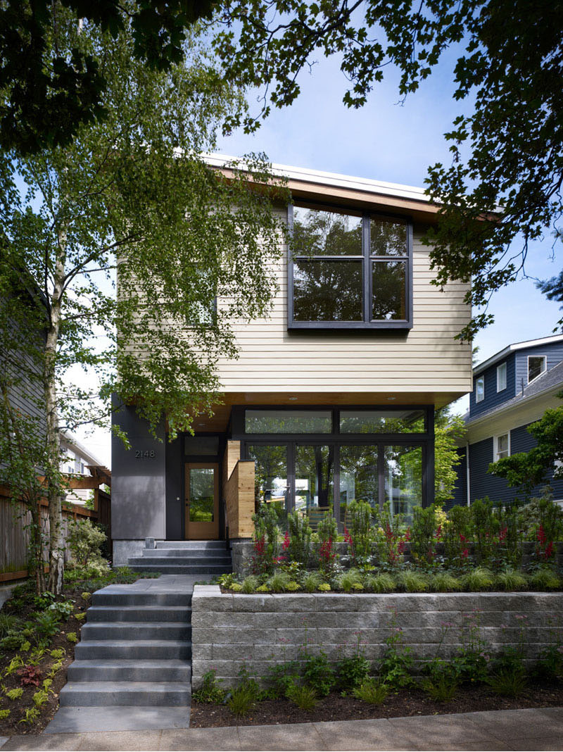
Principal architect Rik Adams, together with project team Rick Mohler and Rick Ghillino, designed this home located in Seattle’s Queen Anne neighborhood, for a family that needed more space.
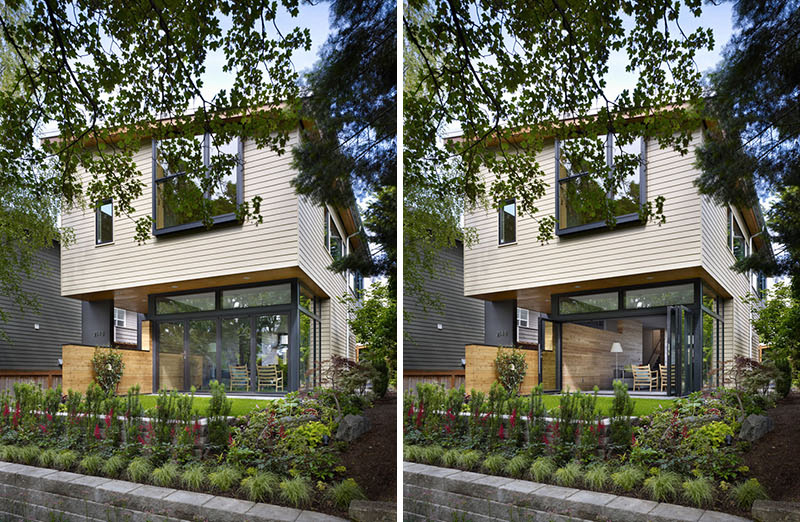
The existing 850 square foot single-story house no longer met the needs of the owner’s growing family, so the architects added a new second story and remodeled the main living area, without increasing the size of the existing foundation.
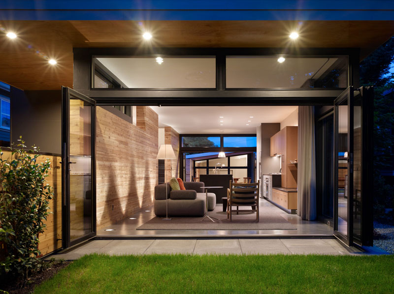
The interior and exterior spaces are blurred by the use of slide-fold doors that fully open both ends of the living space to the outdoors.
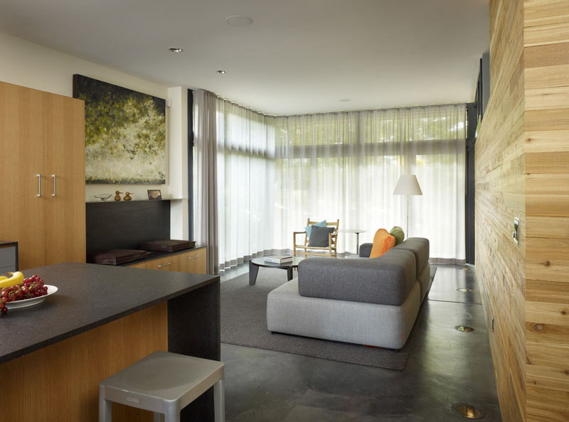
Sheer curtains as well as opaque shades are also used in the home so the owners can get their desired level of privacy. It also features tall ceilings and north facing clerestory windows which provide a sense of space to the upper rooms.
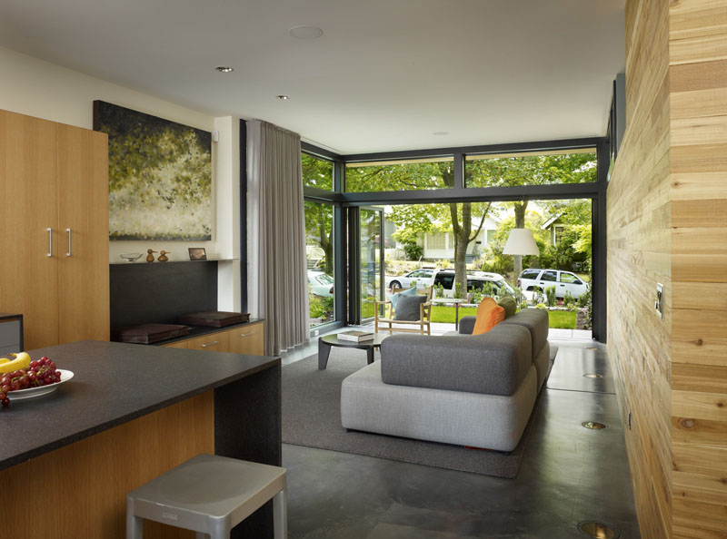
When the sheer curtains are open, one can get a good look at the outdoor spaces of the house. And yes, the home definitely looks transparent on this manner.
Read Also: Fazenda Boa Vista: Families Enjoy Outdoor Living in this Contemporary Home
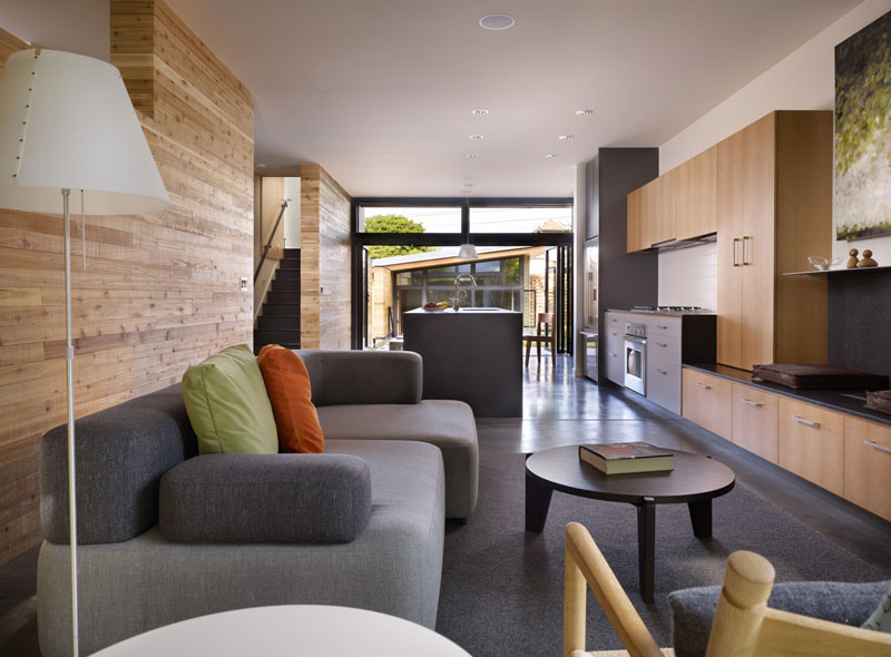
Looking through the main floor, you can see how the space flows from the living room to the kitchen to the dining room, and then onto the backyard and secondary structure.
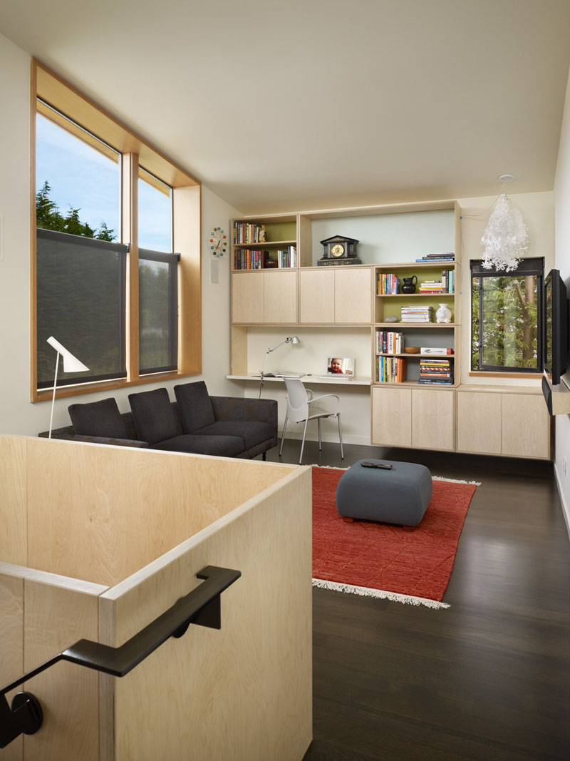
In the upper level of the house, there’s another living room, with a built-in home office, and windows providing street views. Half-blinds were added to the windows facing the street for added privacy.
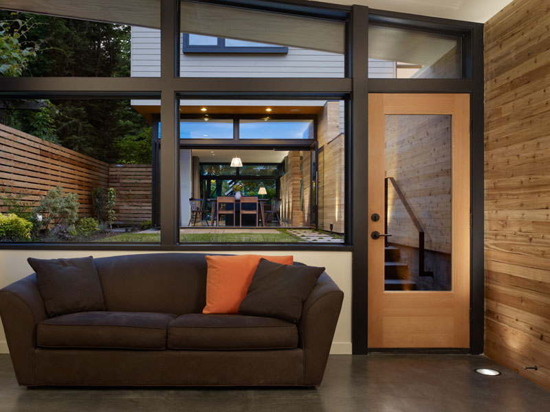
At the rear of the home, a detached structure serves as a garage and future studio.
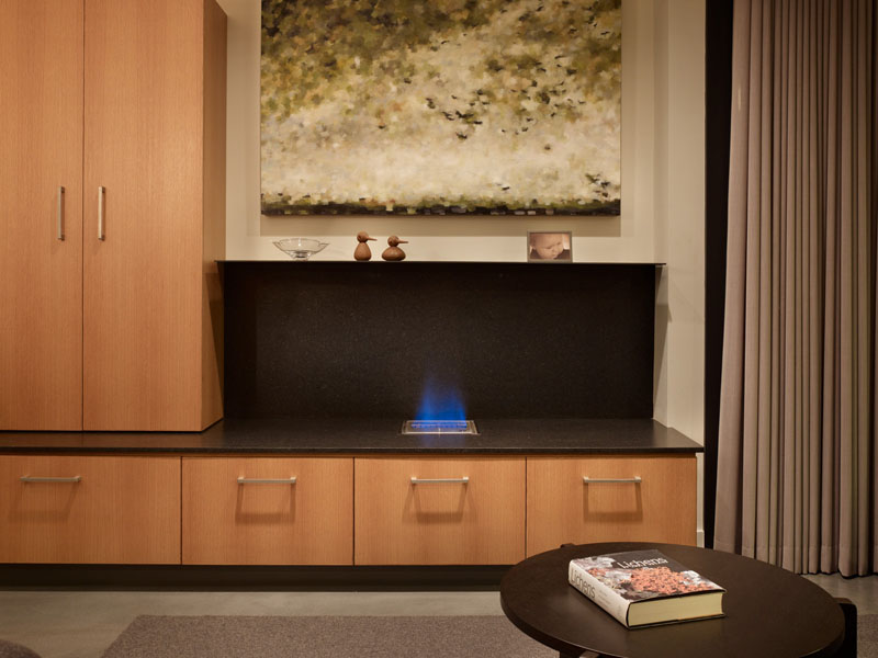
Seen here is a closer look at the fireplace surround that has a small mantle that separates the fireplace from the artwork above. At first glance, you might not recognize the fireplace at once because of its modern design but yah, it is there.
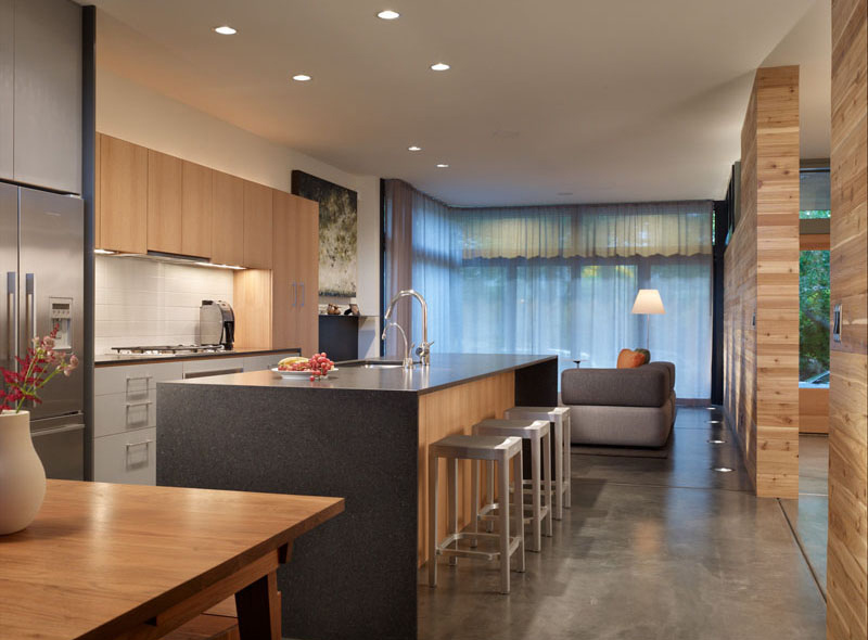
It also features a dining room that extends to a private terrace and garden. And as you can see, the kitchen and dining areas as well as the living room are in one open space.
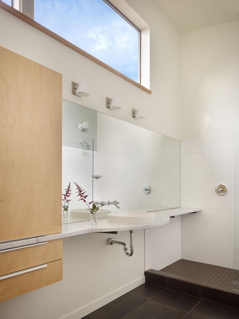
Plenty of light enters the bathroom through clerestory windows and the vanity runs the length of the wall, cutting through the cabinetry, it does look very unique, right?
If you do not have enough space in your home, the Wall House could be a good source of inspiration. You can see what it did to make the interior spaces appear larger and what it did in order to accommodate all the areas needed for the home. Adamsmohler.com – Rick Mohler and Rick Ghillino designed this modern home and was able to successfully integrate what the homeowners wanted for the house. With how it turned out, the home looks really beautiful and it sure is something that you might want to be as a home too. It is nice that the spaces were used well and that the areas are well distributed. What can you say about the house?