Wood is used in many different homes and we can see how beautiful it looks like when used for the interior, exterior, furniture and others. No wonder that many people prefer to use if especially because it looks nice in whatever type of space from modern to contemporary ones. But we are aware that through time, wood would change its appearance and may also have a tendency to expand or shrink due to the changing weather. With that, wood needs to be updated and restored after years of being exposed to varying weather especially if it is used outdoors or in the exterior. Today, we are going to show you a house that was updated because it used wood for its exterior.
You will get to see a before and after showcase of a restored house that was built back in the 1980s. The architecture firm, The Ranch Mine, worked on the restoration of the home as well as on its landscaping. The house is located on a small lot in a historic district in central Phoenix, Arizona. Aside from restoring the house, the designers were tasked to redesign the landscape, and transform the guest house into a new master suite which actually turned out really stunning. The main home’s restoration is focused on refinishing and repairing the redwood that clad around the curved walls both in the interior and exterior of the house. Let us take a look at the house below.
Location: Phoenix, Arizona
Designer: The Ranch Mine
Style: Contemporary
Number of Levels: Two-storey
Unique feature: A 1980s home is clad with redwood and was updated since the wooden exterior was restored. Aside from that, the interior as well as the landscaping was updated too.
Similar House: Before and After: From a Dull 1970s House to a Stunning Bright Contemporary Update

Seen here is the home with a curved wall. Notice that the design of the house is still the same but the wooden features was just updated. And it does look lovely!
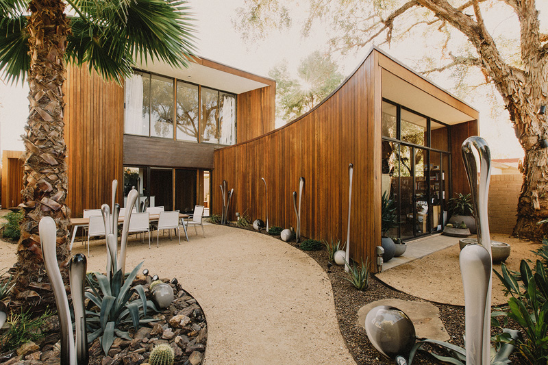
I like how they did the landscape of this house. What intrigue me are the plants here and the lightings that look unique but add a creative touch to the area.
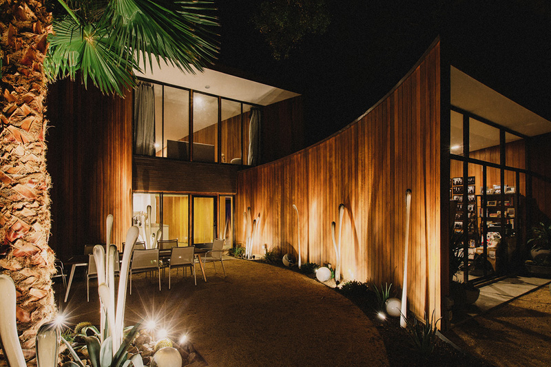
This one shows us how the house looks like when the lights in the landscaping are turned on. It looks really beautiful, right? It would be nice to dine outside with an aura like this one.
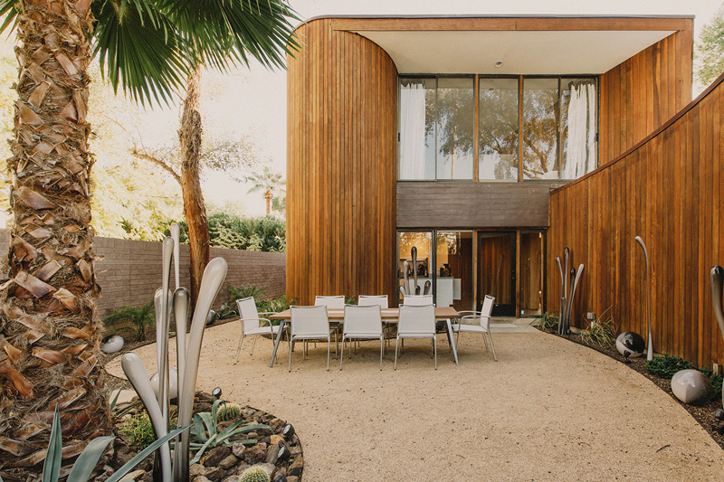
At the entrance to the home, you’re welcomed by an outdoor eating area.
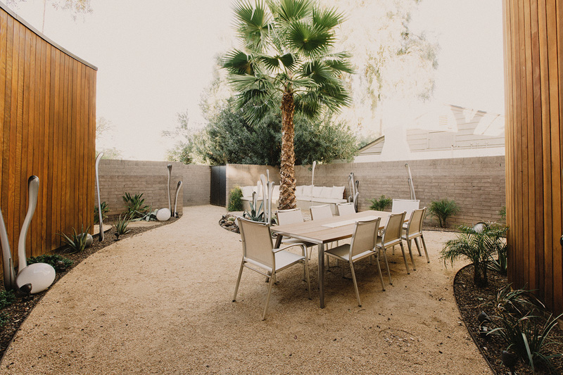
There’s also a seating area tucked away in the corner.
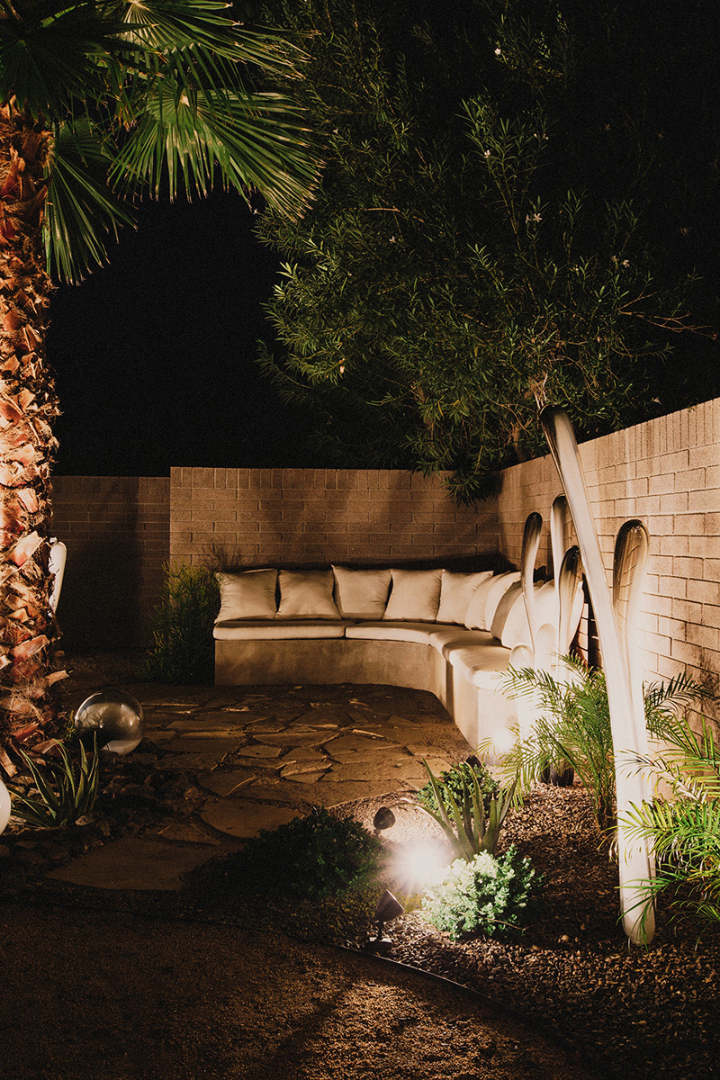
Outdoor lighting creates dramatic shadows, while making the space usable at night.
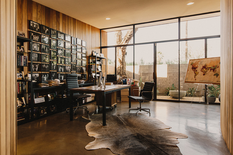
The study has a wall of windows, allowing natural light to fill the space.
Read Also: Before and After: From a 1940s Cottage to a Contemporary Residence
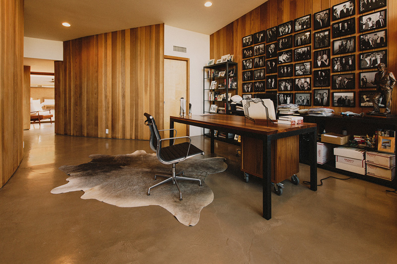
A collage of black and white photos break up the wall of wood.
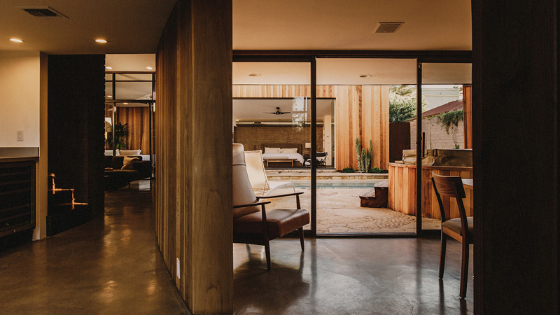
A view from inside to the outdoor areas with the swimming pool and master bedroom.

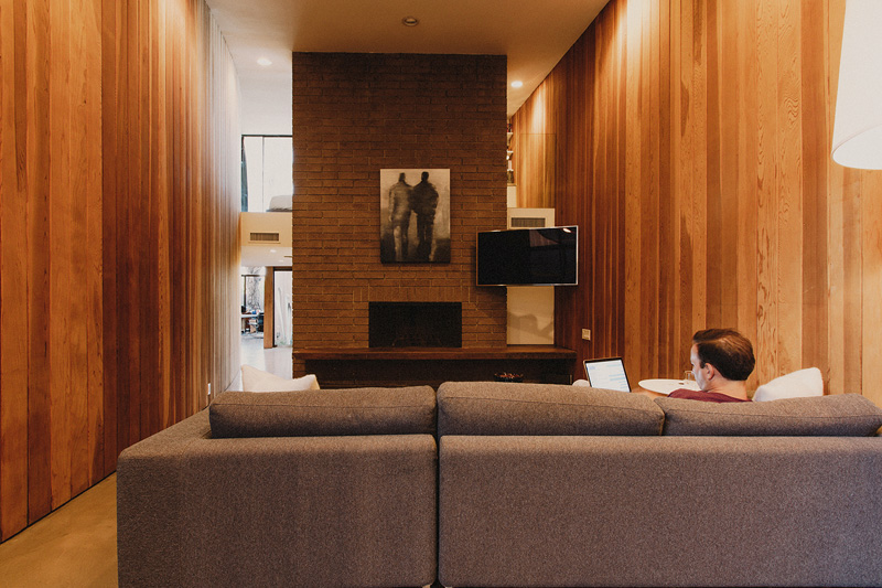
The living room received an entire overhaul, going from over-stuffed with animal trophies, to simplistic style with minimal art.
One of the highlights of the house is the wooded stairs that lead to the second floor.
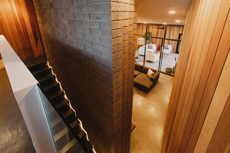
From the top of the stairs, you can see the living room and the breezeway.
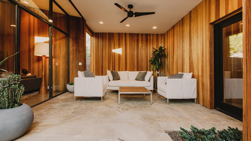
The breezeway is a space that is open to the elements, but enclosed enough to make it a livable room.
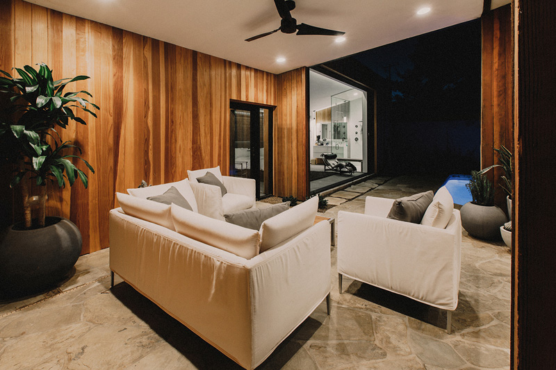
Here you can see how the breezeway is open to the elements.

The original guesthouse was also transformed and was opened up to make a master bedroom that faces the pool.
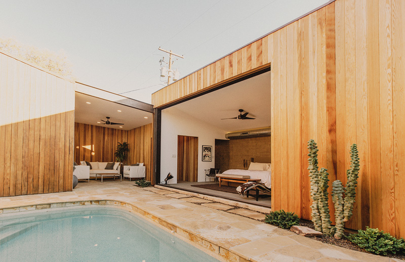
The pool was reduced in size to make a more functional courtyard, and planting areas with French drains were added to solve flooding problems.
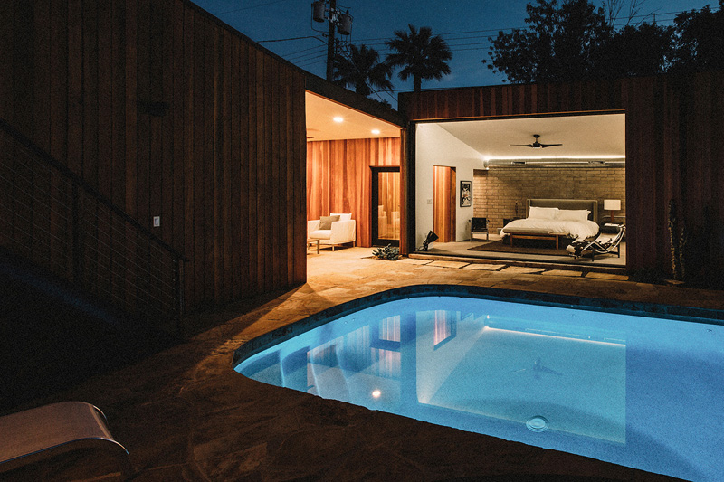
During the night, the pool area and the breezeway are lit up which adds more beauty to the outdoor space of the house. Lighting really has a huge impact to a home even in the swimming pool.
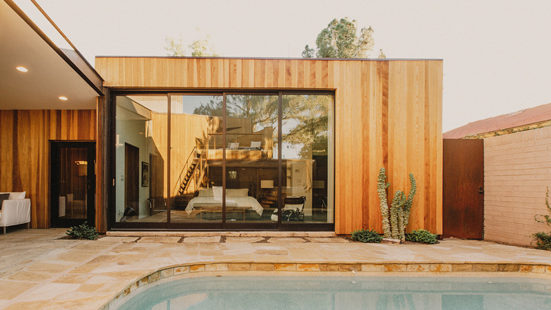
A 16 foot wide by 10 foot tall pocketing glass door, opens the master suite to the pool courtyard.
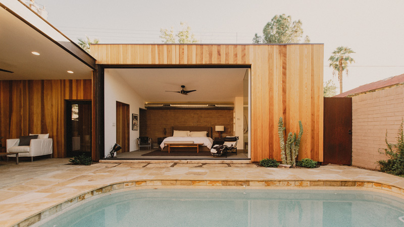
This master bedroom faces the pool area and once open, it would be very relaxing to take a rest here. I can tell that even when it is open, the area is still nice a spot to rest and relax.
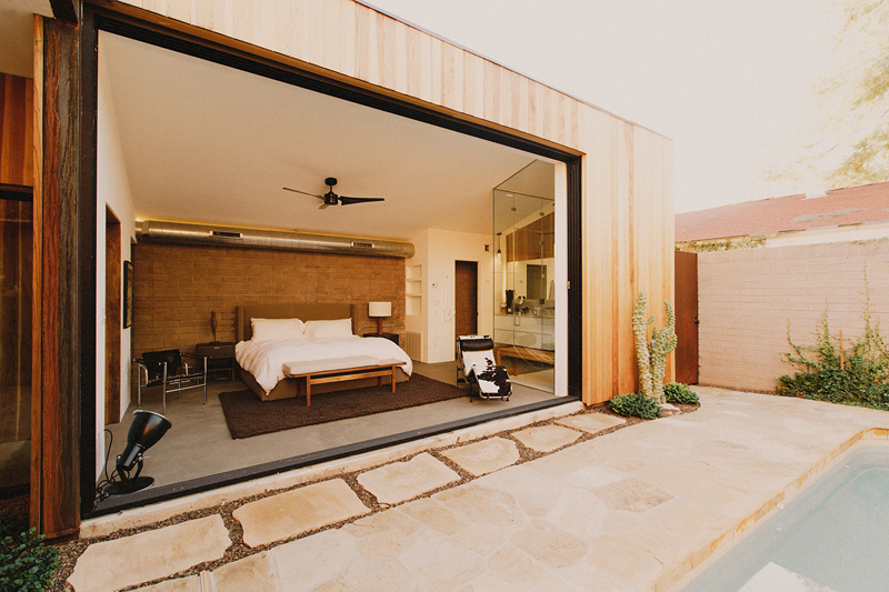
The open floor plan of the master suite was inspired by their client’s trips to exotic hotels around the world.
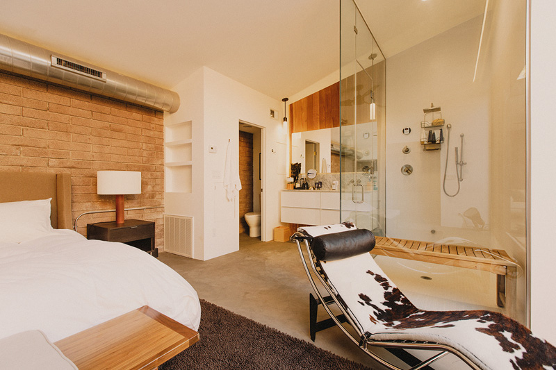
Hidden in the corner of the bedroom is a frameless glass steam shower.
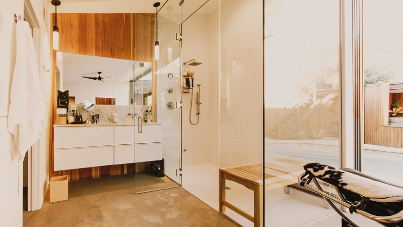
Aside from the steam shower, it also has a floating vanity with a large rectangular mirror. It looks nice against the wooden wall.
Lovely. Very lovely indeed! You can see how the original look of the house was retained and enhanced. New elements were also added in the house as well. This beautiful update of a home was done by The Ranch Mine who was able to update the home into an even more stunning residence. Aside from the redwood material used in the exterior, the interior was also given a new look which is clutter-free, neat and organized. You have seen that in the before and after pictures that we have shown you above. So, what can you say about the updated space above?