Sometimes, even the ugliest residence can actually be turned into a stunning home through the excellent idea of a designer. Even those that are nearly dilapidated can still be transformed. How much more for homes that are still in good condition? We have featured many home transformations before and we have another one today. You could see a before and after showcase wherein you can directly compare the difference of the original home and the new one. With this, you can see what changes were done to the house both in the interior and exterior.
A 1940’s home located in Australia was renovated by Architectural designer Janik Dalecki. The original run down circa has an updated design in the exterior and interior featuring an open floor plan, and plenty of space for entertaining. As you will see in the images below, you will notice the huge difference in its look and how lovely it already turned out. Even the garage was update as well as the sidings of the home. Of course, there is also a significant change in the interior too. Let us take a look at the home below.
Location: Australia
Designer: Janik Dalecki
Style: Contemporary
Number of Levels: One-storey
Unique feature: A 1940’s cottage is transformed into a stunning contemporary residence with a cozy and beautiful interior that fits the home owner’s needs.
Similar House: Before and After: Remarkable 1980’s Contemporary Duplex in Queensland, Australia

This is a before and after view of the front of the house. Notice how the exterior was changed with wooden sidings and bricks. You can also see that the garage was changed too with a more beautiful wooden ceiling.
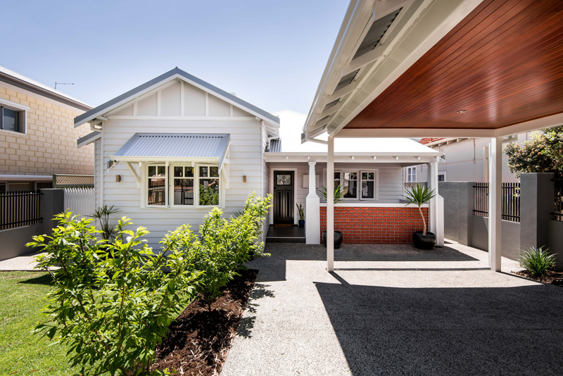
A closer look at the new house with a stunning design. Well, this sure is a lot better than the previous one! I like that bricks were added to the porch side.
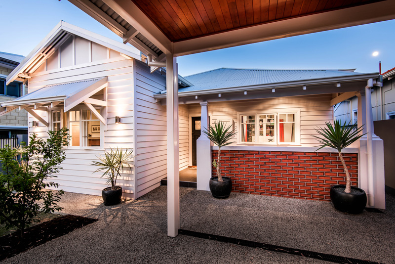
The flooring was also updated too and what added drama to the home are the lights as well as the placements of plants.
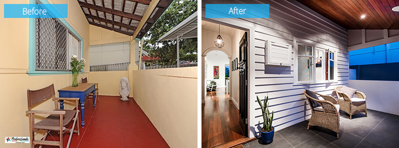
This is a before and after view of the front porch. Before, it looked very ordinary with red flooring and wire mesh for the windows. But now, it looked neat in gray tiles plus the sidings on the wall and some French windows.
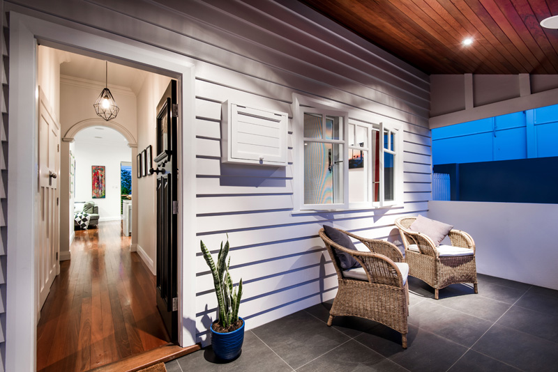
Aside from that, the furniture was changed too and there is an added lighting in the area to bring more drama. From the porch, one can get into the house through a foyer that goes through an arc opening.
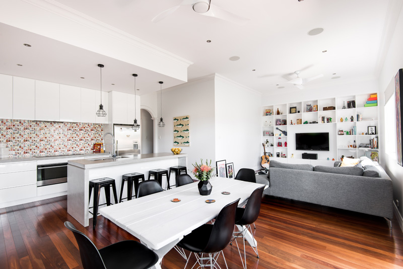
In the interior of the home, there’s an open living, dining and kitchen area that we can see here. Notice the beautiful combination of white and wood in here. Also, the contrast that black adds to the area is stunning.
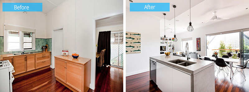
The old kitchen looks boring and dull and yes, totally classic. Meanwhile, the new kitchen has a sleek modern look that is located in the open plan layout of the house.
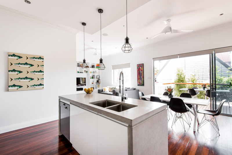
A closer look at the kitchen island with dual sink. This is indeed a good spot to work and prepare food. Just above it are industrial pendant lights. You can also see that the area opens to a porch where another dining area is located.
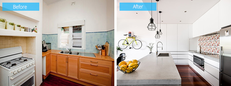
Another comparison of the old and new kitchen wherein the kitchen has floor-to-ceiling cabinets and concrete countertops. The new kitchen is indeed nicer than the old one that looks really classic.
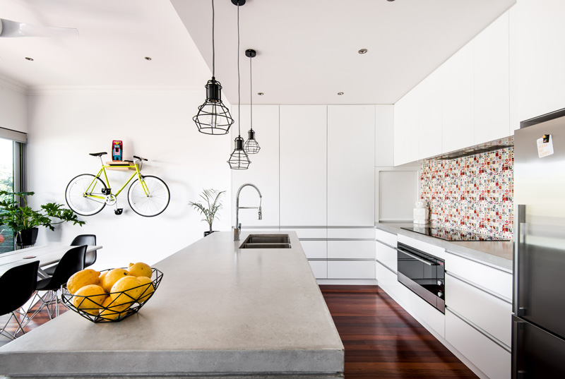
The patterns on the backsplash of the kitchen add more appeal to the area. What also draws my attention is the way that bicycle is being stored on the wall. Nice, right? As if it is an added decor to the interior.
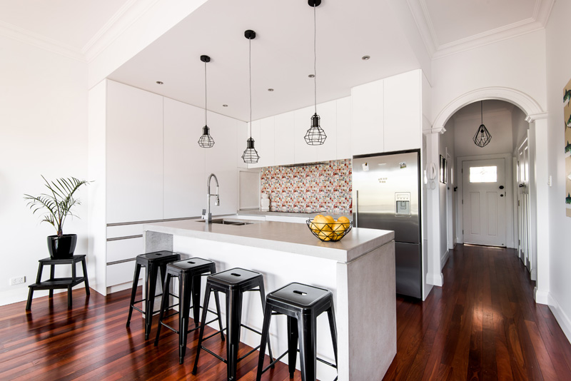
As you can see in this image, when one enters the home, he will be greeted by the kitchen, dining and living areas which are all located on the same open space. Like the rest of the home, this has contrast of black and white in it.
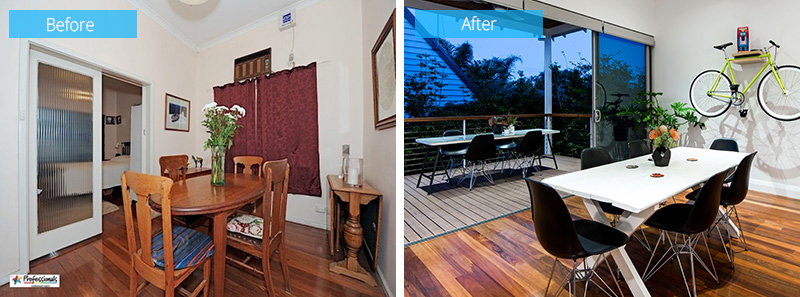
Seen here is a before and after photos of the dining room. The new space is opened up to allow indoor/outdoor dining and entertaining. This means you can just choose whether to eat inside or outside.
Read Also: Before and After: Chic Interior of Client Freakin’ Fabulous
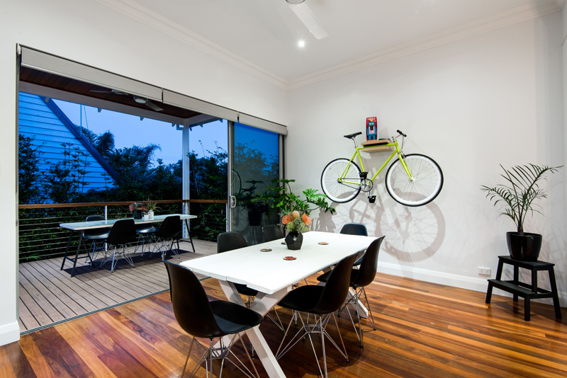
The dining set has a combination of black and white. You can see that there is also another dining set at the porch where the family can entertain guests and other family members.
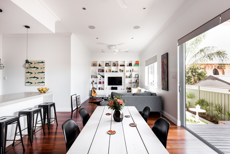
Since the area has an open floor plan, the dining area has views of the living room. You can notice that the color palette is the same all throughout the area.
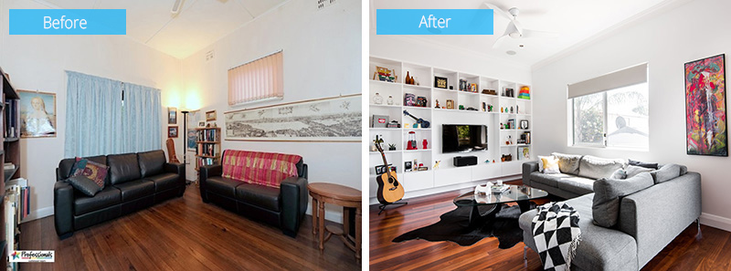
This is the before and after photos of the living room where you can see a new full wall of shelving that has been added to the new space to provide extra storage.
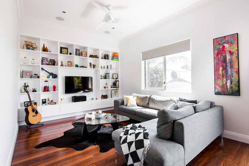
Aside from being an extra storage, the wall shelving is also a nice place to display the owner’s collections. This is a beautiful contemporary living room with a triangular coffee table that sits on a black cowhide.
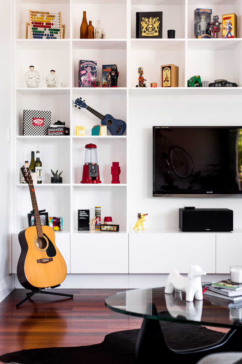
One secret to make a wall shelving lovely is to add some decors and creatively arrange them on it. In the middle of the wall storage is the television set.
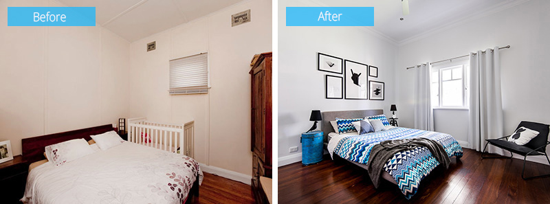
The old bedroom looks dull and plain with a small window but the new one has a much larger window that bring more light to the area. It also looks a lot better especially that there are decors added into it.
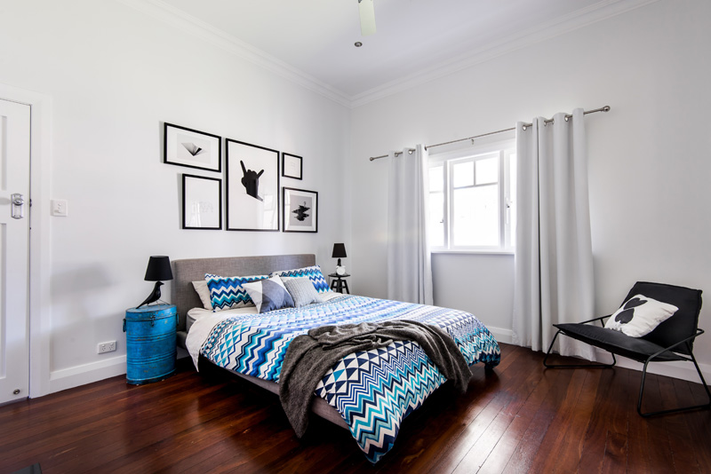
Aside from the gallery on the headboard area and the side tables with interesting table lamps, the bedding set is very nice. I had been looking for something like this for a long time already!
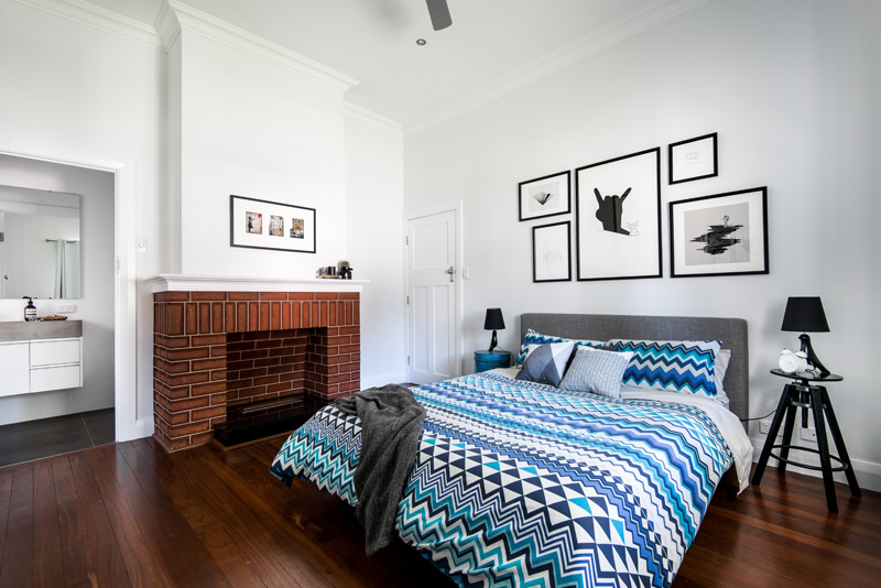
In the bedroom, there is a fireplace made of bricks that serves as a focal point of the area. But you know, I really can’t move on with this duvet set. So very nice with different geometric patterns in blue, green, white and black!
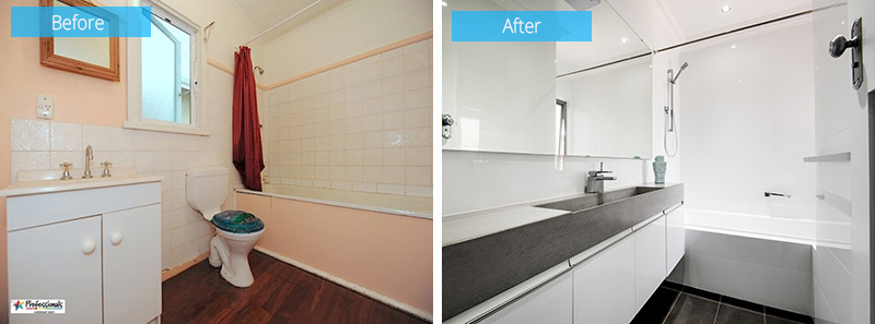
The bathroom changed a lot as it went from being a peach color with a small mirror to a sleek white bathroom that features a concrete counter and large mirror.
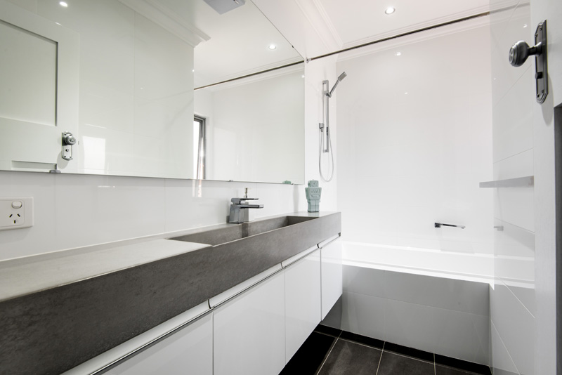
The bathroom looks a lot different from the previous bathroom. This time, it has many features that made it appear larger like the large mirror and white tiles.
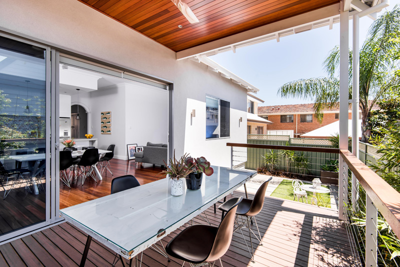
An outdoor dining area was also added in the home which we have taken a glimpse of while looking at the interior dining area. This also have a white dining table with black chairs. On top of the table is a glass.
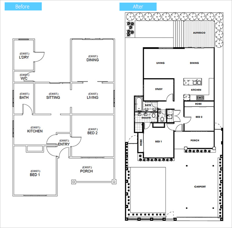
This photo shows you the new design of the home through its floor plan. Notice the changes as some part of the walls were removed and new walls were added.
The images of the home taken by Dion Robeson could show us the great difference of the original home to its new renovation. Apparently, the change is good and has turned the home into something that isn’t just trendy but also function and beautiful. The house is designed by Janik Dalecki who made sure that there will be an apparent change in the looks and functions of the home in order to fit into the needs of the homeowners. So, what can you say about this home renovation?