Before and After: Brightened Modern Celio Apartment in Italy
Impressive before and after transformation of a home in Italy.
A home, no matter how old it is can actually have a chance to improve and look good through updates from time to time. That is why, some homes would seek the help of designers to work on their homes and improve its look. This way, the home appears more refreshing and cozier to live in. It is the new furnitrue arrangements, lightings, decors and even color scheme that give the home a totally new look. We have seen how some home spaces improved through before and after photos we have shown you. Now, we will show you another home that will showcase a better interior.
An apartment in Rome, Italy was transformed into a modern space by Carola Vannini Architecture. Featured below are the before and after photos of the apartment which now has a modern appeal. The space has wooden flooring and updated wall colors. The home looks welcoming from the entrance hallway to the other public areas. One notable feature is that the apartment because bright and is no longer cramped. Lighting were added along the floor and ceiling with a bright color scheme. There are also many artistic wall arts that bring more creative flare to the apartment. Once you see the recent photos, you will be amazed of how much it has changed. For sure, you won’t expect that the house looked dull and dark before because there are no longer traces of that in the present apartment. Take a look at the space in the images below.
Location: Rome, Italy
Designer: Carola Vannini Architecture
Style: Modern
Type of Space: Apartment
Unique feature: A modern apartment was transformed into a more stunning and brighter residence as new lightings were added and a new color scheme was brought in.
Similar House: Apartment Kiev: A Serene Abode in the City
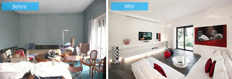 Before, the living room has an eclectic mix of furniture that is’t arranged well. The walls are gray and it doesn’t have enough lighting. But the new living room looks very different with wooden flooring and white colors that has added pops of red.
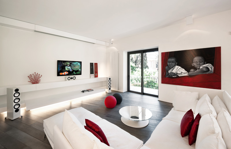 Aside from the new flooring, lights were also added on the flooring and ceiling. Notice that wall system that has lights on it. And there are new furniture as well.
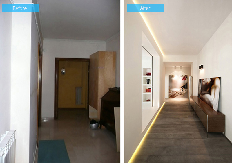 The hallway looks creepy before but now, it looks grand and it even has a hotel feel especially with the decors added to it.
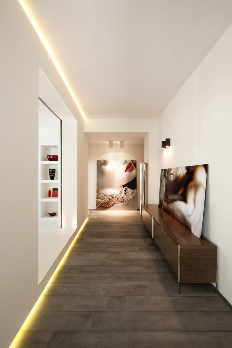 Notice the artistic wall decors here as well how it is lighted. It is indeed a matter of good design!
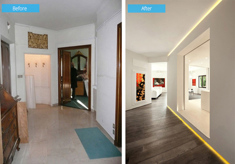 This photo is taken from the angle of the entrance hallway, where you can see that it has been opened up to make the living room, dining room, and kitchen more accessible. The new design also let light through it.
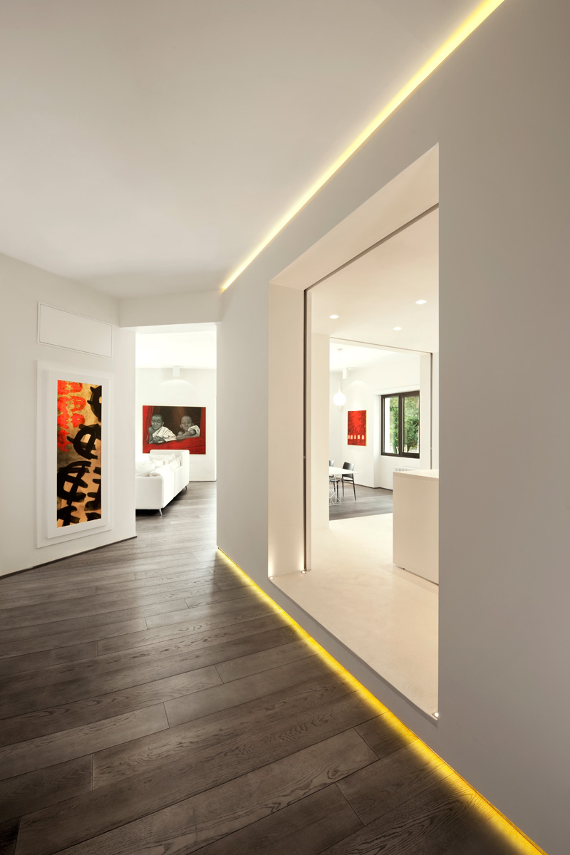 I really like the idea of how they lighted the flooring that gives the kitchen a visual appeal that it is floating from the floor.
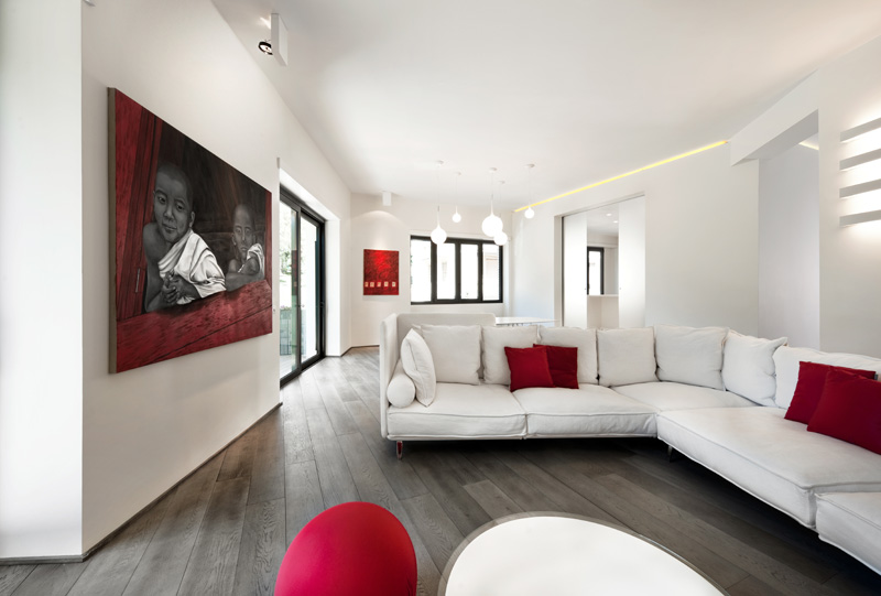 The living room has a theme of red, white and wood which takes over the space. The sofa is new with white colors with a round glass coffee table.
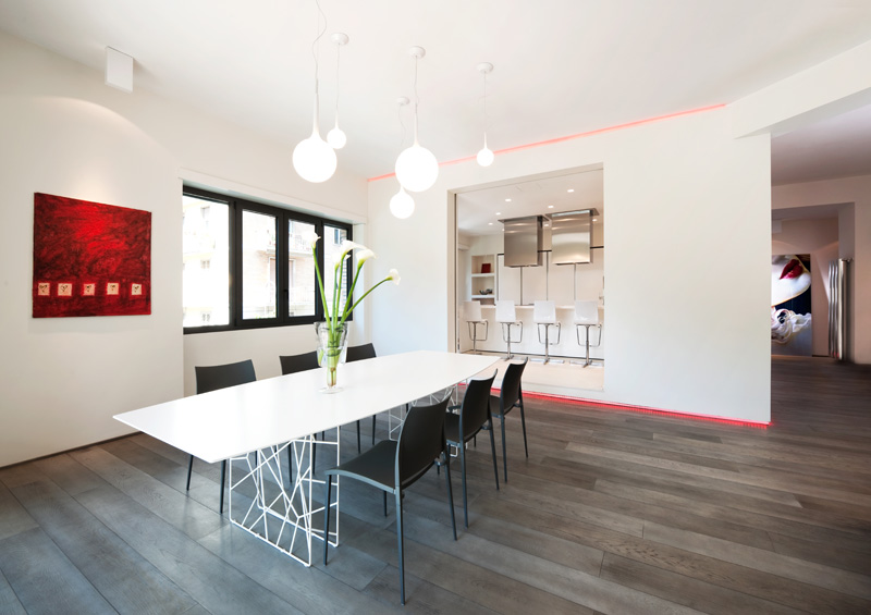 The space has been opened up wherein the living and dining room are sharing the same space. Notice the design of the legs of the dining table.
Read Also: A Small Apartment Owned by Toy Collectors in Taiwan
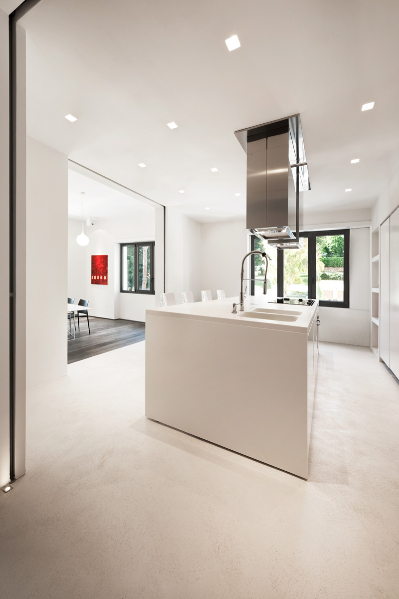 In the kitchen, the bright white colour scheme is also used. It has an exhaust fan for the stove that is made of stainless steel.
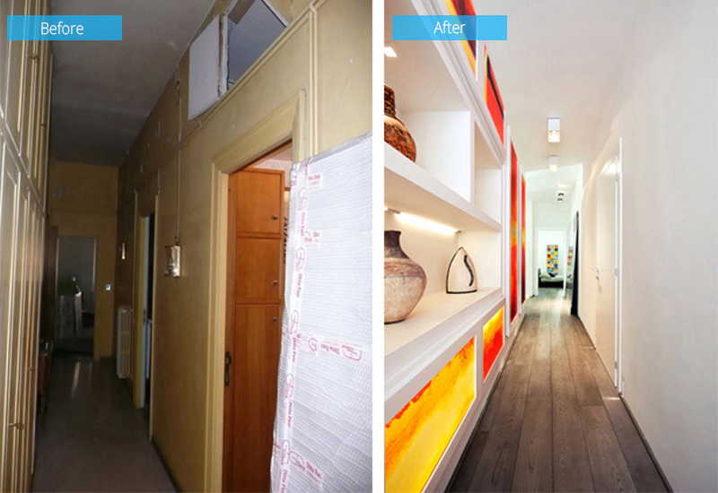 Another hallway that is located outside the kitchen that features a built-in shelving and leads you to the master bedroom.
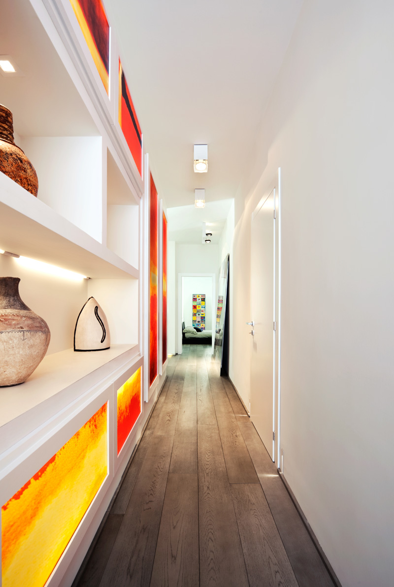 Isn’t this beautiful? Instead of leaving the walls blank, a beautiful mix of yellow and vermillion were added which are neatly framed around the built-in shelves.
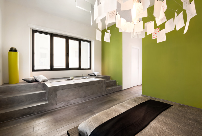 This is the master bedroom with green walls and built-in bathtub. Isn’t it a nice idea to have a bath tub in your own bedroom? And notice the creative wall hangings too!
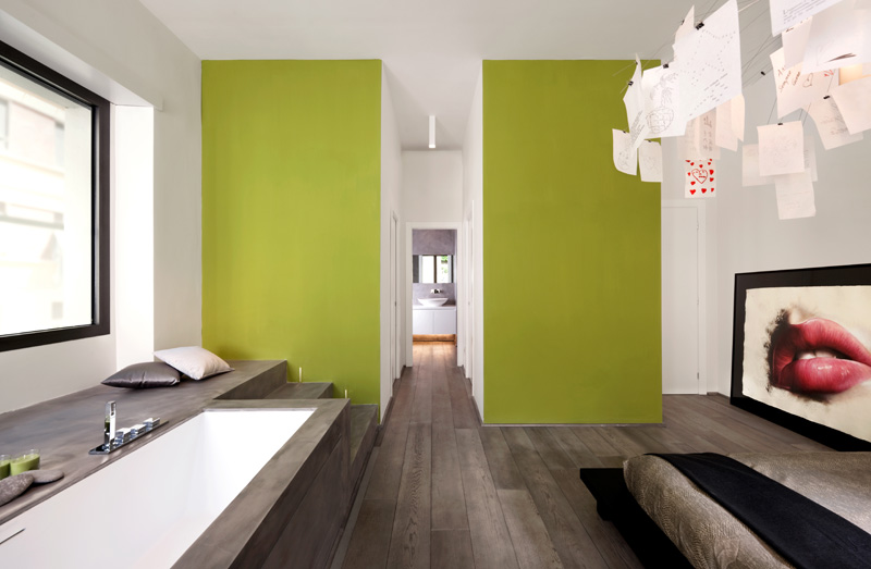 Past the green feature wall, there is storage and the rest of the master bathroom. Very unique design indeed!
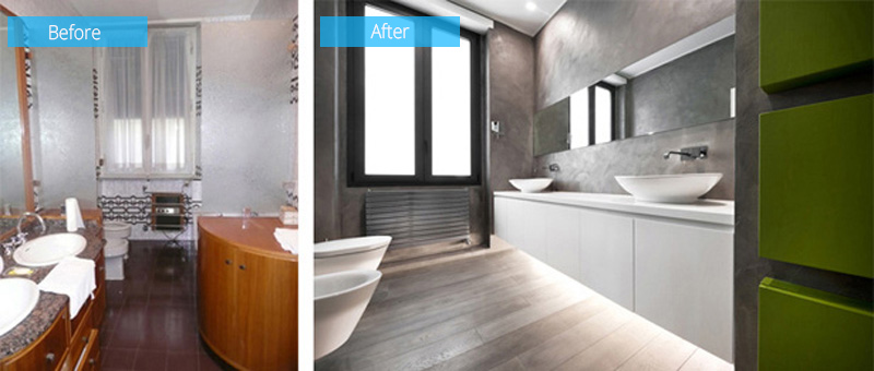 The master bathroom was also updated that features a floating white vanity with lighting underneath.
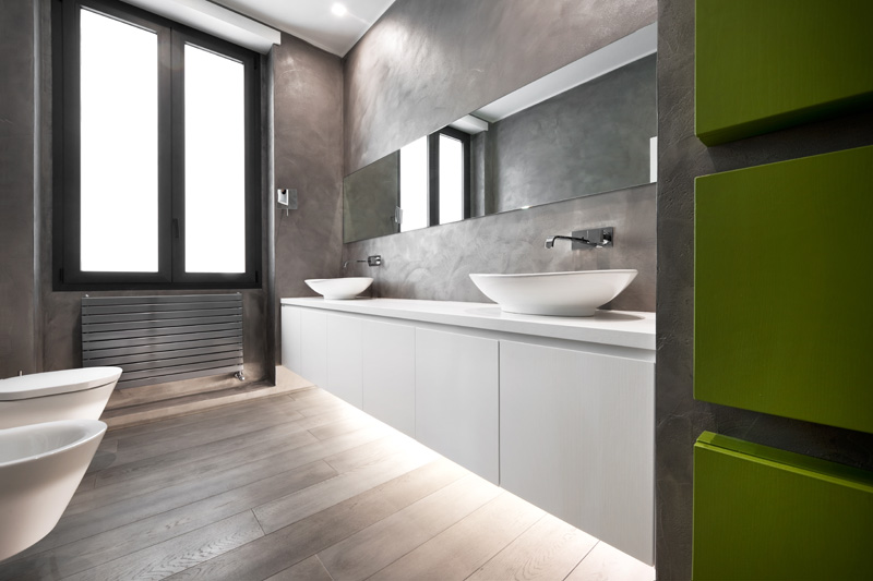 Apparently, it looks a lot better than the previous bathroom. It also has some green colors too.
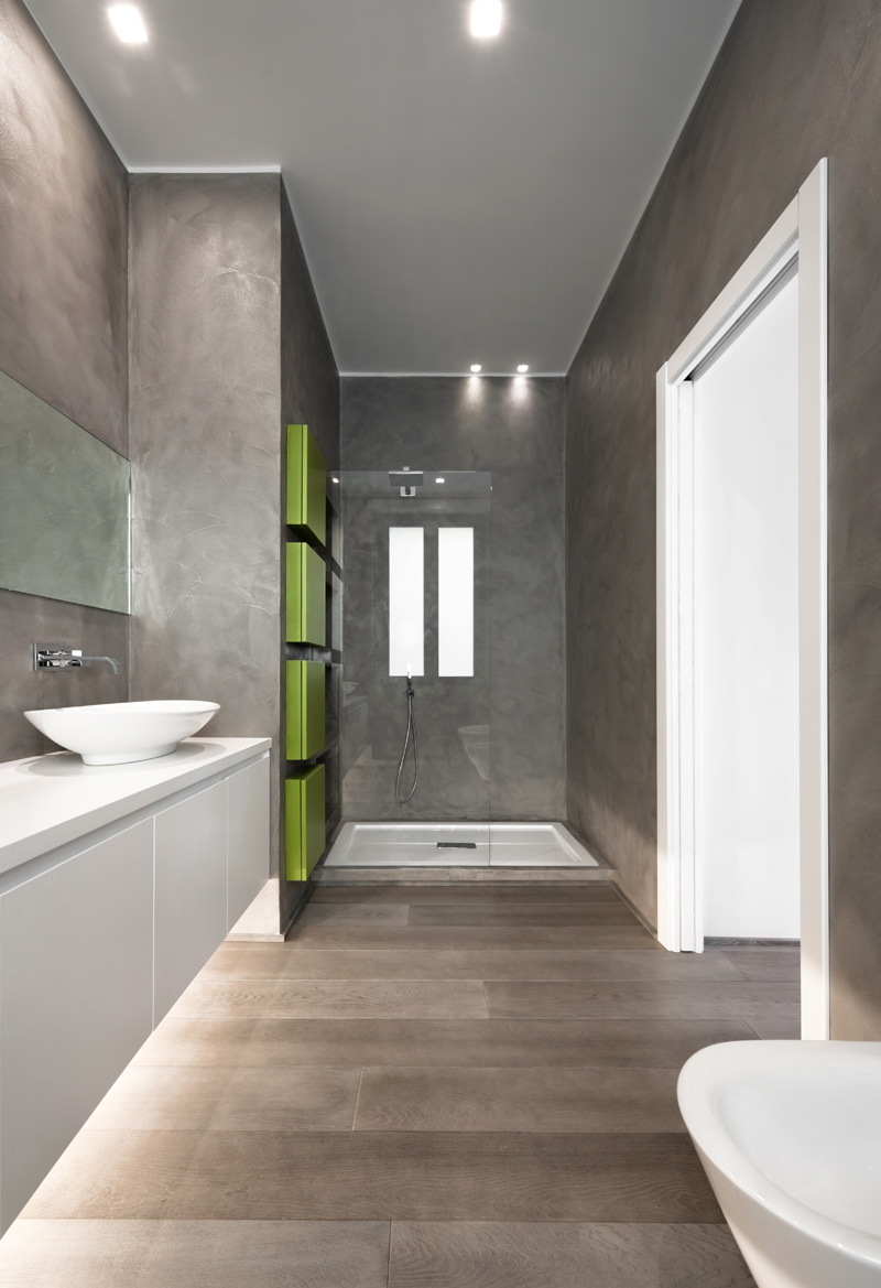 Notice the shower area in the bathroom that has a glass wall.
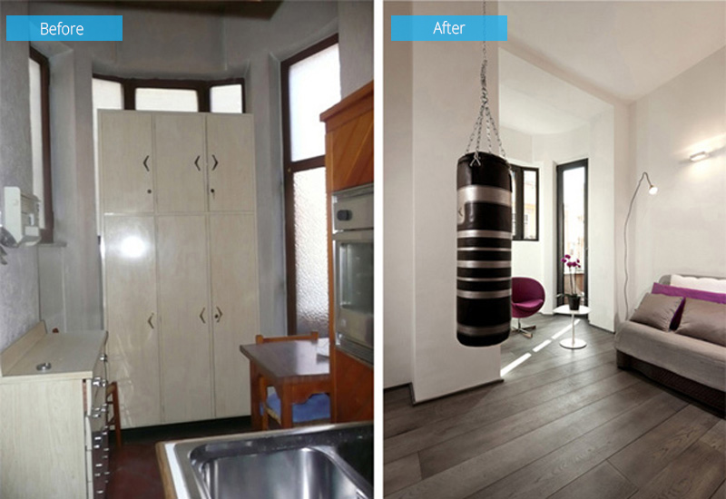 Before the renovation, this space looks dark and uninviting. But a new sofa bed was brought in.
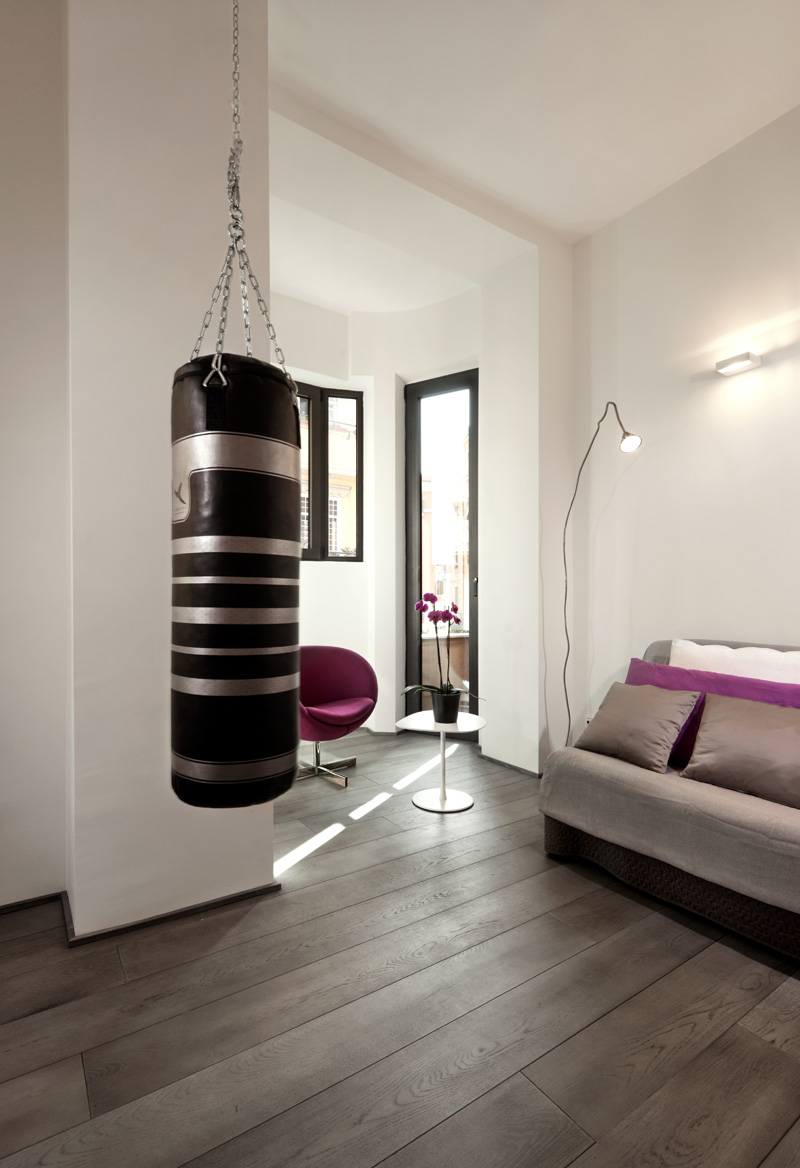 It also has a new color palette of white and purple. The punching bag becomes an added decor to the area.
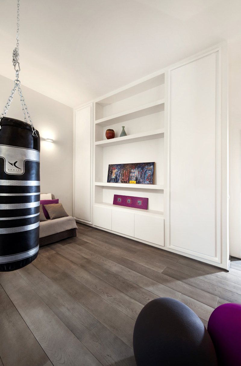 A well-lighted sace in the apartment has a sofa bed and and lovely color scheme.
 This area can actually be used as a guest bedroom as well. It has a white wall system for storage too.
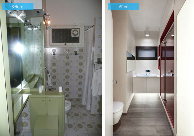
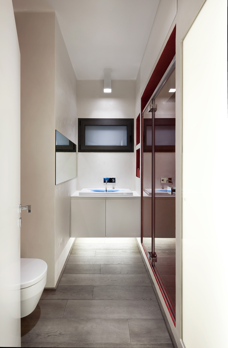 Well, this space is actually a dated bathroom which became the bathroom for the guest bedroom.
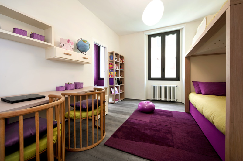 This is the children’s bedroom that has a very playful vibe. Like the previous space, this also has pops of purple as well.
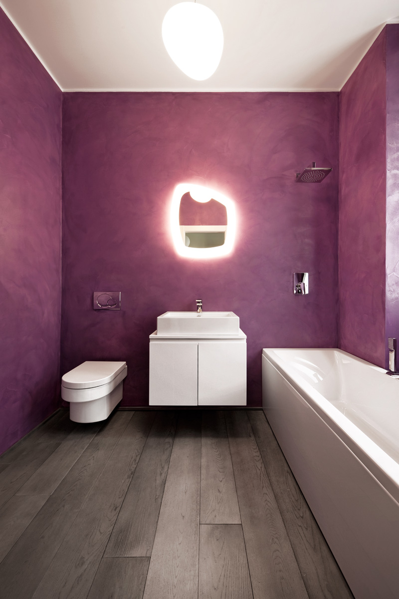 The purple theme is also carried through into the children’s bathroom. Looking, nice indeed!
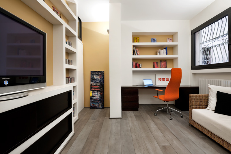 And this is a home office/studio with built-in shelving/desk in the apartment. It is also an entertainment area where the owners can watch TV.
Beautiful, right? You can appreciate the house even more because you get to see the before and after photos. Seeing the photos prior to the transformation will make you realize that no matter how cramped or dull a space it, it can look beautiful depending on how the dseigner will do it. In this project, I can say that Carola Vannini Architecture did an amazing job to this apartment because aside from making it brighter and cozier, its design goes with the modern trend too and it looks very neat and organized as well. How about you, what can you say about this apartment?


