Before and After: 1980’s Split-Level House Transformation in Canada
An old house was given a colorful modern look. Check out the impressive transformation!
Redesigns, renovations and transformations always surprise us. It would always make us realize that whatever the kind of space it and no matter how it looks, there is actually still a chance to update it and make it look beautiful and functional as well. I know you know what I mean since we have already featured many homes like this. You can appreciate the beauty of the homes even more when you see the before and after photos since you are able to compare. Today, we will feature another home with before and after photos showing an impressive change in the space.
The house is a transformed 1980’s split level home in Vancouver, Canada. It has a bright and open contemporary style with some pops of colors in it. The designer of the interior, Amy McKay worked with the homeowner in order to discover their preferred aesthetics and style. The owners wanted a “colorful modern” style so they can find a home that they could make their own. The main floor of the house received a complete overhaul. The different areas from the living room, fireplace, and bathroom were renovated. A new kitchen was also added in the house as well. Let us take a look at the home below.
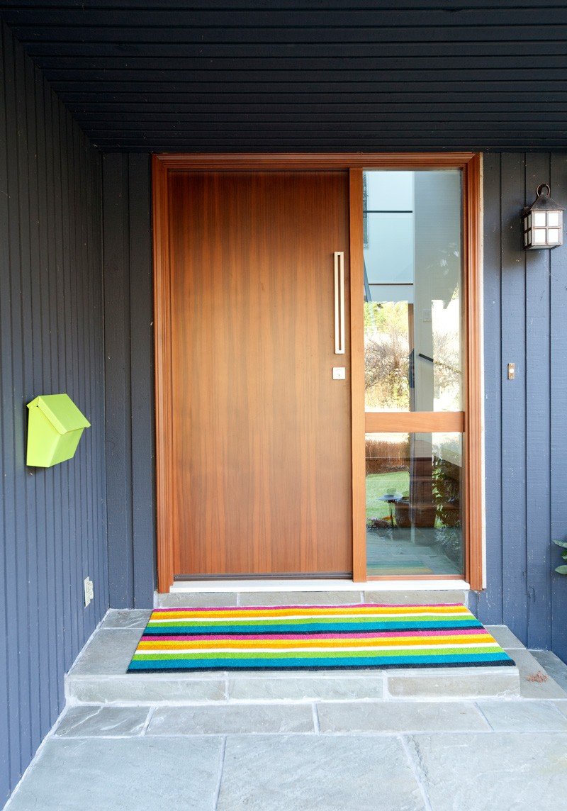 You will be welcomed with a wooden door that has a green mailbox and a colorful area rug. You will get a hint of the motif inside the house.
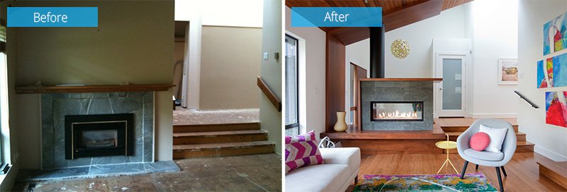 Seen here is the fireplace and steps of the living area. Notice the difference of the fireplace which is now elevated from the flooring and has a modern look with stone finish.
 The new living area with fireplace looks very beautiful now. It is neater and yes more modern indeed.
 I know the old living area looks very boring and dark. With the new painting on the walls and the wooden ceiling. Drapes were removed to give the space a more airy feel.
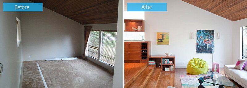 For this one, the walls were removed so it can be connected to the other areas of the house. With an open space, it looks a lot better now especially with the new flooring.
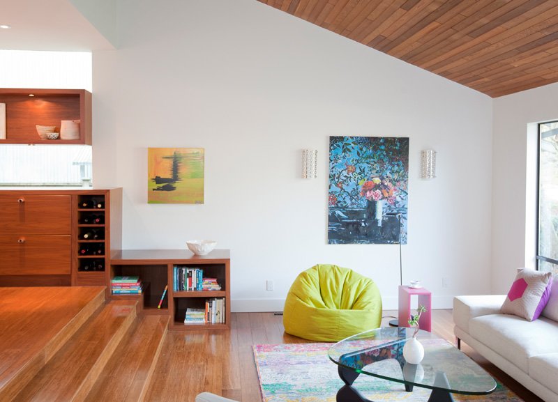 I love that area rug! It is very gorgeous indeed with pretty wall paintings and decors. There is a green bean bag on the floor as well as a colorful floor lamp too.
Read Also: Before and After: From Salmon-Colored Stucco Home to Stunning Contemporary Home in Austin, Texas
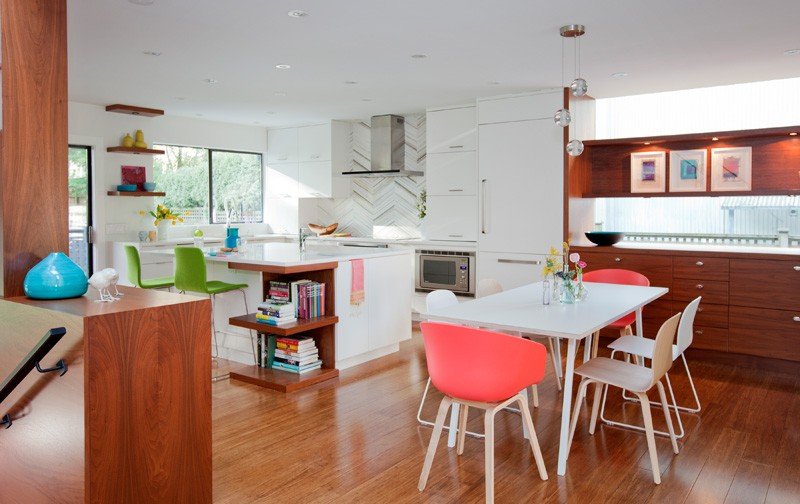 The kitchen has a dining area with a pretty pink chair! I love that accent! While in the kitchen, green chairs are being used. The backsplash of the kitchen looks interesting too.
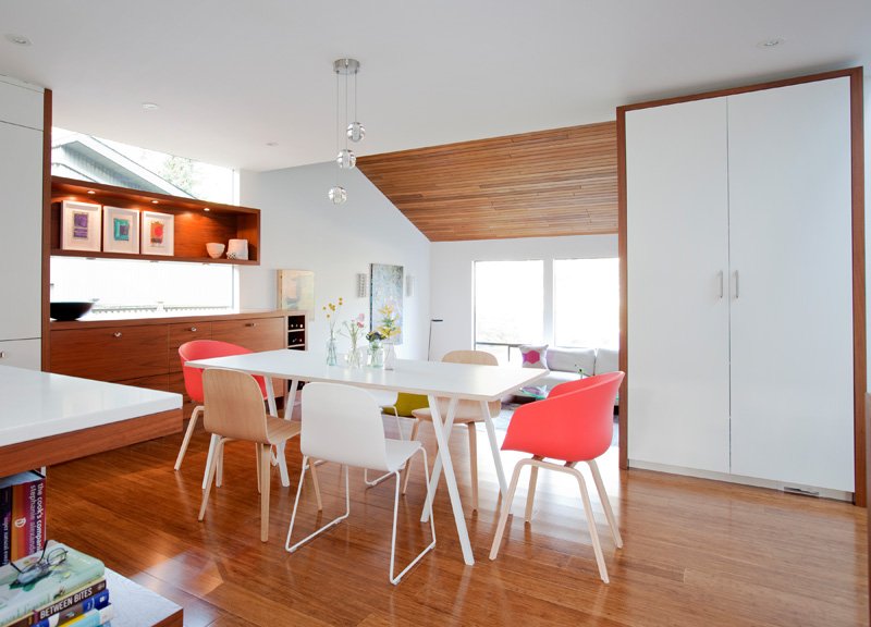 It was a good idea to use white and wood together then bring in some pops of colors. A floating shelf carries some frames and other decors on it.
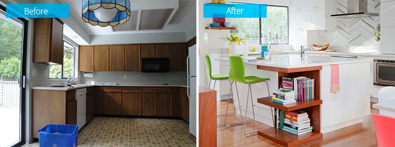 Seen here is a before and after image of the kitchen. The old ceramic tiles were removed and wooden flooring was added. The cabinets were also updated too as well as the lighting.
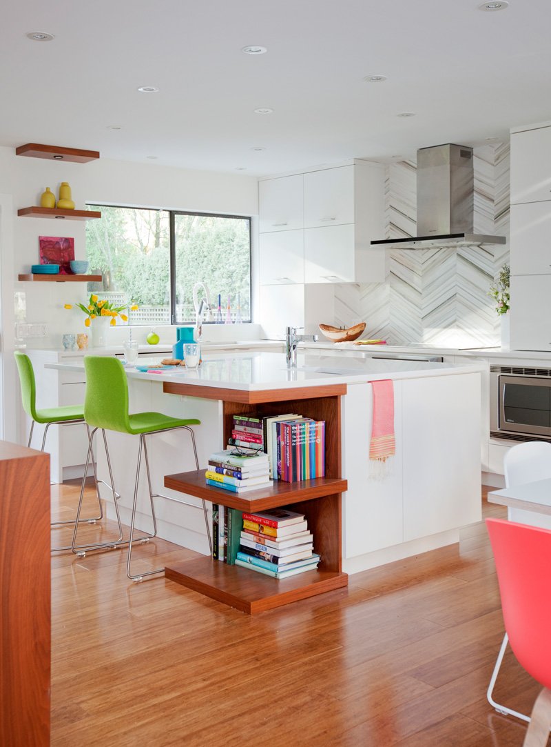 A closer look at the kitchen. I like the design of this one because even if it isn’t large, it is well-organized and very neat.
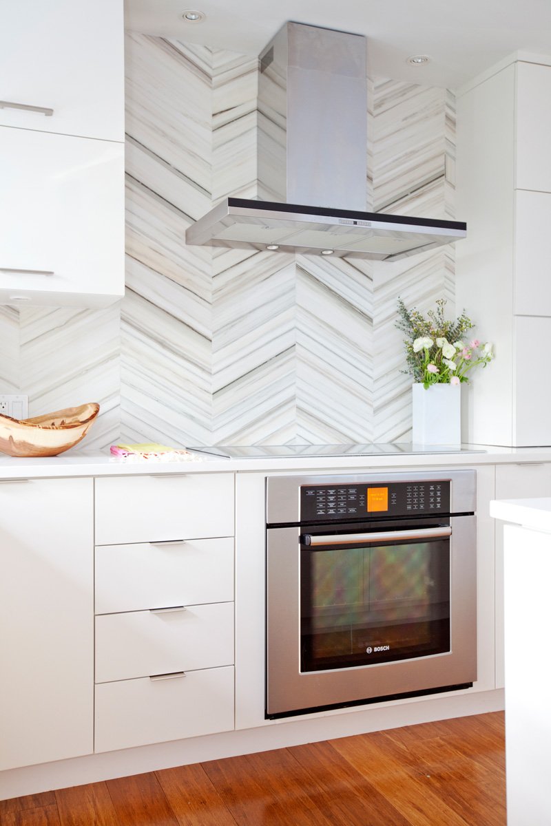 The backsplash of the kitchen is very creative and decorative. You can see here the oven and range as well as the range hood.
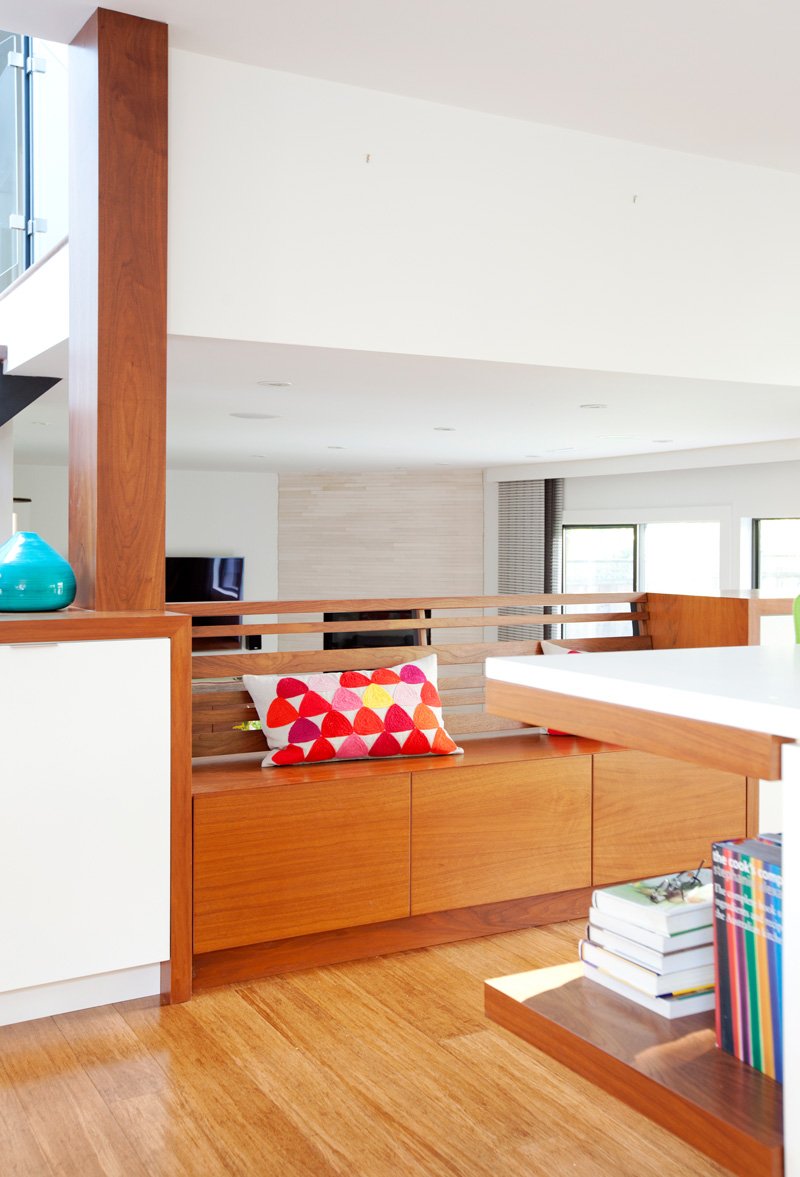 In the kitchen, there is a bench with storage space under it. That throw pillow is cute!
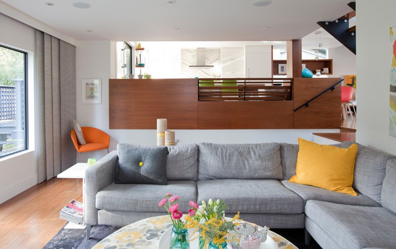 Below the elevated kitchen is another seating space. I can tell that this is the family room. I like what they did to the centerpiece.
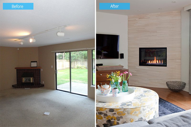 The family room was once boring and ugly too. But new painting and flooring was brought in as well as some furnishings to give it a better look.
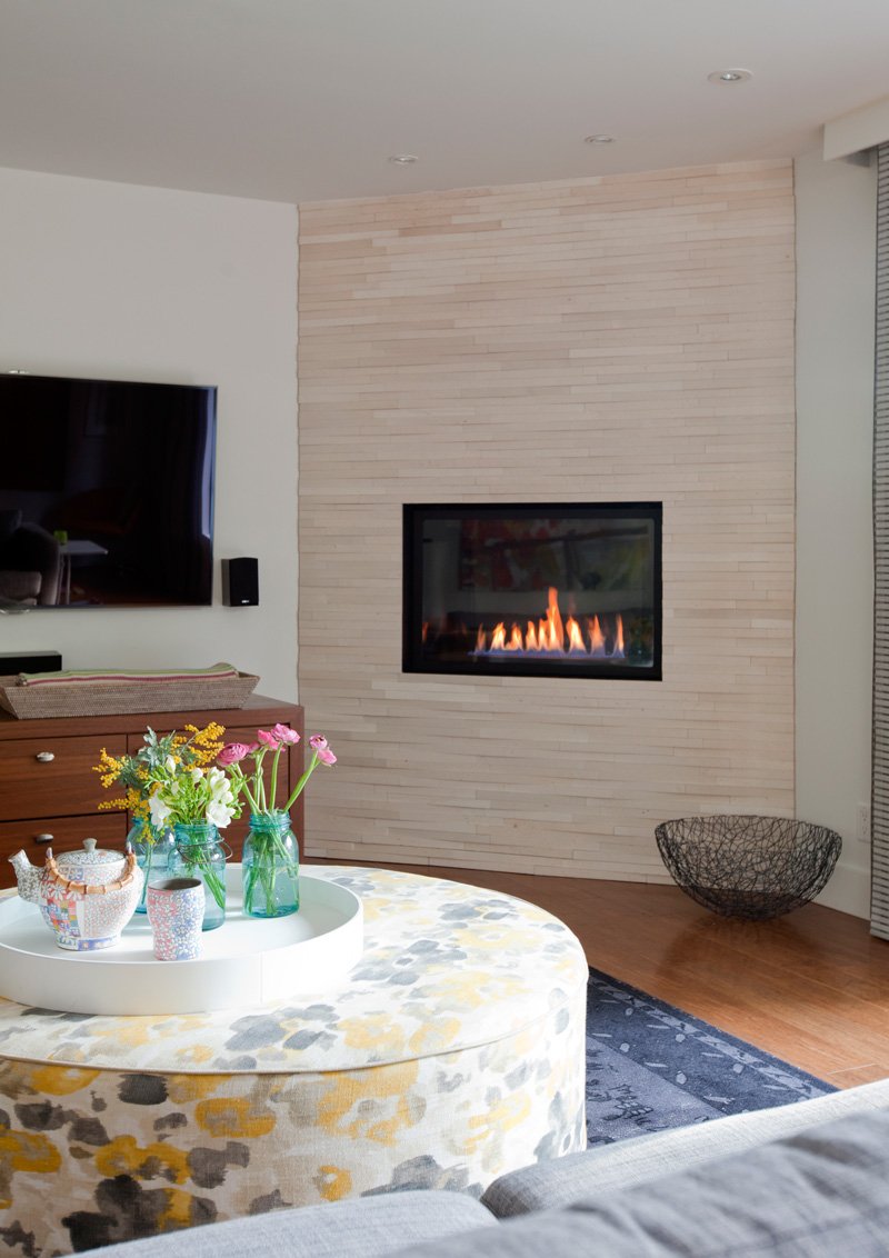 A closer look at the fireplace with added finish that gives it some beautiful texture. Notice that round ottoman center table they used here.
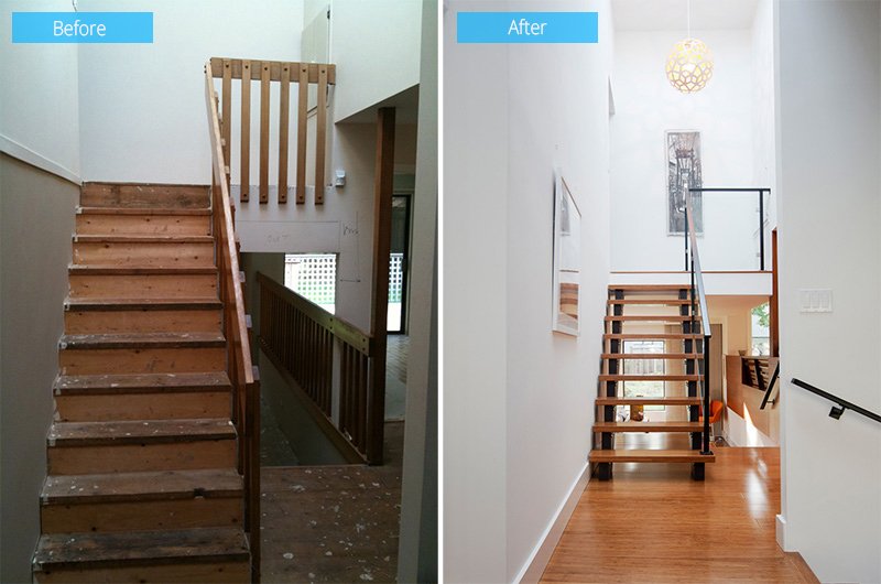 Look closely at this stairs. You can see that the staircase is indeed old and needed to be changed. The new staircase combines wood, glass and steel for the railings.
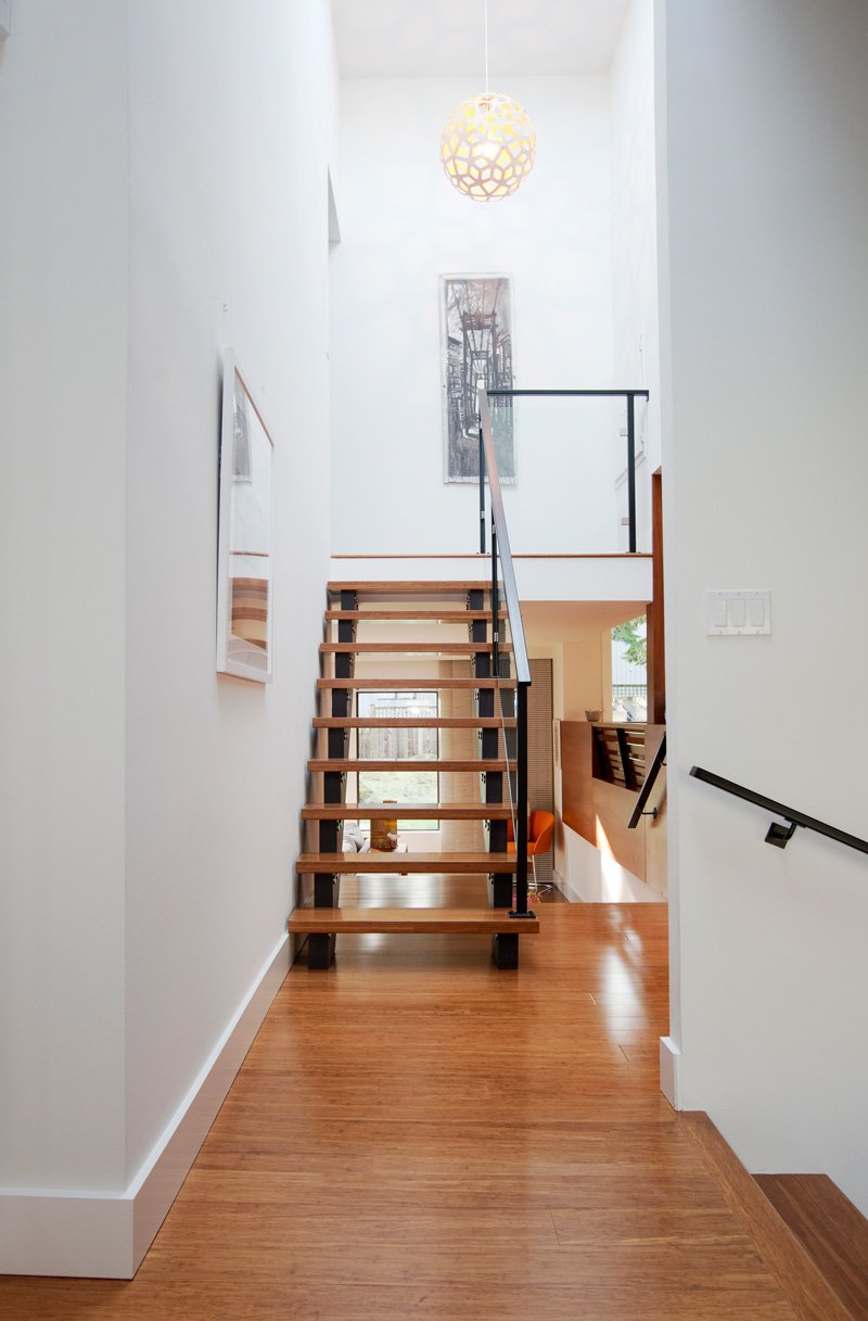 Adding a beautiful pendant light to the landing of the staircase makes it look even more attractive. Say bye to the once boring staircase!
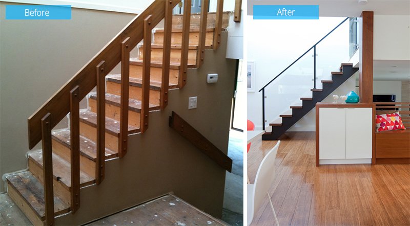 Another view of the staircase where you can see the changes they did to it. It looks a lot better with the new design and materials. It looks more modern that way too.
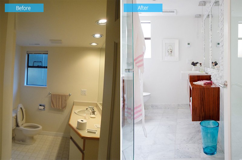 The old bathroom looks dark and ordinary. The floor tiles were changed as well as the painting. A floating wooden vanity was added to instead of the old vanity.
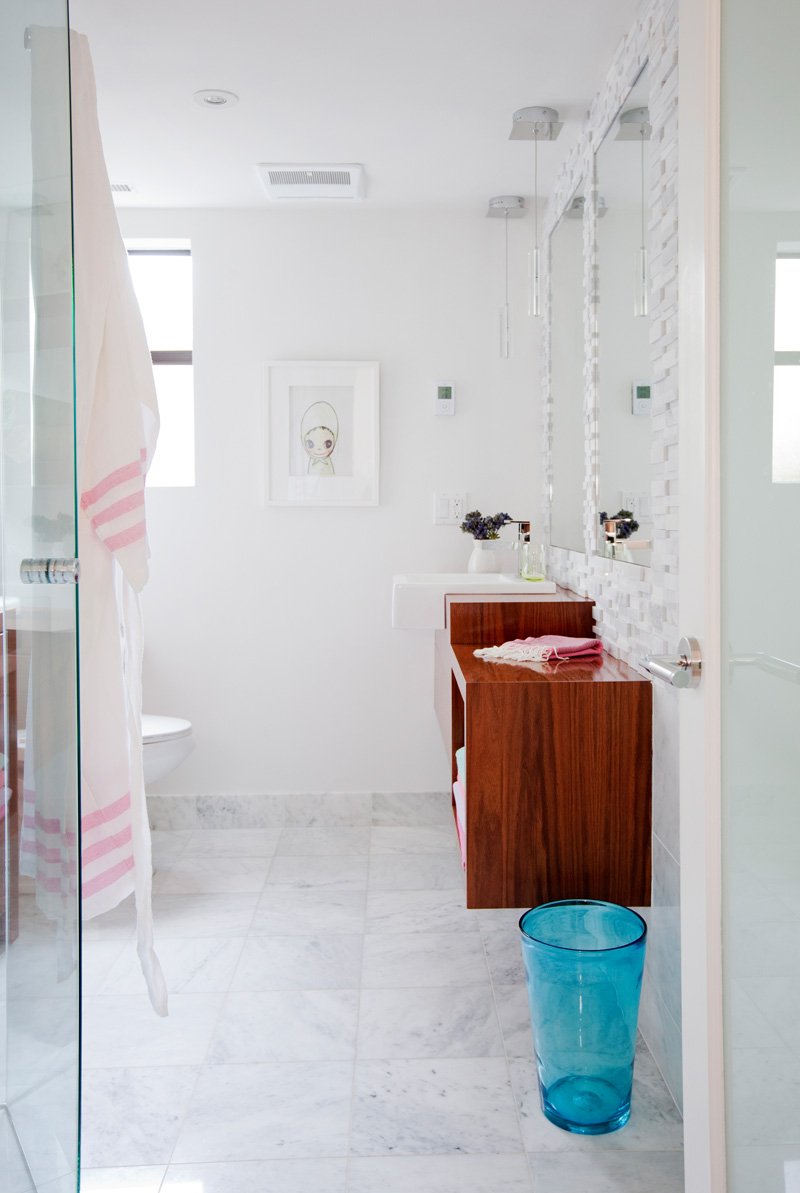 I love what they did to the walls above the vanity and around the mirrors. Isn’t this a beautiful bathroom with some pops of colors?
What can you say about this house interior by Ami McKay? It is indeed beautiful. Since we were able to see the transformation, we could appreciate the space even more. We can see how the interior was changed and how it became more usable and functional and cozy! The new space now looks more as “home” than the old one. And yes, it has that colorful modern look the client wants without overdoing it. I like how the colors were integrated into the space with the wooden materials that surround it. Furnishings bear some colors that adds visual appeal to the area.


