Before and After: Chic Interior of Client Freakin’ Fabulous
I know you are pleased whenever you see some before and after photos of some home projects because you get to see a glimpse of how the area looked like prior to the redesign. Aside from that, you can even appreciate the new design even more as you see how much it has improved from its prior look. Today, we have another before and after project to show you.
I like how Amber Lewis calls her clients for every project. It would be unique and it could also tell us what kind of clients she has or how she looks at a certain project. What we will feature today is her project with Client Freakin’ Fabulous. Well, we don’t need to describe to you the project because I guess all the adjectives you are looking for is already there! Just take a look at the photos below so you will know what made it freaking’ fabulous!
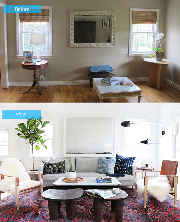 Not an ordinary space anymore as it was painted white all over and new furniture were brought in.
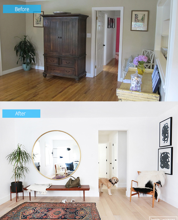 The foyer has a lovely look too. Before, it looked plain and dry but now, it looked very inviting already!
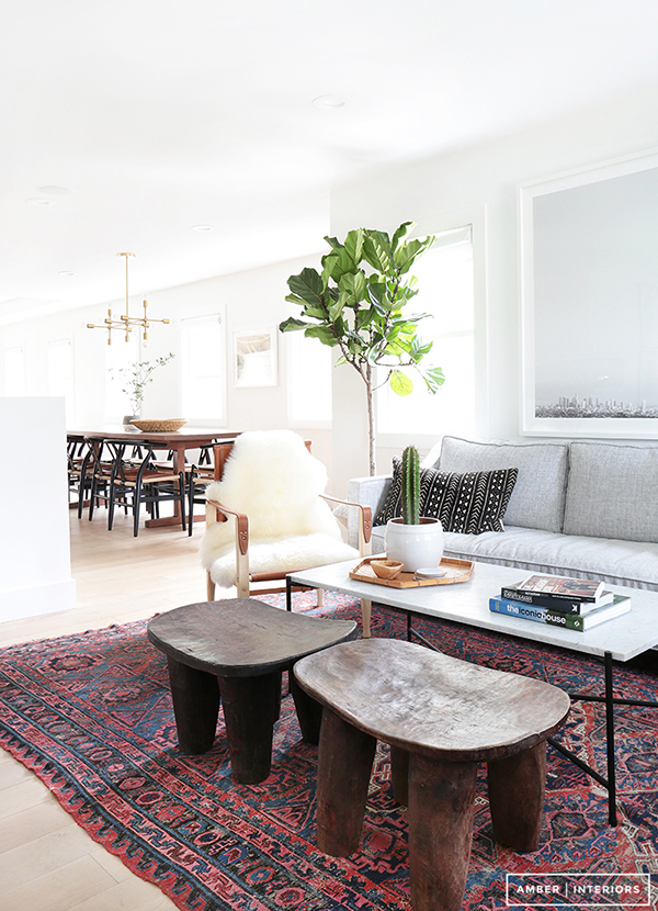 There is a Scandinavian feel in this interior that made it look comfy and creative.
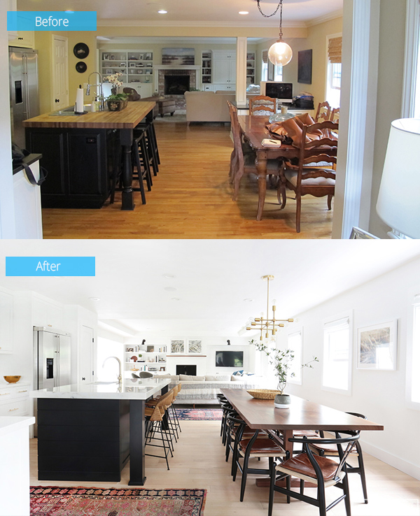 Just a usual traditional dining and kitchen space- but now, it has a brighter look with new contemporary furniture.
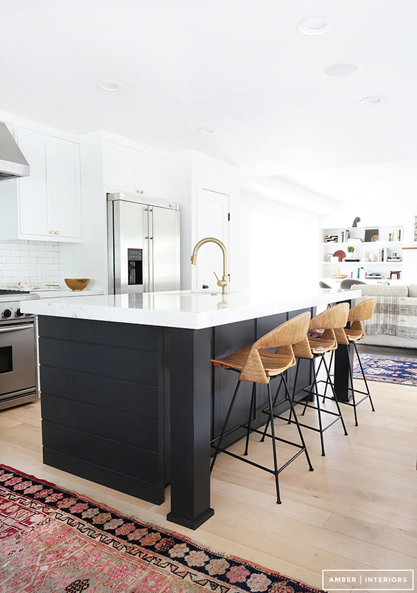 I honestly love those high counter stools in the kitchen island! Just look at them!
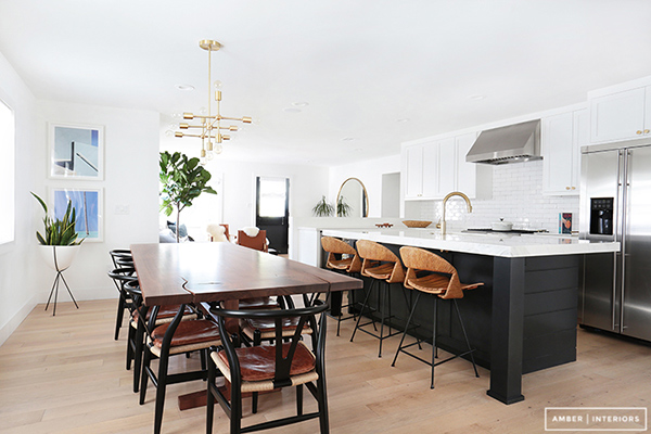 For this space, there is some Mid-century feel in it. Having plants in here made it look even more serene.
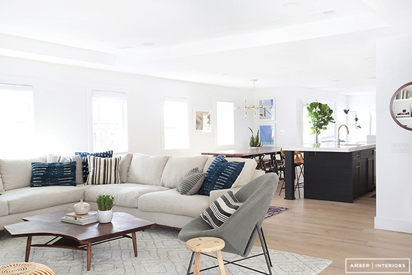 A look at the public spaces of the house from the living area to the kitchen and dining.
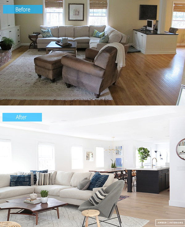 The old space was boring but now, it has so much life in it despite the simple color palette.
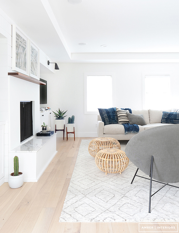 Modern geometric patterns are seen in the throw pillows that grace this lovely living area.
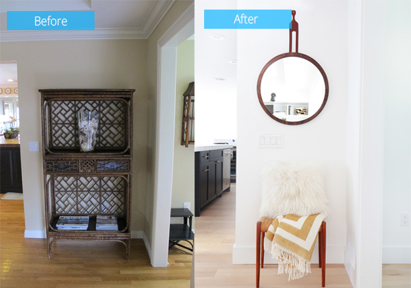 Instead of a traditional piece of furniture, a lovely chair and mirror was added in the area.
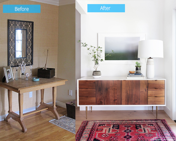 For this one, a more beautiful console table is used with a sleek mirror and decors were added to it.
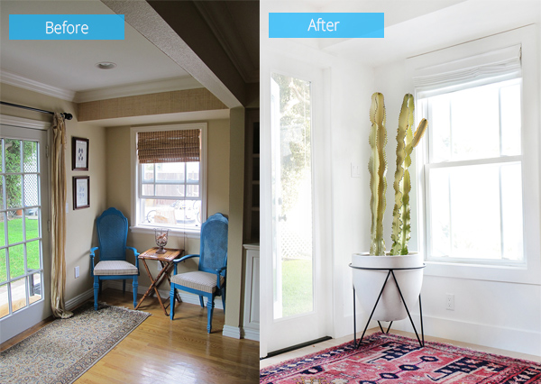 A tall plant in a giant jar took the place of the old blue chairs which looks like it was never used.
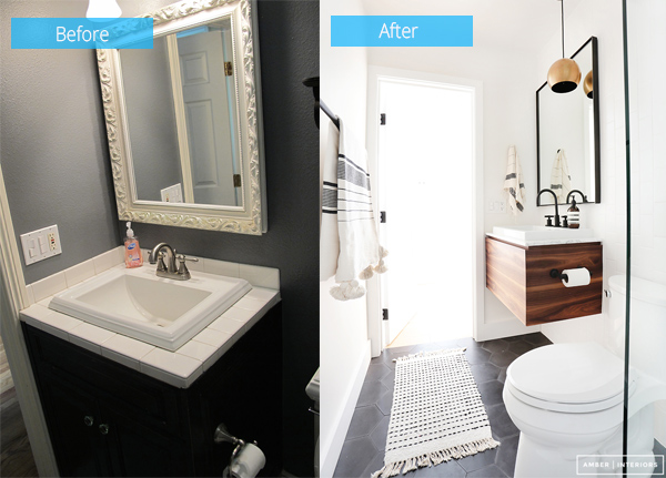 The small powder room didn’t just look more spacious but it does look even more attractive.
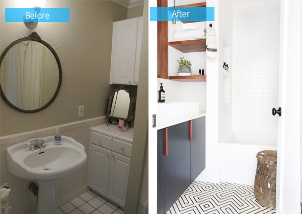 Patterns on the floor and white walls-such a lovely guest bathroom!
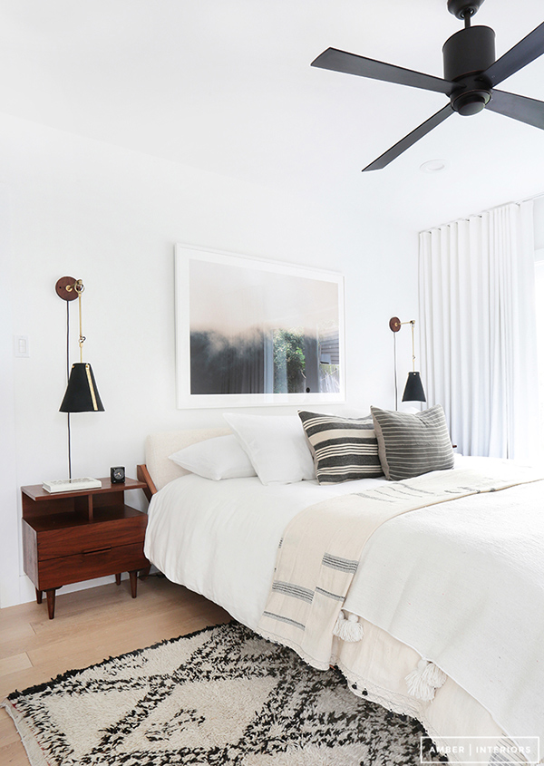 And of course, the bedroom. It has black, gray and white colors in it to make it more relaxing.
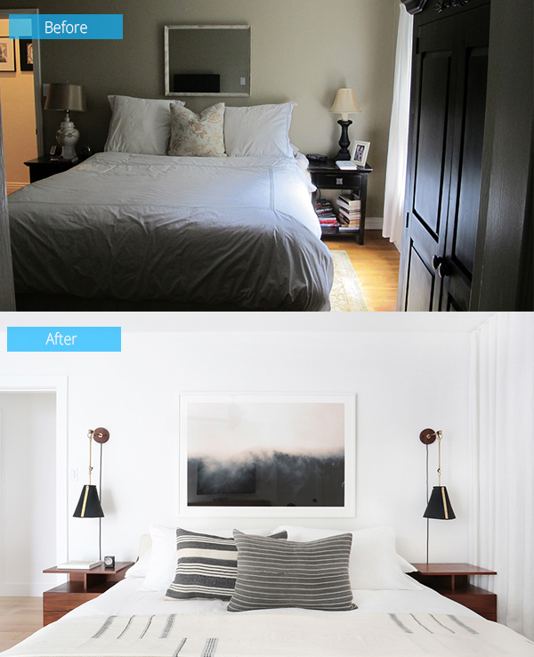 Now tell me, which one would you prefer to sleep, the before bedroom or the after bedroom? Of course, the new design!
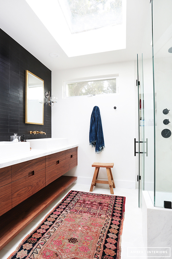 The master bathroom also has that rug that is similar to those seen in the living room. Note that it has a skylight to bring in some light.
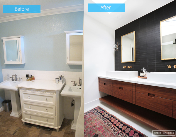 Black backsplash wooden cabinets and white walls- stunning, right? Much better than the previous space.
I know you saw a great change from the before photos to the current look of the space. Isn’t it freaking’ fabulous? It sure is! This project is from Amber Interior Design who had expressed her joy in working with the happy and sweet family who owns the house. According to her she would even love to do some decorating for them whether it’s for a cake, a dog house or anything, as long as it is with them! No wonder her clients were labeled as freaking’ fabulous! You can see the owners had an amazing personality merely by looking at the spaces above.


