Fascinating Look of the Exterior and Interiors of the Casa SE in Mexico
The shape and forms of the building matters the most in creating and crafting a type of house whether it is traditional, contemporary or modern. The shape and structure of the building plays the important role in lay outing the different areas of the house both for the interior or exterior. Today, we will show you how these forms and figures of the house building contributed much on achieving the best concept and layout design.
This house is named as the Casa SE which was built traditionally as a residential quarter specifically situated in the western parts of Guadalajara. This is said to be built intently as a permanent home for a family of 4 adults. The client requested to have a more comfortable and spacious area in the house that will also allow them to have private terraces. This has two levels and each part took their role in underlining the importance of the entire level as a whole. Let us check the different significant areas of the house that made this house stand out among the other houses in the neighborhood through the images below.
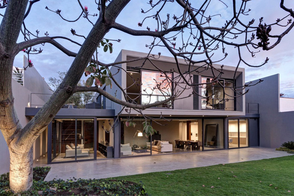 See how this geometric shape and figure of the house building underlines its modern and elegant concept.
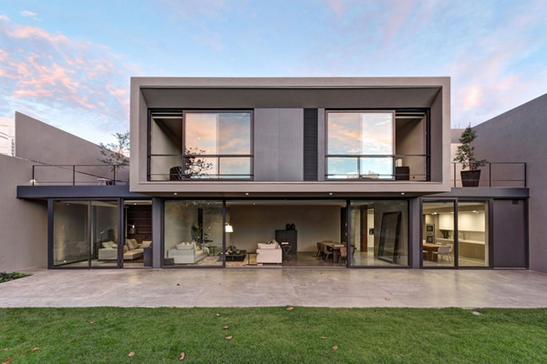 Green grass in the landscape is very effective in presenting two different textures of smooth and rough from the house building to the exterior.
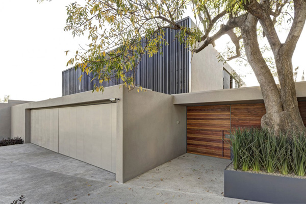 Lines and textures are well -presented even in the entrance and garage area of the house.
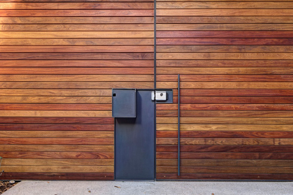 Incredible lines and wooden patterns are unveiled in this entrance from its walls and door.
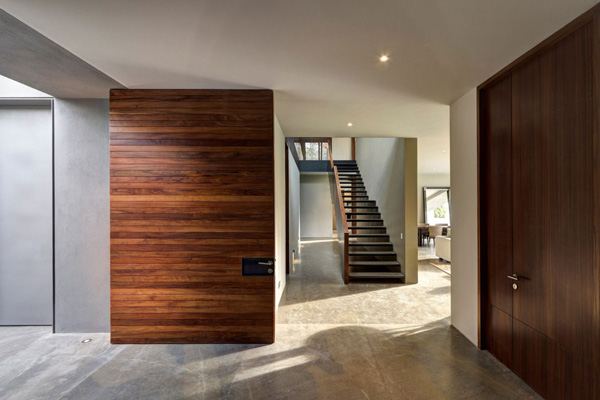 Natural light is always accessible in the interior as it used to underline the durable and sustainable materials here.
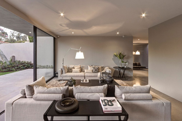 Who will say this soft and beige furniture enhances the interior to expose its comfort and elegance?
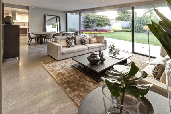 Innovative and stylish design of the furniture and accessories arranged in the interior can truly show its fashionable concept.
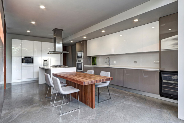 White, silver, grey and wooden color is utilized to make this dining space look so clean and stunning.
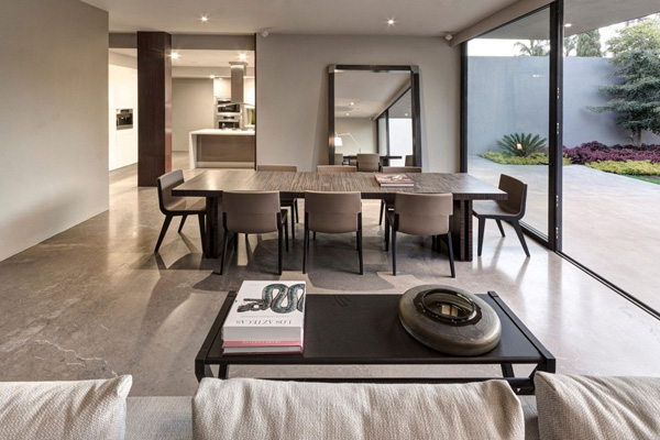 Chocolate brown color of the dining set harmonizes with the walls and floor in the interior.
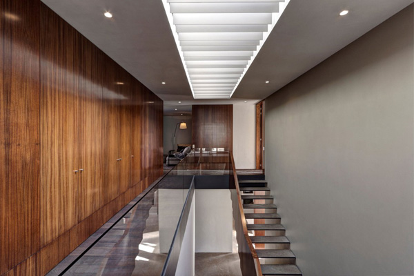 Lines and different dimensions are seen in the movements of the walls texture and staircase pattern in the second level of the house.
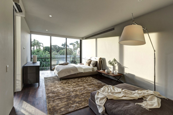 Rough texture of the carpet in this bedroom highly emphasized its role in creating balance in the bedroom.
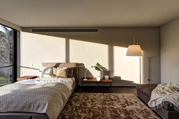 Sustainable lights are always welcome in this bedroom that provide a minimal consumption of electricity.
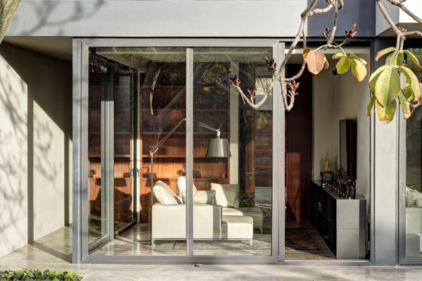 Glassed walls and doors can offer the transparency and easy accessibility in the house.
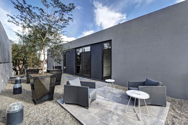 Different shapes of these grey furniture set in the patio also adds attraction to the outdoor areas.
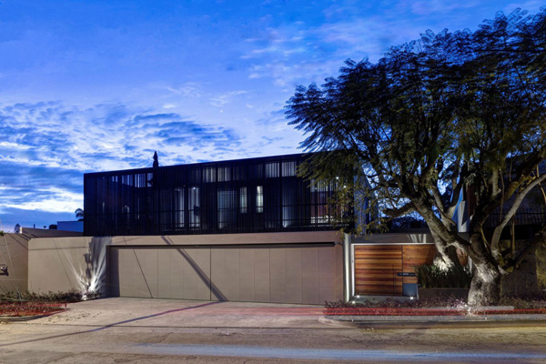 At night, we can never deny the fascinating contribution of the lights in the exterior.
As we have witnessed the different amazing ideas of the Elías Rizo Arquitectos to make this house lovelier and functional, the house really stand out among the other houses here. I personally like the special emphasis on its detail and craftsmanship that can be seen in every areas of the building. The metal screen that serves as the frames in the main façade shows a very meticulous constructed staircase. We hope that we have given you another set of ideas today.


