Before and After: Old House Turns Into a Kid-Friendly Modern Home
Anyone would want a modern home especially that we can get much of homes like this from magazines and even home design websites like Home Design Lover. Well, it sure is the trend these days and they are functional, beautiful and practical too. No wonder that this is what couple Sascha and Denise Zarins wanted for their home. Both are mechanical engineers and wanted a custom home for their family. They found a home in Saratoga, California which was remodeled into something the entire family loved.
The Zarins had two young sons and they want the home to be safe for them with a generous amount of wood, glass and stone. The home they got was built in 1969. Well, it looked far from what they wanted but it was livable and there it has a large flat lot as well as an established neighborhood. They knew it was a nice place to raise the boys and so they lived in it for four years before renovating it because it wouldn’t be nice to do a renovation with infants in the house. Let us see how the house was changed through the remodeling process by Cast Architecture.
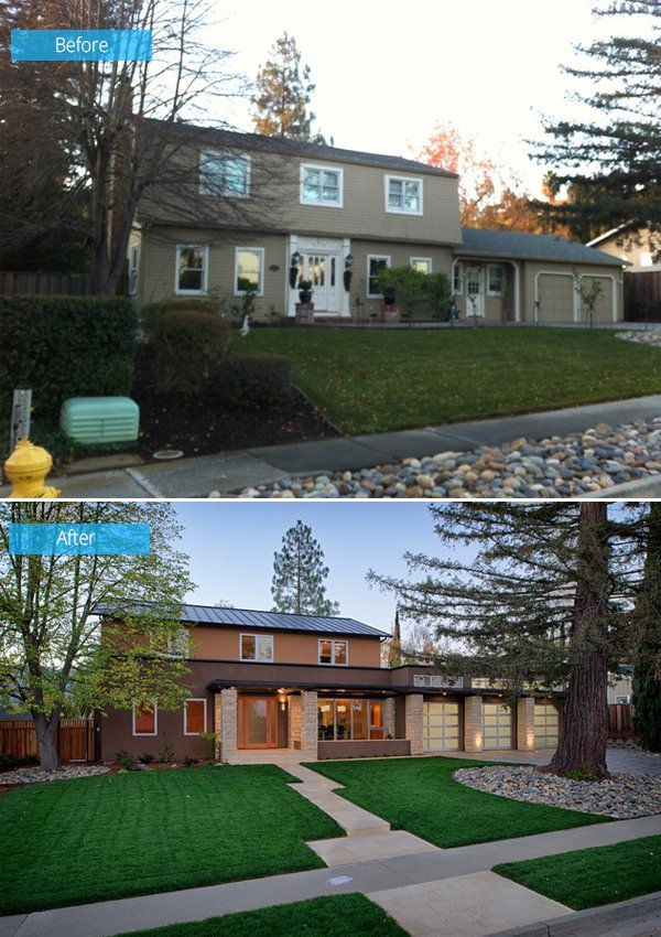 You can notice the huge difference of the house not just in the exterior but even in the landscaping too. It added stones to the exterior and more glass.
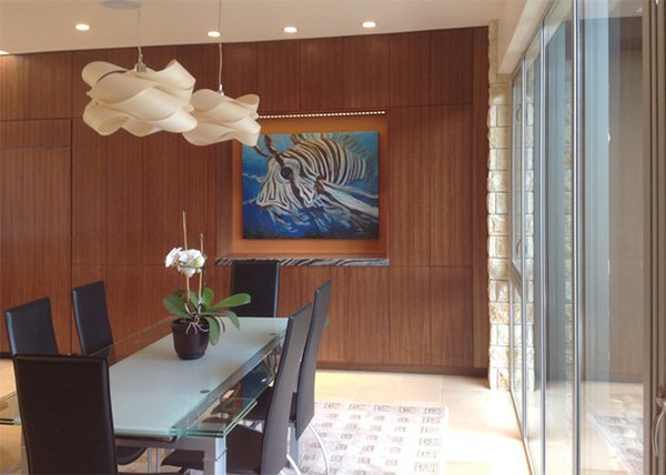 Even if the home had a modern design, they made sure that it is kid friendly. They didn’t have high-end things that they could worry about getting destroyed. In the dining area is a wall of glass windows that faces the street.
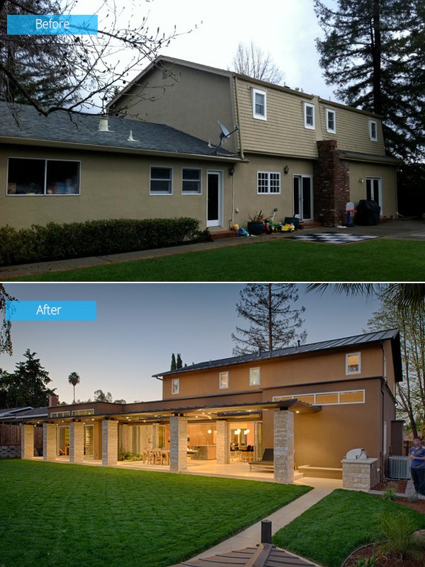 The remodel was done by De Mettei Construction. The internal wall so the lower level were removed, the garage higher was raised. The porch was extended and the exterior was changed. But they had to make sure everything complies with the tough building codes of the city.
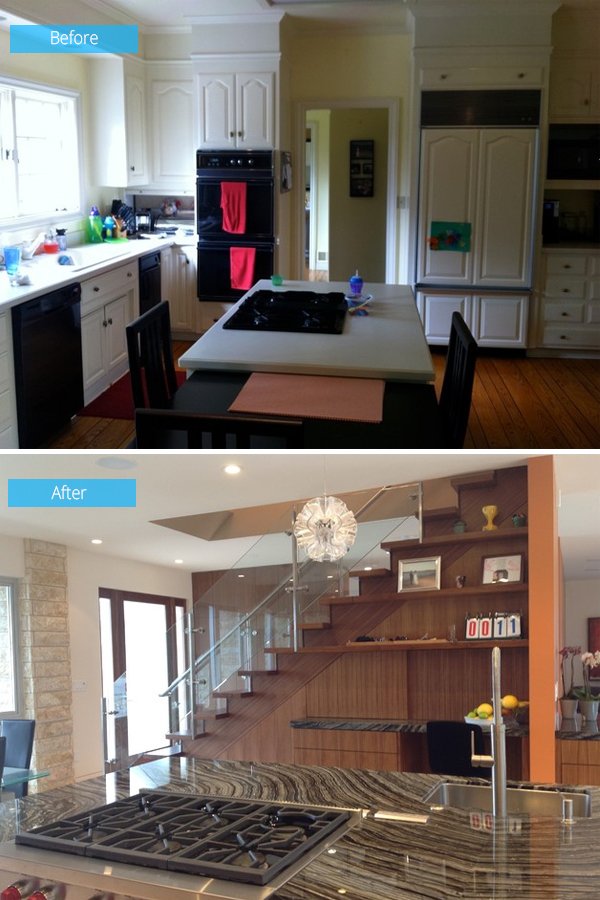 Before, the kitchen was a closed-off rooms on the lower level with windows facing the back yard. In the new design, the kitchen was divided from the family room and living room with a staircase.
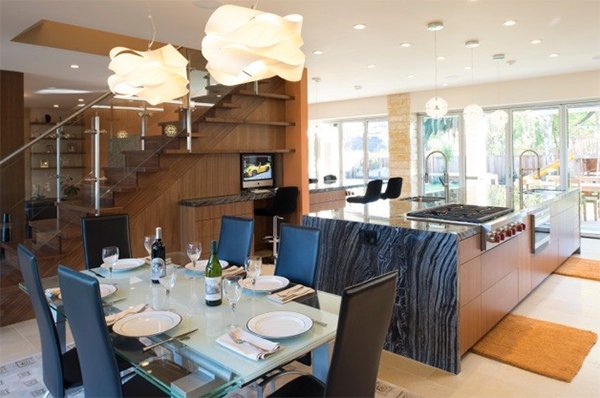 The kitchen has an open-plan layout with an island complete with a wine fridge, dishwasher and cook top. It is adorned with a waterfall marble top.
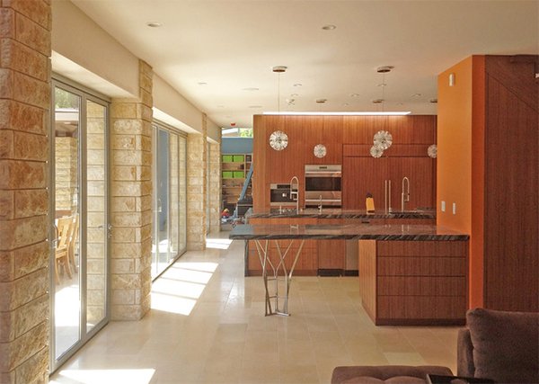 The stainless counter bar base is a lovely idea by Hutchins which looked great in the kitchen. This breakfast bar is also a buffet space when there are guests in the house. Bifold doors faces the garden.
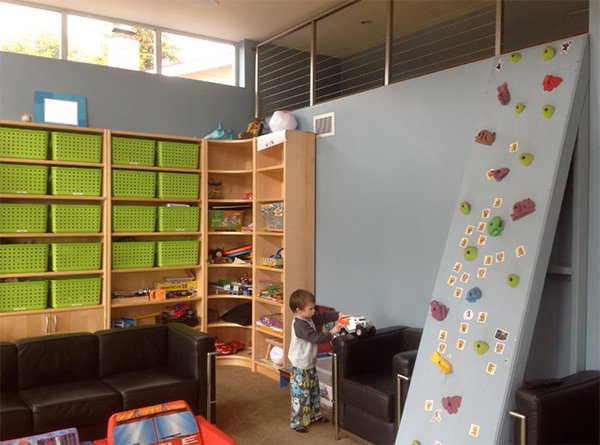 The playroom is adjacent the kitchen with child-size furnishings on a carpeted floor. It has a climbing wall, storage for toys and books.
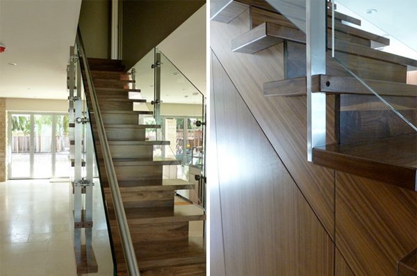 The staircase has a safe and practical design. It has closed treads and high-tempered-glass panels that were designed considering child safety.
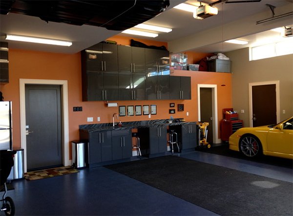 The double-height garage isn’t just for the car but also served as working areas when they create projects like radio-controlled cars, models, puzzles and others. The space is also safe for the boys too.
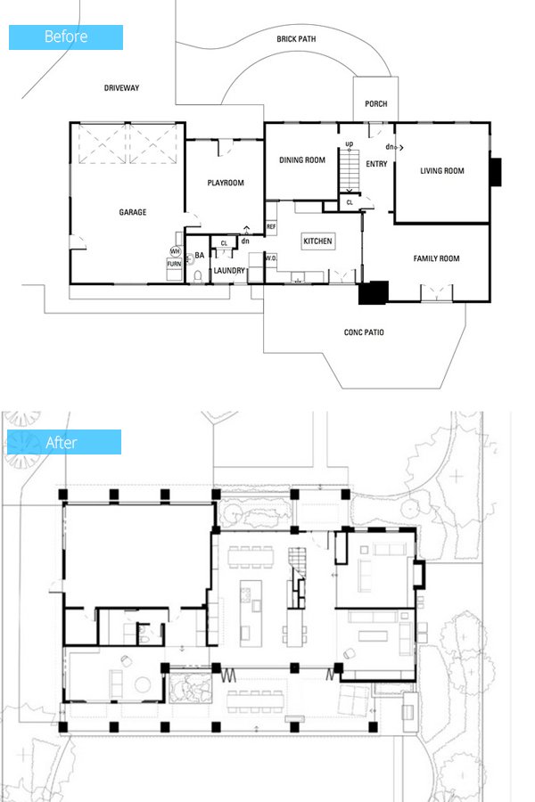 The original layout had closed off rooms that hinder natural light. The backyard wasn’t used well too. In the new layout, it was reconfigured to take advantage of natural light and open space. A covered patio was added for an indoor-outdoor living.
Now that sure is an amazing improvement! I like how the exterior looked like with the stones and lights and all! No doubt, architect Matt Hutchins of Cast Architecture did a good job in the remodel of the Zarins home in California. Even the interior was done so well that it all fitted the lifestyle of the family including the two boys. What can you say about this renovation?


