When a space is already aged, there is a chance that it will be damaged or it will no longer appear presentable. Worse, it might not be functional anymore. With that, it would need some renovation or redesign in able to restore its functionality for the current users. It would need to be updated so that it will look aesthetically pleasing. We have seen many homes that are old and damaged but were still given a different look with the help of creative designers who made sure that despite the change, one will still be able to recognize the space as something that was upgraded which gives it a higher value. If you had been following Home Design Lover, you might have seen some ‘before and after’ features we have done where you can see the differences of the space from its prior look to its new appearance after a renovation. This is what you will see today in a kitchen.
A dilapidated house that was built back in 1920 located in Sydney, Australia looks far from its original appearance since it became a home to squatters and the homeless for over 10 years. With that, the house that is located near the cafes and schools of the city, needs to be saved from its condition. The property was bought by a new owner who believed in the potential of the home and that it can be renovated into a beautiful family home despite the graffiti that covers it. Since the homeowners want it to be their forever home, Minosa Design made sure that the kitchen will look the way they wanted it and would function the way they need it. The kitchen needs to cater to the busy lifestyle of the owners combining the kitchen and dining areas with an open living space. The area has a warm and sleek aesthetics featuring a large island that approximately measures 13 feet (4 meters) in length. It has a built-in wood dining table. Aside from that, there is also a window seat that provides dining space in the kitchen.
Location: Sydney, Australia
Designer: Minosa Design
Style: Modern
Type of Space: Kitchen
Unique feature: From a graffiti covered kitchen to an award-winning kitchen with a sleek look and functional design featuring a hidden laundry.
Similar House: Before and After Photos: Greendale Tailored Kitchen in Wisconsin
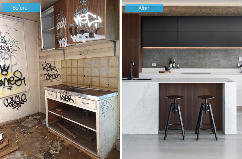
Seen here is the before and after photos of the kitchen. Who would expect that this kitchen actually looks like this prior to the renovation? Aside from the scattered mess, broken furniture and walls, it is also very dirty.
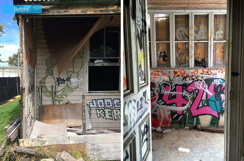
The exterior of the house looks like this. Not just the graffiti covered it but it is totally damaged from the walls to the roofing. Notice that even the doors and windows have graffiti on it.
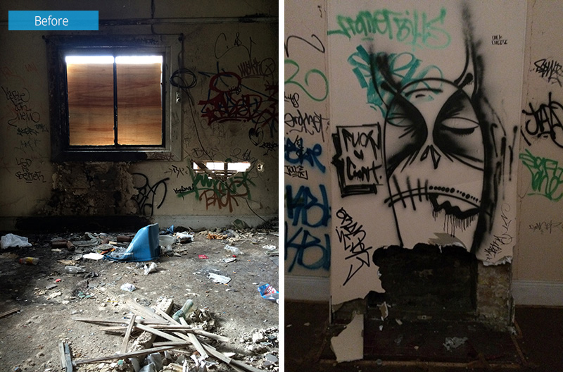
Homeless people and squatters lived in the house, damaging it and covering it with graffiti. Even the walls were broken too. You can also see the garbage all around here. I can just imagine how much cleaning they did in the area.
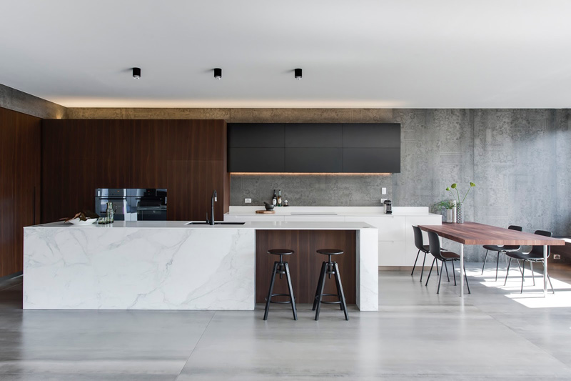
To make sure that everything will be organized and well-arranged, many storage spaces were added into the kitchen. Aside from the tall cabinets, there is also a hanging cabinet with added lights too.
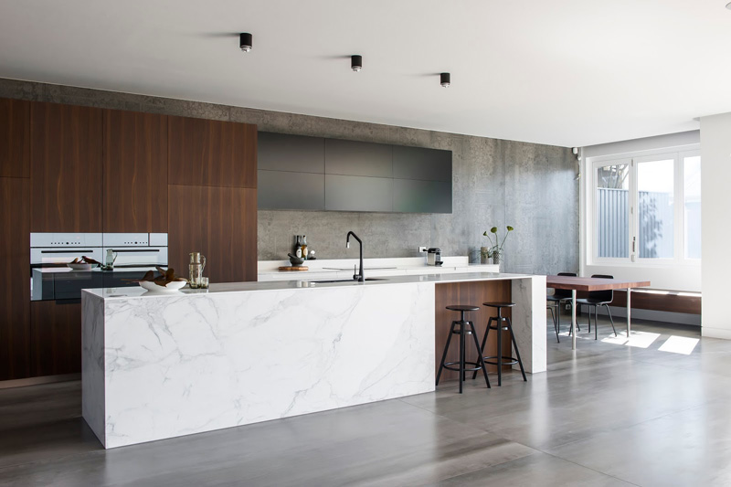
I have observed the utilization of neutral colors in the kitchen from the white ceiling to the flooring. You can also see some texture on the island too because of the stone used in making it.
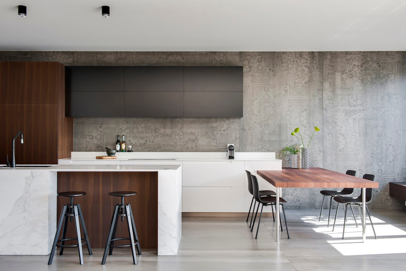
Aside from the design, the kitchen is also very functional with its modern fixtures and equipment added in it. It is a modern kitchen in terms of function and aesthetics.
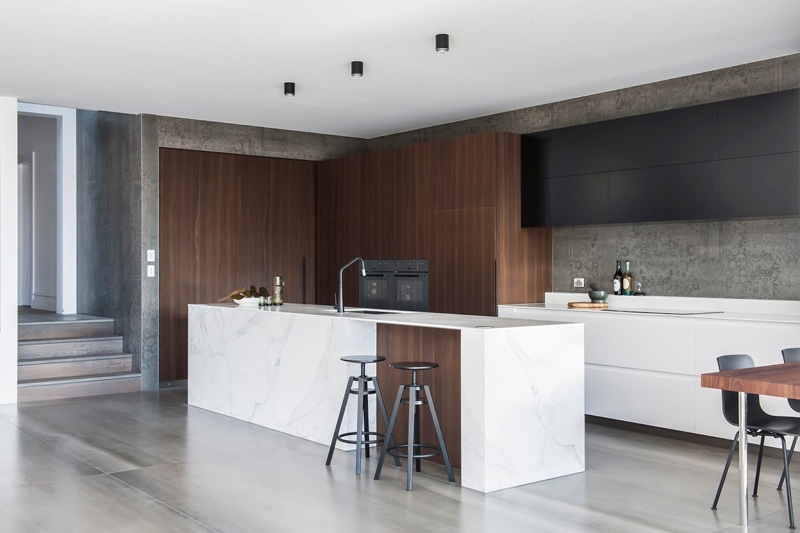
Who would not love the mix of patterns and textures here? From a distance, you would think that the wall is plain concrete but it actually has some detailed patterns on it. It matched well with the wooden cabinets, flooring and the white and black finishes of the island and cabinets.
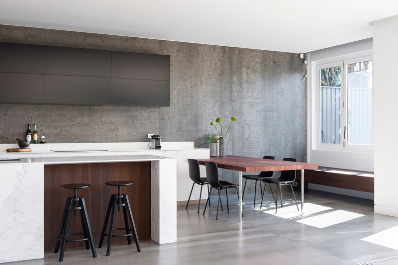
You can see that the kitchen used high-quality furniture from the high-counter stools in the island to the chairs and tables in the dining area. And there are also added plants too to bring some freshness into the space.
Read Also: Before and After Photos of a Happy Hip Family Kitchen Renovation in St. Louis
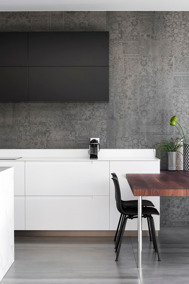
The walls in the kitchen has detailed patterns that has a monochromatic color. Despite the patterns, it doesn’t look overdesigned. As a matter of fact, it upgraded the appearance of the kitchen.
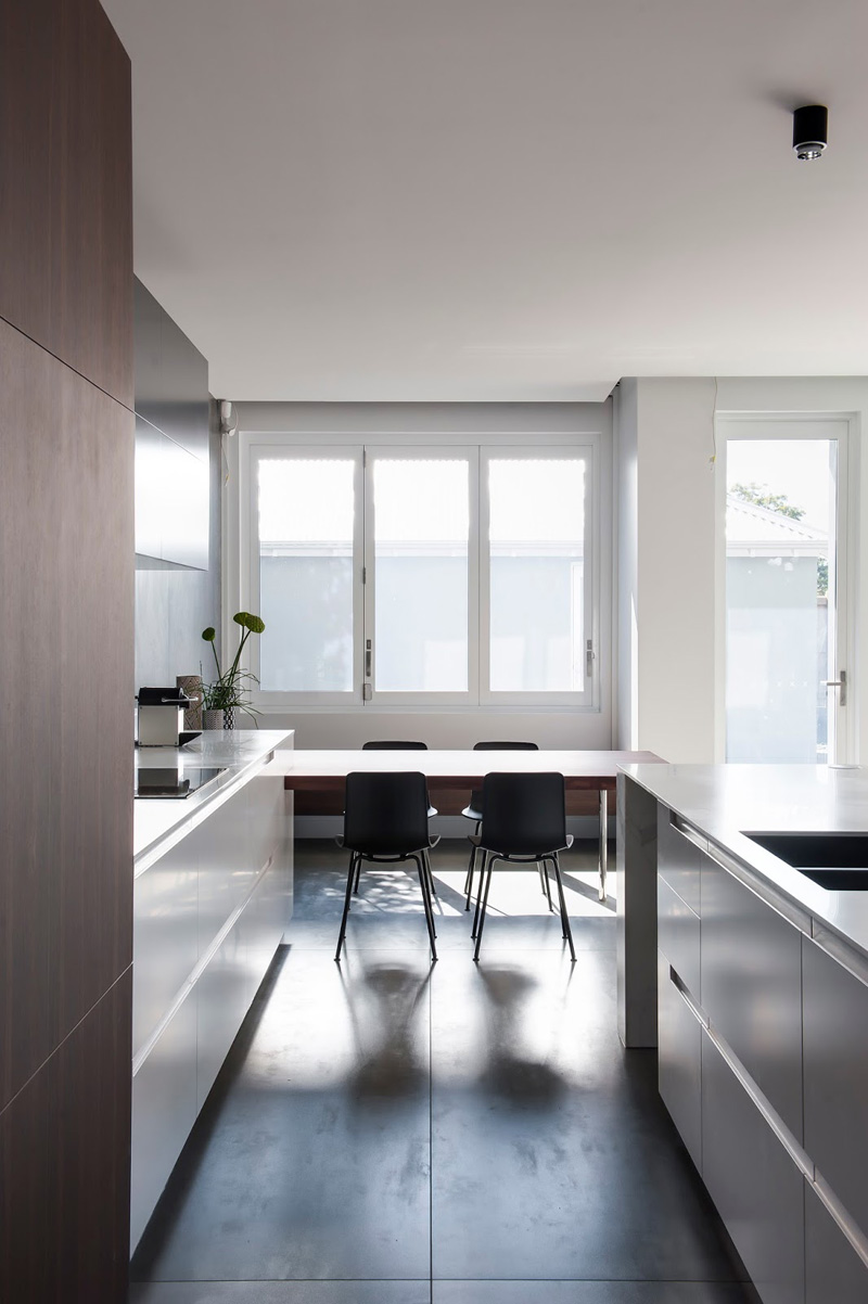
Windows surround the kitchen and dining space that allow natural light to pass through area illuminating it with natural brightness. It would be nice to dine with the touch of the sun’s beams.
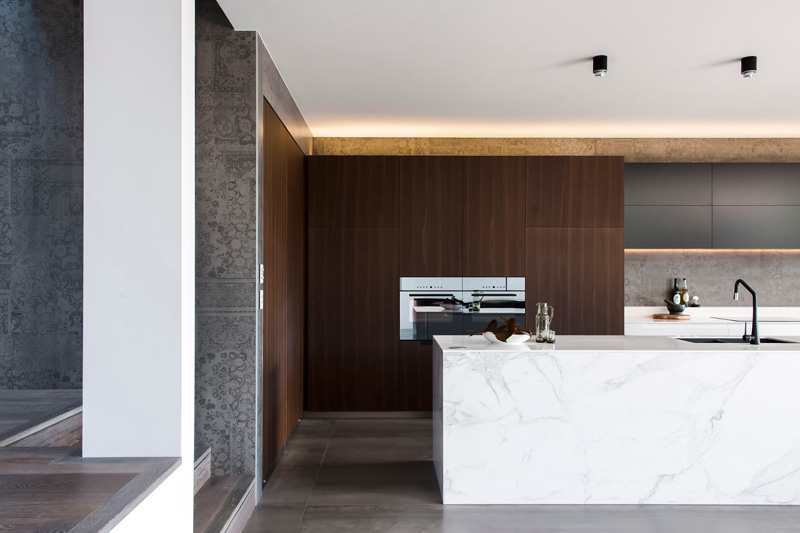
The lighting of the kitchen has a huge impact on how it looks. It has hidden lighting, above and below the cabinets that provide a warm glow in the area and even gives more appeal to the wooden cabinets.
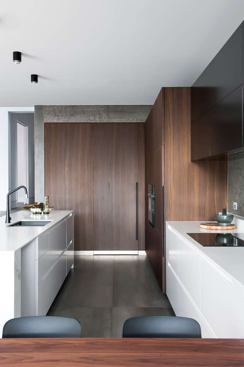
The home owner want to incorporate the laundry in the kitchen which is one of the requirements of the house. Since the space is not that big, they found a solution by adding a door which looks like just another cabinet door to discreetly hide the laundry.
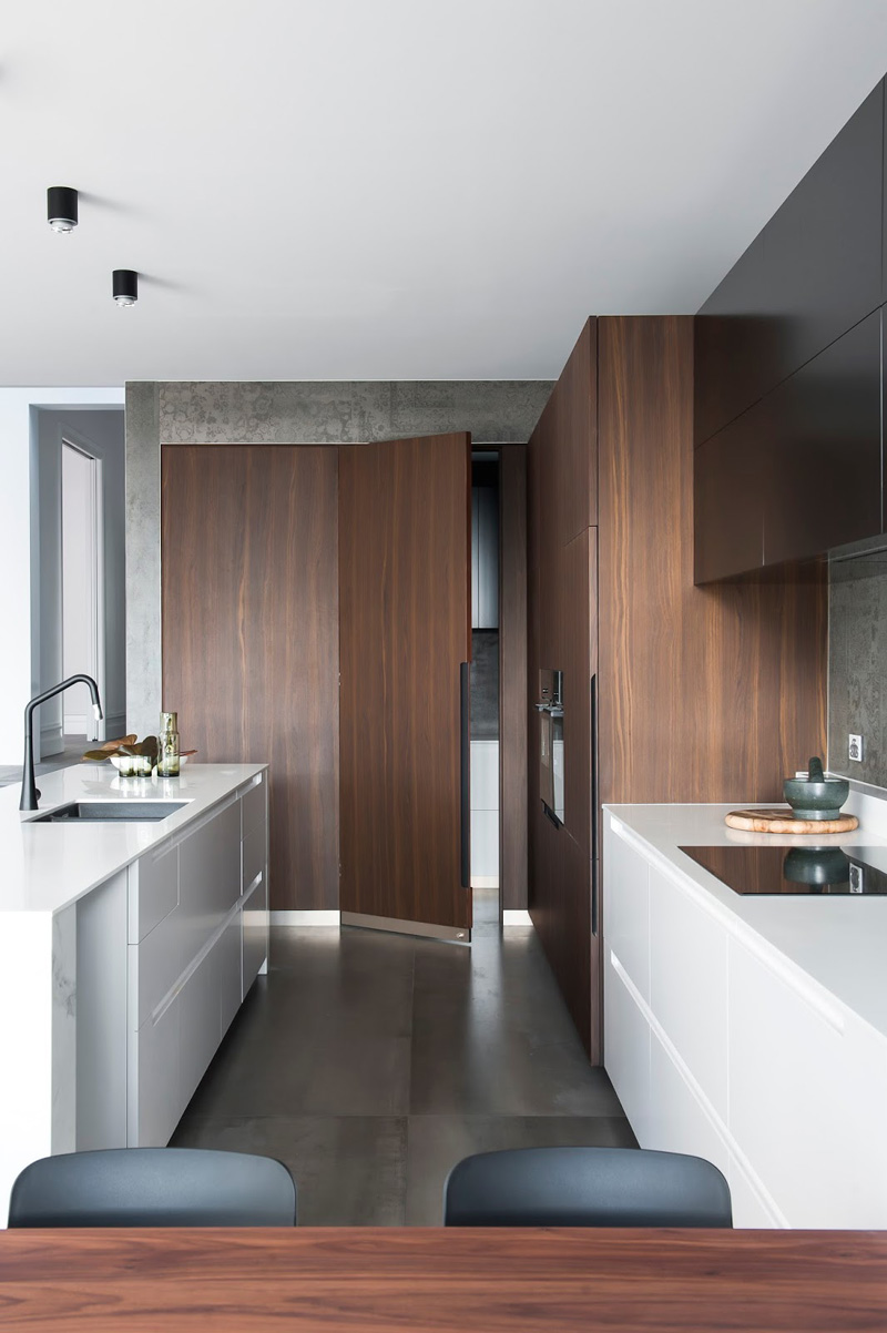
There is a secret storage in the kitchen which opens access to a full laundry, with washer, dryer and additional storage. Who would expect to see this in the kitchen? Beautiful planning indeed!
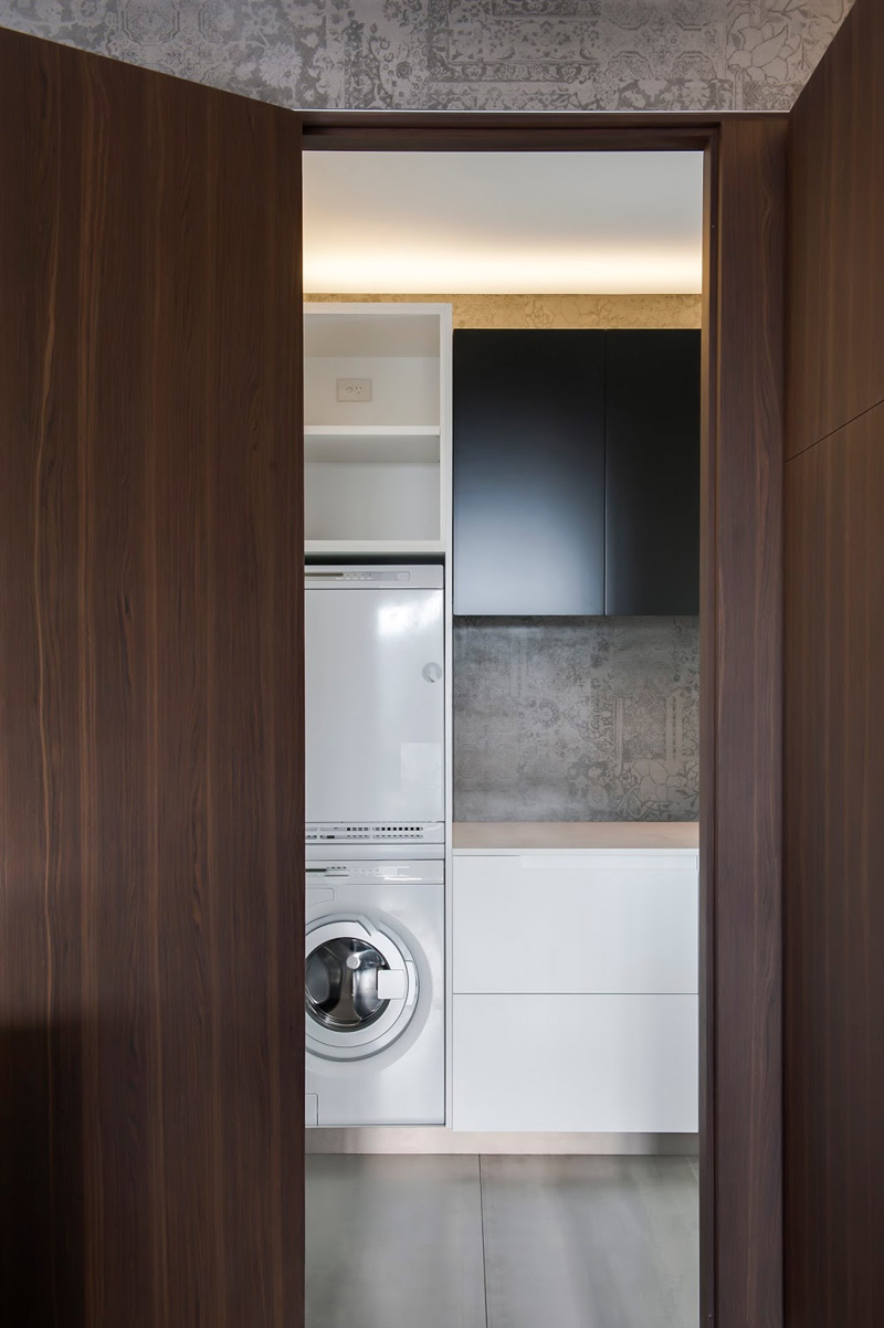
The kitchen also has many storage areas as well as a full laundry. The wooden finish matches well with the glossy dark cabinets as well as the textured walls.
Impressive, right? What Minosa Design did to the kitchen above is indeed amazing. As a matter of fact, the project received top honors for the home’s kitchen at the 2015 Housing Industry Association Awards. And we know why because of how the kitchen was redesigned. Just look at its previous graffiti filled space to the new sleek one. Totally amazing indeed! Who would expect that the kitchen can still be transformed into a space as beautiful as this? And for those who didn’t know that this was a remodel, who would know that it came from a graffiti filled home?