Whenever we see beautiful house renovations, we are inspired to upgrade the look of our own spaces. Well, I always feel that urge within me to redecorate my space but that urge fails due to lack of time. That is why most people who wants a redesign or revamp of their spaces hire someone to do the job who could really focus on doing the renovation. Today, we are going to show you another inspiring renovation that turned out to be charming and sophisticated. This is the Vila Mariana Residence in Sao Paulo, Brazil.
We have featured many homes from this area and I’d guess there are really amazing home designs in Sao Paulo. I wonder how beautiful their place is because even the homes are total stunners. Anyway, going back to Vila Mariana, the house has a 34-square meter space with two levels and was completely redesigned to for a young couple. Ventilation and lighting system were important for the project as well as the furniture which were all designed by Cristiane Bergesch. Enjoy a virtual tour of the home’s interior!
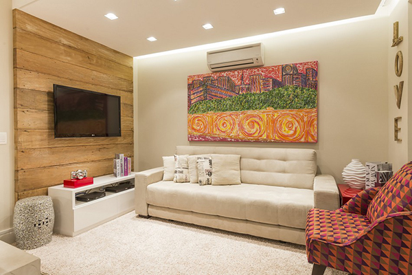
I always love the idea of adding wood panels like this at the back of a television. It brings in nature’s touch in a creative way.
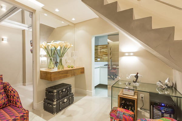
Wherever you are in the house, you will always catch a glimpse of creative elements like that chest and colorful furniture.
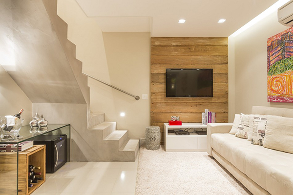
The house isn’t that spacious but it is complete with everything the couple needs.
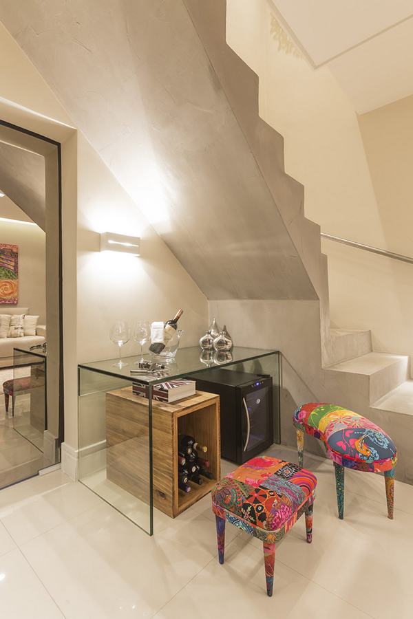
These chairs are pieces that I especially love in the space. Seems a good idea for a DIY.
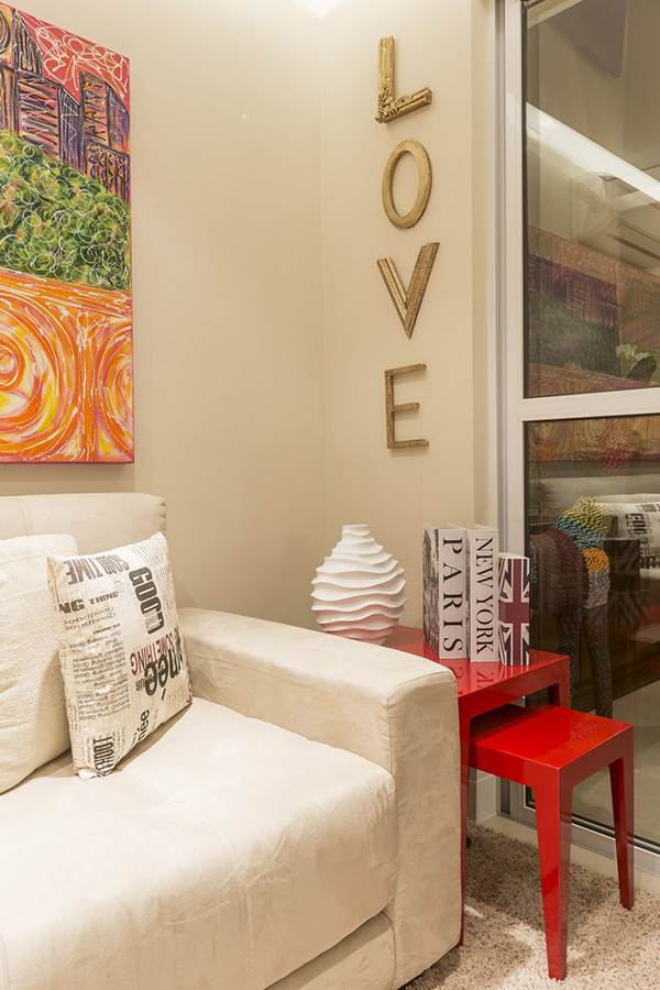
When I saw these L-O-V-E letters, it fell in love with it too. The letter L and V are actually parts of a frame.
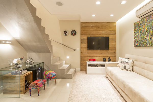
You can also see different paintings and wall decors in the house too.
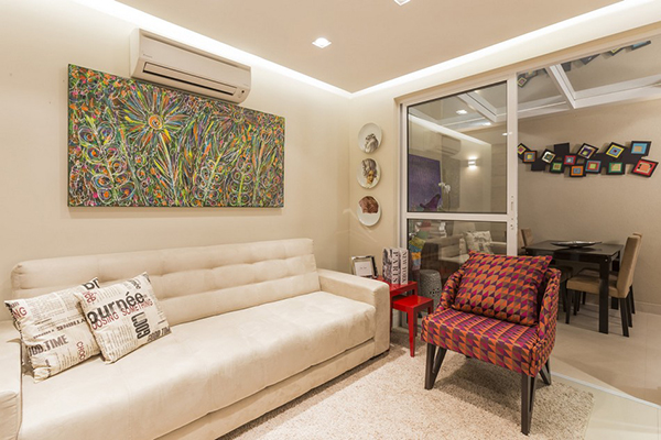
The had a problem of where to place the dining room because of lack of space. So, they changed the main door into a sliding door to join the living room and the outdoors. It expanded the space to 46 sq.meters.
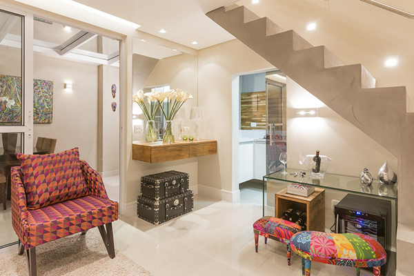
The color of the interior and the addition of plenty of glass added sheen to the entire space.
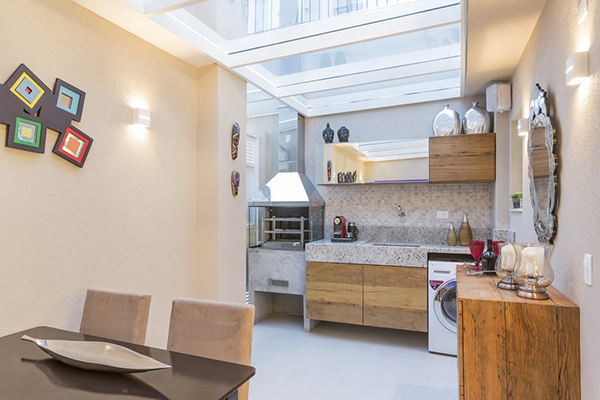
The kitchen is small but has lovely elements too that made it look spacious.
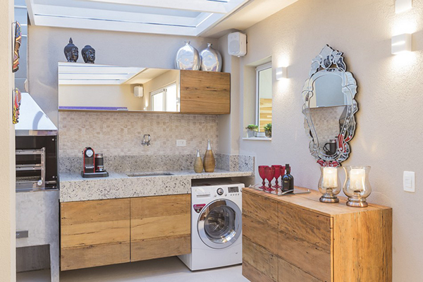
The compact 4 sq.m. kitchen has an oven with a cook top and the cabinets have special glass with mirror effect.
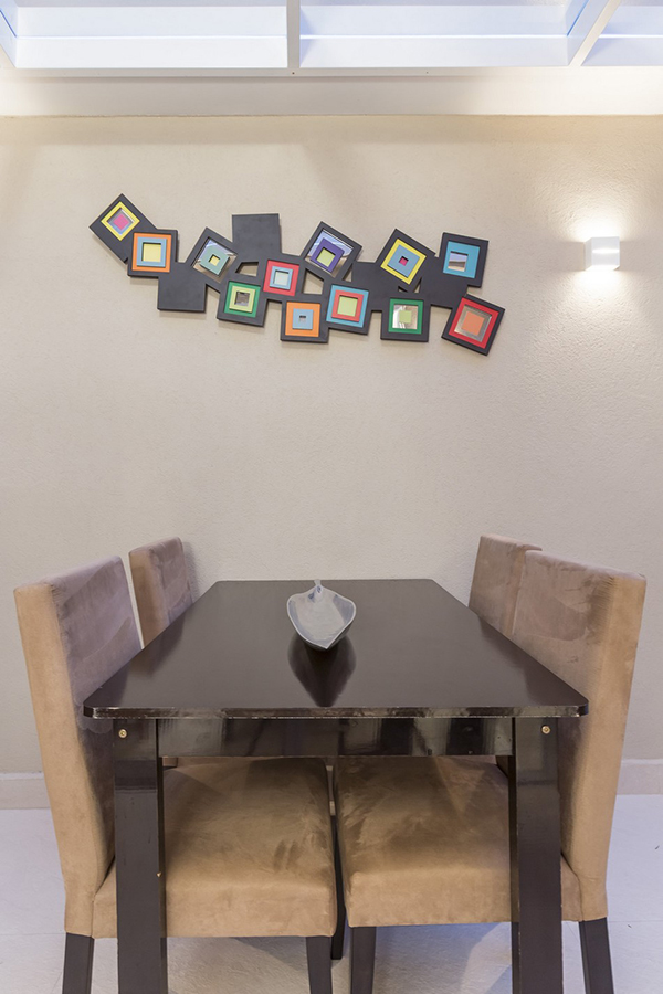
The dining room is just small but it looks beautiful too with that wall decor on the wall and modern dining set.
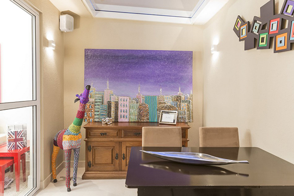
With a backdrop like this in the dining room, you’d surely have the appetite to eat! I so like that giraffe decor and the huge painting.
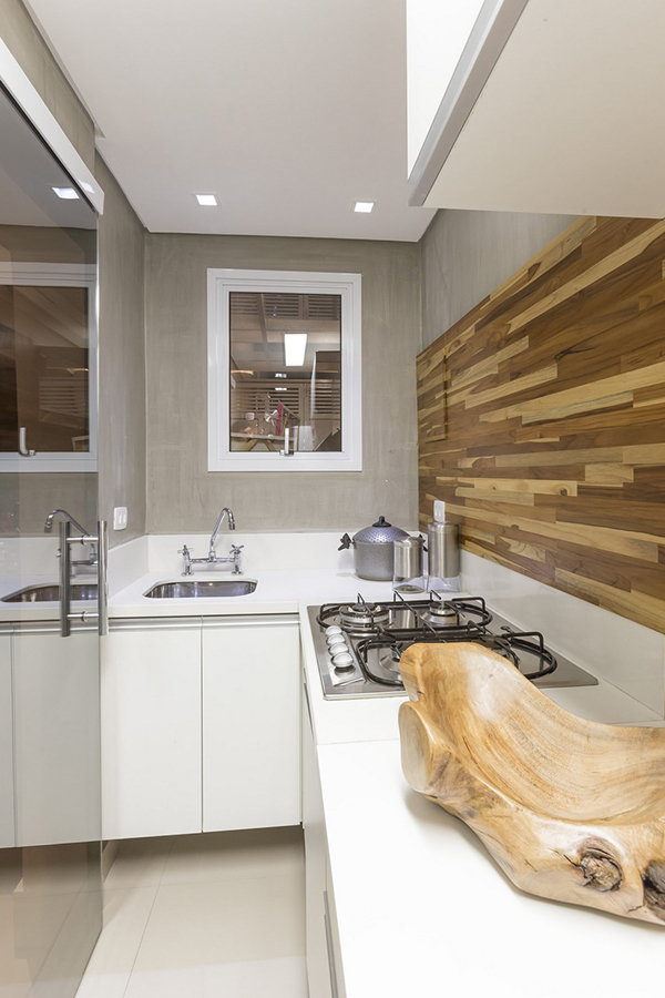
For the kitchen, it has this area where you can prepare food. It has a creative wooden backsplash design.
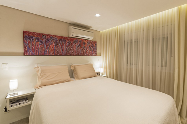
The bedroom is simple but hotel-like. It has soft colors and textures too. Of course, an artistic element won’t be amiss.
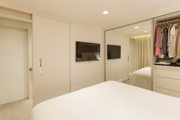
A huge mirror allows light to bounce around the bedroom. It has a closet too.
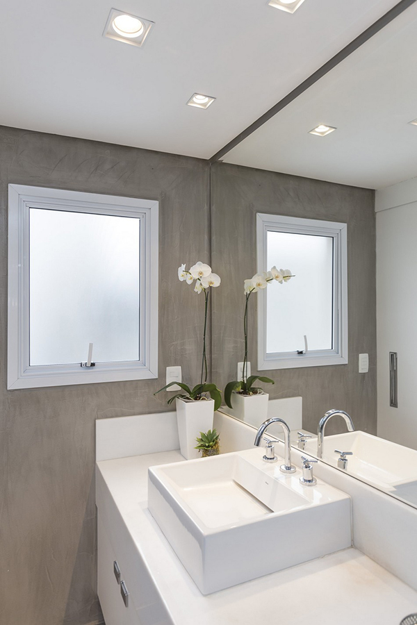
The bathroom has white colors which looked simple and neat.
Stunning. Sophisticated. Superb. I so love the look of this home! It may not be as spacious as what you want to be but just take look at how the space turned out! Cristiane Bergesch really considered the modern lifestyle of the couple and made sure that every corner of the house would fit to their needs. Amazing how every inch showcases creativity while not overcrowding the house. The decors and the custom furniture added life to the residence and made it appear even more cozy and inviting as well.