There are many ways to design a studio type space. No matter how small it is, it can turn into a functional home once it is designed in a way to maximize the available area.
We have seen many apartments like this. No doubt, we are impressed by the way small spaces are designed not just in terms of appeal but mostly of usage.
If you were living in a small space, what are the important areas that you would like to integrate into it?
Try to imagine the kind of home you want with a limited space.
At first, you will find it hard to picture out a home that small. But once you see interiors that actually work despite the limited footprint, you will no doubt come up with your own idea.
Do you need some inspiration?
Chinese design firm Shenzhen Super Normal Design worked on a modern apartment which features a tea area and living room on a raised platform.
Intriguing, right?
Why don’t you scroll down and check out what this space can offer?
Location: Dapeng Peninsula, Shenzhen
Designer: Shenzhen Super Normal Design
Style: Modern
Type of Space: Apartment
Unique feature: A modern apartment which features a raised platform with a table that could be lifted from it.
Similar House: A Small Sydney Apartment Features Creative Storage Solutions

This modern holiday apartment is part of the Seven Star Yufeng Club, which is a private club located on the Dapeng Peninsula, Shenzhen.
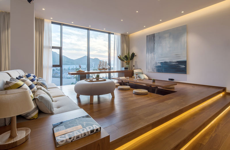
The interior of the apartment that we will show you today is located on the fourth floor of the building. It has an open plan layout, with hidden lighting that highlights a variety of areas like the small stairs and on the parts where the ceiling meets the walls.
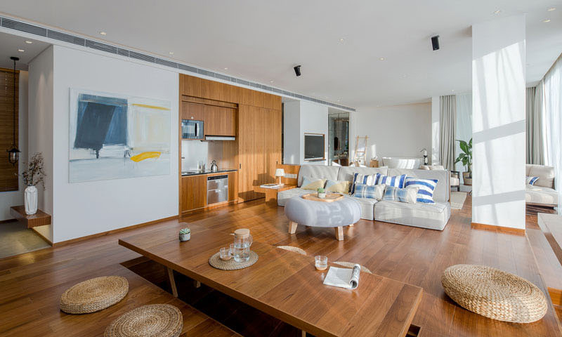
One impressive feature of the apartment is a platform with tea area. A section of its flooring is raised to create a table with a hollow space underneath for placing your legs when sitting. To provide comfortable sitting, there are round straw cushions around it.
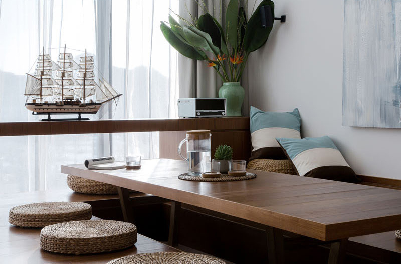
A closer look at the tea area which is really inviting. From here, one can get a good look outside through a fixed glass window just on its side. You can also see a plant which doesn’t just add appeal to the space but it also helps clean the air.
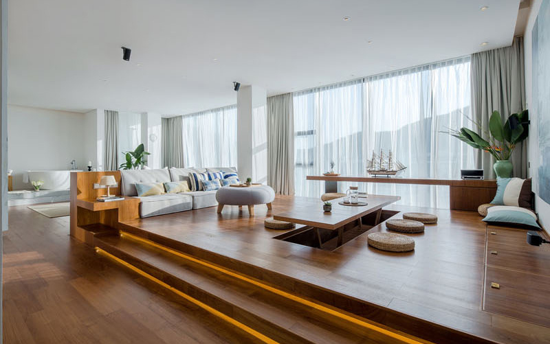
Notice how the lights add more appeal to the platform and to the entire interior. While most areas are white, there are some pops of colors from the decorations and accessories which make it look even more relaxing. Since there is a large glass window on the side, the interior is flooded with natural light.
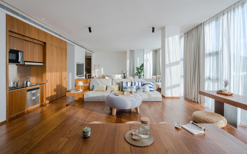
Next to the tea area is the living space which is comprised of a low profile couch and a round ottoman. Like the tea area, it also has throw pillows with large stripes. Beside the living space is a small kitchen area with wood cabinetry which continues the look of the raised platform.
Read Also: Taaacito Micro-Apartment Features a Wall That Transforms the Space
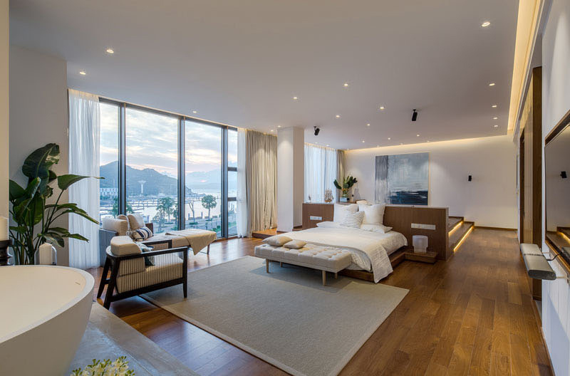
Behind the living area is the sleeping area which shows a comfortable bed. The headboard separates the two spaces while providing built-in bedside tables and a bed frame at the same time. On its side is a glass window which gives a good view of the waters and the park outside.
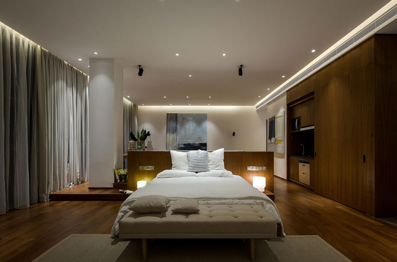
The lighting in the interior adds to the home’s relaxing aura, especially during the night. You can also see that the bed used earth tones to bring warmth to the space.
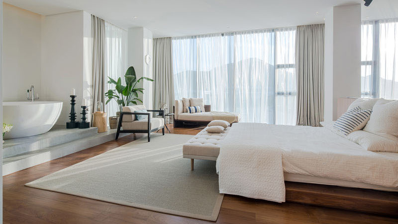
Near the bed is another raised area where we can see a bathtub. There is a more private bathroom area located off to the side of the bathtub. It is hidden with
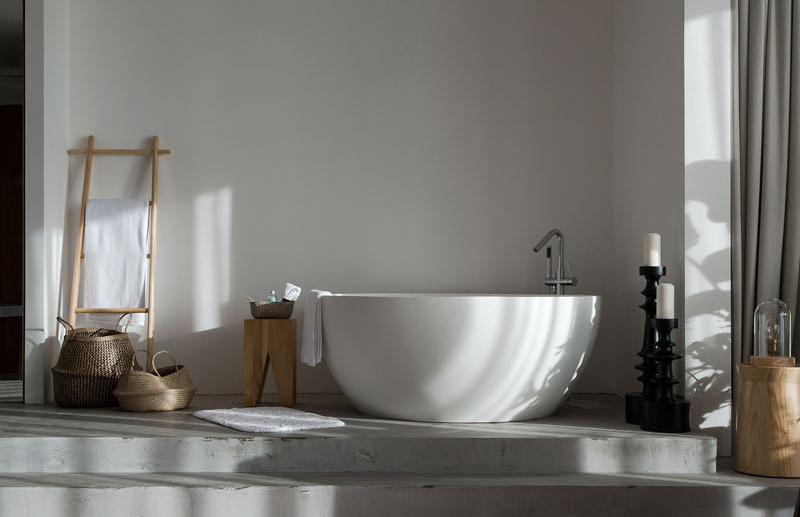
This freestanding deep soaking bathtub sits on a slightly raised up area from the main floor and it is defined by concrete flooring. Love how this area is decorated!
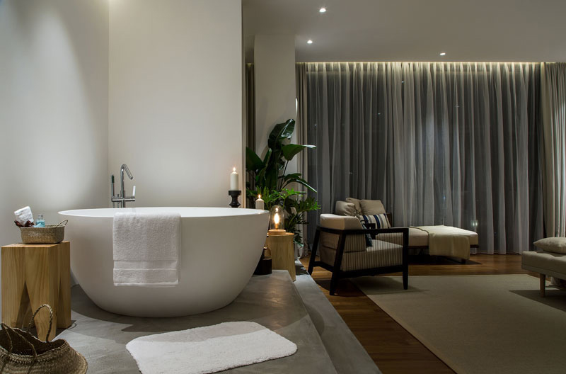
On the other side of the bathtub is a small sitting area with an armchair and daybed. It is a nice spot to relax and unwind. One can also look out to the water views from here once the curtains are open.
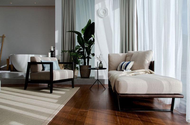
A closer look at the sitting area which used the same neutral hues of the bed near it. It is also adorned by a striped pillow like what we can see from the rest of the space.
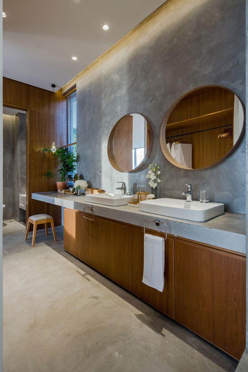
This is the private bathroom which features a large wood vanity with a concrete countertop. Hanging above each sink are two round wood-framed mirror. The vanity extends to create additional counter space with an open space to keep the stool.
Shenzhen Super Normal Design definitely did an amazing job in designing this apartment. Despite the small space, they managed to integrate all the important areas in it from a living a room to a bedroom. It is also impressive that the apartment has a beautiful design using neutral hues while adding some colors using the decorations. The entire space is also decorated in a very creative and artistic manner making it look more inviting. Overall, I love the look and this would be a great inspiration for studio spaces. The raised platforms are unique features that made the area more functional and practical. What are your thoughts? Let me know in the comment section below.