Of course, it is not new to use to see a combination of styles and features inside a house. Aside from seeing modern to traditional combinations, there could also be other elements of a home that would remind us of something from the past or elements that would bring in elements of the present. It is indeed nice to combine both for a home. Usually, this happens if a house or any type of dwelling is in an old building and modern interior is being added. I guess you have seen spaces like that we have already featured in the site and it really looks stunning! Today, we are going to show you a lovely apartment that combines old and new features and for sure, you will love it!
This apartment in Barcelona, Spain is inside a 19th century building. The owners commissioned designer Sergi Pons to add contemporary features into the apartment. The result is a stunning space that combines the new elements to the old architecture of the building. It actually appears like they are totally done that way on purpose. You will be able to appreciate the space even more once you scroll down the page and see more images of the interior. It used mostly white for the furniture as well as wood which look perfect with the wooden ceiling and flooring and also with the old stone walls. It showcased a balance of texture and style. Come take a look at this apartment through the images below.
Location: Barcelona, Spain
Designer: Sergi Pons
Style: Modern Contemporary
Type of Space: Apartment
Unique feature: An impressive apartment in Barcelona located in a 19th century building with added contemporary elements inside it.
Similar House: Chic Modern Apartment in Chicago Infused with Natural Textures
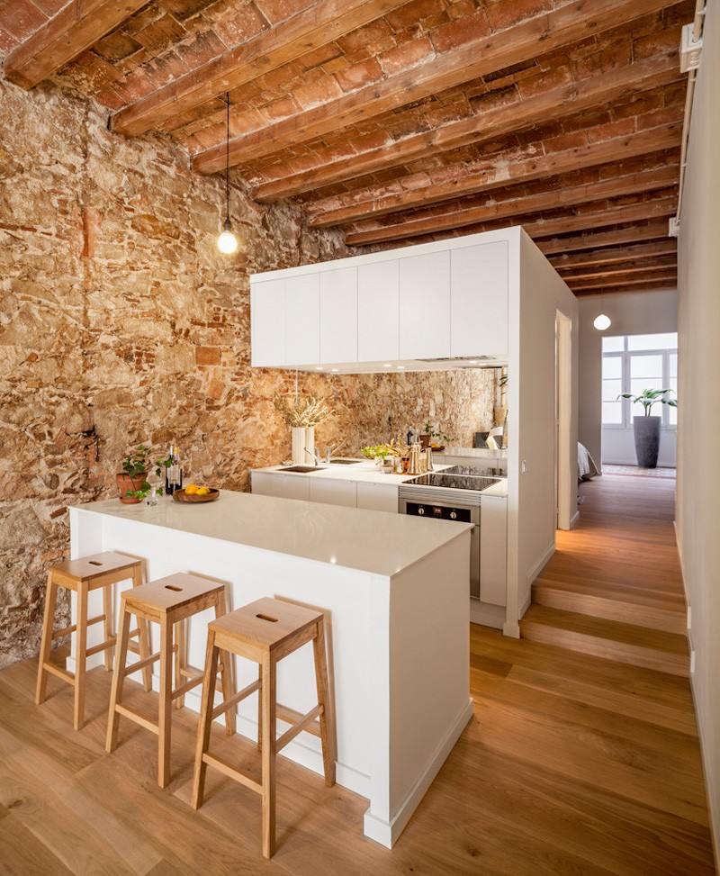
If you were not given about the background of the home, you will not have an idea that it is actually located inside an old building because it appears like everything was done on purpose. I know you will agree with me that this is a stunning interior from the hallway to the kitchen!
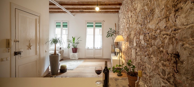
This could be the entrance of the apartment with a cute starfish decor on the door. Also seen here are classic windows and the rough texture of the stone walls. You can also see many plants in the interior too that bring natural elements to the apartment.
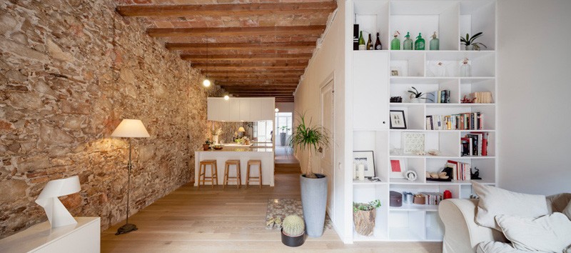
The apartment was once broken up into several different spaces but it was redesigned to have a more open living area like what we can see here. From the main door, you can move right towards the kitchen and private areas or you can move left the living area that has a white shelving where the owners can display his special mementos and collections.
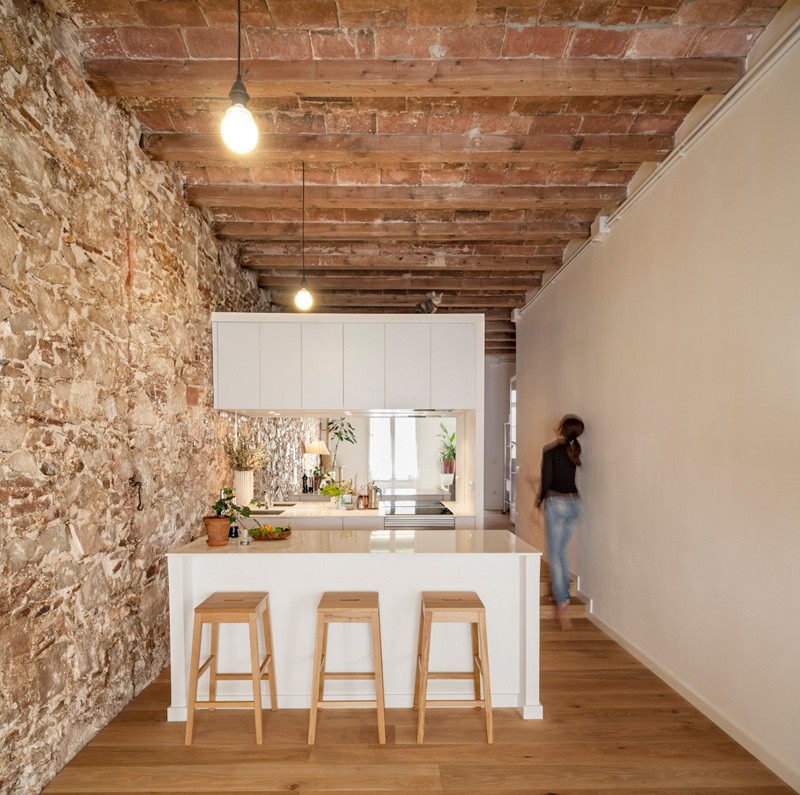
The kitchen of the apartment has been kept small and is in white color. It has a mirrored backsplash that make the space appear larger. Yes, you might not notice the mirror as the backsplash but notice the window there which is actually a reflection of that from the living space.
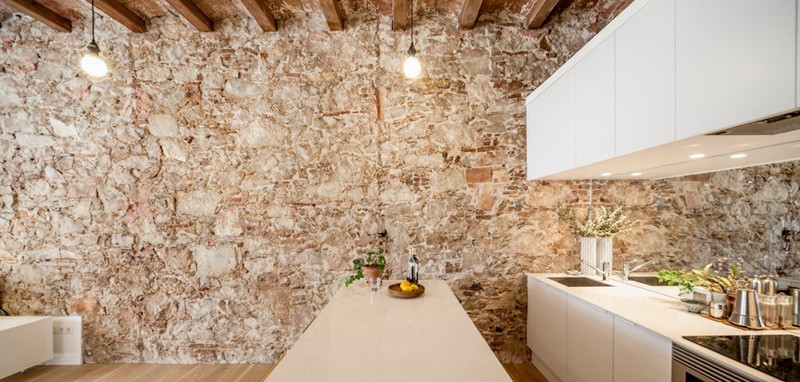
Notice that using white and sleek design for the kitchen serves as a lovely contrast with the stone walls and the reclaimed ceiling. For the lighting, it used simple bare bulbs hanging from the beams of the apartment.
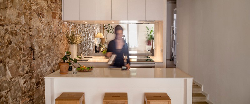
The kitchen island is one important feature of the space since it provides additional counter space, storage, and it also includes enough room for seating three friends. And I forgot to mention, I like the simple design of the wooden stools.
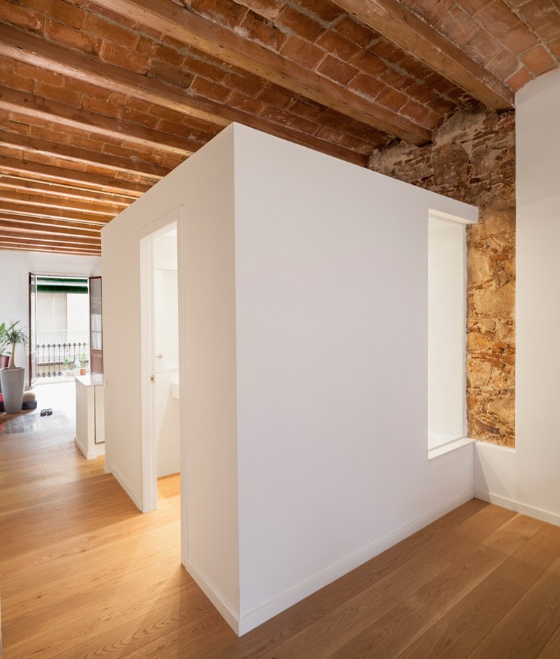
From the kitchen, a small hallway leads to the bathroom which is hidden within a white box. Who would think that this is actually a bathroom? And yes, I am expecting to see white inside the bathroom too.
Read Also: Talisman Building Apartment: Converted Warehouse with Vaulted Ceilings in UK
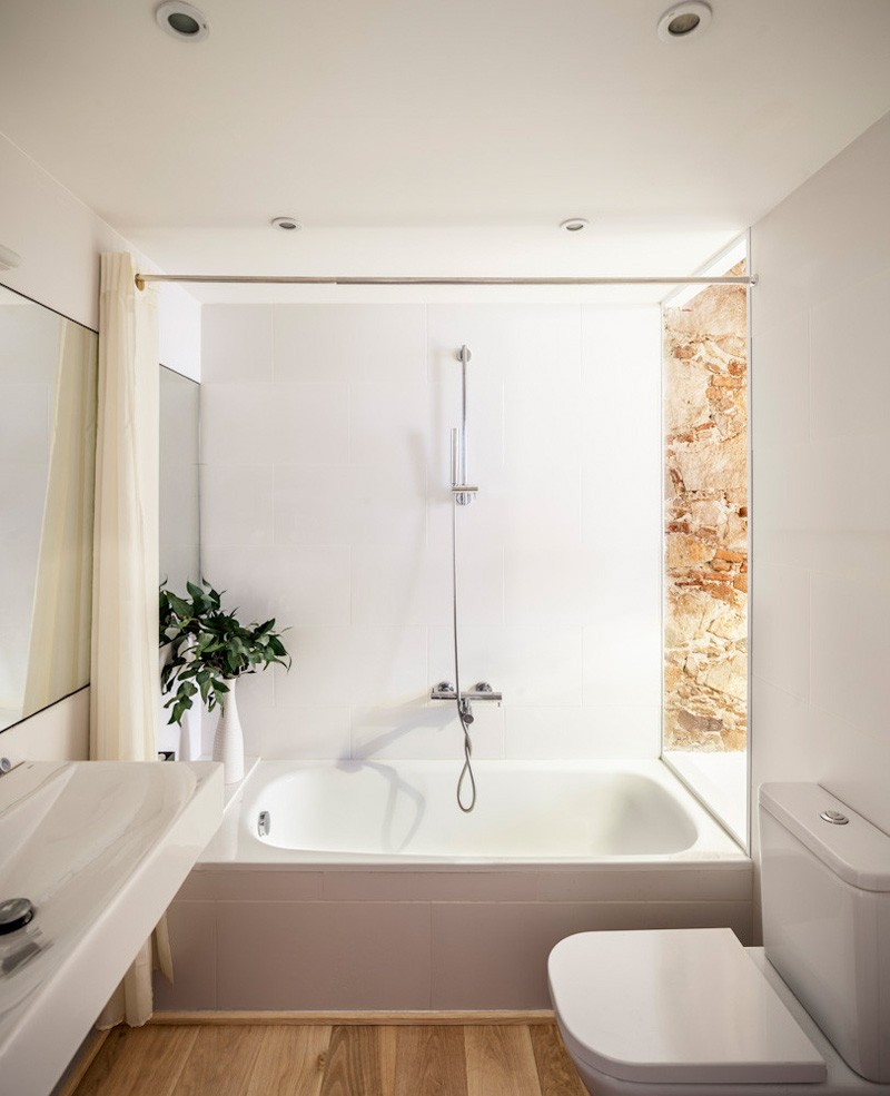
And I wasn’t mistaken because there are white bathroom fixtures in here. The bathroom also includes all the essentials and it has an open area to the bedroom which allows natural light to fill the space and it made the white bathroom even brighter!
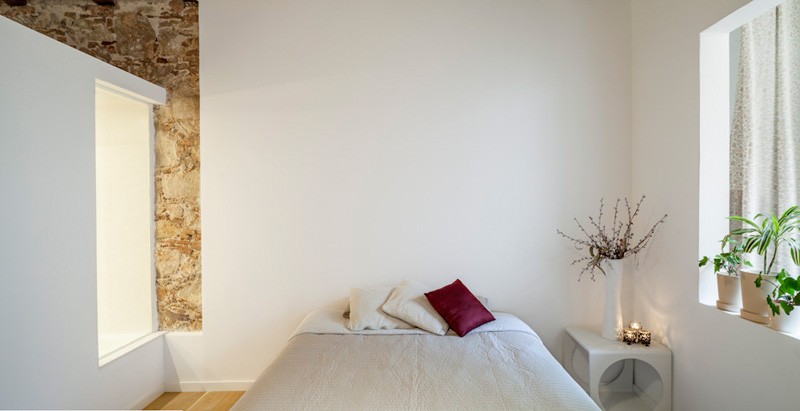
In this image, you can see the opening from the bathroom to the bedroom which has been kept minimal in its design but it actually looks really nice! Another thing that I have noticed in this apartment are the plants that you can see in every area, making it appear refreshing.
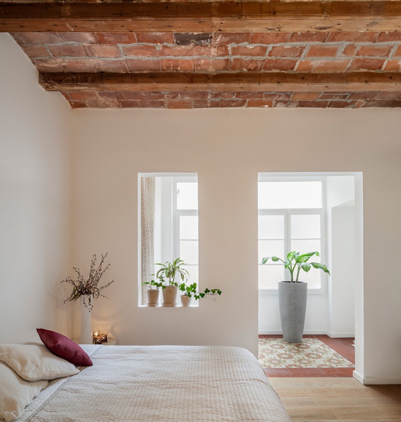
The bedroom is just simple even for its choice of bed covers and fabrics. On its side is a white side table with pretty tea lights. Just off this small bedroom is a sunroom which brings in a huge amount of natural light into the space.
I don’t know about you but I love how this space turned out! It is indeed nice to combine the old architecture of the building with the modern contemporary elements. I also like it that Sergi Pons, who designed the interior, used white on most of the areas and also combined that with wood. The color of the stone one seemingly goes with the features of the interior and it is actually an asset to the apartment. Also, the layout is well done creating a home that is easy to access and very cozy. How about you, what can you say about this apartment?