The apartment, located in the heart of Bucharest, offers a panoramic view towards the urban landscape. The family’s way of life is similar to the context, being communicative, flexible and dynamic. These aspects were the main elements that lead to the definition of the new functional and spatial scheme: the opening of the daytime spaces, but without giving up the possibility of separating them if needed, and the separation of the night time area, that offers a high level of intimacy for each family member.
Hence, the end result for the design of Apartment M integrates the kitchen and the office to the existing generous living room as an intersection of two rectangular volumes, with the dining area, right in the center of this intersection, becoming a “hot spot” of the house. Thus, functions merge into a common image, where wood, both horizontally and vertically disposed, covering storage area, provides fluidity and unity of the space, creating a neutral background at the same time. Come join us for a brief tour of the apartment below.
Location: Bucharest, Romania
Designer: Rosu-Ciocodeica
Style: Modern
Type of Space: Apartment
Unique feature: Apart from its beautiful color palette, you will love how the spaces are being defined in this apartment’s interior.
Similar House: Half Walls Divide Spaces in Apartment Huber
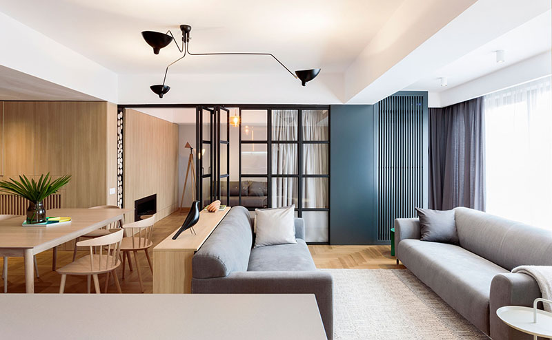
Dark grey metal elements, contrasting and cold, become highlights of the interior for Apartment M, but it also divide different areas and create differentiated spots: the entrance hall, the kitchen area, the glass doors and the black lamp above the living room.
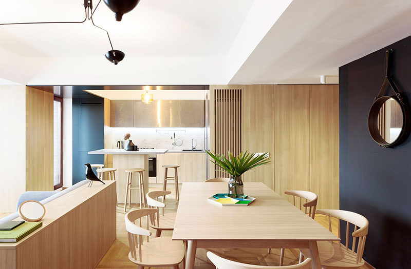
When necessary, metallic and glass wall can create a capsule, separated from the rest of the house. It was designed as a multifunctional room, which can be used either as an office or as guest bedroom.
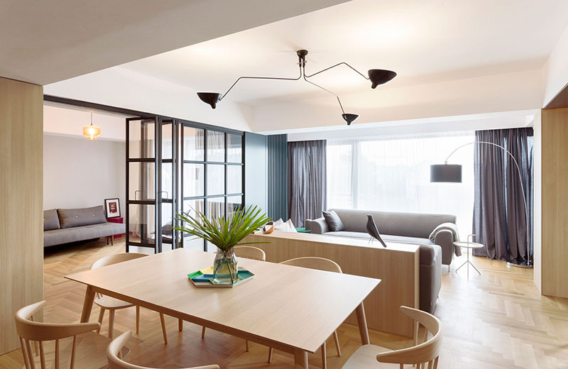
The height of the small wall is the same as the sofa, making it a predictable place to keep some decor items, like the bird sculpture they have, or some books.
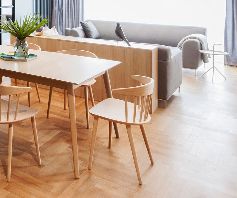
A closer look at the beautiful wooden dining set which has curvy features on its chairs.
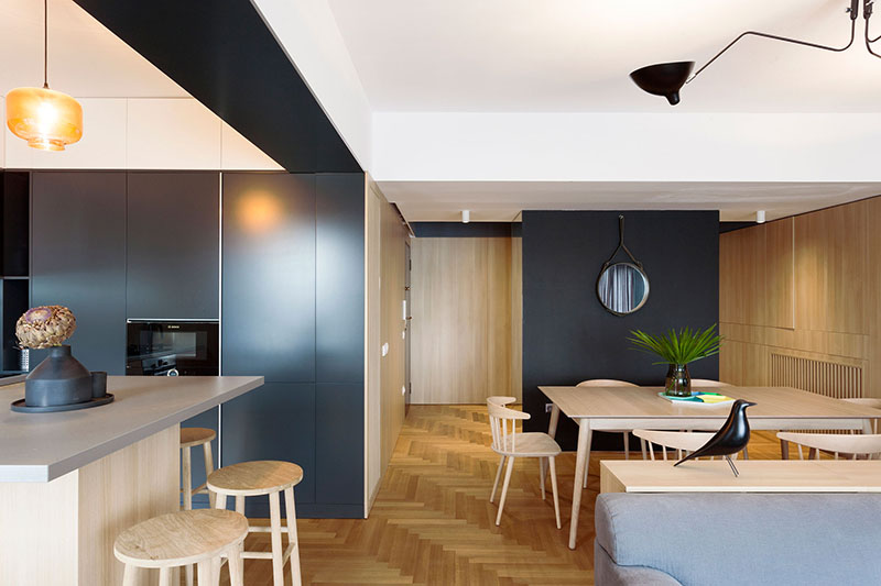
Another important element is the almost invisible wardrobe placed in the hallway, that is covered in mirrors on three sides and appearing as a very thin black panel towards the living room, becoming a strong and contrasting background for the dining area.
Read Also: GH Mild Apartment Divides Interior Spaces Without Using Solid Walls
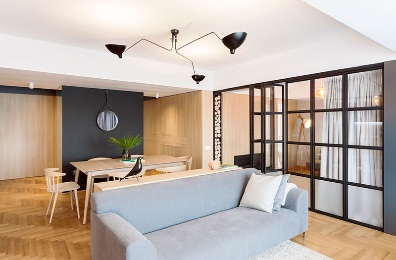
Similar colors and patterns can be observed inside the entrance hall, where the wooden wall panels “hide” the access to the night area, the more private part of the apartment.
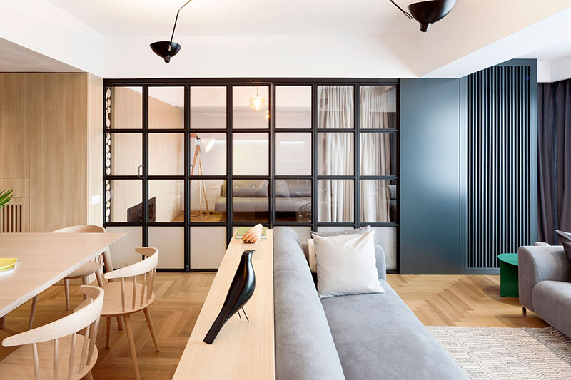
You can see that gray walls was used to separate the areas but instead of using entirely a solid wall, the owners made use of French styled dividers that easily opens and closes which you will see in the next image.
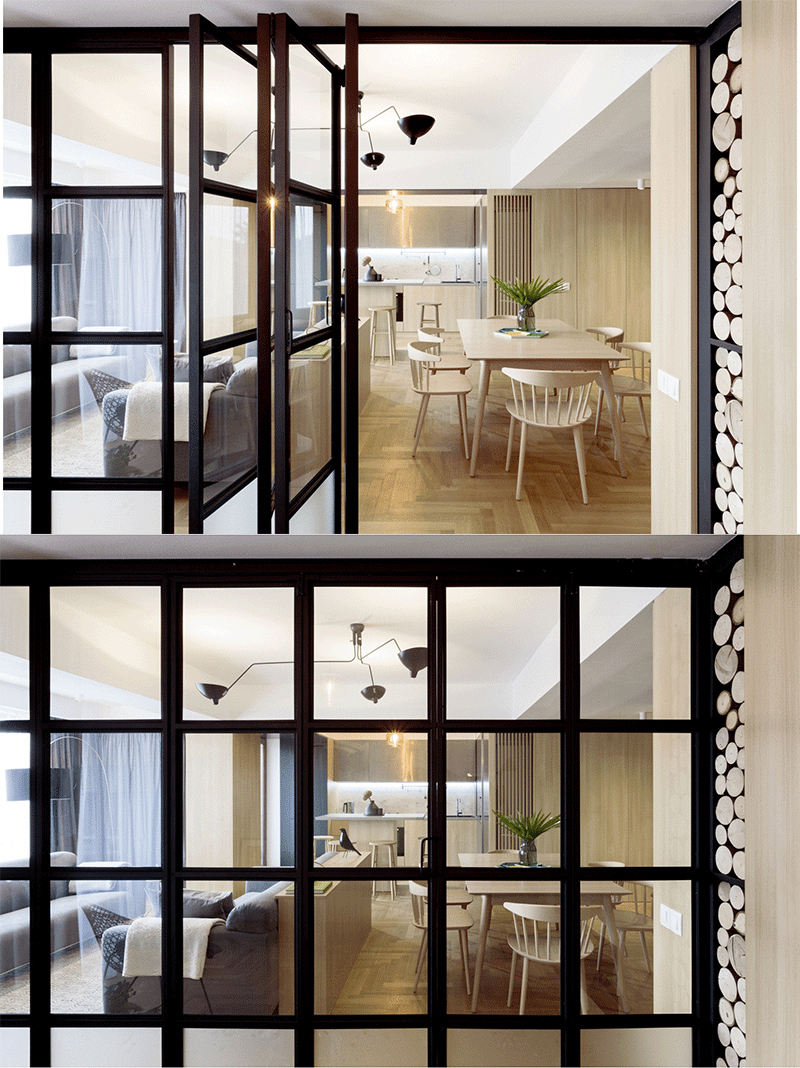
You can see here how the divider works as it opens and closes. Even though it is there, it doesn’t create a strong wall between the spaces because of its use of a black frame and glass.
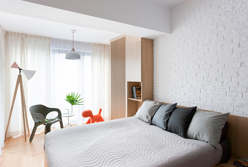
The bedroom follows the same color palette of the whole interior, that is the main frame of the overall design and offers a neutral background for the small interventions and personal objects, that come to personalize each private space.
I love the simplicity of this space! Although there isn’t much available floor space, Rosu-Ciocodeica managed to create a stunning interior with everything that the homeowners needs. Apartment M sure is a great inspiration for those who are living in a small home. It is also nice that it combined various materials and textures in the interior which added appeal to it as well as some depth. The dividers were also well designed which one feature that the designers are very proud of.