These days, small spaces for a home is no longer a problem because most designers know the solution for that. This tiny flat that we will feature today has a small area inside it but once you see the interior, you will be impressed that it has a sophisticated look that doesn’t appear like a mere 45sqm floor area. This flat is located in Copacabana neighborhood (Rio de Janeiro) owned by a young female lawyer.
“Open spaces are not Brazilian’s market favorite solution, and this tiny flat didn’t have much room for subdivisions, so we had to think of light and non-intrusive answers. We integrated the kitchen into the living room, opening views to the main spaces of the flat right upon the entrance“, explained the architects at Ravaglia & Philot. Well, this will surely intrigue as on how the house looks like. So, let us take a quick tour to it.
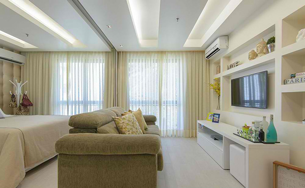
One stunning interior right? Obviously, the area is small but the designers were able to find a way to integrate everything inside without getting crowded.
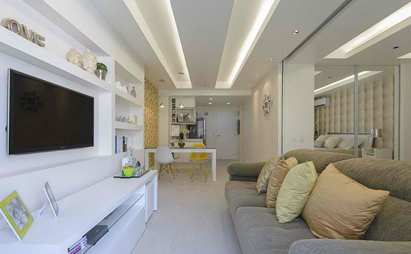
Seen here is the living area where you can also take a glimpse of the dining and kitchen. The long ceiling light brightens up the entire space.
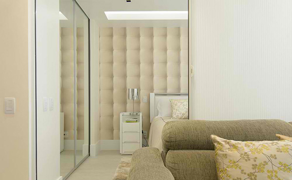
You can see here the bedroom with a lovely beige wall and a mirror on one side but we have something more to reveal about this area.
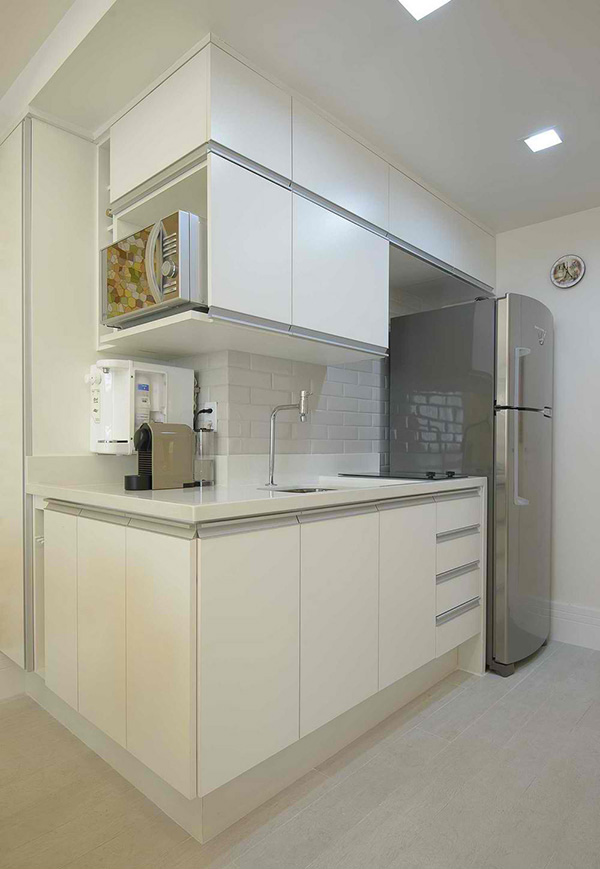
Isn’t this a cute kitchen? We like how everything was arranged in here!
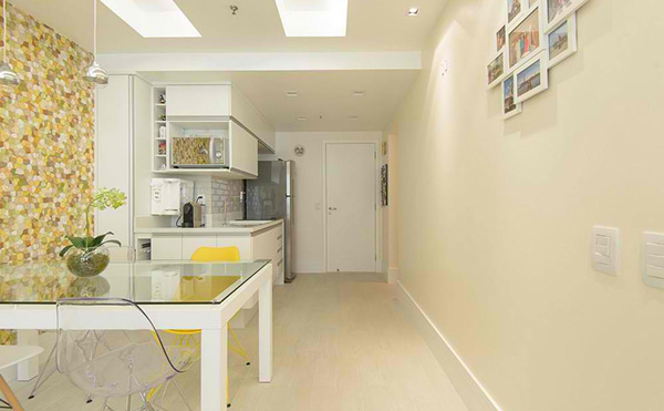
Despite a small space, the designers made sure that a pathway will still be provided for ease of access to all areas of the flat.
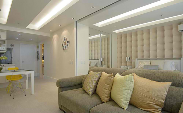
This is the bedroom at the back of the sofa. Look at the bedroom while scrolling down the next images
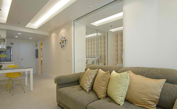
Observe that a white fabric starts to cover the bedroom.
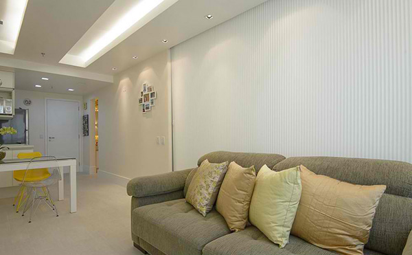
And now it is totally covered concealing the bedroom! This is one secret of this house which sure is very smart!
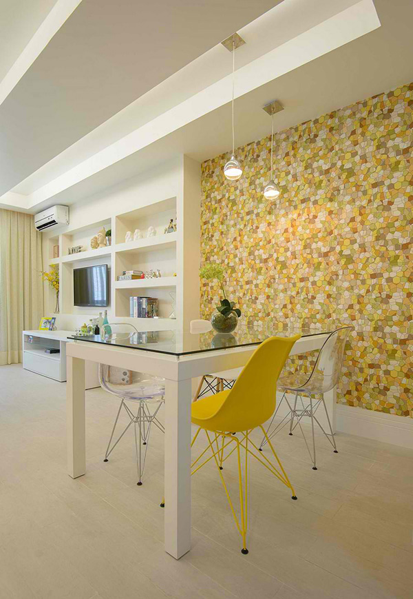
While retaining a clean look, it doesn’t hurt to add some splash of colors like the yellow on the chair.
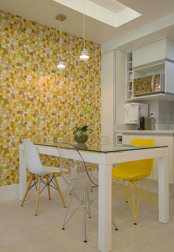
Observe that that wall has mosaic design in different tones that add more life to the interior.
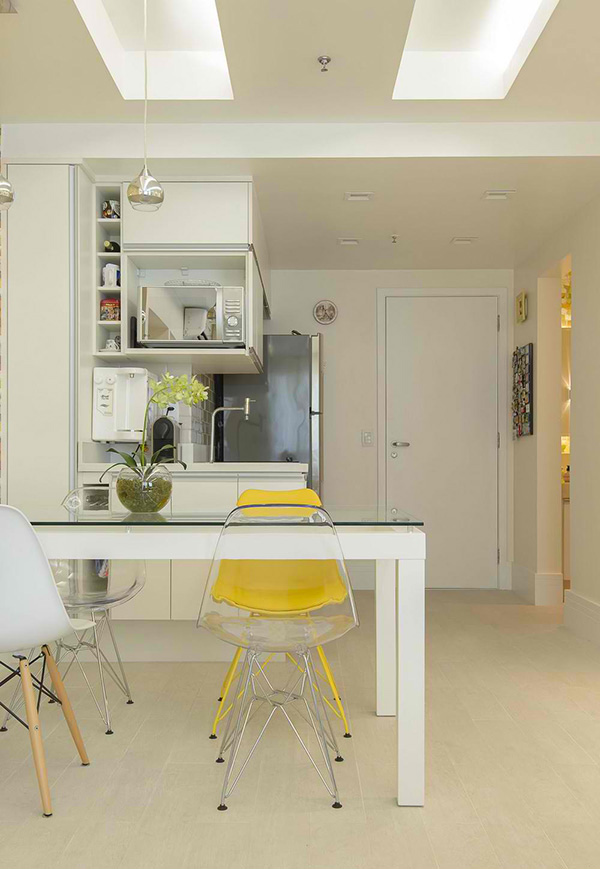
Adding chairs of different finish also gives a creative touch to the space.
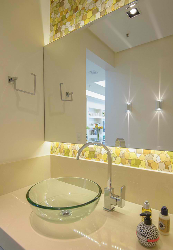
The bathroom is small but beautiful with the same mosaic tiles in the dining.
This indeed has an interesting interior. You have seen that between the living and chamber is a retractable honeycomb room divider that is made from fabric. This is one highlight of the house. Aside from that, it used white glass tiling and white furniture in the interior to add a clean ambiance to the space. But despite retaining that clean look, the house still appeared sophisticated. Thumbs up for Ravaglia & Philot!