The objective for the Westgate Residence renovation is to update the home’s architecture by using new materials, spatial definition and openings. A 1948 house located in Brentwood, CA was redesigned and renovated into this beautiful contemporary house. It was a challenge for the Kurt Krueger Architect and Rhino Construction, Inc. to design and build a house that is peaceful despite being located in a busy street with abundance of foot traffic. They also needed to consider ease of function and practicality since the homeowners were retired couples. The house with a 2,200 square feet floor area was kept to one level. Additional windows, doors and skylights were added to bring in more natural light to the house. Unnecessary partitions and walls were also removed to give it a more airy feel and to make it look larger.
A courtyard with retractable sunshades was added to the front yard which was enclosed with Douglas fir wood slates so that the area remains private from the curious eyes of passers-by. Same wood materials were used for the sidings, doors and windows of the house. Copper gutters and downspouts are in the exterior eaves of the roof. The interior used Walnut wood flooring and cabinetry. Now, let us try to take a short tour of the house through the images below:
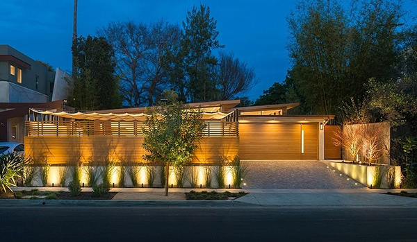
This contemporary home is a thing of beauty. The landscaping was done in a modern style which added more appeal to the exterior.
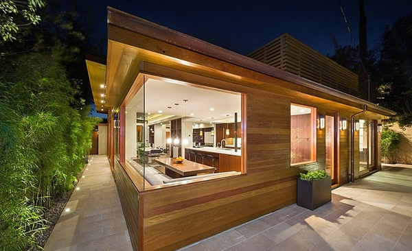
The use of Douglas fir wood for the sidings give it a natural feel plus the addition of bamboo plants around it. Large windows made the home get a breezier feel.
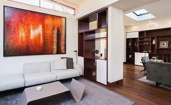
It wouldn’t be a good idea to crowd the house so the foyer was done this way. The abstract painting welcomes the guests as the living room was partly covered with the floor to ceiling cabinet shelf.
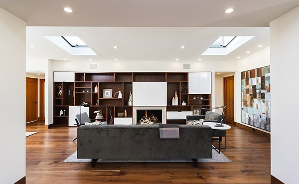
This is living room. We love how the wall shelf was designed creating blocks of white for closed areas.
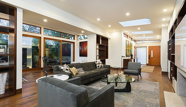
Gray comfy furniture was the perfect choice for this living room. The triangular center table looks great too as it sits on top of the abstract area rug in gray.
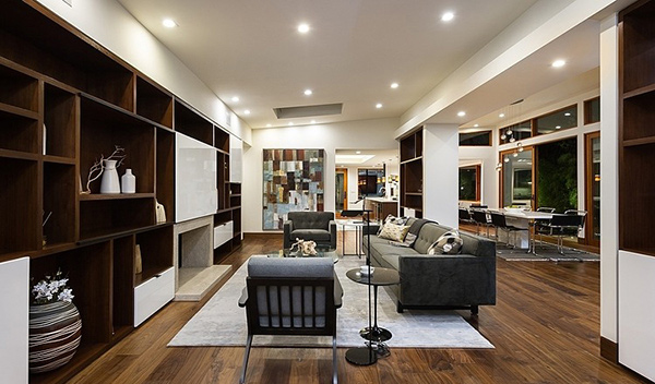
The colors used in the house complements well with the wooden flooring. It was also a good idea to use white for the walls.
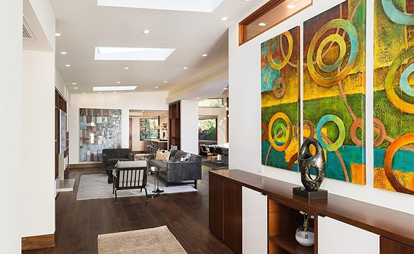
We have observed that the displays are artistic just like this sculpture and wall decor in three separate canvasses.
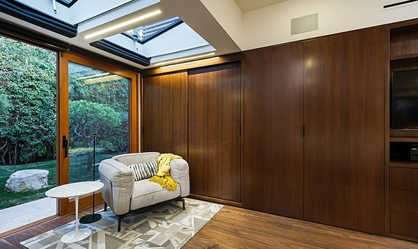
This is one corner of the bedroom. This lounge area allows the homeowners to relax or read a good book. Take a look at the area rug- another abstract decor! Check out the skylight as well. It sure will give the bedroom good lighting during the day.
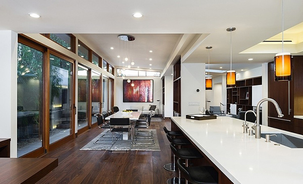
Seen here are the dining area and the kitchen. Notice the black and stainless steel combination for the chairs used in the dining and the kitchen island.
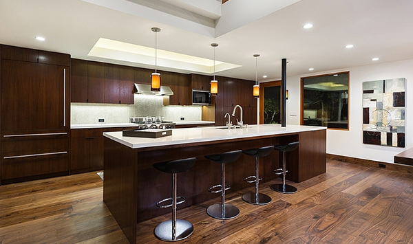
The trio pendant lights in this kitchen made a difference in its look. We love how the wood and white countertop was combined!
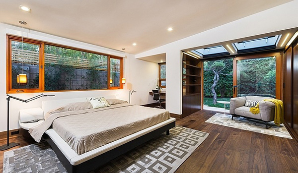
The bedroom is simple and very easy to access. A working area in the corner is a beautiful spot which faces the landscaping outdoors.
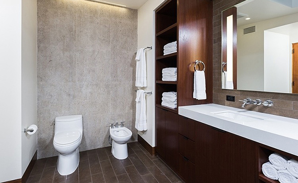
A simple and functional bathroom which provides the homeowners everything they need.
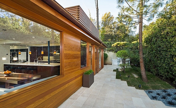
Limestone paving used in this area not just added to its beauty but also made it a lot cleaner and easier to access.
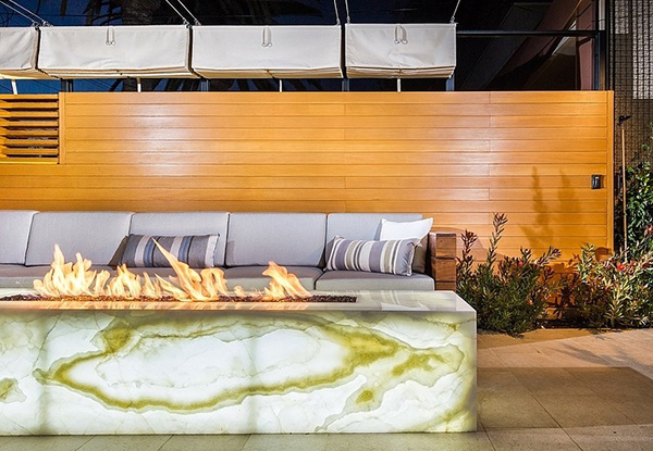
We like the look of this pit fire! Well, it would even be lovelier once you get to sit on that long bench.
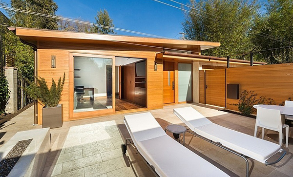
Who would think that this house can actually accommodate lounge chairs, a beautiful outdoor area and a courtyard? The wooden gate and house exterior seems to extend the natural touch from this space.
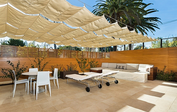
Retractable sunshades were perfect for the courtyard. Who would expect that this is actually along a busy street?
The courtyard is one feature of the house that is indeed beautiful. It used limestone paving and Argentinian cobblestone in the driveway and entrance. To reduce the noise from the street, fountains and water elements were added to provide white noise. The landscaping of the house was done in a manner that it would screen the place as well as add a sense of calm into it. Another material used for the house that made it look lovely is the water-jet stone which was placed at the fireplace, kitchen backsplash and in the Master Bathroom, allowing custom designed grooves into the stone. The Kurt Krueger Architect really made sure that the retired couple could get the kind of home they want. We are certain that despite living in a busy street, the couple could rest well and enjoy their day as if they are in a faraway vacation home.