If a home looks ugly, it doesn’t mean that it couldn’t improve into a lovely home anymore. With the right people to work on it, nothing is impossible. This is what happened to a home in Chevy Chase, Maryland. According to the homeowners, the home is the “second ugliest house in the neighborhood”. It is owned by Di Bruning, an attorney and her husband David Owen, a software services entrepreneur; and their 2 school-age children.
Despite being “ugly”, they fell in love with the two-level 1968 Washington, D.C., home when they saw the open-riser entry staircase that reminded them of the show “The Brady Bunch,” which is her childhood favorite. “Inside, the house had a great vibe and a great amount of space, including two spare bedrooms we could use as offices,” Bruning said. “I knew we could work with it.” The couple hired the architect and builder that they found in Houzz, who came up with a plant that included an updated kitchen and bath. The living area was changed to have an open layout achieving a modern and airy space.
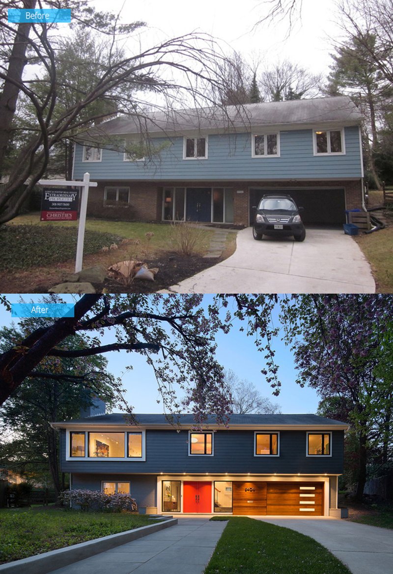
Before, the house seemed to have an oppressive look. The curb appeal was updated by installing a new entry door and sidelights, new windows as well as an enlarged opening at the second-floor living room. New fiber cement sliding and a new garage door were added too.
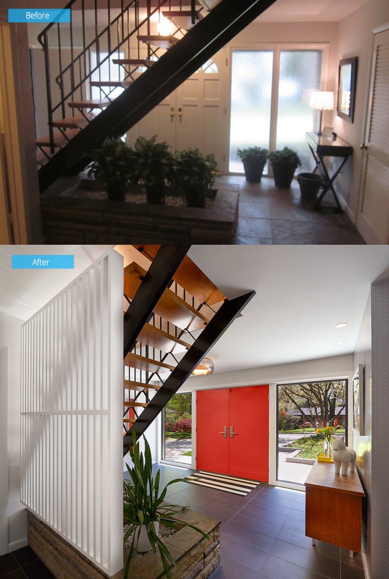
When they first saw the staircase, Bruding loved it. “I grew up in Australia, obsessively watching ‘The Brady Bunch,’” she says. “I loved all things American in the 1960s and ’70s. This staircase was almost exactly like the iconic one on the show, so I was in love.” In the new design, the staircase and the field-stone planter were retained with an added painted wood screen that separate the stairs from the lower-level family room and bedroom.
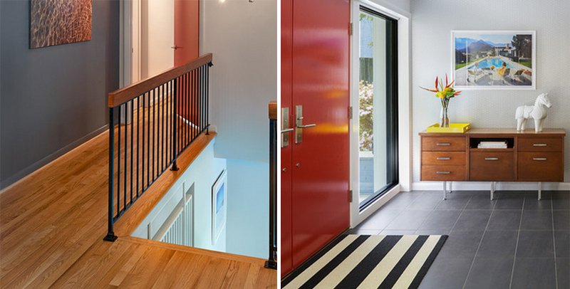
A credenza is added in the foyer. Most of the furniture in the house came from the couple’s previous home. Meanwhile, the landing at the top of the stairs lead to the bedrooms that are located down the hall, as well as to the kitchen and dining and living areas.
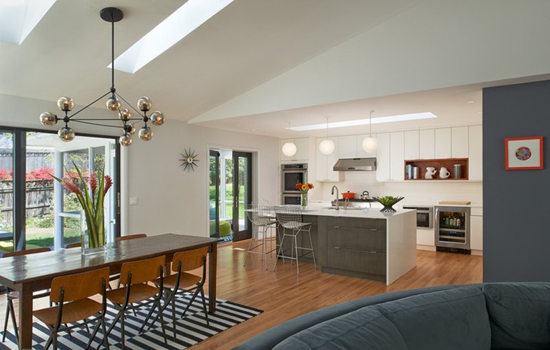
The walls between the rooms were removed in this area to create an open great room for family living. The white oak flooring of the original home was retained. Not seen in the photo is the living room area with curved sectional providing a cozy setting for lounging in the area. A fieldstone fireplace from the original house is also seen in the living area.
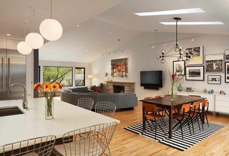
Four new skylights were added between trusses in the second level’s vaulted ceilings to bring in more natural light to the home. A collection of framed photographs were installed in the dining area that served as a beautiful wall backdrop. The teak farmhouse table is surrounded by vintage (1955) Friso Kramer Revolt chairs.
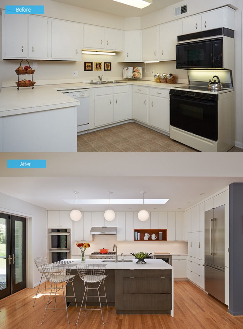
The original kitchen was probably remodeled since the home’s 1968 construction and it was closed off from the dining and living rooms. The new design has an open layout with an island so that whoever works in the kitchen can still converse with family and friends. To give the kitchen a sleek modern look, white lacquer and gray wood custom cabinetry was used. New doors were also added that lead out to the backyard’s screened-in porch.
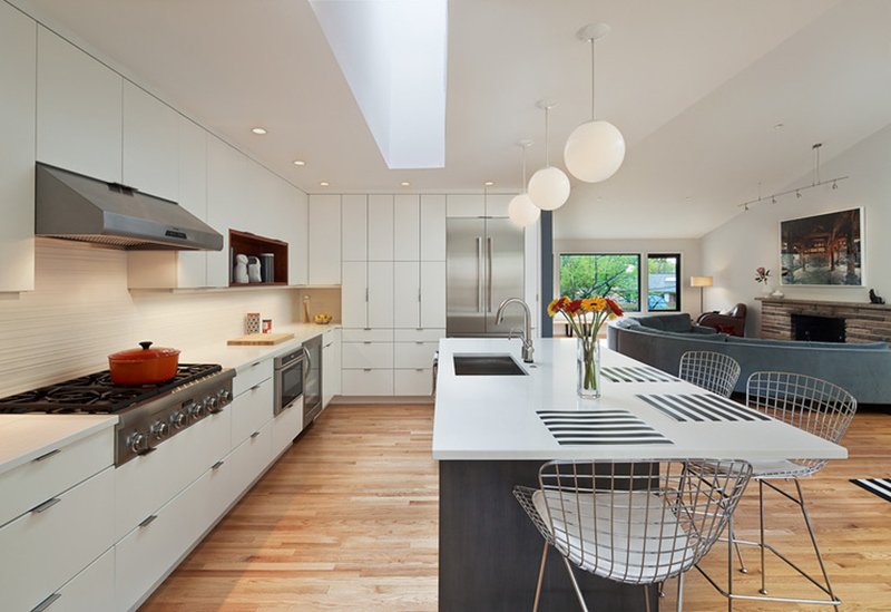
The new appliance package in the kitchen included a Thermador cook top, hood, refrigerator, ovens and dishwasher. The layout and configuration of the kitchen was decided by Bruning. “I didn’t want everyone sitting in a line on bar stools at the island,” she says. “Being able to put a stool around the corner is better for conversation.”
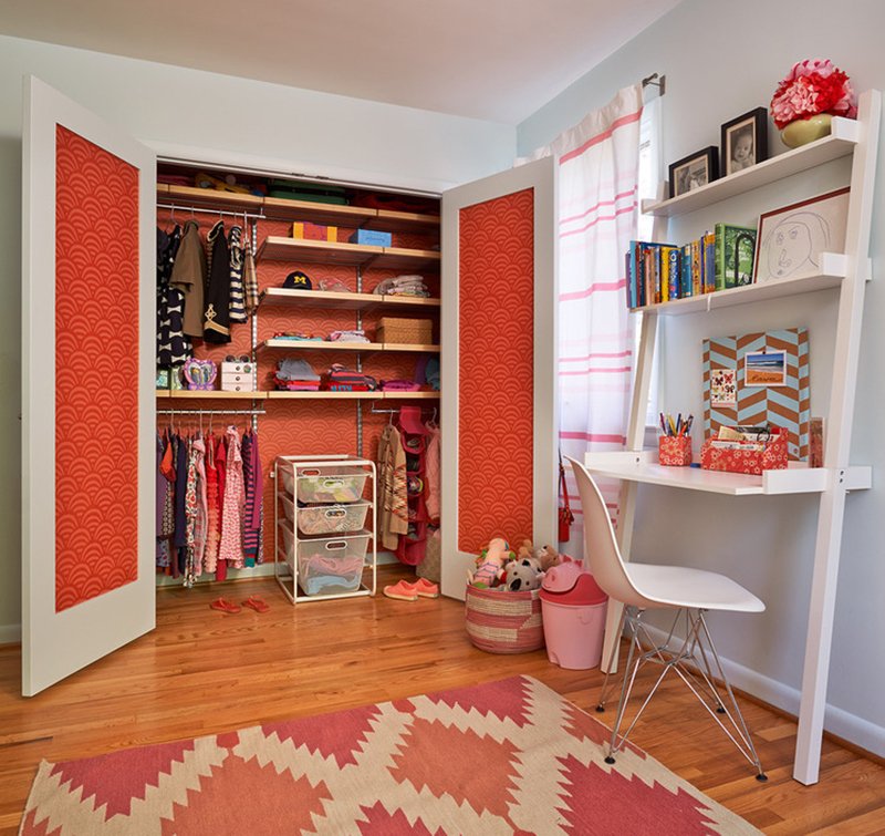
For their young daughter’s bedroom, new doors and wallpaper were added to bring a bright touch to the space. That cabinet is a mess-keeper and would save the rest of the bedroom from any clutter. I love the way things were organized in the cabinet as well as how it would hide some mess. But it does look organized too. Having this area will not just keep the bedroom neat but will also train the child to be organized and clean her bedroom everyday.
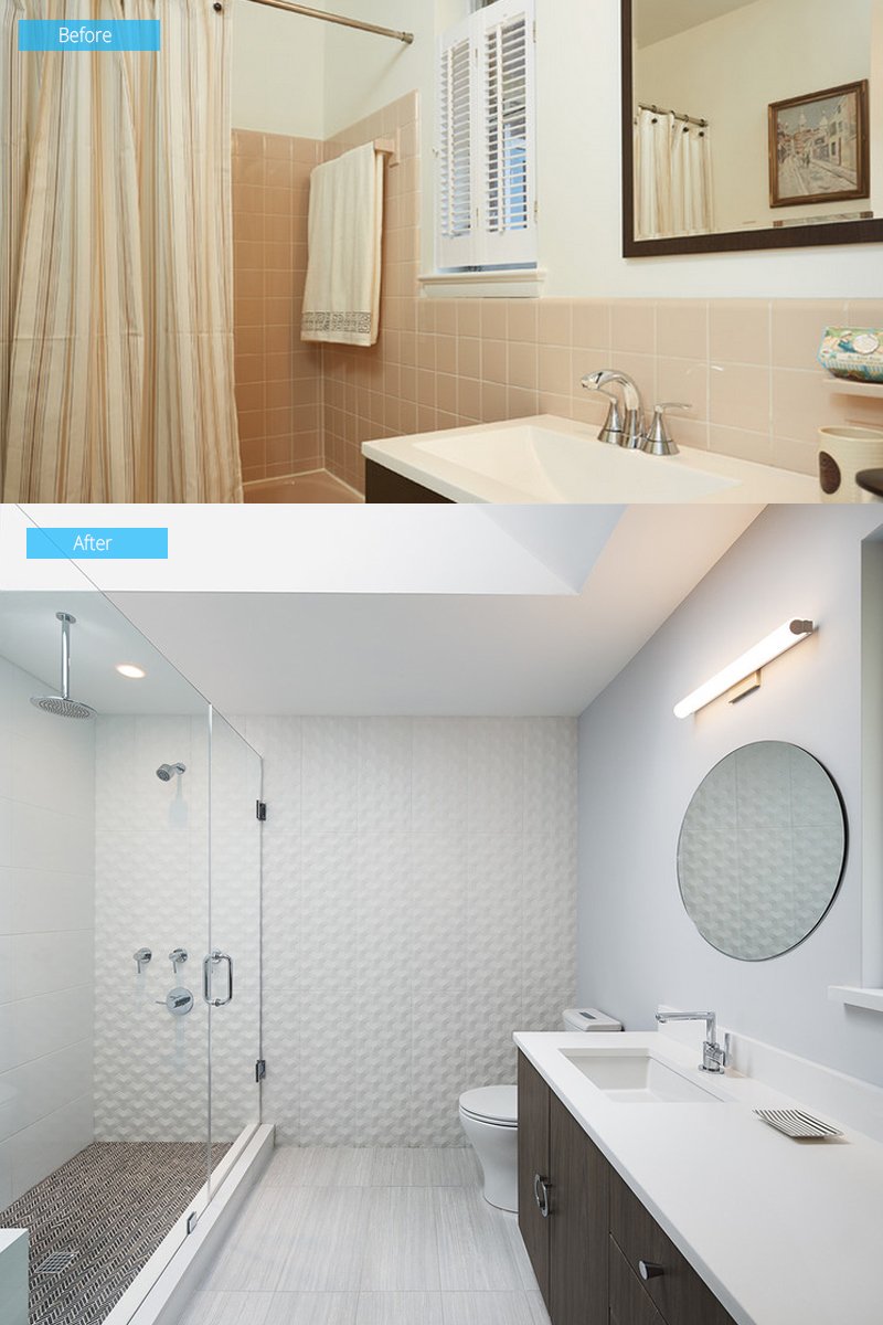
Before, the bathroom has pale peach color scheme. In the new bathroom, more space was added from the kitchen to add a walk-in shower and dual-sink vanity. Aside from that, a walk-in closet was also added in the master bedroom. The existing window of the bathroom is now above the middle of the vanity. In the photo, you can see a bit of the windowsill and opening on the far right. A new skylight was also added to the bathroom that illuminates the space.
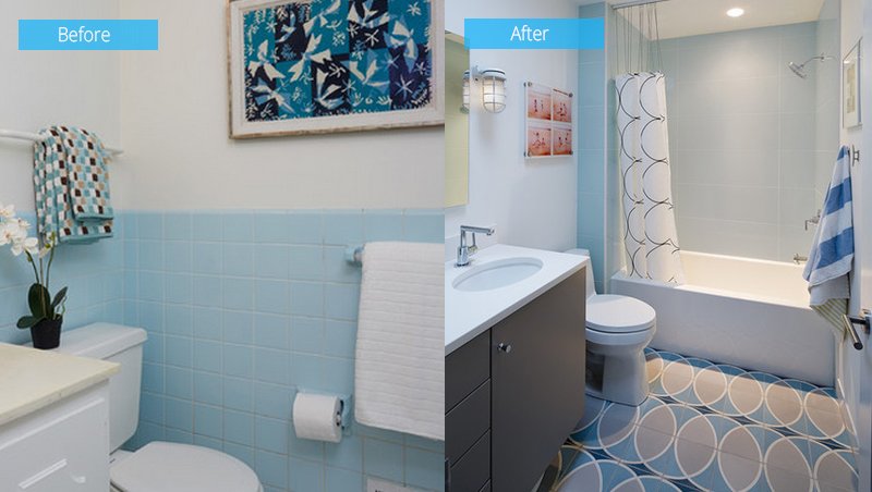
The old hall bathroom was quaint but rather compact featuring an old shower and tub combo just out of view. It was redesigned for the children’s usage with playful tile flooring and more lights were added to make it look brighter.
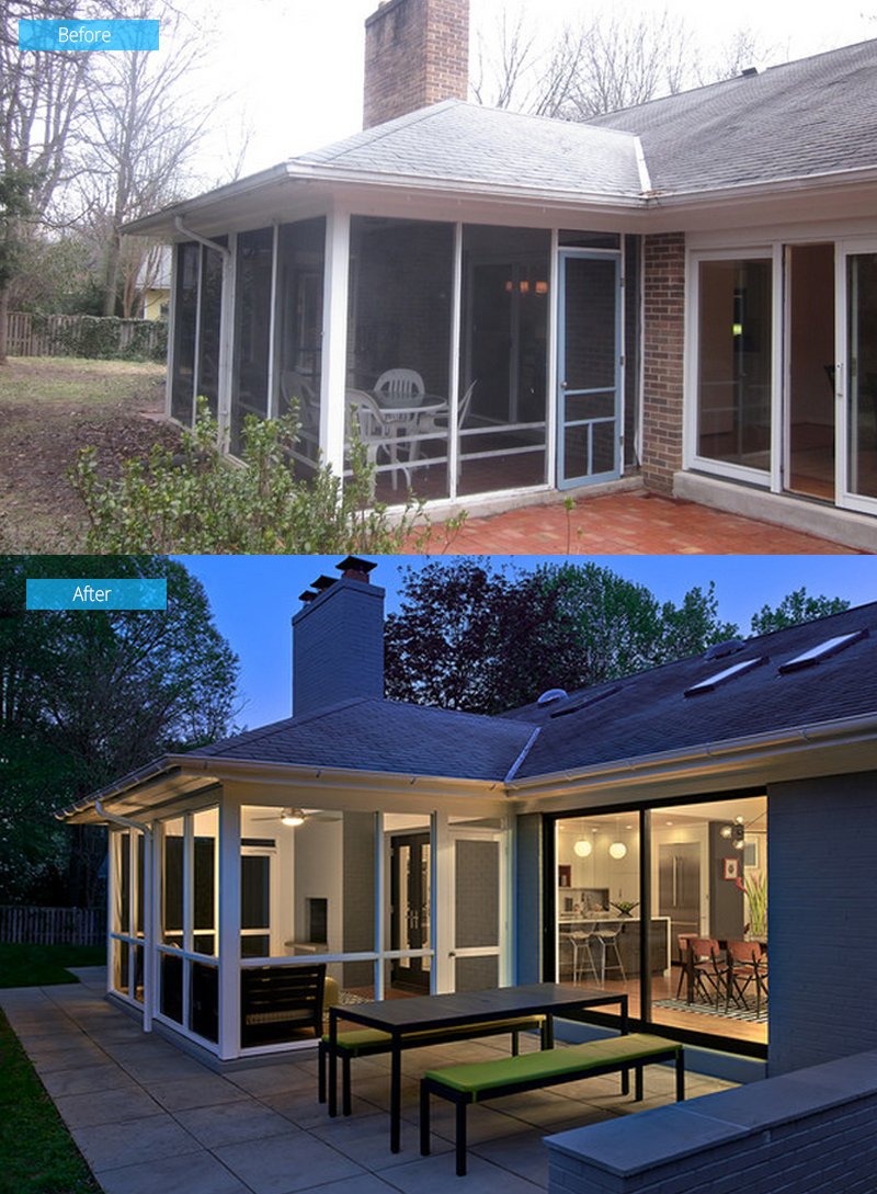
Since the wood framing of the screened-in porch had begun to warp and rot, the framing and screening were rebuilt while expanding the patio and adding a garden wall that doubles as a serving ledge. A seating area was also added in the space where the family can enjoy the beauty of nature while chatting or dining outside.
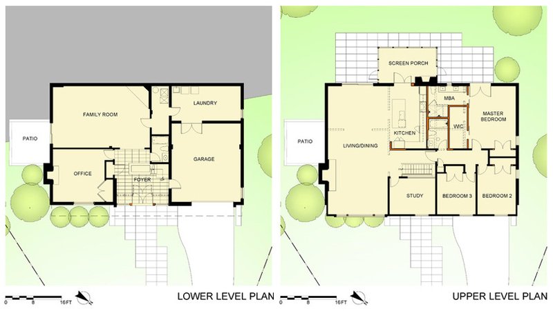
Seen here is the lower-level and upper-level floor plan. The dotted lines represented the demolished walls while the red lines are the new walls. You can notice that the floor plan didn’t change a lot since it only used the existing plan while removing the walls to give the space a better layout and traffic flow.
This project is a collaboration between Architect Lou Balodemas and Highbury Construction who both did an amazing job to turn the ugliest home the neighborhood to the most beautiful home in the area. Anyone who has seen how it looked before will surely be amazed how the home looks like now. There sure is a huge difference even though there is still a resemblance to the old dwelling. Impressive, right? What can you say about this renovation?