There are some homes that opt to get an addition to their space because of different reasons. Some may need another room for some activities. Some may have a growing family while still others would like to maximize their lot and use it for a good purpose. We have featured some homes before with an extension and we found them lovely and very functional. Today, we will show you a house with an addition and I’m sure you will love its design.
This cottage is called the Sandringham Residence since it is located in Sandringham, a bustling suburb of Auckland City, New Zealand. But it is also named as the Maskiell Home because it is owned by Doug Maskiell and wife Jenny. The clients wanted to convert the double-fronted dwelling into a fun, energetic larger home with lots of color. Doing this will enabled the growing family to live in the area for the long term. The renovation of the house extended the existing home with 4 bedrooms, a study and open-plan living area. The front of the home was retained and a two-story extension was added. The design of the extension was based on the form of a contemporary shipping container.
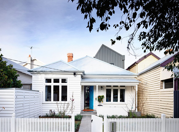
This is the facade of the house. You can see that it does look a bit traditional. This part was retained and when you enter the house, you are up for a surprise.
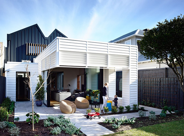
The rear living area is closely connected to the garden which is designed by Annabel Drew. You can see the contemporary design of the extension with high rear windows shielded by fixed louvers.
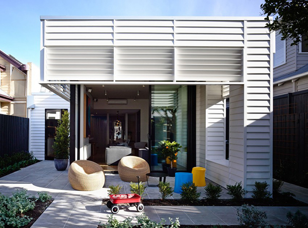
The louvers continue the look of weatherboards creating coherence in the architecture of the house.
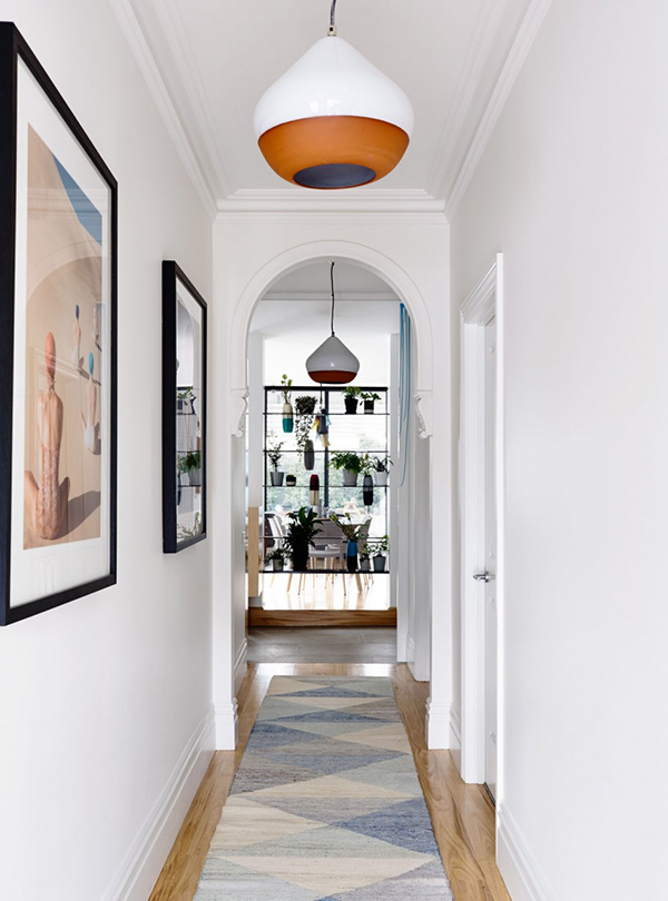
Take a look at this foyer with framed artworks on the wall to decorate it.
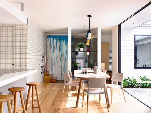
The interior design reflect a simple, utilitarian aesthetic that shows bold graphic shapes with strong blocks of color.
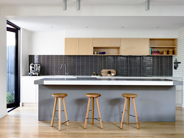
This is the kitchen that looks totally contemporary and neat. Love what they did to the backsplash.
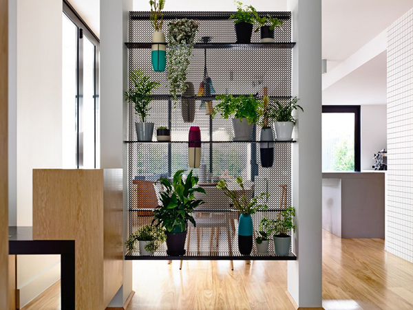
Beautiful indoor garden! I like the way they arranged the pots as well as the variation of colors and styles.
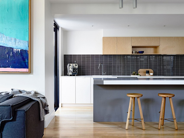
Who wouldn’t love this look? It isn’t just beautiful but very relaxing, even for a kitchen!
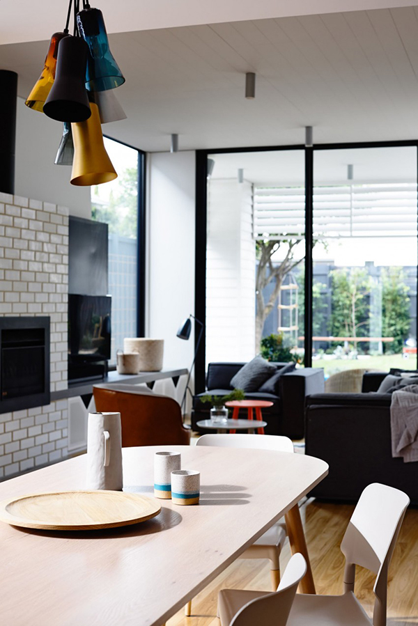
There is an eclectic mix of items in the house but it doesn’t break the modern contemporary feel in it. As a matter of fact, it adds to its appeal.
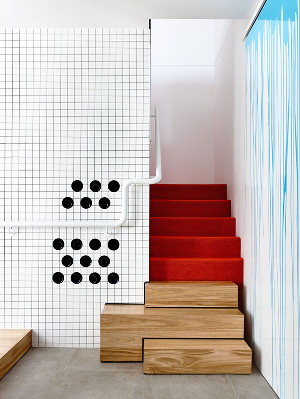
This checkerboard black-and-white wall paneling is a strong graphic detail in the house.
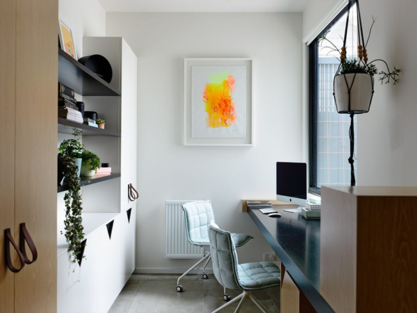
This is the work area in the house that faces the window. Subtle addition of artworks and decors did not over decorate the area.
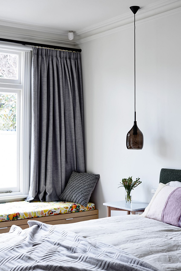
A cozy bedroom that would really lullaby anyone to sleep! That pendant light is beautiful!
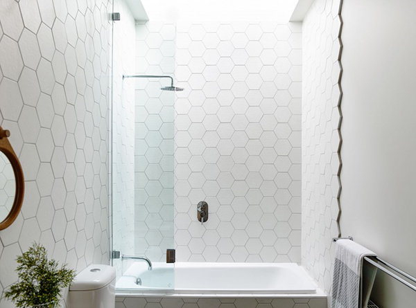
The bathroom has hexagonal tile patterns on the wall adding some interesting aura to the space.
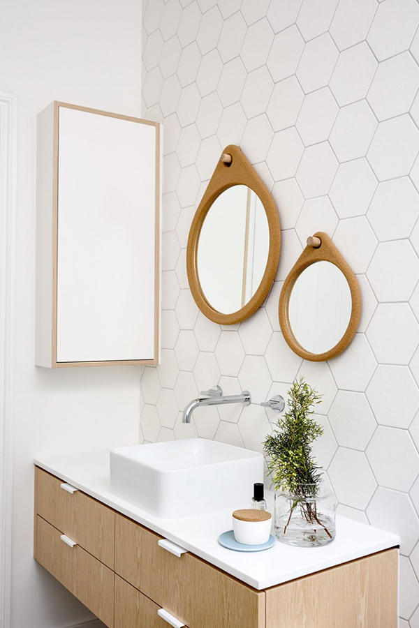
Aside from the wall, the vanity area is also a stunner in wood and white ceramic sink.
The Techne Architecture and the Doherty Design Studio worked on the house for the exterior and interior, respectively. Because of the seamless collaboration between the two talented design teams, the house was developed “around the lifestyle of the client’s growing family, incorporating bright, energetic elements into the interior that create a sense of fun and playfulness”. The original façade and surrounding street scape was retained and was a crucial part of the project. But the house was a given a new life that is undoubtedly stunning. What are the features of the house that you like the most?