Some homeowners feel the need to remodel their homes to make its look up to date. Some would totally change the look by adding some elements on the facade while others just change the paint colors or materials. Whatever they do to the home’s exterior, we can still see a huge difference of the home from its original design to the updated one. And of course, it makes it more visually appealing and more suited to the modern look of other homes around the area.
The project involves a complete renovation of an existing building converted into a private residence. The project seeks a complexity of volumes through the composition of simple elements; the synthetic result is the overlapping of two items from the antithetical nature that interact in strict harmony. A small photovoltaic system, installed on the roof, ensures the energy required for operation of the equipments. The motorized sun screens are connected, through a home automation system, at a light sensor that automatically manage the shielding in function of the contribution of solar lighting required.
Location: Rimini, Emilia-Romagna, Italy
Designer: archiNOW!
Style: Modern
Number of Levels: Three-storey
Unique feature: A home renovation wherein the exterior was updated to give it a more modern look featuring bright white colors as well as stone and wood elements.
Similar House: A Cute Girls Bedroom with a Lofted Play Space
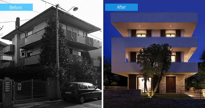
This is the before and after photos of the house showing the original home and the newly renovated residence. Apparently, the new design looks a lot better than the previous house with its white color and it’s C-form that links the second and third floor levels.
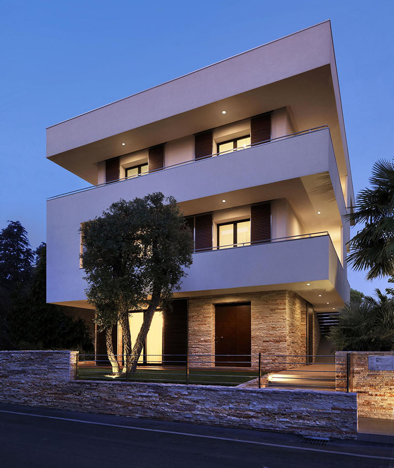
Brick stones were added on the lower level of the house. Same materials are also used for the fence as well. It is nice that they retained the tree in the outdoor space which adds a refreshing appeal to the house.
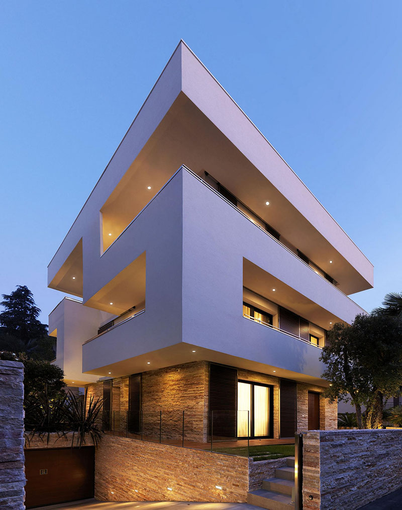
The home is now bright white, with stone and wood elements added to the design. In this image, you can see that it has a garage on basement as it slopes downwards towards it. Steps are used to access the first level of the house.
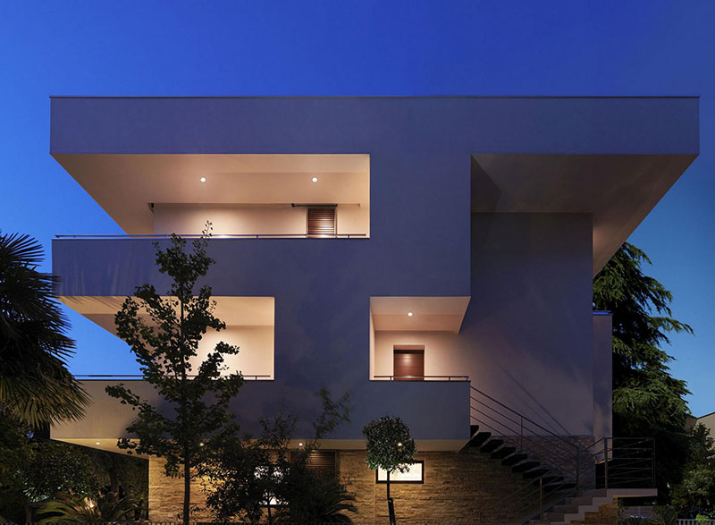
The designers paid particular attention to building energy efficiency, as well as active and passive strategies that considerably reduces the annual consumption. The building is equipped with a heating and cooling system connected to an absorption system through solar panels.
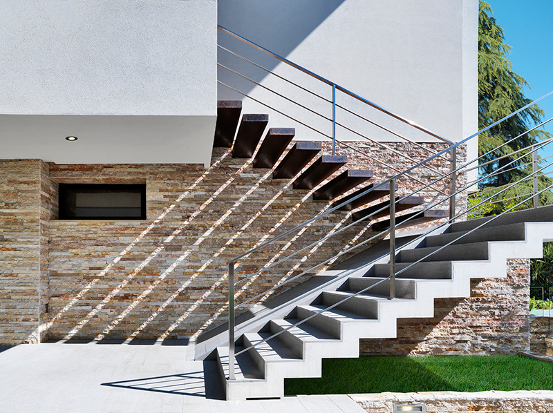
These are the staircase that leads to the upper level of the house. It has a combination of concrete and steel which is a sturdy option for a staircase. It also looks nice with the brick stone walls as a backdrop.
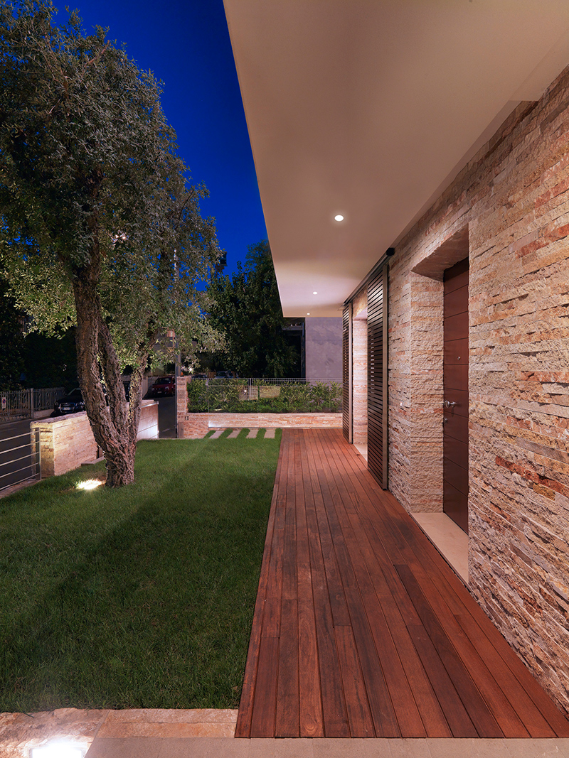
The basement, emerging from the ground, extends to all external landscaping and has as objective to generate a compact mass on the ground and, at the same time, constrain the block overlying characterized by greater dynamism and spatial complexity.
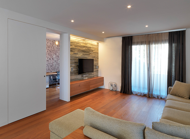
The materials emphasize the concept of volumes in contrast: for the basement, in fact, we have opted for a stone of Trani while the upper volume is treated in plaster. A wooden deck on the ground floor integrates with calcarenitic gray stone used in the pathways.
Read Also: A Summer House Boasts a Parent’s Bedroom with Play Area
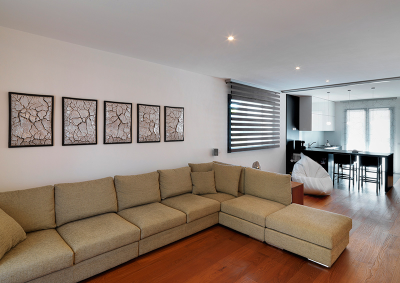
This is the sofa seen in the area above where some artworks are added on the wall. I actually think that this will look better if the wall decors were more colorful and artistic. But this could be the concept of the house using earth colors just like what we saw in its exterior. Notice also that it doesn’t have so many decors and furniture in it.
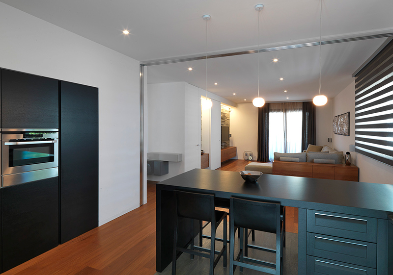
This is the kitchen area of the house with a black kitchen island. On the wall you can see that it used black for the cabinet to identify it from the white walls. The kitchen can also be hidden if desired using a sliding glass door.
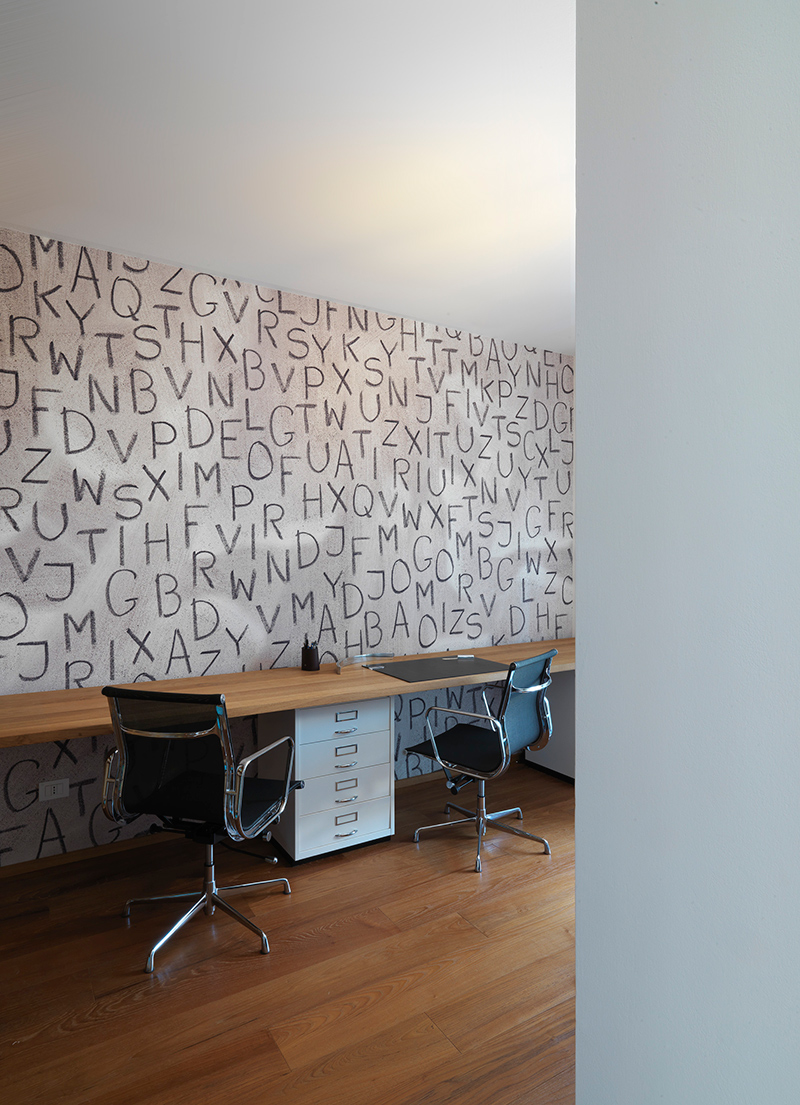
The house also has a working area with handwritten letters as the backdrop for the wallpaper. Seen here are ergonomic office chairs that make working a lot better while in the area. It also has a long wooden built-in desk in it.
This 500 sq. m. home is a project from archiNOW! who have worked with other efficient professionals to complete it. With the images we have seen above, it is obvious that the house has a beautiful design after it was renovated. It looks more modern and more visually appealing. Even if we didn’t have enough images of the home’s interior, I can tell that it looks minimal and modern in design too just like what we saw in the basement. This way, the interior will have a unified look that makes the home cozier to live in. Apparently, the designers did a great job to upgrade the look of the house. Indeed, it was worth it to have a home remodel! What can you say?