Because of the new modern and contemporary trend these days wherein the most focus is given to a home’s usage and functions, many homeowners are considering home renovations. This way, their spaces will not just be updated to the current trend but they will also get to use every square foot in a wise manner. While other homeowners renovate the entire home, there are also some who would up for an extension of home addition. Today, we are going to feature a home addition with a modern and contemporary appeal.
This project is called the Baldwin Duplex which is located in Culver City, California. The home has a 940 square feet floor area which is an interior and exterior remodel of the rear unit of a duplex. The designers were engaged into reorganizing on-site parking and re-positioning openings to create a greater sense of privacy. One addition to the home that can be seen in the images below is a new entryway for the rear unit which looks really very inviting. The remodel also involved a modified first floor layout which improves natural daylight and connections to new outdoor patio.
Location: Culver City, California
Designer: Oonaghryan
Style: Contemporary Modern
Number of Levels: Two-Storey
Unique feature: A simple yet functional modern contemporary home design featuring sophistication and creativity in every corner.
Similar House: Yaraville House: A Unique Contemporary Extension to a Home in Australia
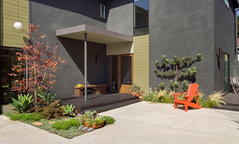
This facade of the house with a contemporary modern design is part of the home’s addition. It isn’t just nice because of the sleek lines used in it but also due to colors and the plants added in the area.
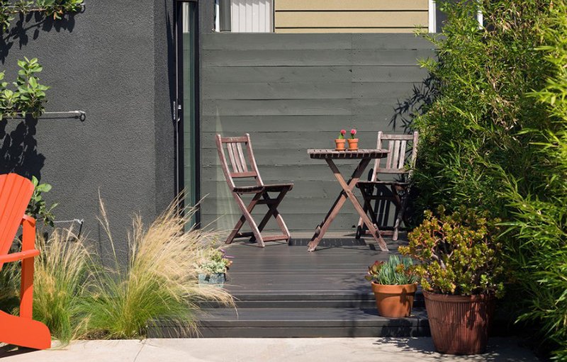
A small seating area is featured on the home’s deck. This outdoor space can be easily accessed through a glass door.
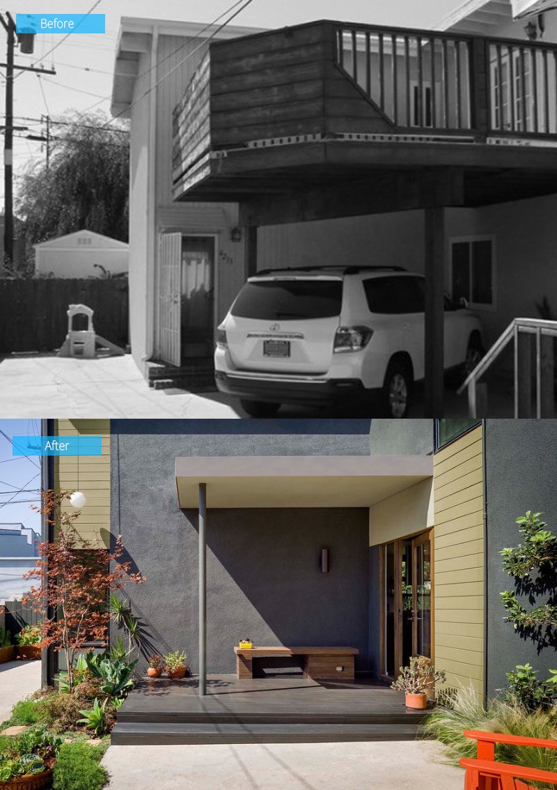
Seen here is the before and after image of the outdoor area. Before, it was a garage and it has an old ugly design. But after the update, it looked really stunning and very modern.
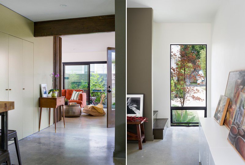
In the interior of the house, it used concrete flooring. It retained the concrete floor without any finishes but it looks shiny due to some treatment. Notice that the hallways don’t look boring. The first picture shows a table with a flower and a frame on it. The other picture has a large window to get a good view of the outdoor space while a long console is adorned with beautiful framed paintings.
Read Also: Before and After: Remodel of the RGR Private House in Italy
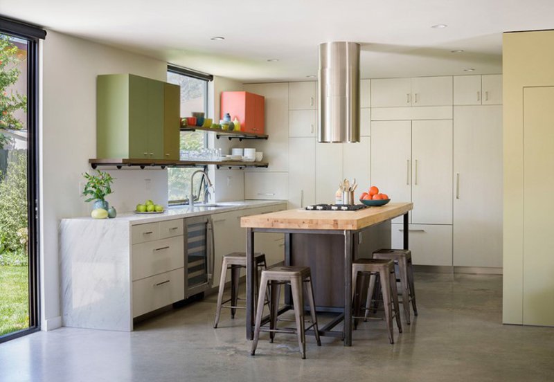
The kitchen has a simple modern design. The cabinets, which come in different sizes, provide enough storage spaces for the user. Aside from that, there are also floating shelves on the other side which carries two cabinets. It is also nice that the kitchen table is made of natural wood.
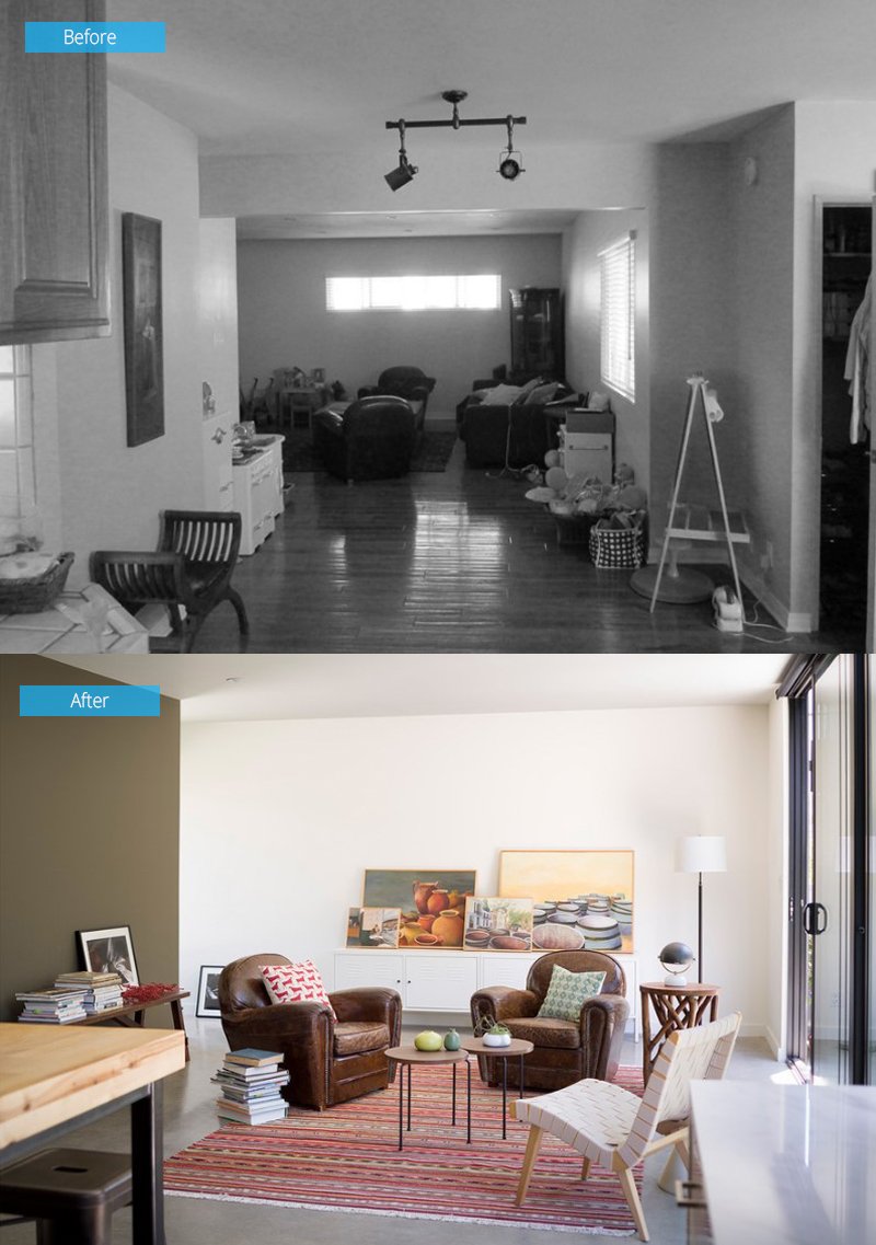
If you look at the image of the space before the renovation, you can see how cluttered it is and the arrangement doesn’t make the area cozy. It also used ceramic flooring and the windows are covered with blinds. But after the renovation, the space looked totally new! Yes, it still used the brown leather chairs but with this manner of arrangement, everything looked organized and creative as well. You can no doubt see that sense of artistry in the area.
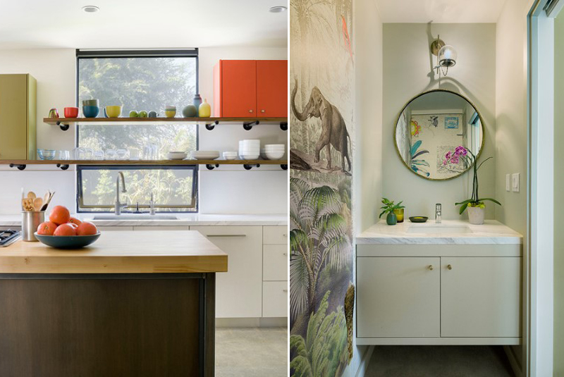
Featured here is a closer look at the kitchen’s floating shelves and picture window. Also seen here is the powder room that has a lovely wall mural which will no doubt remind you of the movie, “The Jungle Book.” Also seen here is a small marble top sink with a round mirror and an industrial wall sconce.
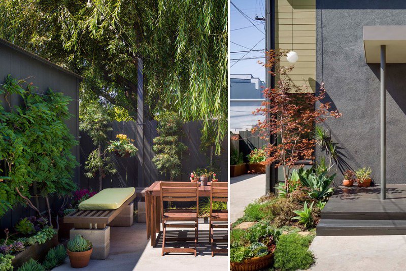
Apart from its stunning and simple interior, you will also love the outdoor area. It is nice that the home has its own courtyard apart from the wooden deck. Plants can really enhance the look of a space especially if it is well-planned.
Can you see the huge difference of the space? For sure, you were able to appreciate this contemporary space even more after you compared it to the previous look of the house. No doubt, it is cozier and more inviting now after the Oonaghryan helped the homeowners improve their home. What I like here is the simplicity of the interiors as well as the sleek lines used in the architecture of the home. It is also nice that there are plants around the home which will bring some fresh aura to it. Although this one is located in the city, it still has a courtyard garden where the family can relax and unwind.