Gorgeous Transformation of a Flat in Barcelona, Spain
Transforming the look of an interior isn’t a new thing for us because we have seen many homes that were remodeled and redesigned already. We have even seen some before and after images for some spaces which turned out really impressive. What I like about redesigns is that we can greatly see the difference between the former spaces to the new one. Today, we are going to feature another lovely interior transformation that would surely impress you even without seeing the before photos.
In Passeig de Sant Joan, Barcelona, Spain, you can find a chic and stylish flat with 75 square meters area. This home was formerly compartmentalized and dark. Hence, partitions were torn down to create an open layout and the distribution of space was improved. The flat became more livable and visually connected the spaces by integrating it to the whole. The rooms were re-configured to have public and private zones. The kitchen area was relocated, that opens up to a social area through a corridor with widened access. When you reach the social area, it has a large wooden table that separates the dining, study, and lounge area. The result of the transformation is very stunning! Come take a look.
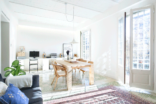 At first glance, you will say that the interior is airy, breezy and bright.
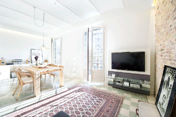 And it sure is. It used natural materials as well as modern materials to create a gorgeous interior.
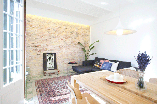 A brick wall serves as an accent wall for the living area.
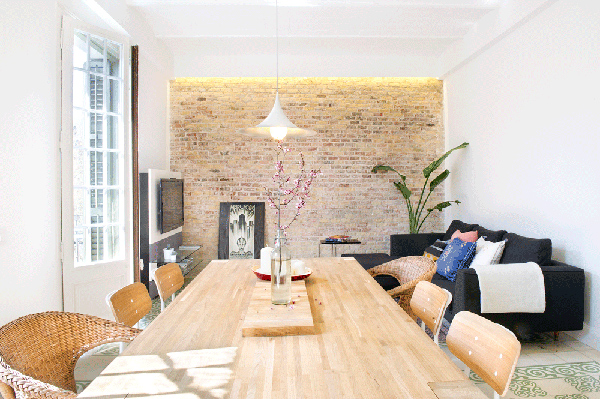 The dining area used a wooden dining set with a simple yet lovely centerpiece.
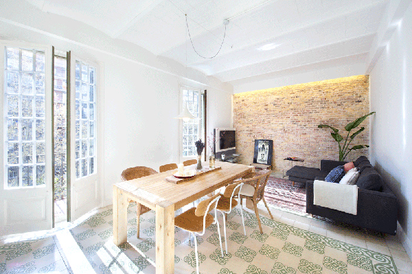 Note the use of different area rug designs for the living and dining spaces to define each one.
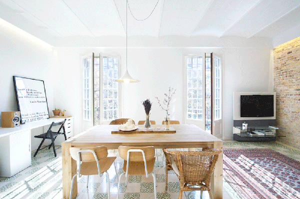 The French doors of doesn’t just add beauty to the space but also allow sunlight to penetrate in the interior.
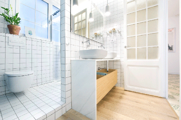 The bathroom is charming with white tiles and wooden accents.
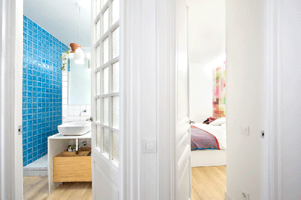 You can see here that the bedroom and bathroom are just beside each other.
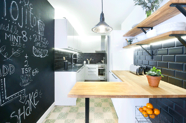 The kitchen has a design that you will love because of the colors and materials it used.
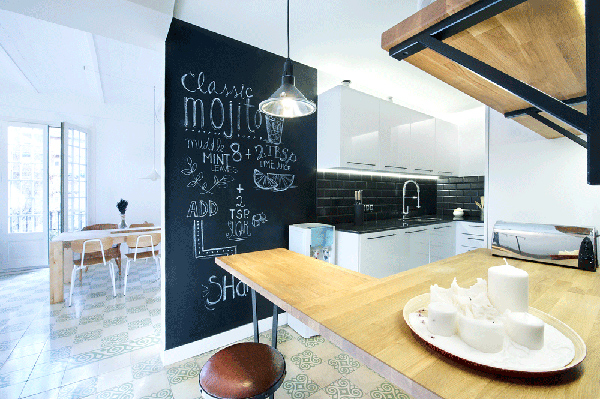 The chalkboard wall accent is a cute addition to the kitchen where you can scribble recipes, notes and reminders.
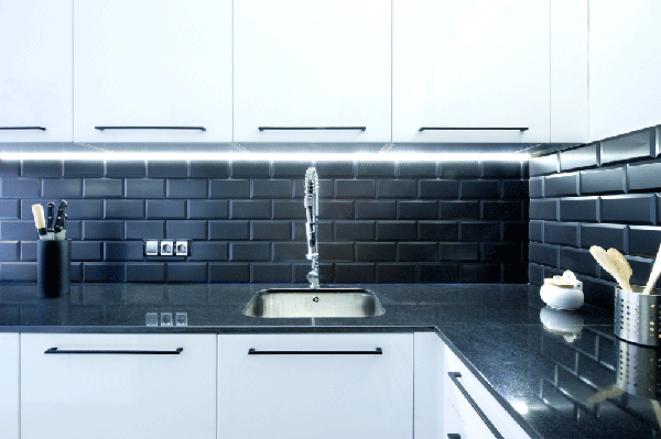 Black backsplash and countertop looks great together in contrast with the white cabinets.
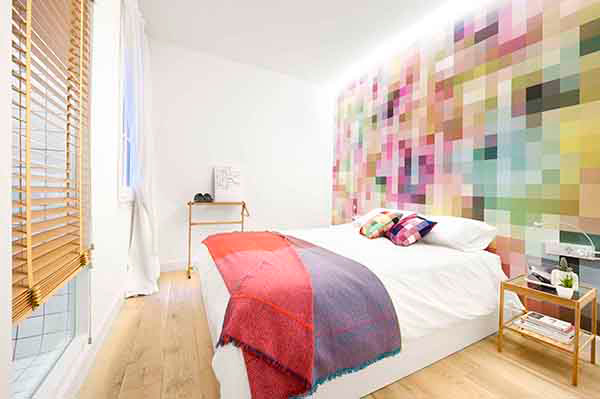 A pretty contemporary bedroom with pixel wall art.
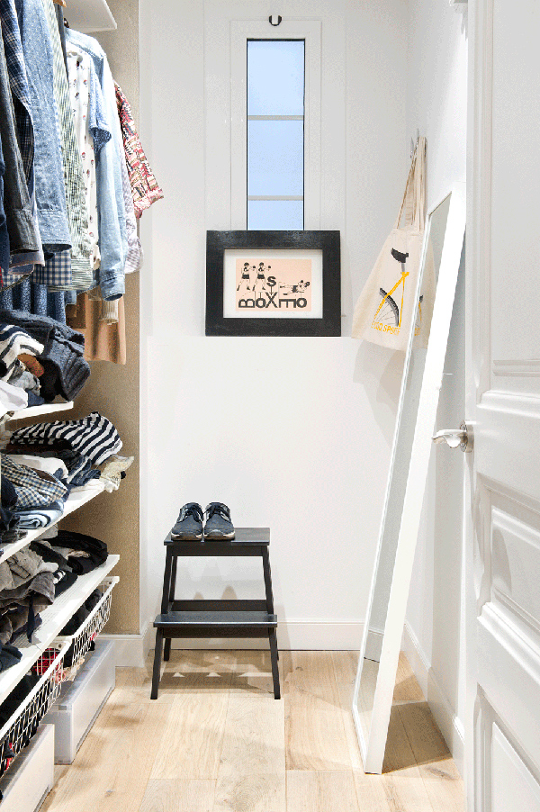 This one is the wardrobe showing us ideas for storage.
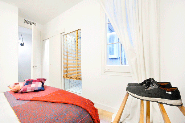 The bathroom can be accessed from the bedroom too as seen here.
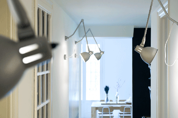 This is a hallway with industrial lights that lead to the social areas.
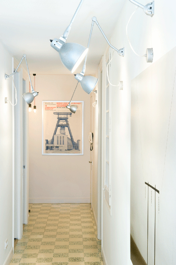 The hallway has beautiful floor cover which is the same as what was used for the dining area.
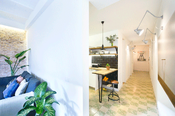 Notice the partition of the living area and the kitchen in this photo.
What can you say about this home? Isn’t the interior stunning? I am sure you found it very lovely because look at it that way too. The space is well divided for various functions and it the design is just relaxing and very artistic without overdoing it. This interior is done by egueyseta.com – Egue y Seta who have amazingly redesigned the interior. I love how the living spaces were decorated. How about you? What do you like about this space?


