When you hear about a minimalist modern home, what comes to your mind is a simple yet up to date design. Yes, you are right about that. As a matter of fact, homes like this can even be hi-tech and would have smart designs to make it look minimal yet with amazing functions. Today, I am going to show you a house with a minimalist modern design that has many awesome features.
This House in Sai Kung is a cramped split-level box which was transformed into four story home located in the Sai Kung District, Hong Kong. Inside this 4,550 square feet (455 square meters) home is a garage, a living room, a family room, two small ensuite bedrooms, two guestrooms with one guest bath, a helper room, a master en-suite bedroom with a walk-in closet and den. It also has an open roof top sitting area giving the dwellers a spectacular sea and garden views. But what I like most in this house is the kitchen and garage area. You’ll see why when you see the image below.
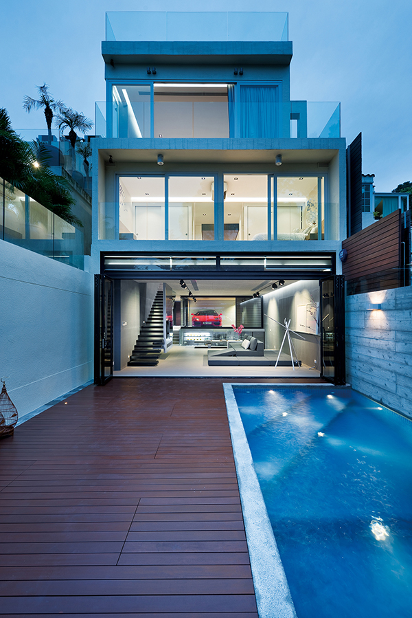
This is how the exterior of the house looks like with an outdoor pool. Modern and minimalist indeed!
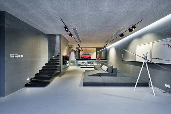
This is the living area and this is all that it has in there- a sofa.
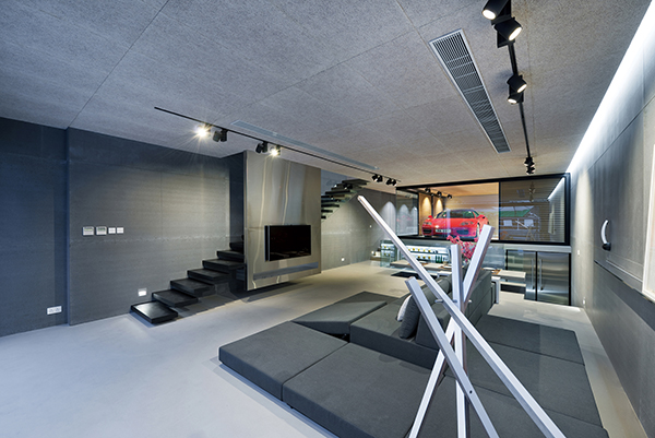
And yes, it has a television too. It looks really bare but that is how a minimalist home looks like.
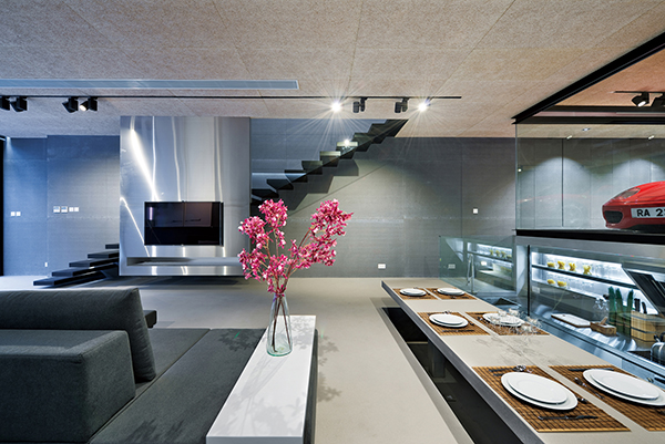
But it didn’t look boring or dull. AS a matter of fact, it looked sophisticated!
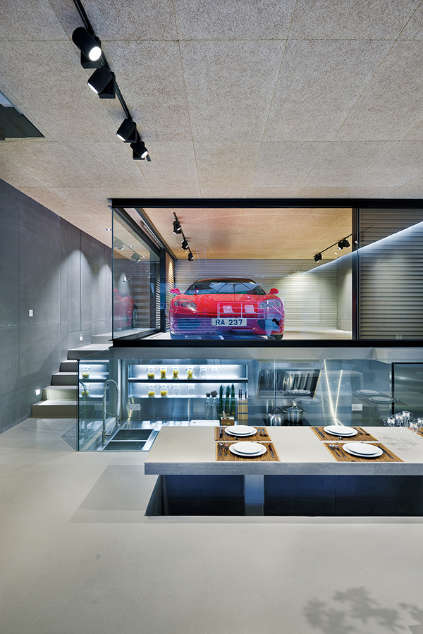
Now look closely at the dining table. It is actually part of the flooring being lifted up. While the kitchen is sunken.
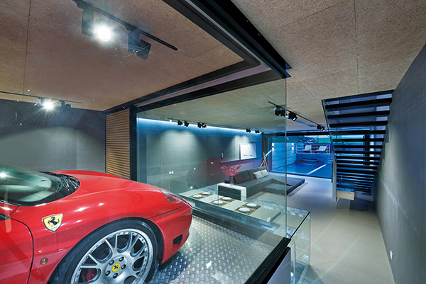
Above the kitchen is the garage. Just amazing, isn’t it?
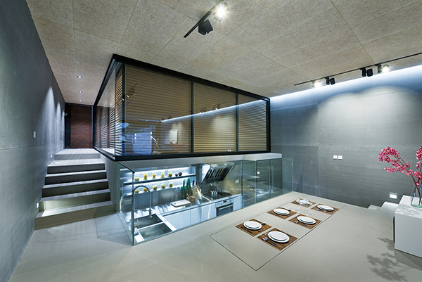
Without the plates, you’ll think that rectangle on the floor is just the floor. But no, it is the dining table!
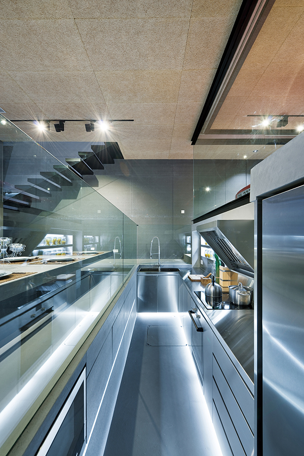
Inside the sunken kitchen is are all these modern cooking and food preparation stuff.
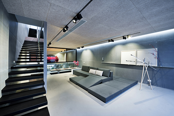
Oh well, what a home indeed! It does look simple but its functions will make you feel like you are in a James Bond movie.
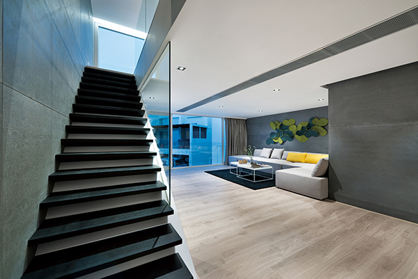
This is the living space in the upper area with a decorative wall art and some pops of yellow.
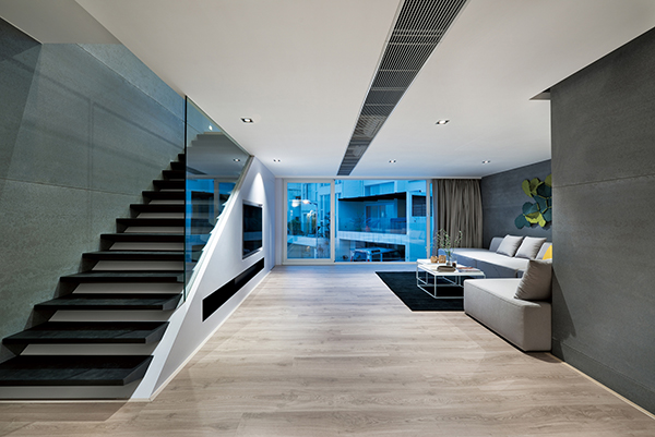
It leads to balcony that can be accessed through a sliding door.
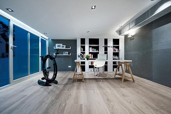
This is the working area with a combination of white and gray.
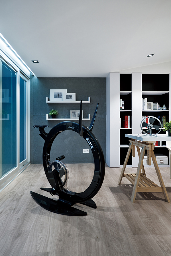
And this is for the owner’s work out sessions right in his working area.
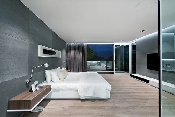
Expect the bedroom to be this simple too. But it has a sliding door that leads to a balcony.
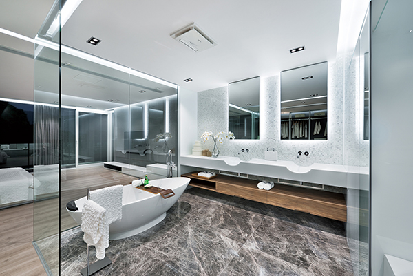
The ensuite is surrounded with glass with a luxurious appeal.
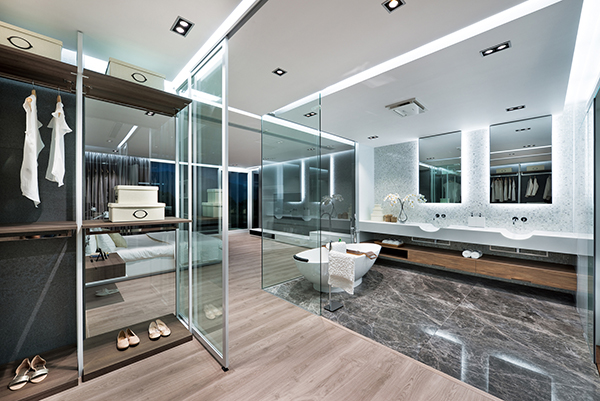
It is spacious and could actually be even better than a hotel bathroom!
You will surely agree with me that the garage and kitchen area is one of the best features of this house designed by Millimeter Interior Design. I’d say that they did a very great job to this design because they were able to maintain a minimalist look despite all the modernism in it as well as some incorporation of hi-tech elements. This is indeed a modern day home from the aesthetics up to the functions!