A studio apartment has an open layout. It is like filling in a blank canvass. In truth, it can be challenging to design a space like this one but it can actually be advantageous too because you are free to do what you want. You can bring in whatever elements you desire because no columns or walls are there at the center of the space. You have an entire canvass to paint a beautiful home.
A small studio apartment located in Moscow, Russia was designed with beautiful and functional interiors making it visually spacious. This 484 square feet (45 square meters) studio is occupied by a young woman comprised with a living room, a sleeping area and a kitchen. The color palette has light soft hues with bright accents on individual parts. One challenging thing in the studio is the lack of storage which was then given answer by the designers. Interior partitions where “thickened” and were turned into built-in wardrobe closets in the hallway and a small wardrobe from the bedroom area. Other than that, you can see more storage solutions in the images below.
Additionally, the bed in the bedroom is raised on a platform, on the one hand, visually separating living and sleeping areas, and on the other, to get extra space for storage of bulky items (such as blankets, pillows, bedding, etc.).
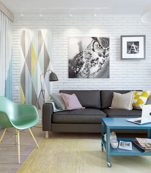
Adding such lovely decors for the walls with white bricks made it appear like a gallery.
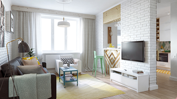
Despite being small, the designer made sure that it looked amazing by adding graphic elements into it.
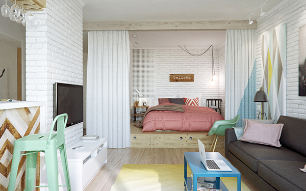
From the living room, you can see the bedroom which can have that much needed privacy through a curtain.
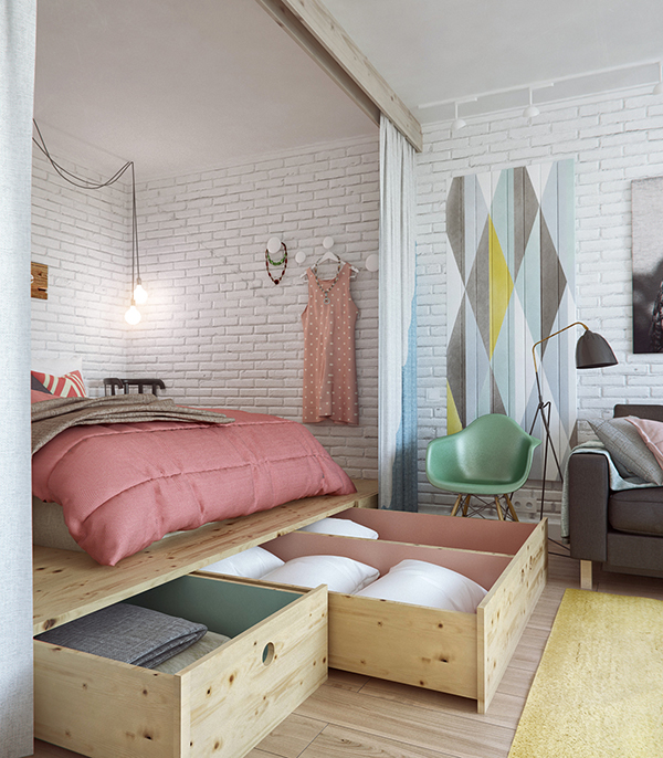
The bedroom is raise from the flooring with a platform where other items can be stored.
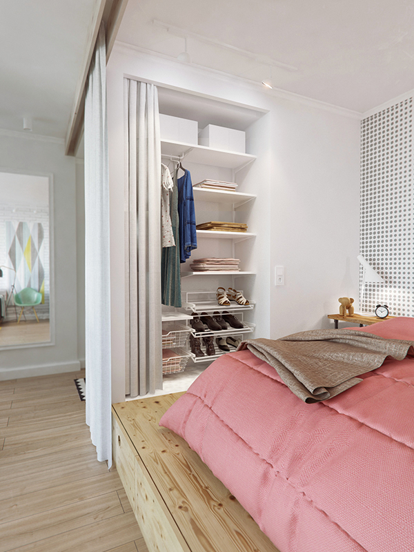
There are also built-in shelves for other items that the owner wants to keep.
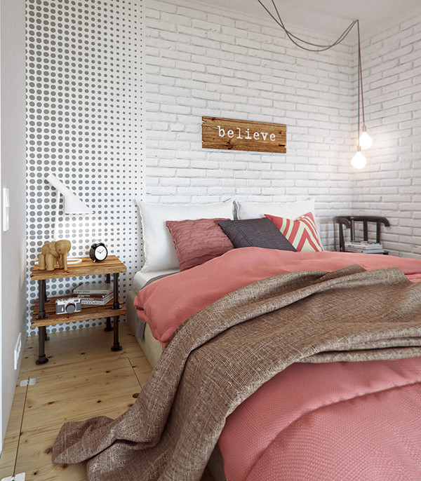
I like the look of the bedroom as it added interesting decors everywhere.
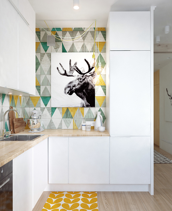
The backsplash of the kitchen has a play of colors and tiling. Everything just looked very modern and bright!
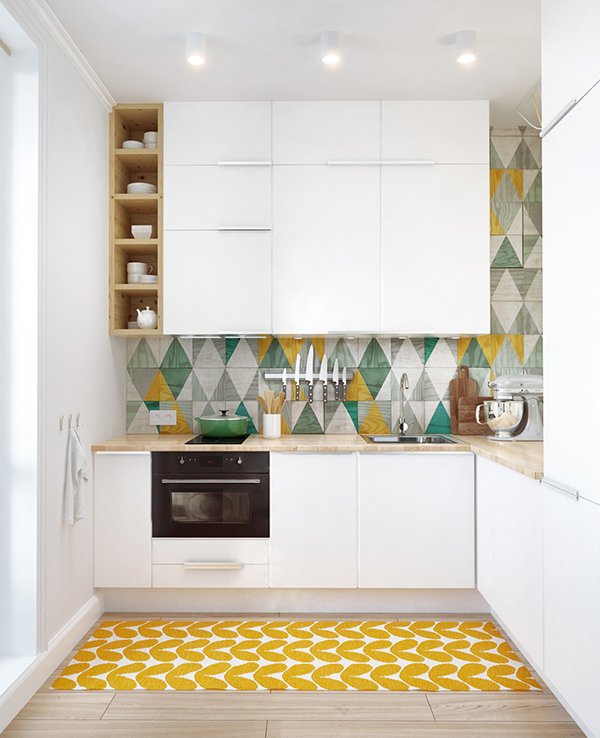
That area rug is a perfect addition to the space.
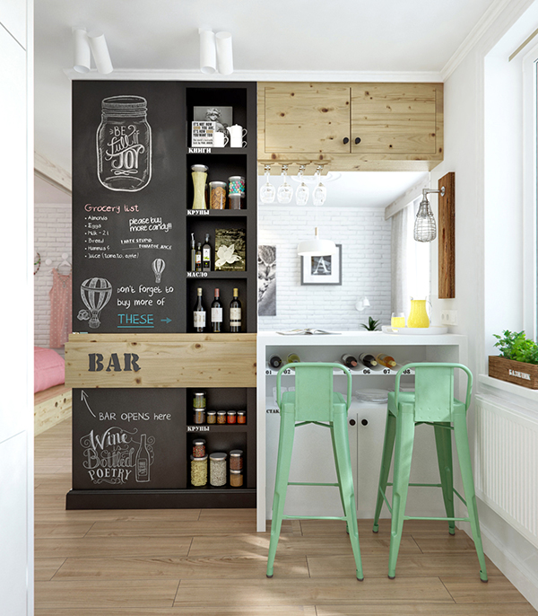
A bar was inserted to the area with a chalkboard painted wall.
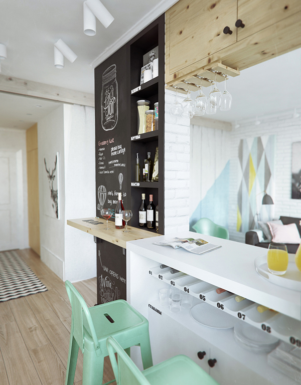
Notice how the wine and other stuff were stored in this part. Pretty creative!
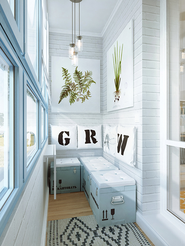
The seats on the balcony are comprised of repainted army boxes, which can also be used for additional storage. Love those pillows on the wall!
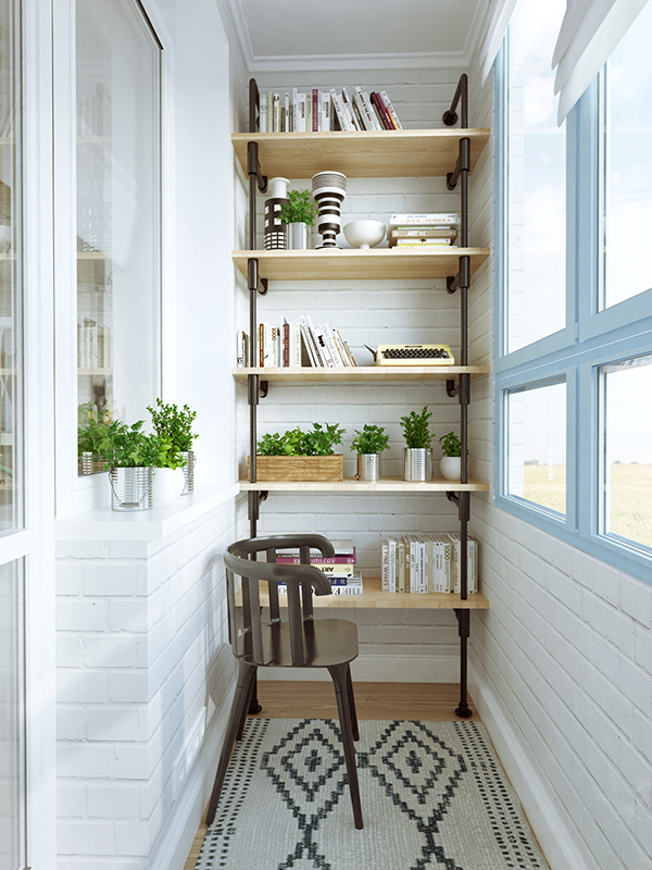
On the other side is a shelf of books with plants.
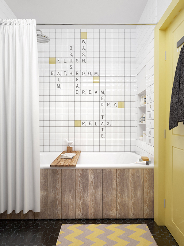
Of all the bathrooms I have seen, this one is my favorite! That Scrabble look on the walls is just very creative indeed!
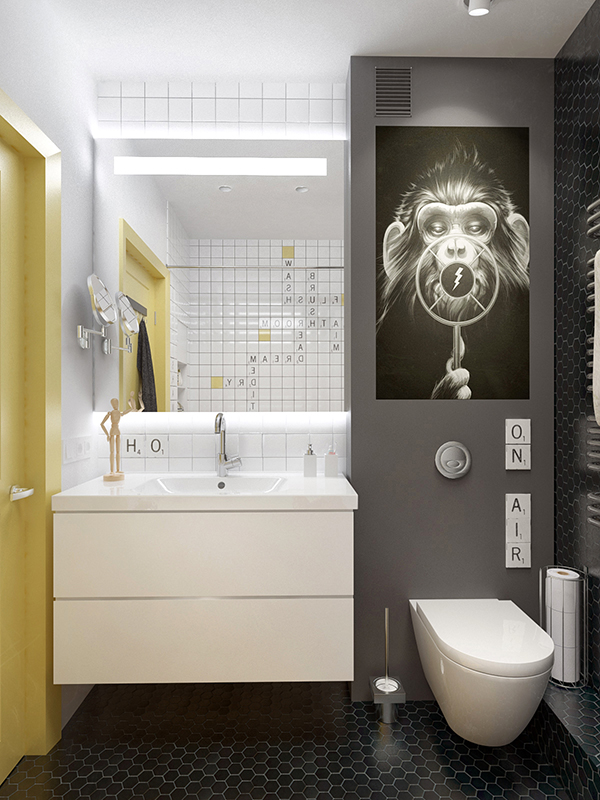
And it has wall decors too with a light yellow door.
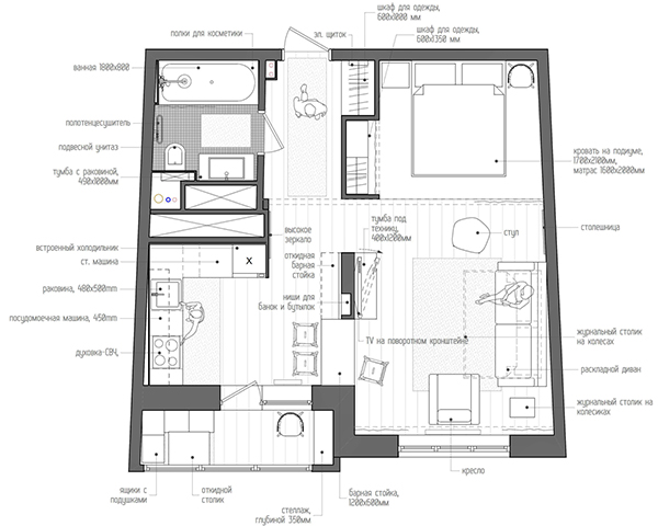
This is the floor plan of the apartment. Yes, everything fit in the small space!
I like the way the studio apartment was designed especially its use of light tones as well as the storage spaces. With one’s creativity and practical thinking, nothing can be impossible. What the INT2 Architecture did to this apartment turned it into a space that any young lady would love!